Mastering Image Resizing in HTML: A Tophinhanhdep.com Guide to Optimized Visuals

In the vibrant world of digital imagery, where stunning wallpapers, captivating backgrounds, and beautiful photography reign supreme, the ability to effectively manage and display images is paramount. At Tophinhanhdep.com, we understand that every pixel matters, not just for aesthetic appeal but also for the overall user experience. One of the most fundamental yet often misunderstood aspects of web development is how to resize images in HTML. While the concept seems straightforward, the nuances of client-side resizing versus server-side optimization can drastically impact your website’s performance, image quality, and visual integrity.
This comprehensive guide from Tophinhanhdep.com delves into the various methods of resizing images directly within HTML and CSS, while critically examining their limitations and advocating for more robust, modern solutions. Whether you’re a photographer showcasing high-resolution stock photos, a digital artist presenting creative designs, or simply someone looking to optimize their visual content, understanding these techniques is crucial for delivering an unparalleled visual experience. We’ll explore how simple HTML attributes can lay the groundwork, how CSS offers greater control for responsive designs, and why the ultimate solution often lies in advanced image tools and optimization strategies that align with Tophinhanhdep.com’s commitment to superior image delivery.
The Fundamentals of HTML Image Resizing: Your First Steps to Visual Control
When it comes to displaying images on a webpage, the <img> tag is your primary tool. This element allows you to embed an image, and it provides several attributes that can directly influence how that image appears. For simple resizing, HTML offers immediate, though often superficial, control.
Using width and height Attributes Directly

The most straightforward way to specify an image’s dimensions in HTML is by using the width and height attributes directly within the <img> tag. These attributes tell the browser the intended size of the image in pixels.
For example, if you have an image file named beautiful-nature.jpg from Tophinhanhdep.com’s extensive nature collection, and you want it to display at 400 pixels wide by 300 pixels high, your HTML code would look like this:
<img src="beautiful-nature.jpg" alt="A serene nature landscape" width="400" height="300">In HTML 4.01, it was possible to define height using percentages of the containing element, but with HTML5, these values must be specified in pixels. This direct declaration ensures that the browser reserves the appropriate space for the image when the page loads, preventing sudden layout shifts (often referred to as “flickering”) that can occur if image dimensions are unknown.
Considerations for Tophinhanhdep.com users: While this method provides immediate visual control, it’s crucial to understand a significant caveat: using width and height attributes in HTML does not change the actual file size of the image. If beautiful-nature.jpg is originally a high-resolution, multi-megabyte photograph, the browser will still download the entire large file, even if it’s displayed at a much smaller size. This can severely impact page load times, especially for visitors on slower internet connections or mobile devices. For those passionate about “High Resolution” and “Beautiful Photography” found on Tophinhanhdep.com, this distinction is vital for maintaining both visual quality and site performance.
Leveraging Inline CSS with the style Attribute
For more granular control over individual image styles, including resizing, you can employ the style attribute. This attribute allows you to embed CSS rules directly into an HTML element, effectively creating “inline” styles. This method is often preferred for specific, one-off adjustments that don’t warrant a global stylesheet rule.
To resize an image using inline CSS, you would modify the <img> tag as follows:
<img src="abstract-art.jpg" alt="A captivating abstract design" style="width:500px; height:600px;">In this example, the style attribute contains CSS properties that set the width to 500 pixels and height to 600 pixels. A key advantage of using the style attribute is its high specificity: it overrides any dimensions defined by the width and height HTML attributes, as well as general CSS rules for <img> tags, ensuring the image adheres to the exact dimensions specified.
From a “Visual Design” perspective, especially for “Digital Art” or “Creative Ideas” featured on Tophinhanhdep.com, inline CSS offers a quick way to experiment with different sizes for specific visual elements without altering your main design framework. However, like direct HTML attributes, this method still doesn’t address the underlying issue of image file size. The full-sized “abstract-art.jpg” will still be downloaded, regardless of its displayed dimensions.
Advanced Techniques for Responsive and Aesthetic Image Display
Modern web design, particularly for content-rich platforms like Tophinhanhdep.com, demands images that not only look good but also adapt seamlessly to various screen sizes and devices. Basic width and height attributes fall short here. This section explores CSS-driven techniques that offer greater flexibility, ensuring your “Aesthetic” and “Nature” images remain visually stunning across all platforms.
Preserving Aspect Ratio for Flawless Aesthetics
One common pitfall when resizing images is distorting their original aspect ratio. Forcing an image into arbitrary width and height values can make people or objects appear stretched or squashed, severely detracting from the “Beautiful Photography” and “Aesthetic” quality Tophinhanhdep.com strives for. CSS provides elegant solutions to prevent this.
The simplest way to preserve an image’s aspect ratio while controlling one dimension is to set either its width or height to auto. Typically, you’ll want to control the width to fit a container, letting the height adjust proportionally.
/* In your CSS stylesheet */
.responsive-image {
  width: 100%; /* Image will take 100% of its parent container's width */
  height: auto; /* Height adjusts automatically to maintain aspect ratio */
  max-width: 800px; /* Optional: Prevent image from exceeding its original width (or a desired max) */
}
Then, in your HTML:
<img src="mountain-wallpaper.jpg" alt="Majestic mountain view" class="responsive-image">By setting width: 100% and height: auto, the image will scale down (or up, if max-width isn’t set) to fit its parent element, automatically adjusting its height to avoid distortion. The max-width property is particularly useful for images that are larger than their intended display size. Setting max-width: 100% (or a specific pixel value like 800px in the example) ensures that the image will scale down if needed, but never scale up beyond its original dimensions. This prevents a smaller image from becoming pixelated and blurry when rendered larger than its native size, a critical consideration for maintaining the integrity of “High Resolution” images.
Fitting Images to Containers with object-fit and Background Images
Sometimes, you need an image to perfectly fill a specific container area, even if it means cropping part of the image or sacrificing some of its original content. CSS offers powerful properties like object-fit and background-image for achieving these advanced layout effects, crucial for intricate “Photo Manipulation” and “Digital Art” presentations.
The object-fit CSS Property
The object-fit property, applied directly to the <img> tag, dictates how the image’s content should be resized to fit its container. This is invaluable when you want to control both the image’s dimensions and its behavior within those dimensions.
Here are its common values:
fill(default): The image will fill its given area, stretching or squashing as needed, ignoring its aspect ratio..fit-fill { width: 200px; height: 300px; object-fit: fill; }contain: The image is scaled down to fit completely within the content box, preserving its aspect ratio. This may leave empty space (letterboxing) if the aspect ratios don’t match..fit-contain { width: 200px; height: 300px; object-fit: contain; border: 1px solid #ccc; }cover: The image is scaled to fill the content box, preserving its aspect ratio. The image will be clipped if its aspect ratio doesn’t match the container’s. This ensures the container is fully covered..fit-cover { width: 200px; height: 300px; object-fit: cover; border: 1px solid #ccc; }none: The image is not resized at all. It will display at its original size, and only the part that fits within the container will be visible..fit-none { width: 200px; height: 300px; object-fit: none; border: 1px solid #ccc; }scale-down: The image is scaled as ifcontainornonewere used, whichever results in the smaller concrete object size.
You can further refine the image’s position within its container when using object-fit with the object-position property (e.g., object-position: right; to focus on the right side of a cropped image). This allows for precise artistic control over “Photo Manipulation” and “Creative Ideas,” ensuring the most impactful part of the image remains in view.
Resizing Background Images with CSS
For elements like hero sections or banners where an image serves as a visual backdrop rather than an inline content piece, CSS background-image properties are ideal. These offer robust control over how an image fills its containing element, often a div.
.hero-banner {
  background-image: url('aesthetic-background.jpg');
  background-position: center center; /* Centers the image */
  background-size: cover; /* Resizes to cover the entire container, cropping if needed */
  background-repeat: no-repeat; /* Prevents tiling */
  width: 100%;
  height: 400px; /* Fixed height for the container */
}
Key background- properties:
background-image: Specifies the image source.background-position: Controls the starting position of the background image (e.g.,center,top left,50% 50%).background-size: Crucial for resizing:auto: Default, image at full size.length(e.g.,100px 100px): Sets explicit width and height.percentage(e.g.,100% 100%): Sets width and height relative to the parent.contain: Scales the image (preserving aspect ratio) to be fully visible within the container.cover: Scales the image (preserving aspect ratio) to cover the entire container, potentially cropping parts.
background-repeat: Determines if the image repeats (no-repeat,repeat-x,repeat-y,repeat).
Using these background properties, especially background-size: cover;, is a powerful technique for creating visually stunning “Backgrounds” and “Wallpapers” that perfectly adapt to their containers, central to Tophinhanhdep.com’s focus on immersive visual experiences.
Beyond Basic HTML: The Critical Need for Server-Side Image Optimization
While HTML and CSS provide front-end controls for how images appear, they do not address the fundamental issue of image file size. This distinction is paramount for website performance and user satisfaction. At Tophinhanhdep.com, we advocate for solutions that go beyond client-side rendering to truly optimize your visual content.
The Hidden Costs of Client-Side Resizing
Relying solely on HTML or inline CSS for resizing images comes with several significant downsides that negatively impact performance, quality, and user experience:
-
Slow Image Rendering and Bandwidth Wastage: When you use HTML
width/heightattributes or CSS to resize a large image to a smaller display size (e.g., displaying a 2000px wide image as 400px), the browser still has to download the entire 2000px, multi-megabyte image. Only after downloading the full file does it then resize it for display. This leads to:- Increased Page Load Time: Visitors wait longer for the page to render, particularly noticeable on slower network connections.
- Wasted Bandwidth: Both for the server (higher hosting costs) and the user (consuming more mobile data), leading to a less efficient and potentially more expensive browsing experience. This directly contradicts the goals of “Image Tools” like “Compressors” and “Optimizers.”
-
Poor Image Quality: The algorithms browsers use to scale images can vary and are often optimized for speed over quality. When a large image is significantly downscaled on the client side, the resulting visual might appear noticeably blurry, jagged, or lose fine details. This compromises the “High Resolution” and “Beautiful Photography” standards upheld by Tophinhanhdep.com. The browser’s resizing capabilities are rarely as sophisticated as dedicated “Digital Photography” editing software.
-
Increased Memory and Processing Requirements on Client Devices: Resizing large images is a computationally intensive task. When a browser performs this operation for multiple images on a page, it consumes more CPU and memory on the user’s device. On low-end smartphones or older computers, this can lead to a sluggish browsing experience, draining battery life and making the entire website feel unresponsive.
These hidden costs highlight why client-side resizing, while easy to implement, is often an inefficient and suboptimal strategy for image-heavy websites like Tophinhanhdep.com.
The Tophinhanhdep.com Approach: Dynamic Resizing and Optimization
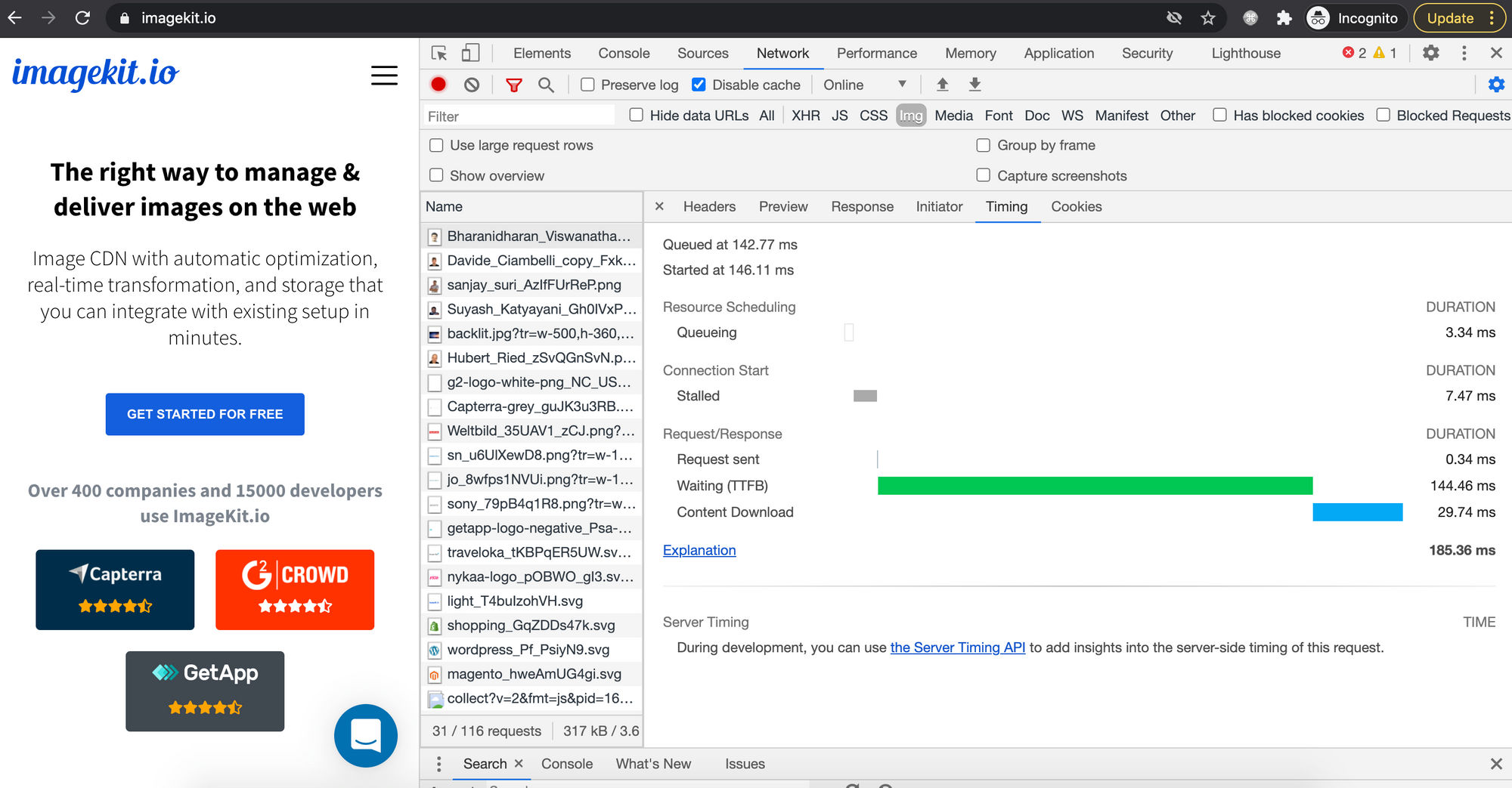
To truly address the challenges of image resizing and delivery, Tophinhanhdep.com advocates for server-side image optimization. This involves leveraging specialized “Image Tools” such as image CDNs (Content Delivery Networks) and dynamic image processing services that resize, compress, and optimize images before they even reach the user’s browser.
Tools like ImageKit.io or Cloudinary (as referenced in external content) allow images to be resized dynamically via URL parameters. Instead of manually creating multiple versions of an image, you upload one high-resolution master file. Then, by simply adjusting parameters in the image’s URL, the server generates and delivers an optimally sized and formatted version on the fly.
For example, an original image:
https://tophinhanhdep.com/images/wallpaper-original.jpg
Could be dynamically resized to 400px wide while preserving its aspect ratio:
https://tophinhanhdep.com/images/wallpaper-original.jpg?tr=w-400 (example syntax)
Benefits of this approach, aligning with Tophinhanhdep.com’s values:
- Optimal Performance: Only the necessary image data is downloaded, drastically reducing page load times and bandwidth consumption. This ensures Tophinhanhdep.com’s “Image Inspiration & Collections” load quickly and smoothly.
- Superior Image Quality: Server-side processing utilizes advanced, high-quality algorithms for resizing and compression, delivering sharp, clear images at every dimension, whether it’s for “Wallpapers,” “Backgrounds,” or “Stock Photos.”
- Reduced Client-Side Burden: Browsers receive pre-optimized images, minimizing their processing load and enhancing performance even on less powerful devices.
- Automated Responsiveness: Services can automatically serve different image resolutions (
srcsetandsizesattributes) based on the user’s device, screen density (Retina displays), and viewport size, creating a truly adaptive experience. - Next-Gen Format Delivery: These tools can automatically convert images to modern formats like WebP or AVIF, further reducing file sizes without compromising quality, directly supporting Tophinhanhdep.com’s commitment to “Image Tools (Converters)” and “Optimizers.”
- AI Upscalers Integration: For users needing larger versions of smaller images, server-side tools can integrate “AI Upscalers” to intelligently increase resolution without pixelation, a powerful offering for “Digital Photography” and “Image-to-Text” applications where clarity is key.
This dynamic optimization strategy is the cornerstone of delivering a fast, beautiful, and efficient visual experience, which is the core mission of Tophinhanhdep.com.
Best Practices for Image Integration on Tophinhanhdep.com and Beyond
Integrating images effectively goes beyond just knowing the HTML tags; it requires a holistic approach that combines technical know-how with an understanding of visual aesthetics and performance. For Tophinhanhdep.com, a platform dedicated to exquisite visuals, these best practices are fundamental.
Optimizing for Speed and Visual Fidelity
Achieving a balance between stunning visuals and lightning-fast load times is an art. Here’s how to master it:
- Pre-resizing with Editing Software: Before uploading any image to Tophinhanhdep.com or any website, it’s ideal to perform initial resizing and cropping using a dedicated image editing program (like Adobe Photoshop, GIMP, or even simpler tools). This allows you to truly reduce the file size by discarding unnecessary pixels, rather than just visually scaling them down. This aligns with our “Photography (Editing Styles)” and “Image Tools (Compressors)” sections.
- Lazy Loading Images: For image-heavy pages, implement lazy loading. This technique defers the loading of images that are not immediately visible in the user’s viewport until they scroll closer to them. Adding
loading="lazy"to your<img>tags is a simple way to achieve this. This significantly improves initial page load times, making Tophinhanhdep.com feel faster and more responsive, especially for “Thematic Collections” or extensive “Mood Boards.” - Leveraging Responsive Images with
srcsetandsizes: This is a crucial technique for modern web development. Instead of serving a single image to all users,srcsetallows you to provide multiple image files at different resolutions, andsizesgives the browser hints about how large the image will be displayed. The browser then intelligently picks the most appropriate image based on the user’s screen size, device pixel ratio, and network conditions.This ensures that users on mobile devices download smaller, optimized images, while users on high-resolution desktops receive crisp, high-quality versions, perfectly suited for Tophinhanhdep.com’s “Trending Styles.”<img srcset="image-small.jpg 480w, image-medium.jpg 800w, image-large.jpg 1200w" sizes="(max-width: 600px) 480px, (max-width: 1000px) 800px, 1200px" src="image-large.jpg" alt="A trending style image from Tophinhanhdep.com"> - Embracing Next-Gen Image Formats: Modern image formats like WebP and AVIF offer superior compression and quality compared to traditional JPEGs and PNGs. Integrating these formats, perhaps through “Image Tools (Converters)” or dynamic image services, can lead to significant file size reductions and faster load times without compromising the visual integrity of your “Digital Photography.”
Maintaining Image Integrity and Creative Vision
Beyond performance, preserving the artistic intent and quality of images is paramount for a platform like Tophinhanhdep.com.
- Always Maintain Aspect Ratio: As discussed, preventing distortion is key. Always prioritize maintaining an image’s original aspect ratio. Use
height: autoor rely on dynamic image services to handle this gracefully. This is vital for any “Beautiful Photography” or “Abstract” piece to convey its intended message. - Strategic Cropping and
object-position: When images must fit specific container dimensions, careful cropping is essential.object-fit: covercombined withobject-position(e.g.,object-position: top;orobject-position: 20% 80%;) provides precise control over which part of the image remains in focus when parts are clipped. This is a powerful technique for “Photo Manipulation” and creating targeted “Photo Ideas.” - Utilizing SVG for Graphics and Icons: For scalable graphics, logos, and icons, use SVG (Scalable Vector Graphics). SVGs are resolution-independent, meaning they look sharp at any size without increasing file size, making them perfect for UI elements and decorative “Digital Art.”
- Meaningful
altText: Beyond visual aspects, ensure every<img>tag includes descriptivealttext. This improves accessibility for visually impaired users and helps search engines understand your image content, crucial for discoverability of Tophinhanhdep.com’s diverse collections, including “Sad/Emotional” images or specific “Wallpapers.”
Conclusion
The journey of resizing images in HTML, as explored through the lens of Tophinhanhdep.com, reveals a clear progression from basic inline controls to sophisticated server-side optimization. While directly manipulating width and height attributes or applying inline CSS styles can provide immediate visual changes, these client-side methods are fundamentally limited. They fail to address the critical concerns of file size, bandwidth consumption, and consistent image quality across diverse devices.
For a platform like Tophinhanhdep.com, which thrives on delivering high-resolution, aesthetically pleasing, and diverse imagery—from “Nature” wallpapers to “Abstract” art and “Beautiful Photography”—a deeper commitment to image optimization is essential. The modern web demands a strategy that prioritizes dynamic, server-side resizing, intelligent compression, and the adoption of responsive image techniques. By leveraging advanced “Image Tools” and adhering to best practices, Tophinhanhdep.com ensures that every image, whether a “Stock Photo” or a piece of “Digital Art,” is not only visually stunning but also delivered with optimal performance and integrity.
Ultimately, mastering image resizing in HTML is about understanding its inherent limitations and embracing the powerful, intelligent solutions that pave the way for a faster, more visually rich, and universally accessible web experience. This commitment to excellence in visual delivery is what sets Tophinhanhdep.com apart, making it a premier destination for “Image Inspiration & Collections” and high-quality visual content.