Mastering Image Centering in CSS for Tophinhanhdep.com: A Comprehensive Guide to Visual Harmony

In the realm of digital imagery, presentation is paramount. For a platform like Tophinhanhdep.com, which prides itself on offering a vast collection of stunning visuals—from breathtaking nature photography and intricate abstract art to emotionally resonant and aesthetically pleasing wallpapers—the way an image is displayed can significantly impact its perceived quality and the user’s experience. A perfectly centered image not only enhances visual balance but also creates a more professional and engaging layout, drawing the viewer’s eye exactly where it needs to be.
The seemingly simple task of “how do you center an image in CSS” has evolved significantly over the years, from basic horizontal adjustments to sophisticated vertical and horizontal alignments that cater to modern, responsive web design. This comprehensive guide will delve into various CSS techniques for centering images, exploring both traditional and cutting-edge methods. We’ll demonstrate how each approach works, provide practical examples, and discuss their suitability for different scenarios on Tophinhanhdep.com, ensuring your high-resolution stock photos, digital art, and creative visual collections always appear at their best.

Horizontal Centering: The Foundation of Balanced Layouts
Horizontal centering is often the first step in achieving a harmonious layout. It ensures that an image is equally distanced from the left and right edges of its containing element or the viewport, creating a sense of stability and order. For Tophinhanhdep.com, where the visual impact of individual images or thematic collections is crucial, precise horizontal alignment is non-negotiable.
Centering Block-Level Images with margin: auto
One of the most common and straightforward methods for horizontally centering a block-level element, including an image, is by using the margin: auto property. This technique relies on the browser automatically calculating equal left and right margins, pushing the element to the center.
How it Works:

For margin: auto to effectively center an element, the element must satisfy two conditions:
- It must be a block-level element: Images (
<img>tags) are naturally inline-block elements by default, but they can be easily converted to block-level usingdisplay: block;. - It must have a defined width: Without a specified width, a block-level element will typically expand to fill the entire available width of its parent container, leaving no space for
automargins to distribute.
Once these conditions are met, setting margin-left: auto; and margin-right: auto; (or the shorthand margin: 0 auto;) will horizontally center the element. The 0 in margin: 0 auto; sets the top and bottom margins to 0, while auto handles the left and right.
Example:
Consider a featured high-resolution nature photograph that you want to display prominently in the center of the page on Tophinhanhdep.com.
Conceptual HTML:
<div class="image-wrapper">
  <img class="centered-image" src="path/to/your/nature-wallpaper.jpg" alt="A beautiful nature scene">
</div>
CSS:
.centered-image {
  display: block; /* Converts the inline image to a block-level element */
  width: 80%; /* Or any specific width in pixels, percentage, or other units */
  max-width: 960px; /* Optional: Ensure it doesn't get too wide on large screens */
  margin: 0 auto; /* Sets top/bottom margin to 0, left/right to auto */
}

/* Optional: Styles for the wrapper if needed, e.g., to give it a background */
.image-wrapper {
  background-color: #f0f0f0;
  padding: 20px;
}
Why it’s Useful for Tophinhanhdep.com: This method is incredibly robust for single, prominent images like wallpapers, beautiful photography, or abstract art pieces that serve as main content elements. It ensures consistent centering across various screen sizes when combined with responsive width settings, crucial for a site focused on visual content where image quality and presentation are key.
Text Alignment for Inline/Inline-Block Elements
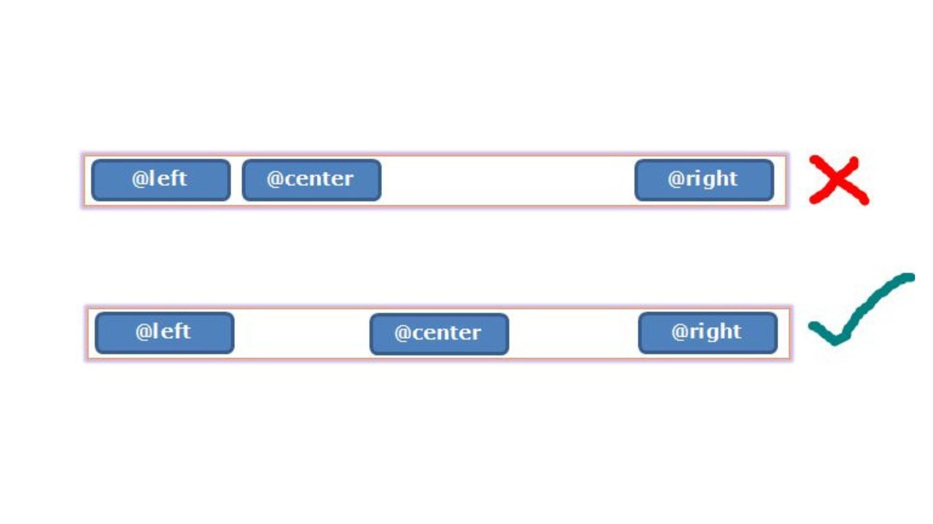
While margin: auto works for block-level elements, what if you have multiple images in a gallery or a series of aesthetic thumbnails that you want to center as a group? For inline or inline-block elements, the text-align: center; property applied to their parent container is the go-to solution.
How it Works:
The text-align property is designed to align the inline content within a block-level container. Since images (<img>) are inline-block elements by default (or can be treated as inline elements in this context), applying text-align: center; to their parent <div> will horizontally center them.
Example:
Imagine a collection of small, aesthetic images forming a mood board on Tophinhanhdep.com, or a row of stock photos.
Conceptual HTML:
<div class="image-gallery">
  <img src="path/to/image1.jpg" alt="Aesthetic image 1">
  <img src="path/to/image2.jpg" alt="Aesthetic image 2">
  <img src="path/to/image3.jpg" alt="Aesthetic image 3">
</div>
CSS:
.image-gallery {
  text-align: center; /* Centers all inline/inline-block children */
  background-color: #e8e8e8;
  padding: 15px;
  border-radius: 8px;
}

.image-gallery img {
  width: 150px; /* Example size for gallery thumbnails */
  height: 100px;
  object-fit: cover; /* Ensures images fill their space without distortion */
  margin: 10px; /* Adds space between images */
  border: 2px solid #ccc;
  border-radius: 5px;
}
Why it’s Useful for Tophinhanhdep.com: This technique is perfect for organizing image collections, mood boards, or rows of trending styles where multiple images need to be centered as a unit. It’s simple, effective, and works well for scenarios where images are naturally flowing inline with text or other inline content. It allows for a clean and visually appealing presentation of digital photography and thematic collections.
Achieving Perfect Vertical and Horizontal Centering: The Modern Approaches
While horizontal centering addresses one axis, modern web design often demands content to be centered both vertically and horizontally within a given space. This is particularly true for hero images, logos, or call-to-action visuals that need to command attention directly in the middle of a screen or container. Tophinhanhdep.com frequently features high-resolution images that benefit from this precise, “dead center” placement, ensuring they are the immediate focal point.
The Power of Flexbox for Responsive Centering
Flexbox, or the Flexible Box Layout module, is a one-dimensional layout method designed to distribute space among items in a container, enabling complex alignment capabilities. It’s incredibly powerful for centering elements precisely, regardless of their size or the size of their container, and is excellent for responsive design—a must for Tophinhanhdep.com’s diverse user base and image resolutions.
How it Works:
To center an item using Flexbox, you declare its parent as a flex container (display: flex;) and then use two key properties:
justify-content: center;: This centers items along the main axis (horizontally by default).align-items: center;: This centers items along the cross axis (vertically by default).
For a single item, this combination perfectly places it in the middle of its container.
Example:
Let’s say you have an AI-upscaled logo or a hero image that you want perfectly centered on a landing page for Tophinhanhdep.com.
Conceptual HTML:
<div class="flex-container">
  <img class="flex-centered-image" src="path/to/your/abstract-art.png" alt="Abstract Art">
</div>
CSS:
.flex-container {
  display: flex; /* Makes the div a flex container */
  justify-content: center; /* Centers content horizontally */
  align-items: center; /* Centers content vertically */
  height: 100vh; /* Example: Occupy full viewport height */
  width: 100%;
  background-color: #333; /* Dark background for contrast */
  overflow: hidden; /* Important for full-screen images */
}

.flex-centered-image {
  max-width: 90%; /* Responsive image sizing */
  max-height: 90%;
  object-fit: contain; /* Ensures the image is fully visible */
}
Why it’s Useful for Tophinhanhdep.com:
Flexbox is ideal for full-page wallpapers, prominent digital art pieces, or stock photos that need to be the absolute focal point. Its responsiveness ensures that regardless of the device—from mobile phones viewing aesthetic backgrounds to large monitors displaying high-resolution photography—the image remains perfectly centered. It’s a modern and highly recommended method for most centering needs, especially when dealing with elements whose dimensions might vary. You can also use align-self: center on the image itself if it’s within a flex container with other items, giving you more granular control.
Elegant Centering with CSS Grid
CSS Grid Layout is a powerful two-dimensional layout system that allows designers to control rows and columns, making it exceptionally versatile for complex visual designs and precise positioning. For centering, Grid provides an even more concise syntax than Flexbox, especially when centering a single item.
How it Works:
Similar to Flexbox, you declare a parent as a grid container (display: grid;). For centering a single item, the place-items property is a powerful shorthand that combines align-items (vertical alignment) and justify-items (horizontal alignment).
Example:
Consider a unique piece of digital photography or a creative idea for a visual design that needs to be perfectly centered within a specific section of Tophinhanhdep.com’s layout.
Conceptual HTML:
<div class="grid-container">
  <img class="grid-centered-item" src="path/to/your/beautiful-photo.jpg" alt="Beautiful Photography">
</div>
CSS:
.grid-container {
  display: grid; /* Makes the div a grid container */
  place-items: center; /* Centers all items both horizontally and vertically */
  height: 600px; /* Example fixed height for the container */
  width: 100%;
  background-color: #f8f8f8;
  border: 1px dashed #ccc;
}

.grid-centered-item {
  width: 70%; /* Example width for the image */
  height: auto;
  max-width: 400px;
  border-radius: 10px;
  box-shadow: 0 4px 8px rgba(0,0,0,0.1);
}
Why it’s Useful for Tophinhanhdep.com:
CSS Grid offers an elegant solution for centering, especially when you’re working with a layout that is already grid-based or when you want to use its powerful two-dimensional capabilities for other elements. It’s excellent for showcasing individual pieces of digital art or high-resolution photography within a well-structured section of the website. Additionally, you can achieve similar results by applying place-self: center; directly to the inner item, or margin: auto; on the inner item if it’s the sole occupant of a grid cell.
Leveraging Absolute Positioning with transform
Before Flexbox and Grid became widely supported, developers often turned to absolute positioning combined with CSS transform for pixel-perfect vertical and horizontal centering. This method remains a valid and powerful option, especially for overlays or elements that need to break out of the normal document flow.
How it Works:
This technique involves several steps:
- Parent Positioning: The container element must have
position: relative;(orabsolute,fixed,sticky) to establish a positioning context for its absolutely positioned child. - Child Positioning: The element to be centered is set to
position: absolute;. - Initial Offset:
top: 50%;andleft: 50%;are applied to move the top-left corner of the element to the exact center of its parent. - Correction with
transform: Since the top-left corner is at the center, the element itself is shifted down and to the right. To correct this,transform: translate(-50%, -50%);is used. This moves the element back by half of its own width and half of its own height, effectively centering its true middle point.
The beauty of transform: translate() is that it bases its percentage values on the element’s own size, meaning you don’t need to know the exact dimensions of the image you’re centering. This is a significant advantage for dynamic content like AI-upscaled images where dimensions might vary.
Example:
Suppose you want to overlay a small, transparent logo or a watermarked image on top of a larger background image on Tophinhanhdep.com, perfectly centered.
Conceptual HTML:
<div class="absolute-container">
  <img class="absolute-centered-overlay" src="path/to/your/logo-icon.png" alt="Tophinhanhdep.com Logo">
</div>
CSS:
.absolute-container {
  position: relative; /* Establishes positioning context for child */
  width: 100%;
  height: 400px; /* Example fixed height */
  background-image: url('path/to/large-background.jpg');
  background-size: cover;
  background-position: center;
}

.absolute-centered-overlay {
  position: absolute; /* Takes element out of normal flow */
  top: 50%; /* Moves top edge to vertical center */
  left: 50%; /* Moves left edge to horizontal center */
  transform: translate(-50%, -50%); /* Corrects positioning to true center */
  width: 100px; /* Example size for the overlay */
  height: auto;
}
Why it’s Useful for Tophinhanhdep.com: This method is incredibly flexible for specific scenarios such as image overlays, modals, loading spinners, or dynamic elements that need to float above other content. It’s highly effective for precisely placing graphics or icons over high-resolution images without disrupting the main layout, making it a valuable tool for complex visual design and photo manipulation tasks.
Practical Considerations for Tophinhanhdep.com
Beyond the technical implementation of CSS centering, integrating these techniques effectively into a platform like Tophinhanhdep.com requires careful consideration of several practical aspects. The goal is not just to center an image but to ensure that its centering contributes to a superior user experience, visual design, and overall performance.
Responsive Design and Image Optimization
For a website dedicated to high-resolution images, wallpapers, and backgrounds, responsiveness is non-negotiable. Centering techniques must work seamlessly across desktops, tablets, and mobile devices.
- Fluid Dimensions: When centering images, always prioritize fluid widths (e.g.,
width: 100%; max-width: 960px;) over fixed pixel values to ensure images scale gracefully. Combined withobject-fit: cover;orcontain;, this ensures optimal display. - Viewport Units: For full-screen aesthetic images or backgrounds,
height: 100vh;(viewport height) is excellent for containers, ensuring they take up the full screen, allowing Flexbox or Grid to perfectly center the image within. - Image Optimization: Centering a massive, unoptimized image can still lead to poor performance, even if it looks good. Tophinhanhdep.com’s emphasis on “Image Tools” like Converters, Compressors, and Optimizers highlights this. Always ensure images are properly compressed, served in modern formats (like WebP), and lazy-loaded to complement any centering strategy and enhance page load times. AI Upscalers can improve image quality, but even upscaled images need optimization for web delivery.
Accessibility and User Experience
A well-centered image is visually appealing, but it should also be accessible and intuitive for users.
altattributes: Always include descriptivealttext for images, regardless of how they are centered. This is crucial for screen readers and SEO, especially for a site rich in digital photography and image inspiration.- Focus Management: If centered images are interactive (e.g., part of a gallery or mood board, leading to a larger view), ensure keyboard navigation and focus management are well-handled.
- Consistency: Maintain consistency in your centering strategies across similar elements throughout Tophinhanhdep.com. This creates a predictable and comfortable user experience, reinforcing the platform’s professional aesthetic.
Choosing the Right Method
With multiple powerful CSS centering techniques available, selecting the most appropriate one depends on the specific context:
- For horizontal centering of a single block-level image:
display: block; margin: 0 auto;is simple, effective, and widely supported. Best for main content images like featured wallpapers. - For horizontal centering of multiple inline/inline-block images (e.g., a gallery row):
text-align: center;on the parent container is the most straightforward. Ideal for thematic collections or trending styles. - For precise vertical and horizontal centering (dead center) of a single item:
- Flexbox (
display: flex; justify-content: center; align-items: center;) is highly recommended for its flexibility and responsiveness, especially when item sizes are unknown or variable (e.g., stock photos, AI-upscaled images). - CSS Grid (
display: grid; place-items: center;) offers an even more concise syntax and is excellent if your layout is already using Grid or if you appreciate its powerful two-dimensional capabilities for visual design. - Absolute Positioning with
transform: translate(-50%, -50%);is perfect for overlays, modals, or elements that need to be centered irrespective of the document flow, such as a creative idea for a watermark over a beautiful photograph.
- Flexbox (
Each method has its strengths, and a well-rounded web developer working on Tophinhanhdep.com will understand when to apply each to achieve the best visual results and performance.
Conclusion
The art of centering images in CSS is fundamental to creating visually compelling and user-friendly websites, especially for platforms like Tophinhanhdep.com, where image quality and presentation are at the core of its identity. From mastering simple horizontal alignment with margin: auto and text-align: center, to leveraging the advanced capabilities of Flexbox and CSS Grid for perfect vertical and horizontal placement, and even employing the precise transform property with absolute positioning, the tools at our disposal are more powerful and versatile than ever.
By carefully selecting and applying these CSS techniques, Tophinhanhdep.com can ensure that every high-resolution image, every aesthetic wallpaper, and every piece of digital art is displayed with impeccable balance and harmony. This meticulous attention to visual detail not only elevates the user experience but also underscores the commitment to high-quality visual design and image inspiration that defines Tophinhanhdep.com. As web technologies continue to evolve, so too will the methods for crafting perfect visual layouts, ensuring Tophinhanhdep.com remains a premier destination for stunning imagery.