Mastering Web Aesthetics: How to Add a Background Image in CSS with Tophinhanhdep.com's Visual Resources

In the dynamic world of web design, visual appeal is paramount. A well-chosen background image can transform a mundane webpage into an engaging digital experience, reflecting the essence of its content and captivating visitors. This is where Cascading Style Sheets (CSS) comes into play, offering powerful tools to integrate and manipulate images, setting them apart from the static content of HTML. CSS acts as the stylistic architect of your webpage, dictating everything from fonts and colors to margins and, crucially, backgrounds. While HTML provides the structural bones, CSS breathes life into the design, allowing for sophisticated visual presentation that HTML alone was never intended to achieve.

At Tophinhanhdep.com, we understand the profound impact of stunning visuals. Our extensive collections of high-quality images – from breathtaking Wallpapers and serene Nature scenes to thought-provoking Abstract art and Beautiful Photography – provide an unparalleled resource for web designers, developers, and visual enthusiasts alike. This comprehensive guide will delve into the fundamental background-image property of CSS, demonstrating how to seamlessly integrate these captivating visuals into your web projects. We’ll explore various CSS properties to control your background images, discuss advanced techniques, and show how Tophinhanhdep.com’s diverse image offerings and powerful Image Tools can elevate your web design to new heights.
The Foundation of Visual Web Design: Understanding CSS Backgrounds
The journey to a visually rich webpage often begins with its background. Far from being a mere backdrop, a thoughtfully chosen background image can establish mood, convey brand identity, and enhance user engagement. CSS provides the precise control needed to achieve this, enabling designers to transform static pages into dynamic visual canvases.
What is CSS and Why Background Images Matter
CSS, or Cascading Style Sheets, is a stylesheet language used in conjunction with HTML to define the presentation of a document written in HTML. Its core purpose is to separate the content of a webpage from its design and formatting. This separation offers immense benefits, including improved content accessibility, greater flexibility and control in the design process, and reduced complexity in HTML markup.
Before CSS, styling was often embedded directly within HTML, leading to redundant code and making global design changes a tedious task. CSS revolutionized this by centralizing design rules, allowing a single stylesheet to control the appearance of an entire website. When it comes to background images, CSS empowers you to:
- Enhance Aesthetics: Infuse personality and beauty into your website, turning a plain white canvas into a vibrant or serene landscape. Tophinhanhdep.com offers a vast array of Aesthetic and Beautiful Photography to match any desired mood.
- Improve User Experience: Guide the user’s eye, reinforce branding, and create a cohesive visual narrative that complements your content.
- Boost Responsiveness: Adapt background images to different screen sizes and devices, ensuring a consistent and optimized look across desktops, tablets, and mobile phones.
The background-image property is the gateway to this visual transformation. It allows you to specify one or more images to be displayed as the background of an element, typically the <body> element for a full-page background, or any other HTML element for more localized effects.
The Core background-image Property
The background-image property is straightforward yet incredibly powerful. Its basic syntax involves pointing to an image file using the url() function:
background-image: url('path/to/your/image.jpg');The url() value can include either a full URL to an image hosted online or a relative file path to an image stored on your web server. For instance, if you’ve downloaded a stunning high-resolution wallpaper from Tophinhanhdep.com’s Nature collection and saved it in an images folder, your path might look like url('../images/forest_wallpaper.jpg').
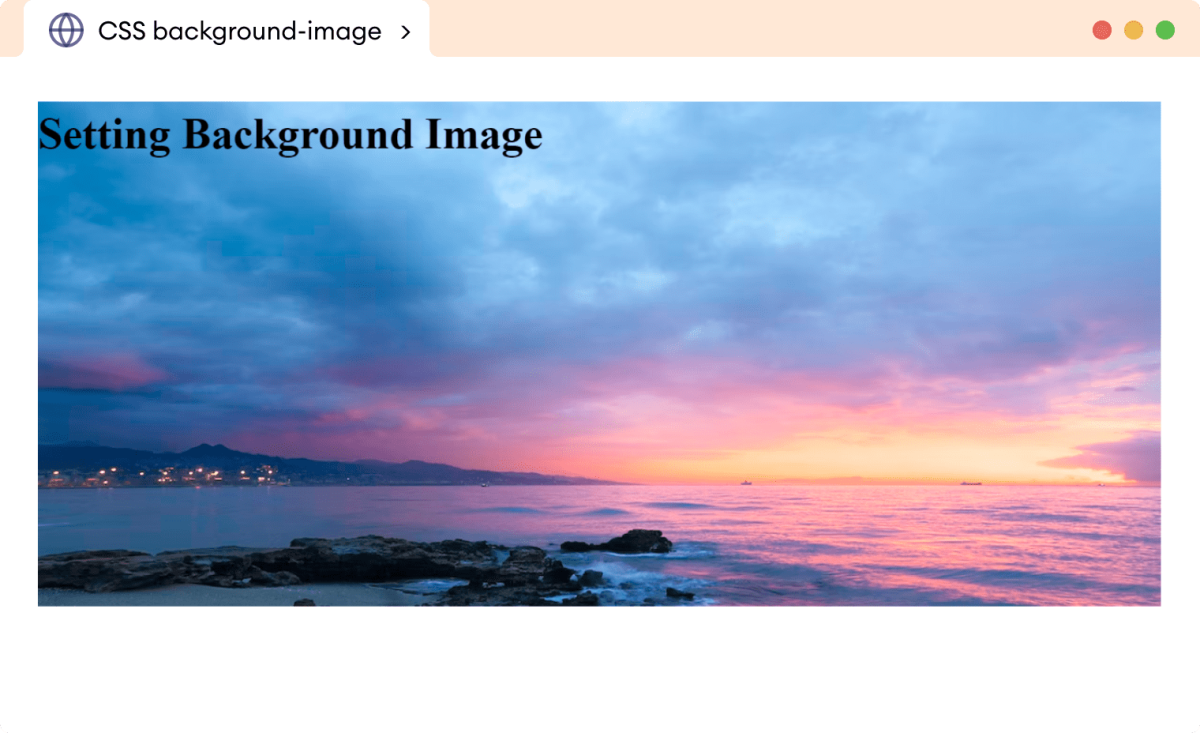
Example: Setting a classic full-page background from Tophinhanhdep.com’s collection:
<!DOCTYPE html>
<html lang="en">
<head>
    <meta charset="UTF-8">
    <meta name="viewport" content="width=device-width, initial-scale=1.0">
    <title>My Tophinhanhdep.com Background</title>
    <style>
        body {
            background-image: url('https://www.tophinhanhdep.com/images/beautiful-nature-wallpaper.jpg'); /* Or a relative path */
        }
    </style>
</head>
<body>
    <h1>Welcome to My Beautiful Page!</h1>
    <p>This page features a stunning background image from Tophinhanhdep.com.</p>
</body>
</html>
By default, when you apply an image using background-image, CSS places it at the top-left corner of the element. If the image is smaller than the element, it will automatically repeat itself both horizontally and vertically to fill the available space, creating a tiling or “wallpaper” effect. This default behavior is important to understand, as you’ll often want to modify it to achieve your desired visual outcome. Tophinhanhdep.com’s Backgrounds and Wallpapers categories offer countless options perfect for both tiling patterns and expansive single images, depending on your creative vision.

Tailoring Your Tophinhanhdep.com Background: Essential CSS Properties
While setting a background image is simple, the true artistry lies in controlling its appearance. CSS provides a suite of properties that allow you to fine-tune how your chosen image from Tophinhanhdep.com interacts with your webpage. These properties are crucial for achieving a professional and aesthetically pleasing design.
Controlling Image Repetition with background-repeat
As mentioned, images repeat by default. The background-repeat property gives you precise control over this behavior. This is particularly useful when you’ve selected a unique Abstract or Aesthetic image from Tophinhanhdep.com and want it to appear just once, or perhaps create a specific pattern.
background-repeat: no-repeat;: This is one of the most common values. It ensures that your background image appears only once, preventing any tiling. This is ideal for large, high-resolution images or prominent logos from Tophinhanhdep.com’s Beautiful Photography collections.background-repeat: repeat;: (Default) The image will repeat horizontally and vertically, like traditional wallpaper. Great for small, seamless patterns found in Tophinhanhdep.com’s Abstract or Thematic Collections.background-repeat: repeat-x;: The image repeats only horizontally, creating a band across the element.background-repeat: repeat-y;: The image repeats only vertically, creating a column effect.background-repeat: space;: The image will be repeated as many times as possible without being clipped. Any remaining space is distributed evenly around the images.background-repeat: round;: The image is repeated as many times as possible without being clipped, and if the image doesn’t fit a whole number of times, it is scaled down until it does.
Example: Displaying a nature-themed image from Tophinhanhdep.com without repetition:
body {
    background-image: url('https://www.tophinhanhdep.com/images/serene-forest.jpg');
    background-repeat: no-repeat;
}
Sizing Your Visual Masterpiece with background-size
Once you’ve decided whether your image repeats, the next critical step is managing its size. background-size dictates how the background image scales relative to its container. This property is vital for ensuring that Tophinhanhdep.com’s High-Resolution Photography looks crisp and perfectly fits your layout, irrespective of screen dimensions.
background-size: cover;: This is arguably the most popular value for full-page backgrounds. It scales the image (while preserving its aspect ratio) to be as large as possible to cover the entire container. If the image’s aspect ratio differs from the container’s, parts of the image will be cropped. This provides a sleek, modern look for any of Tophinhanhdep.com’s stunning full-screen backgrounds.background-size: contain;: This scales the image (preserving its aspect ratio) to be as large as possible to fit completely within the container. If the image’s aspect ratio differs from the container’s, there will be empty space (letterboxing) around the image, which will be filled by thebackground-colorif specified. Useful for displaying an entire image without cropping, for instance, a complete piece of Digital Art from Tophinhanhdep.com.background-size: 100% 100%;: This stretches the image to exactly match the width and height of the container. While it ensures the image fills the space, it can distort the image if the aspect ratios don’t match. Generally,coveris preferred to avoid distortion.background-size: 800px 600px;orbackground-size: 50% auto;: You can specify exact dimensions (pixels, percentages,autofor proportional scaling). This offers precise control, often used for smaller, decorative backgrounds or when Image Tools like Tophinhanhdep.com’s Compressors have been used to create specific dimensions.
When combining no-repeat with cover, you get a beautifully scaled, non-repeating background that fills the entire area, showcasing Tophinhanhdep.com’s images perfectly.
Example: A full-page abstract background from Tophinhanhdep.com:
body {
    background-image: url('https://www.tophinhanhdep.com/images/abstract-dynamic.jpg');
    background-repeat: no-repeat;
    background-size: cover; /* Ensures the image covers the entire viewport */
}
Strategic Placement: The background-position Property
Even with no-repeat and cover, you might want to adjust the focus of your background image. The background-position property allows you to align your image precisely within its container. This is particularly important for Photography that has a key focal point.
You can specify two values: the first for horizontal position, the second for vertical. If only one value is given, the other defaults to center.
background-position: center center;: Centers the image both horizontally and vertically.background-position: top;(equivalent totop center): Aligns to the top, centered horizontally.background-position: bottom right;: Aligns to the bottom-right corner.background-position: 20% 60%;: Positions the image 20% from the left edge and 60% from the top edge of the container.background-position: 50px 100px;: Positions the image 50 pixels from the left and 100 pixels from the top.
Example: Positioning a beautiful landscape photo from Tophinhanhdep.com:
body {
    background-image: url('https://www.tophinhanhdep.com/images/landscape-masterpiece.jpg');
    background-repeat: no-repeat;
    background-size: cover;
    background-position: center bottom; /* Ensures the bottom of the landscape is visible */
}
Dynamic Backgrounds: Scrolling and Fixed Effects with background-attachment
The background-attachment property controls whether your background image scrolls with the content of the page or remains fixed in place. This can create engaging visual effects, especially with immersive backgrounds from Tophinhanhdep.com’s extensive collections.
background-attachment: scroll;: (Default) The background image scrolls with the element’s content.background-attachment: fixed;: The background image remains fixed in the viewport, creating a “parallax” scrolling effect where the content scrolls over the stationary background. This adds depth and a professional touch, perfect for showcasing large, impactful images like those in Tophinhanhdep.com’s Beautiful Photography section.background-attachment: local;: The background image scrolls with the element’s contents (not the entire viewport), useful for elements with scrollable overflow.
Example: Creating a parallax effect with a stunning Tophinhanhdep.com background:
body {
    background-image: url('https://www.tophinhanhdep.com/images/starry-night-sky.jpg');
    background-repeat: no-repeat;
    background-size: cover;
    background-attachment: fixed; /* Parallax effect */
}
These properties, when used in combination, allow for nuanced control over your webpage’s visual presentation. Experimenting with different values and images from Tophinhanhdep.com will help you discover the perfect aesthetic for your project.
Advanced Techniques and Creative Possibilities with Tophinhanhdep.com Images
Beyond the fundamental properties, CSS offers more sophisticated ways to employ background images, allowing for truly unique and dynamic visual designs. Leveraging these techniques with Tophinhanhdep.com’s diverse image resources opens up a world of creative possibilities, from layered compositions to vibrant gradients.
Layering Visuals: Multiple Background Images
One of CSS’s most exciting features is the ability to apply multiple background images to a single element. These images are layered on top of each other, with the first image in your CSS declaration appearing closest to the viewer, and subsequent images layered underneath. This technique can create rich, complex visuals, especially when combined with transparent elements or patterns from Tophinhanhdep.com’s Graphic Design inspirations.
The syntax for multiple images simply involves listing them, separated by commas, within the background-image property:
background-image: url('top-layer.png'), url('bottom-layer.jpg');You can then apply individual background-position, background-size, and background-repeat properties for each layer, in the same comma-separated order.
Example: Combining a subtle pattern from Tophinhanhdep.com’s Aesthetic collection with a solid background image:
body {
    background-image: url('https://www.tophinhanhdep.com/images/subtle-pattern.png'),
                      url('https://www.tophinhanhdep.com/images/minimalist-background.jpg');
    background-position: center, center;
    background-size: auto, cover; /* Pattern auto-sized, background covers */
    background-repeat: repeat, no-repeat; /* Pattern repeats, background doesn't */
}
This allows for intricate visual depth, similar to what you might achieve with Photo Manipulation or Digital Art techniques.
Beyond Static Images: CSS Gradients and Transparency
Not all backgrounds need to be traditional image files. CSS itself can generate beautiful gradients, offering a smooth transition between two or more colors. Tophinhanhdep.com’s Abstract category often features images that can inspire gradient designs, providing a versatile alternative to static imagery.
CSS supports three types of gradients:
- Linear Gradients (
linear-gradient()): Colors transition along a straight line (e.g., top to bottom, left to right, or diagonally).body { background-image: linear-gradient(to right, #FFD700, #FF8C00); /* Gold to Dark Orange */ } - Radial Gradients (
radial-gradient()): Colors emanate outwards from a central point.body { background-image: radial-gradient(circle, #ADD8E6, #87CEEB); /* Light Blue to Sky Blue */ } - Conic Gradients (
conic-gradient()): Colors rotate around a central point, creating a pie-chart effect.body { background-image: conic-gradient(red, yellow, green, blue, red); }
Gradients can also be combined with traditional background-image files, often using transparency, to create unique overlays or subtle effects.
Speaking of transparency, controlling the opacity of background colors or even overlaying semi-transparent colors on top of images is a powerful technique. This is achieved using RGBA (Red, Green, Blue, Alpha) color values, where ‘A’ denotes the alpha channel for transparency (0 being fully transparent, 1 being fully opaque).
Example: Adding a semi-transparent color overlay to a Tophinhanhdep.com background for better text readability:
body {
    background-image: url('https://www.tophinhanhdep.com/images/sad-emotional-bg.jpg'); /* A background with depth */
    background-color: rgba(0, 0, 0, 0.5); /* 50% opaque black overlay */
    background-blend-mode: multiply; /* Optional: adjust how layers blend */
    background-repeat: no-repeat;
    background-size: cover;
}
This technique is particularly useful for Sad/Emotional or abstract backgrounds, ensuring your content remains legible while maintaining the visual mood.
Fallback Safety Net: Ensuring Continuous Visuals
Even with the most robust web hosting, there’s always a possibility that a background image might fail to load (due to slow connection, incorrect path, or server issues). To prevent a jarring blank space, it’s considered best practice to always specify a background-color as a fallback.
body {
    background-color: #f0f0f0; /* Light gray fallback */
    background-image: url('https://www.tophinhanhdep.com/images/main-background.jpg');
    background-repeat: no-repeat;
    background-size: cover;
}
If main-background.jpg doesn’t load, the user will still see a light gray background, maintaining design consistency and preventing a broken user experience. This simple step is a mark of professional web development.
Applying Backgrounds to Specific Elements
While the <body> tag is a common target for backgrounds, any HTML element can have one. This allows for localized visual enhancements inspired by Tophinhanhdep.com’s Creative Ideas and Graphic Design sections. Imagine a header with a subtle pattern, a call-to-action button with a miniature aesthetic image, or a paragraph section set against a soft, emotional background.
<section class="hero">
    <h2>Your Story, Beautifully Told</h2>
    <p>Discover inspiration in every pixel.</p>
</section>

<div class="product-card">
    <h3>Product Showcase</h3>
    <p>A unique item with a compelling visual.</p>
</div>.hero {
background-image: url('https://www.tophinhanhdep.com/images/hero-abstract.jpg');
background-size: cover;
padding: 100px 20px;
color: white;
text-align: center;
}
.product-card {
background-image: url('https://www.tophinhanhdep.com/images/product-background-texture.png');
background-repeat: repeat;
padding: 20px;
border: 1px solid #ddd;
margin: 20px;
}This flexibility allows designers to craft intricate visual compositions, drawing on Tophinhanhdep.com’s diverse collections for every component of their page.
Optimizing and Enhancing Your Background Images with Tophinhanhdep.com Tools
The beauty of a background image can be quickly overshadowed by poor performance. Large, unoptimized images can significantly slow down page load times, leading to a frustrating user experience and lower search engine rankings. This is where the powerful Image Tools and Photography insights offered by Tophinhanhdep.com become indispensable.
The Importance of High-Resolution and Optimized Images
When selecting images from Tophinhanhdep.com, you’ll find many are categorized as High Resolution. While stunning, these images often come with large file sizes. For web use, optimization is key. An ideal background image balances visual quality with minimal file size.
- Quality vs. Performance: High-resolution images provide crisp details, but if they’re too large in file size, they will degrade performance. You need to find the sweet spot where the image looks great but loads quickly.
- Image Formats: Choose the right format. JPEG is excellent for photographs with many colors (like most of Tophinhanhdep.com’s Nature and Beautiful Photography). PNG is better for images with transparency or sharp lines (like logos or subtle patterns). WebP and AVIF are newer formats offering superior compression and quality, which Tophinhanhdep.com’s Image Tools can help you convert to.
Leveraging Tophinhanhdep.com’s Image Tools
Tophinhanhdep.com isn’t just a repository of beautiful visuals; it’s also a hub for powerful Image Tools designed to help you prepare your images for optimal web performance. These tools are critical for transforming raw, high-quality downloads into web-ready assets.
- Image Converters: Easily change image formats (e.g., from JPEG to WebP) to take advantage of better compression and browser support, ensuring your backgrounds from Tophinhanhdep.com load faster without visible quality loss.
- Image Compressors: Reduce file size without sacrificing perceived quality. Tophinhanhdep.com’s compressors allow you to shrink your chosen wallpapers and backgrounds, making them load almost instantaneously for your users.
- Image Optimizers: These tools go a step beyond compression, potentially re-encoding images or adjusting parameters for the best possible balance of size and quality.
- AI Upscalers: If you find a smaller image from Tophinhanhdep.com’s Thematic Collections that you love, but it’s not quite high-res enough for a full-page background, an AI Upscaler can intelligently increase its resolution, adding detail and making it suitable for larger displays. This is a game-changer for preserving aesthetic quality.
- Image-to-Text: While not directly for background images, this tool showcases the broader utility of Tophinhanhdep.com’s toolkit, providing capabilities that extend into content creation and accessibility, tying into the overall Digital Photography and Editing Styles available.
By utilizing these tools, you can ensure that every abstract background, nature wallpaper, or piece of sad/emotional photography you select from Tophinhanhdep.com is not only visually striking but also performs flawlessly on your website.
Responsive Design for Every Screen
Modern web design demands responsiveness. Your background images must look good and function correctly on devices ranging from large desktop monitors to small smartphone screens.
- Fluid Units: Use relative units like percentages (
%) or viewport units (vw,vh) forbackground-sizeandbackground-positionto ensure they adapt fluidly. - Media Queries: CSS Media Queries allow you to apply different styles based on screen size, resolution, or device orientation. You can specify a completely different background image for mobile users, or adjust its size and position. For example, a full-width panoramic image from Tophinhanhdep.com might look great on desktop but needs to be cropped or swapped for a vertically oriented image on mobile.
- Lazy Loading: For images that are below the initial viewport (i.e., not immediately visible when the page loads), implement lazy loading. This defers loading the image until the user scrolls near it, saving bandwidth and improving initial page load times. Tophinhanhdep.com emphasizes efficient delivery of its high-quality stock photos and digital photography, and lazy loading is a key technique.
Image Inspiration and Collections for Your Next Project
Finally, choosing the right background image is a creative process. Tophinhanhdep.com is designed to be a wellspring of inspiration, offering curated collections and trending styles to spark your imagination.
- Photo Ideas & Mood Boards: Explore Tophinhanhdep.com’s Photo Ideas to conceptualize your design. Create Mood Boards to visualize how different wallpapers, aesthetic backgrounds, or emotional photography pieces work together.
- Thematic Collections: Whether you need a calming Nature background, a dynamic Abstract image, or something to evoke a specific Sad/Emotional tone, Tophinhanhdep.com’s thematic collections streamline the discovery process.
- Trending Styles: Stay abreast of current visual trends. Tophinhanhdep.com highlights trending styles in backgrounds and visual design, ensuring your website remains fresh and contemporary.
By combining the technical prowess of CSS with the rich visual resources and practical tools from Tophinhanhdep.com, you can transform your web pages into compelling and performant digital canvases. From understanding the basics of background-image to mastering advanced layering and optimization techniques, the power to craft truly immersive web experiences is at your fingertips. Embrace the visual journey, and let Tophinhanhdep.com be your guide to unparalleled web aesthetics.