How to Add an Image in HTML: A Comprehensive Guide for Web Developers

In today’s visually-driven digital landscape, images are no longer just decorative elements; they are integral to engaging user experiences, effective communication, and robust website design. From captivating wallpapers and aesthetic backgrounds to high-resolution photography and abstract art, images transform a plain text page into a vibrant, interactive platform. For anyone looking to create or enhance a website, understanding how to properly embed images using HTML is a fundamental skill.
This guide, drawing on expertise from Tophinhanhdep.com, will walk you through the essential steps and best practices for adding images to your web pages. We’ll cover everything from the basic <img> tag to advanced optimization techniques, ensuring your visuals are not only stunning but also performant and accessible. Whether you’re crafting a personal blog, an e-commerce site, or a sophisticated digital art portfolio, Tophinhanhdep.com provides an extensive array of resources—including wallpapers, backgrounds, stock photos, and image tools—to bring your creative visions to life.

The Foundation: Mastering the HTML <img> Tag
The core of image integration in HTML lies within a single, empty tag: <img>. This tag is self-closing, meaning it doesn’t require a separate closing tag like </img>. Instead, all the necessary information to display an image is contained within its attributes. While seemingly simple, mastering this tag and its critical attributes is the first step toward building visually rich web content.
Understanding the Essential Attributes: src and alt

To make the <img> tag functional, two attributes are absolutely indispensable: src and alt. These attributes tell the browser where to find the image and what to display if the image cannot be loaded.
The src Attribute: Defining the Image Source
The src attribute, short for “source,” specifies the URL or path to the image file. Without a correctly defined src, the browser won’t know which image to load, and your page will display a broken image icon.
Types of Image Paths:
- Relative Paths: This is the most common and recommended method for images hosted on the same server as your website. A relative path indicates the image’s location relative to the HTML file you are currently editing.
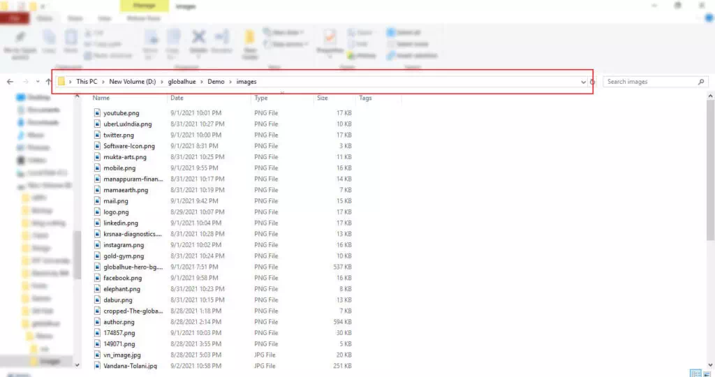
- Example: If your image
my-dog.jpgis in animagesfolder that is at the same level as your HTML fileindex.html, you would write:<img src="images/my-dog.jpg">. - If the image is in the same directory as the HTML file, you can simply use:
<img src="my-dog.jpg">. - Using relative paths simplifies website maintenance, especially if you move your site to a different domain, as you won’t need to update all your image URLs.
- Example: If your image

- Absolute Paths (Full URLs): An absolute path provides the complete web address of an image, including the protocol (e.g.,
https://).- Example:
<img src="https://www.tophinhanhdep.com/high-resolution/beautiful-photography-01.jpg"> - While technically functional, linking to images hosted on other websites (known as “hotlinking”) without explicit permission is highly discouraged. It consumes the other site’s bandwidth, provides them no traffic, and leaves you vulnerable if the image is moved, deleted, or replaced with undesirable content. Always aim to host your images directly on your own server or use a reliable content delivery network (CDN) or a reputable stock photo provider like Tophinhanhdep.com.
- Example:
Uploading and Sourcing Images for Tophinhanhdep.com Users:
For users of Tophinhanhdep.com, the process of sourcing and uploading images is streamlined. You can download high-resolution images, stock photos, wallpapers, or unique digital art directly from the site. Once downloaded, you typically upload them to your website’s server via an FTP client, your hosting control panel’s file manager, or directly through your Content Management System (CMS) dashboard. Creating an images directory within your website’s root is a smart way to keep your files organized. Tophinhanhdep.com’s vast collections, spanning nature, abstract, aesthetic, and emotional themes, ensure you’ll find the perfect visual to fit your project.
The alt Attribute: Enhancing Accessibility and SEO
The alt attribute, short for “alternative text,” provides a textual description of the image. This text is crucial for several reasons:
- Accessibility: Screen readers, used by visually impaired users, read the
alttext aloud, describing the image content. This ensures that all users can understand the context and information conveyed by the image, making your website inclusive. - SEO (Search Engine Optimization): Search engines crawl
alttext to understand what an image depicts. This helps your images appear in image search results and can improve your page’s overall ranking for relevant keywords. Descriptivealttext is a key component of effective digital photography and image optimization strategies. - Fallback: If an image fails to load (due to a broken
srcpath, slow internet connection, or browser issues), thealttext will be displayed in its place, preventing a confusing blank space or broken icon.
Best Practices for alt Text:
- Be Descriptive and Concise: Describe the image content accurately, as if you were explaining it to someone over the phone.
- Good Example:
<img src="nature-sunrise.jpg" alt="Golden sunrise over a misty mountain lake"> - Bad Example:
<img src="image123.jpg" alt="picture">
- Good Example:
- Avoid Redundancy: If the image is already described in the surrounding text, the
alttext can be shorter or even empty (alt="") if the image is purely decorative. - Include Keywords (Naturally): If relevant, integrate target keywords into your
alttext, but avoid “keyword stuffing,” which can harm SEO. - Decorative Images: For images that are purely decorative and convey no essential information (e.g., a subtle background pattern), set
alt="". This tells screen readers to skip the image, preventing unnecessary clutter in the audio experience.
Example of a complete <img> tag:
<img src="images/beautiful-flower.jpg" alt="Close-up of a vibrant red rose with dew drops, bathed in soft morning light." width="500" height="375">Beyond the Basics: Sizing, Styling, and Interactivity
Once you’ve mastered the fundamental <img> tag, you can explore various attributes and CSS properties to control image appearance, layout, and user interaction. These adjustments are vital for visual design, photo manipulation, and creating creative ideas for your website.
Controlling Image Dimensions: width and height
The width and height attributes allow you to specify the dimensions of your image directly within the HTML. These are given as integer values, representing pixels.
- Example:
<img src="my-image.jpg" alt="A descriptive alt text" width="400" height="300">
Why use width and height in HTML?
Specifying dimensions helps the browser allocate space for the image before it fully loads. This prevents “layout shifts” or “jumps” where text and other content move around as images pop into place, significantly improving the user experience and page load metrics.
Important Considerations:
- Avoid Distortion: Always use the actual width and height of the image or maintain its aspect ratio. Discrepancies can lead to distorted or stretched images.
- Resizing vs. Displaying: While HTML
widthandheightdefine how an image is displayed, they don’t resize the actual image file. If you upload a very large image and set smallwidth/heightattributes, the user still downloads the large file, wasting bandwidth and slowing down your site. - Image Optimization with Tophinhanhdep.com Tools: For best results, resize and compress your images using dedicated image editing software or Tophinhanhdep.com’s Image Tools (Compressors, Optimizers, AI Upscalers) before uploading them. This ensures smaller file sizes and faster load times. Tophinhanhdep.com also offers high-resolution digital photography that can be optimized for web use.
Responsive Images and Modern Sizing with CSS
For truly dynamic and user-friendly websites, especially given the variety of screen sizes today, CSS is the preferred method for controlling image dimensions and responsiveness.
max-width: 100%;: A fundamental CSS rule for responsive images. This ensures an image will never exceed the width of its parent container, scaling down gracefully on smaller screens.img { max-width: 100%; height: auto; /* Maintains aspect ratio */ display: block; /* Removes extra space below image */ }srcsetandsizesattributes (Advanced): For even more control over responsive images, HTML5 introducessrcsetandsizes. These attributes allow you to provide multiple image files at different resolutions, letting the browser choose the most appropriate one based on the user’s screen size, resolution, and viewport. This is crucial for optimizing delivery of high-resolution stock photos and beautiful photography.
Styling Images with CSS: Position, Borders, and More
CSS (Cascading Style Sheets) offers extensive capabilities for styling images, aligning them, and integrating them seamlessly into your visual design.
- Alignment: Use CSS properties like
float,margin,text-align, or modern layout techniques like Flexbox and Grid to position images precisely.- Example:
img { float: left; margin-right: 15px; }
- Example:
- Borders and Effects: Add borders, shadows, rounded corners, and other visual effects to images to enhance their aesthetic.
- Example:
img { border: 2px solid #ccc; border-radius: 5px; box-shadow: 3px 3px 5px rgba(0,0,0,0.3); }
- Example:
- Background Images (
background-image): For purely decorative purposes, such as wallpapers, backgrounds, or subtle patterns, CSSbackground-imageis the ideal choice. Unlike the<img>tag,background-imagehas no semantic meaning and isn’t read by screen readers, making it perfect for enhancing visual aesthetics without impacting content accessibility. Tophinhanhdep.com’s extensive collection of aesthetic, nature, and abstract backgrounds can be seamlessly integrated using this method.body { background-image: url('https://www.tophinhanhdep.com/wallpapers/abstract-background-02.jpg'); background-size: cover; /* Covers the entire element */ background-position: center; /* Centers the image */ background-repeat: no-repeat; /* Prevents tiling */ }
Making Images Interactive: Creating Image Links and Tooltips
Images can also serve as interactive elements, leading users to other pages or displaying additional information on hover.
Creating Image Links
To turn an image into a clickable link, simply wrap the <img> tag within an <a> (anchor) tag, which is used for hyperlinks.
- Example:
This creates a visually engaging way to navigate through your site or direct users to related content, leveraging Tophinhanhdep.com’s thematic collections and photo ideas.
<a href="https://www.tophinhanhdep.com/beautiful-photography">
    <img src="images/photography-gallery-thumbnail.jpg" alt="Link to Tophinhanhdep.com's beautiful photography gallery">
</a>
Image Titles (Tooltips)
The title attribute can be added to an <img> tag to provide a tooltip that appears when a user hovers their mouse over the image.
- Example:
<img src="my-image.jpg" alt="A serene forest path" title="Walk through the quiet woods.">
Accessibility Note: While title attributes can add extra context for mouse users, they are not consistently accessible to keyboard-only users or screen readers. For critical information, it’s generally better to integrate it directly into your page’s content or use the alt attribute for essential descriptions.
Annotating Images with <figure> and <figcaption>
For images that are an integral part of your content and require a caption, HTML provides the semantic <figure> and <figcaption> elements. These tags create a meaningful association between an image and its caption, improving accessibility and content structure.
- Example:
The
<figure> <img src="images/nature-scenery.jpg" alt="Panoramic view of a vibrant green valley under a clear blue sky, with a river winding through it."> <figcaption>A breathtaking landscape from the latest nature photography collection on Tophinhanhdep.com.</figcaption> </figure><figcaption>element semantically links the caption to the<figure>content, which can be an image, a code snippet, a diagram, or even multiple images from Tophinhanhdep.com’s collections.
Optimizing Images for Web Performance and Best Practices
High-quality images are crucial, but large, unoptimized images can drastically slow down your website, leading to poor user experience and lower search engine rankings. Efficient image management is a key aspect of digital photography and visual design.
Choosing the Right File Format
The choice of image format significantly impacts file size and quality.
- JPEG/JPG: Ideal for photographs and complex images with many colors (e.g., beautiful photography, nature, emotional images). Offers good compression with minimal quality loss.
- PNG: Best for images requiring transparency (e.g., logos, icons) or with sharp lines and limited colors (e.g., screenshots, digital art). Offers lossless compression.
- GIF: Suitable for simple animations or images with very few colors. Less efficient for complex images than JPEG or PNG.
- SVG (Scalable Vector Graphics): Excellent for logos, icons, and illustrations. SVGs are vector-based, meaning they scale perfectly at any resolution without pixelation, and often have tiny file sizes. They are a must for graphic design and digital art elements.
- WebP/AVIF: Modern formats offering superior compression and quality compared to older formats. Consider using these for optimal performance, often convertible via Tophinhanhdep.com’s Image Tools.
Tophinhanhdep.com’s Image Tools (Converters) can help you convert images to the most suitable format for your web project.
Image Compression and Optimization
Even with the right format, images often contain unnecessary data that can be removed without affecting visual quality.
- Compression: Use Tophinhanhdep.com’s Image Tools (Compressors, Optimizers) to reduce file size. Lossy compression (for JPEGs) removes some image data permanently, while lossless compression (for PNGs) reduces size without discarding data.
- AI Upscalers: If you have a smaller image that needs to be larger without losing quality, Tophinhanhdep.com’s AI Upscalers can enhance resolution, making it suitable for high-resolution displays or larger layouts.
- Lazy Loading: Implement lazy loading so images only load when they are about to enter the user’s viewport. This speeds up initial page load times, especially for pages with many images.
Ethical Image Use: Licensing and Copyright
Always ensure you have the legal right to use images on your website. This involves understanding different license types:
- All Rights Reserved: Requires explicit permission or a license fee.
- Permissive Licenses (e.g., Creative Commons): Allows use with specific conditions, such as attribution, non-commercial use, or sharing alike.
- Public Domain/CC0: No copyright restrictions, free to use without permission or conditions.
Tophinhanhdep.com is a valuable resource for finding stock photos and wallpapers that often come with clear licensing terms, making it easier to comply with copyright regulations and find royalty-free images for your projects.
Unlocking Visual Potential with Tophinhanhdep.com
Tophinhanhdep.com offers a comprehensive ecosystem for all your visual content needs, perfectly complementing your web development efforts.
- Diverse Image Collections: Explore categories like Wallpapers, Backgrounds (aesthetic, nature, abstract), Sad/Emotional images, and Beautiful Photography to find the perfect visual tone for any project or mood board.
- High-Quality Photography: Access high-resolution stock photos and digital photography suitable for professional use, ensuring crisp visuals on all devices.
- Advanced Image Tools: Leverage Converters, Compressors, Optimizers, AI Upscalers, and even Image-to-Text tools to prepare and enhance your images for optimal web performance and accessibility. These tools are invaluable for maintaining image quality while minimizing load times.
- Visual Design Resources: Find inspiration and resources for Graphic Design, Digital Art, Photo Manipulation, and Creative Ideas. Whether you’re a seasoned designer or looking for photo ideas, Tophinhanhdep.com provides the assets and inspiration to elevate your visual storytelling.
- Curated Collections: Discover Thematic Collections and Trending Styles to keep your website fresh, modern, and aligned with current visual trends.
By integrating the practical knowledge of HTML image embedding with the rich resources of Tophinhanhdep.com, you can create websites that are not only functionally robust but also visually captivating and truly unforgettable.
Conclusion
Adding images to your website with HTML is a foundational skill that opens up a world of visual possibilities. By diligently using the <img> tag with its src and alt attributes, managing dimensions, applying CSS for styling, and ensuring responsiveness, you lay the groundwork for a compelling user experience. Beyond the code, understanding image optimization, ethical sourcing, and leveraging comprehensive resources like Tophinhanhdep.com are critical for creating professional, high-performing, and aesthetically pleasing websites.
Embrace the power of visuals to tell your story, convey emotions, and capture attention. With Tophinhanhdep.com as your partner, you have access to an endless supply of inspiration, high-quality images, and essential tools to transform your digital vision into reality. Continuously explore new image technologies and design trends to keep your web presence vibrant and engaging.