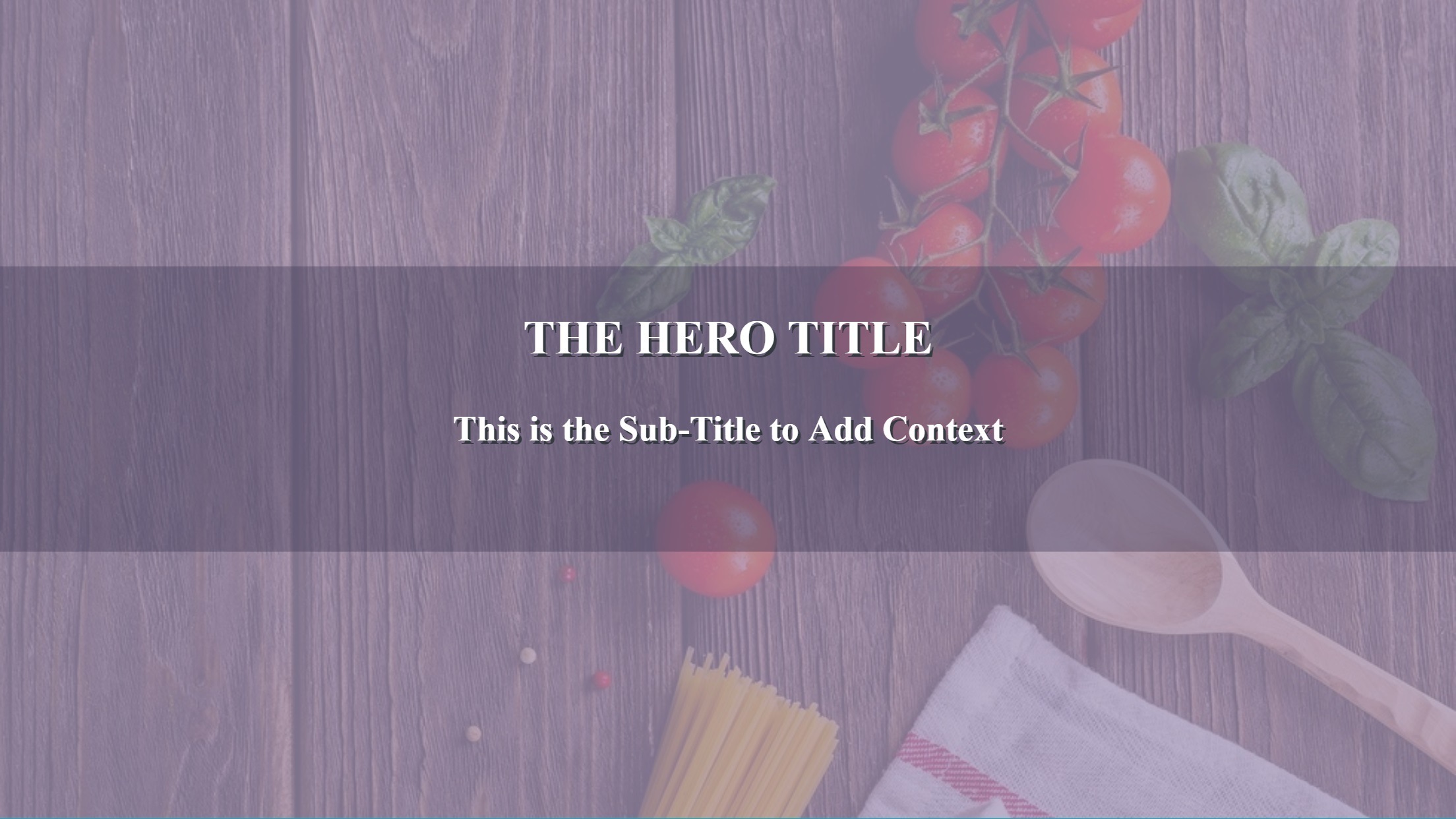
Mastering Background Images in CSS for Dynamic Web Design on Tophinhanhdep.com

In the vibrant world of web design, where visual appeal reigns supreme, the ability to seamlessly integrate stunning images into a webpage’s design is paramount. Cascading Style Sheets (CSS) serves as the indispensable language that allows developers and designers to separate a webpage’s content from its aesthetic presentation, defining everything from fonts and colors to layouts and, crucially, backgrounds. Among its many powerful features, the background-image property stands out as a fundamental tool for transforming a static page into an immersive visual experience. On Tophinhanhdep.com, we understand the profound impact that a well-chosen background, whether it’s a breathtaking piece of nature photography, an abstract digital art creation, or an aesthetic wallpaper, can have on user engagement and overall design. This comprehensive guide will delve into the intricacies of adding and managing background images using CSS, exploring both foundational techniques and advanced strategies, all while emphasizing the importance of image optimization and creative design principles.

The Fundamentals of CSS Background Images
The journey to captivating web backgrounds begins with a solid understanding of the core CSS properties. These properties allow you to not only set an image but also dictate how it behaves, where it sits, and how it interacts with other page elements.
Setting Your Canvas: The background-image Property
At its heart, the background-image property is the gateway to introducing visual flair to your web elements. It allows you to specify one or more images to serve as the backdrop for any HTML element, most commonly the body element to cover the entire page.
The basic syntax is straightforward:
selector {
  background-image: url('path/to/your/image.jpg');
}
Here, url() is a function that takes the file path to your image as an argument. This path can be either:
- A relative path: If the image is in the same directory as your CSS file, you can simply use its filename (e.g.,
url('my_background.png')). If it’s in a subfolder, specify the relative path (e.g.,url('../images/my_background.png')orurl('./assets/backgrounds/nature.jpg')). - An absolute URL: For images hosted externally or when a full web address is preferred (e.g.,
url('https://www.tophinhanhdep.com/images/beautiful-scenery.jpg')).
By default, when you apply a background image to an element, CSS positions it at the top-left corner and, if the image is smaller than the element, it will repeat both horizontally and vertically to fill the available space. This tiling effect can be desirable for certain patterns or textures, echoing classic wallpaper designs, but often requires further control.
Example: Setting a basic background for the body
<!DOCTYPE html>
<html lang="en">
<head>
    <meta charset="UTF-8">
    <meta name="viewport" content="width=device-width, initial-scale=1.0">
    <title>My Aesthetic Page</title>
    <style>
        body {
            background-image: url('images/aesthetic_wallpaper.jpg');
            /* Image will repeat by default */
        }
    </style>
</head>
<body>
    <h1>Welcome to Tophinhanhdep.com!</h1>
    <p>Explore our collection of stunning backgrounds.</p>
</body>
</html>
The versatility of this property means it’s widely supported across all modern browsers, ensuring your carefully chosen “Aesthetic Images” or “Nature Wallpapers” render consistently for your audience.
Shaping the Visual Narrative: Controlling Image Repetition with background-repeat

The default repeating behavior of background images often needs adjustment to achieve the desired visual design. The background-repeat property provides precise control over how an image tiles across an element.
background-repeat: no-repeat;: This is perhaps the most common value, preventing the background image from repeating. The image will appear only once at its specified position. This is ideal for large, single “Photography” pieces or detailed “Abstract” images.background-repeat: repeat;: (Default) The image repeats both horizontally and vertically, creating a tiled effect. Useful for small, seamless patterns or “Wallpapers.”background-repeat: repeat-x;: The image repeats only horizontally, along the x-axis. This can be effective for creating horizontal bands or borders.background-repeat: repeat-y;: The image repeats only vertically, along the y-axis. Useful for vertical patterns or sidebar accents.background-repeat: space;: The image is repeated as many times as it fits, and any remaining space is distributed evenly around the images. No clipping occurs.background-repeat: round;: The image is repeated as many times as it fits, and if it doesn’t fit a whole number of times, it is scaled up or down to fill the space.
Example: A single, non-repeating image
body {
    background-image: url('images/high_resolution_nature.jpg');
    background-repeat: no-repeat; /* Image appears only once */
}
This property is crucial for presenting “Beautiful Photography” as a single, impactful background without distortion or unintended repetition.
Mastering Dimensions: Sizing Your Background with background-size
Once you’ve decided on repetition, controlling the size of your background image is the next critical step, especially in a world of diverse screen resolutions and devices. The background-size property allows for flexible scaling of background images.
background-size: cover;: This value scales the background image to be as large as possible so that the background area is completely covered by the image. Some parts of the image may be clipped to fit. This is widely used for full-page backgrounds, ensuring a seamless visual fill with high-resolution “Stock Photos” or “Wallpapers” from Tophinhanhdep.com, regardless of screen dimensions.background-size: contain;: This scales the image to the largest size such that both its width and height can fit inside the content area. The entire image will be visible, but it might leave empty space around the image if the aspect ratios don’t match. This is ideal when the entire image content is vital, such as detailed “Digital Art.”background-size: auto;: (Default) The background image is displayed at its original size.background-size: 100% auto;orbackground-size: 100% 100%;: You can specify explicit dimensions using percentages, pixels (px), or other CSS units.100% automakes the image span the full width of the element, with its height scaling proportionally.100% 100%stretches the image to fill both width and height, potentially distorting its aspect ratio.background-size: 150px 200px;: Sets a fixed width and height for the image. If only one value is provided (e.g.,background-size: 150px;), it sets the width, and the height scales proportionally.
Example: Full-page cover background
html, body {
    height: 100%;
    margin: 0;
}
body {
    background-image: url('images/abstract_background.jpg');
    background-repeat: no-repeat;
    background-size: cover; /* Image will cover the entire viewport */
}
Proper use of background-size is vital for “Responsive Web Design,” ensuring that “High Resolution” images adapt gracefully across desktops, tablets, and mobile phones, maintaining both quality and aesthetic integrity.
Precision Placement: Positioning Backgrounds with background-position
Once an image is sized and its repetition controlled, its exact placement becomes the next design consideration. The background-position property allows you to fine-tune where the background image sits within its element.
This property accepts keywords, length units (pixels, ems, rems), or percentages. You typically specify two values: the first for the horizontal position and the second for the vertical. If only one value is provided, the second defaults to center.
Common background-position values:
background-position: center center;orbackground-position: center;: Centers the image both horizontally and vertically.background-position: top left;: Places the image at the top-left corner.background-position: bottom right;: Places the image at the bottom-right corner.background-position: 20px 50px;: Positions the image 20 pixels from the left and 50 pixels from the top.background-position: 10% 80%;: Positions the image 10% from the left edge and 80% from the top edge of the element.
Example: Centering a logo as a background
.hero-section {
    background-image: url('images/logo_icon.png');
    background-repeat: no-repeat;
    background-position: center; /* Centers the logo within the hero section */
    height: 400px;
    width: 100%;
}
Careful positioning can highlight key elements in “Photography” or complement “Graphic Design” compositions, ensuring that the visual focus aligns with your creative intent.
Advanced Techniques and Creative Implementations
Beyond the basics, CSS offers a suite of advanced properties and techniques that unlock even greater creative potential for background images, allowing for intricate layering, dynamic effects, and robust fallbacks.
Immersive Experiences: Anchoring Backgrounds with background-attachment
The scrolling behavior of a background image can dramatically alter the user’s perception of a page. The background-attachment property controls whether a background image scrolls with the content or remains fixed in the viewport.
background-attachment: scroll;: (Default) The background image scrolls along with the element’s content.background-attachment: fixed;: The background image remains fixed relative to the viewport. This creates a visually engaging “parallax” effect, where the content scrolls over a static background, adding depth and a sense of professionalism to “Visual Design.”background-attachment: local;: The background image scrolls with the element’s contents, but if the element itself has scrollbars (e.g., anoverflow: scrolldiv), the background will scroll within that element.
Example: Parallax effect
body {
    background-image: url('images/mountain_view.jpg');
    background-repeat: no-repeat;
    background-size: cover;
    background-attachment: fixed; /* Creates a parallax scrolling effect */
}
This technique is fantastic for presenting “Beautiful Photography” or serene “Nature” backgrounds in an interactive way that enhances the overall user experience.
Layering Visuals: Implementing Multiple Background Images
CSS is not limited to a single background image. You can specify multiple images for a single element, layering them on top of each other to create complex and visually rich designs, much like in “Photo Manipulation” or “Digital Art.”
To achieve this, simply list multiple url() values, separated by commas, in the background-image property. The order matters: the first image listed will be the topmost layer, visible closest to the viewer, while subsequent images are stacked underneath.
body {
    background-image:
        url('images/overlay_pattern.png'), /* Topmost layer */
        url('images/main_background.jpg'); /* Bottom layer */
    background-repeat: no-repeat, repeat; /* Control repeat for each image */
    background-position: center center, 0 0; /* Position each image */
    background-size: 50% auto, cover; /* Size each image */
}
This allows for intricate compositions, combining subtle textures or “Abstract” overlays with a primary “Background Image,” creating unique “Creative Ideas” for your “Visual Design.” You can even use different background-repeat, background-position, and background-size values for each individual image in the stack, listed in the same order.
Dynamic Backgrounds: Gradients and Fallback Colors
Sometimes, an image isn’t available, or a gradient effect is desired. CSS provides robust options for both scenarios, offering flexibility and ensuring visual consistency.
-
CSS Gradients: Instead of static images, CSS can generate dynamic color transitions directly.
linear-gradient(): Creates a linear progression of colors along a straight line.radial-gradient(): Creates a gradient that radiates outwards from a central point.conic-gradient(): Creates a gradient where colors rotate around a central point.
These can be used alone or combined with traditional background images, often layered underneath.
body {
    background-image: linear-gradient(to right, rgba(255,0,0,0.5), rgba(255,255,0,0.5)), url('images/city_night.jpg');
    background-size: cover;
}
This example applies a semi-transparent red-to-yellow gradient over a city night image, demonstrating “Graphic Design” techniques for blending and mood-setting.
-
Fallback Colors with
background-color: A critical best practice is to always specify abackground-colorin conjunction withbackground-image. If the image fails to load (due to incorrect path, network issues, or browser limitations), the user will see the solid background color instead of a blank space. This maintains “Visual Design” consistency and ensures content remains readable.body { background-image: url('images/non_existent_image.jpg'); /* This image will fail to load */ background-color: lightblue; /* This color will display as a fallback */ }This simple yet powerful technique safeguards your design, ensuring a good user experience even when “Images” encounter loading issues.
Precision Targeting: Applying Backgrounds to Specific Elements
While the body tag is a common target for background images, CSS allows you to apply backgrounds to virtually any HTML element. This offers immense flexibility for internal “Visual Design,” allowing you to define specific sections, content blocks, or even individual paragraphs with their own unique visual backdrops.
For instance, you might want a “Mood Board” effect for a div section or a subtle background for a p (paragraph) tag to highlight certain text.
<!DOCTYPE html>
<html lang="en">
<head>
    <meta charset="UTF-8">
    <meta name="viewport" content="width=device-width, initial-scale=1.0">
    <title>Element Specific Backgrounds</title>
    <style>
        .hero-banner {
            background-image: url('images/happy_people_banner.jpg');
            background-repeat: no-repeat;
            background-size: cover;
            height: 300px;
            color: white;
            text-align: center;
            display: flex;
            align-items: center;
            justify-content: center;
        }
        .info-box {
            background-image: url('images/subtle_texture.png');
            background-repeat: repeat;
            padding: 20px;
            margin: 20px;
            border: 1px solid #ccc;
        }
    </style>
</head>
<body>
    <div class="hero-banner">
        <h2>Experience the joy with Tophinhanhdep.com</h2>
    </div>
    <div class="info-box">
        <p>This paragraph has its own unique background, perfect for "Thematic Collections" or specific "Photo Ideas."</p>
    </div>
</body>
</html>
This granular control empowers designers to create segmented “Visual Design” layouts, making certain content blocks stand out with tailored “Backgrounds” or “Aesthetic” touches.
Optimizing Background Images for Performance and Aesthetics
While visually striking backgrounds are desirable, they must be implemented with performance in mind. Large, unoptimized images can significantly slow down page load times, impacting user experience and SEO. Tophinhanhdep.com advocates for a balance between stunning visuals and efficient delivery.
The Importance of Image Quality and Resolution
“Photography,” particularly “High Resolution” images, forms the backbone of many appealing backgrounds on Tophinhanhdep.com. However, raw, high-resolution files from cameras or professional “Stock Photos” are often too large for direct web use.
- Choosing the Right Images: Whether you’re opting for “Nature” landscapes, “Abstract” patterns, or “Sad/Emotional” artistic shots, select images that are visually impactful but also appropriately sized for their intended use.
- Resolution vs. File Size: Aim for images that have a sufficient resolution for display (e.g., 72dpi for web), but prioritize reducing the file size (in KB or MB). A high-resolution image that takes ages to load is counterproductive.
Leveraging Image Tools for Web Efficiency
This is where “Image Tools” become indispensable. Tophinhanhdep.com offers various functionalities (or concepts) to manage your media efficiently:
- Compressors: Tools that reduce the file size of images (JPEG, PNG, WebP) by removing unnecessary data or applying smart compression algorithms, often with minimal perceivable quality loss. This is crucial for every background image.
- Optimizers: These tools go a step further, performing various optimizations like removing metadata, selecting optimal color palettes, and converting to next-gen formats (like WebP) that offer superior compression.
- Converters: Easily convert images between different formats (e.g., PNG to JPG, JPG to WebP) to choose the most efficient format for your specific background.
- AI Upscalers: For instances where you have a lower-resolution image you wish to use as a background, AI Upscalers can intelligently enhance its resolution, adding detail and sharpness, making it suitable for larger displays without pixelation. This is invaluable for repurposing older “Digital Photography” or “Image Collections.”
Implementing these tools ensures that your “Aesthetic Backgrounds” from Tophinhanhdep.com load quickly and look crisp, contributing to a smooth user journey.
Automating Image Delivery with Advanced Image Solutions
Manually optimizing every background image for various screen sizes and devices is a tedious and error-prone task. Tophinhanhdep.com’s advanced image solutions integrate the power of cloud-based media management to automate this process, ensuring optimal image delivery at all times.
Imagine a system where, instead of static image files, you use dynamically generated URLs. These URLs contain parameters that instruct the server to perform real-time transformations on your images before they are delivered to the user’s browser.
- Server-Side Resizing: Instead of uploading one massive image and letting CSS shrink it (which still loads the large file), Tophinhanhdep.com’s solutions can resize images on the server. You request an image at a specific width and height (e.g.,
w_800,h_600), and the server delivers an appropriately sized, optimized version. This drastically reduces bandwidth and load times. - Intelligent Cropping with Auto Gravity: For responsive designs, simply resizing might crop out important parts of your “Photography.” With “auto-gravity” features, Tophinhanhdep.com’s AI-powered tools can automatically detect and focus on the most important elements (faces, objects, dominant features) within your “Images,” intelligently cropping them to fit various aspect ratios without losing the visual impact.
- Generative Fill for Seamless Expansion: If your design requires an image to fill a larger area than its original dimensions, generative AI can seamlessly expand the image. Tophinhanhdep.com’s advanced features can use “Generative Fill” to intelligently add pixels around the edges of an image, matching its existing style and content, to fill out a designated space. This is a game-changer for “Digital Art” and “Photo Manipulation,” creating perfectly fitting backgrounds without awkward cropping or stretching.
These automated solutions mean you can upload high-quality “Stock Photos” or your “Beautiful Photography” once, and Tophinhanhdep.com’s platform will handle the complex optimization and delivery, serving the perfect background image for every user and device, improving performance and maintaining aesthetic quality.
Best Practices and Creative Inspiration
Implementing background images effectively involves more than just coding; it requires an understanding of design principles and a keen eye for user experience.
Responsive Design Considerations
Background images must be fluid and adaptable to various screen sizes.
- Media Queries: Use CSS
@mediaqueries to apply different background images, sizes, or positions based on screen width, device orientation, or resolution. For example, a “High Resolution” landscape photo might work well on desktop, but a vertically oriented abstract image might be better for mobile. - Prioritize Content: Always ensure that your background image complements, rather than competes with, your foreground content. Readability is key, especially for text overlays.
Enhancing User Experience (UX)
Thoughtful background image implementation significantly contributes to a positive UX.
- Relevance and Aesthetics: Choose “Images (Wallpapers, Backgrounds, Aesthetic, Nature, Abstract, Sad/Emotional, Beautiful Photography)” that align with your website’s purpose and brand identity. Tophinhanhdep.com offers a vast array of “Image Inspiration & Collections” to guide your choices, from “Mood Boards” to “Trending Styles.”
- Contrast and Readability: When placing text or interactive elements over a background image, ensure sufficient contrast. Techniques like semi-transparent overlays (using
rgba()inbackground-color) or text shadows can improve readability. - Lazy Loading: For images that are not immediately visible upon page load (e.g., in a long scrolling page or a hero section further down), implement lazy loading. This defers loading the image until it’s about to enter the viewport, saving bandwidth and improving initial page load speed.
Finding Inspiration and Resources on Tophinhanhdep.com
Tophinhanhdep.com is your ultimate resource for all things related to web visuals.
- Explore Image Collections: Dive into our curated “Image Inspiration & Collections,” including “Photo Ideas,” “Mood Boards,” and “Thematic Collections” for your next background.
- Discover Trending Styles: Stay updated with “Trending Styles” in web “Visual Design” to ensure your backgrounds are modern and engaging.
- Leverage Photography: Browse our extensive selection of “High Resolution” images, “Stock Photos,” and diverse “Digital Photography” to find the perfect backdrop for any mood or message.
- Unleash Creativity: Use our platform to discover images that fit “Graphic Design” projects, “Digital Art” aspirations, or “Photo Manipulation” concepts, helping you craft truly unique backgrounds.
Conclusion
The background-image property in CSS is a cornerstone of modern web design, offering unparalleled power to infuse personality, mood, and aesthetic appeal into any webpage. From simply setting a single image to layering multiple dynamic visuals, managing repetition, sizing, and positioning, CSS provides comprehensive control over your backgrounds. By combining these fundamental techniques with advanced strategies like gradients and robust fallback colors, and critically, by embracing image optimization and automated delivery solutions available through platforms like Tophinhanhdep.com, you can create websites that are not only visually stunning but also performant and user-friendly.
On Tophinhanhdep.com, we are committed to providing you with the “Images,” “Photography,” “Image Tools,” “Visual Design,” and “Image Inspiration & Collections” necessary to craft breathtaking online experiences. Embrace the power of CSS background images, and let your creativity transform the digital canvas.