Mastering Background Images in HTML and CSS: A Comprehensive Guide for Tophinhanhdep.com

In today’s visually-driven digital landscape, the background of a website is far more than just empty space; it’s a powerful tool for setting the mood, enhancing user experience, and reinforcing brand identity. A well-chosen background image can instantly captivate visitors, conveying professionalism, artistry, or a sense of adventure. Whether you’re aiming for the serene beauty of a Nature scene, the striking impact of an Abstract pattern, or the emotional depth of Sad/Emotional imagery, the right background can transform a plain webpage into an immersive visual journey.
For designers and developers on Tophinhanhdep.com, understanding how to effectively integrate stunning visuals into web backgrounds is a crucial skill. This guide will walk you through the essential techniques for adding background images using HTML and, more importantly, CSS. We’ll explore various methods, from basic implementation to advanced styling and optimization strategies, ensuring your website’s visuals are not only beautiful but also performant and responsive. With Tophinhanhdep.com’s vast collection of High Resolution Wallpapers, Backgrounds, and Beautiful Photography, you have an endless source of inspiration to create truly compelling web experiences.
The Foundation: Understanding HTML and CSS for Backgrounds

Creating a visually appealing website begins with a solid understanding of how HTML structures content and how CSS styles it. While older HTML methods allowed for rudimentary background image placement, modern web development overwhelmingly favors CSS for its flexibility, power, and separation of concerns.
The Evolution of Web Backgrounds (HTML vs. CSS)
Historically, web developers could embed a background image directly into an HTML document using the background attribute within the <body> tag. For example: <body background="my_background.png">. This method was straightforward but came with significant limitations. It offered minimal control over how the image behaved—it would typically tile across the page and couldn’t be easily resized or repositioned without external tools. Furthermore, this HTML attribute is now considered deprecated and is not supported in HTML5, meaning it’s best avoided for current projects.

The advent of Cascading Style Sheets (CSS) revolutionized web design, providing developers with unparalleled control over presentation. CSS allows you to define styles for your HTML elements, including background images, in a much more sophisticated way. By separating content (HTML) from presentation (CSS), you achieve cleaner code, easier maintenance, and greater design flexibility. This separation is particularly beneficial for Tophinhanhdep.com users who frequently experiment with different Aesthetic and Trending Styles for their backgrounds.
Setting Up Your HTML Document for Styling
To begin applying background images using CSS, you need to either embed your CSS directly within the HTML document or link to an external stylesheet.
1. Internal Style Sheet: This method involves placing your CSS rules within a <style> tag in the <head> section of your HTML document. This is ideal for single-page sites or smaller projects where styles are specific to that one page.
<!DOCTYPE html>
<html>
<head>
  <title>Tophinhanhdep.com Background Example</title>
  <style>
    /* Your CSS rules will go here */
    body {
      background-image: url("path/to/your/image.jpg");
    }
  </style>
</head>
<body>
  <!-- Your website content -->
</body>
</html>
2. External Style Sheet: For larger, more complex websites, it’s highly recommended to create a separate CSS file (e.g., styles.css) and link it to your HTML document using the <link> tag within the <head> section. This promotes better organization and allows you to apply the same styles across multiple HTML pages efficiently.
<!DOCTYPE html>
<html>
<head>
  <title>Tophinhanhdep.com Background Example</title>
  <link rel="stylesheet" href="styles.css">
</head>
<body>
  <!-- Your website content -->
</body>
</html>
In your styles.css file, you would then define the body background rule:
/* styles.css */
body {
  background-image: url("path/to/your/image.jpg");
}
The next step, regardless of whether you use an internal or external stylesheet, is to define the actual CSS properties that control your background image. This is where the true power of CSS comes into play, allowing you to fine-tune every aspect of your background from Tophinhanhdep.com’s diverse image Collections.
Essential CSS Techniques for Stunning Background Images
CSS provides a rich set of properties to control every aspect of your background images, from simply displaying them to managing their size, position, and behavior. These properties are fundamental to creating dynamic and engaging visual designs for your website.
Specifying Your Background Image Source
The core of adding a background image is the background-image property. It tells the browser which image file to use.
body {
  background-image: url("my_background.png");
}- Relative Path: If
my_background.pngis in the same folder as your HTML or CSS file, you can use its filename directly. If it’s in a subfolder (e.g.,images), you’d useurl("images/my_background.png"). If it’s one level up, you’d useurl("../my_background.png"). This method is common for images stored on your web server. - Absolute URL: You can also link to an image hosted anywhere on the web by providing its full URL:
url("https://www.Tophinhanhdep.com/images/beautiful_nature.jpg"). This is useful for Stock Photos or specific Image Inspiration found online.
Controlling Image Repetition and Placement
By default, if a background image is smaller than the element it’s applied to, it will repeat, or “tile,” both horizontally and vertically to fill the space. You can control this behavior using the background-repeat property.
background-repeat: no-repeat;: The image will appear only once. This is often desired for large, single Wallpaper images.background-repeat: repeat;: (Default) The image repeats both horizontally and vertically, creating a tiled effect. Ideal for small Pattern images.background-repeat: repeat-x;: The image repeats horizontally only.background-repeat: repeat-y;: The image repeats vertically only.background-repeat: space;: Images are repeated as much as possible without cropping, and space is distributed evenly around them.background-repeat: round;: Images are repeated to fill the area, and if they don’t fit perfectly, they are rescaled to fit.
Example:
body {
  background-image: url("Tophinhanhdep-pattern.png");
  background-repeat: repeat-x; /* Repeats horizontally */
}
Sizing and Fixing Your Background
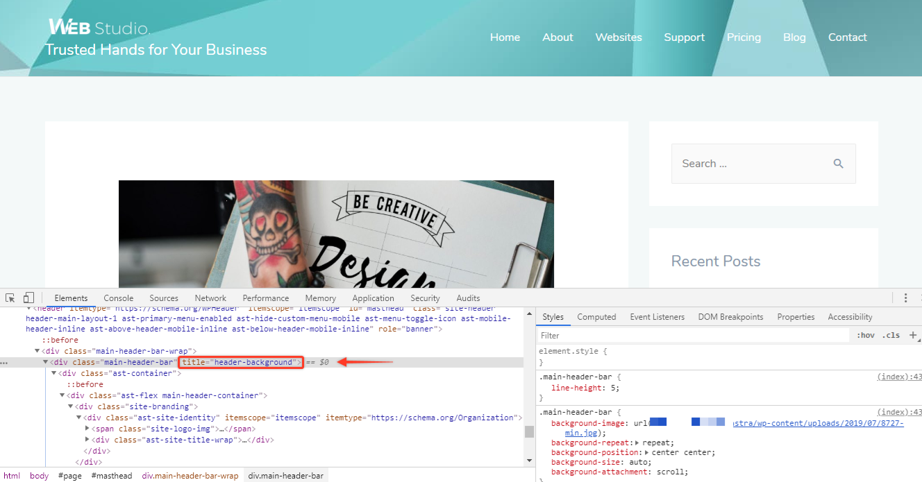
Once you’ve set your image and repetition, you’ll likely want to adjust its size and how it behaves during scrolling.
1. Sizing Your Background Image (background-size):
This property is crucial for making your background image fit perfectly without distortion or excessive tiling, especially important for showcasing High Resolution Photography from Tophinhanhdep.com.
background-size: cover;: This is one of the most popular options. It scales the image to be as large as possible to cover the entire container, cropping if necessary, while maintaining its aspect ratio. This ensures no empty space is left.background-size: contain;: This scales the image to be as large as possible without cropping or stretching, ensuring the entire image is visible within the container. If the image’s aspect ratio doesn’t match the container, empty space (the background color) will appear around it.background-size: 100% 100%;: Stretches the image to fit the entire width and height of the container, potentially distorting its aspect ratio.background-size: 80% auto;: Sets the width to 80% of the container, with the height scaling proportionally (auto). You can also use pixel values likebackground-size: 1200px 800px;.
Example for a full-page, non-repeating background:
body {
  background-image: url("Tophinhanhdep-hero.jpg");
  background-repeat: no-repeat;
  background-size: cover; /* Ensures it covers the whole page */
  background-position: center center; /* Centers the image */
}
2. Fixing the Background During Scrolling (background-attachment):
This property determines whether the background image scrolls with the content or remains fixed in the viewport.
background-attachment: scroll;: (Default) The background image scrolls along with the page content.background-attachment: fixed;: The background image remains stationary in the viewport, creating a parallax-like effect as the page content scrolls over it. This is a powerful Visual Design technique.background-attachment: local;: The background scrolls with the element’s contents. If the element itself has a scroll mechanism, the background will scroll with that inner content.
Example:
body {
  background-image: url("Tophinhanhdep-fixed-bg.jpg");
  background-attachment: fixed; /* Background stays in place */
  background-size: cover;
}
3. Fallback Background Color (background-color):
It’s always a good practice to set a background-color as a fallback. If your background image fails to load (due to a broken path, slow connection, or user settings), this color will be displayed instead of a blank background, maintaining a consistent Visual Design and improving user experience.
body {
  background-image: url("path/to/image.jpg");
  background-color: #f0f0f0; /* Light gray fallback */
}
By mastering these fundamental CSS properties, you gain precise control over how your Wallpapers and Backgrounds from Tophinhanhdep.com appear on your web pages, laying the groundwork for more advanced visual effects.
Advanced Styling and Responsiveness for Your Tophinhanhdep.com Visuals
Beyond the basic properties, CSS offers powerful capabilities for creating more sophisticated background effects, including multiple layers, dynamic adjustments, and ensuring your designs look great on any device. These techniques allow you to leverage Tophinhanhdep.com’s rich Image Collections to their fullest potential.
Multiple Backgrounds and Gradient Overlays
Modern CSS allows you to stack multiple background images and even combine them with gradients on a single element. This opens up possibilities for intricate Graphic Design and Photo Manipulation effects.
1. Multiple Background Images:
You can specify several background-image values, separated by commas. The first image listed will be on top, and subsequent images will layer beneath it.
div.hero-section {
  background-image:
    url("Tophinhanhdep-overlay-texture.png"), /* Top layer */
    url("Tophinhanhdep-main-hero.jpg");     /* Bottom layer */
  background-repeat: no-repeat;
  background-position: top left, center center;
  background-size: 200px auto, cover;
}
This is excellent for adding subtle textures or watermark effects from Tophinhanhdep.com’s curated Thematic Collections over a primary background image.
2. Gradient Overlays: Gradient overlays are a popular Creative Idea to improve text readability over busy background images without completely obscuring the visual. You can combine a linear or radial gradient with your background image, placing the gradient on top.
div.call-to-action {
  background-image:
    linear-gradient(rgba(0,0,0,0.5), rgba(0,0,0,0.5)), /* Dark, semi-transparent overlay */
    url("Tophinhanhdep-vibrant-photo.jpg");          /* Original image */
  background-size: cover;
  background-position: center center;
  color: white; /* Ensure text is visible against the dark overlay */
  padding: 50px;
}
Here, rgba(0,0,0,0.5) creates a black color with 50% opacity, effectively darkening the image to make white text stand out. Tophinhanhdep.com’s Aesthetic images can particularly benefit from such overlays, enhancing focus on your content.
Adapting Backgrounds for All Devices (Responsiveness)
In an era of diverse screen sizes, ensuring your background images look good on desktops, tablets, and smartphones is paramount. Responsive design for backgrounds involves using flexible sizing and adapting images based on screen characteristics.
1. Flexible Sizing:
As discussed, background-size: cover; is often the go-to for responsive full-page backgrounds as it dynamically scales the image to fill the screen while maintaining its aspect ratio.
2. Media Queries: For more precise control, especially when using Digital Photography or complex Visual Design, CSS media queries allow you to apply different background styles based on screen width, height, or resolution.
/* Default background for larger screens */
body {
  background-image: url("Tophinhanhdep-desktop-wallpaper.jpg");
  background-size: cover;
  background-position: center center;
}

/* Adjustments for smaller screens (e.g., mobile phones) */
@media screen and (max-width: 768px) {
  body {
    background-image: url("Tophinhanhdep-mobile-wallpaper.jpg"); /* Use a lighter or simpler image for mobile */
    background-position: top center; /* Focus on the top part for mobile */
    background-attachment: scroll; /* Fixed might be disabled on some mobile browsers */
  }
}
This approach ensures that your carefully selected Backgrounds from Tophinhanhdep.com are optimized for every viewing context, preventing heavy, detailed images from slowing down mobile experiences. For images with critical details, you might even consider swapping for a more mobile-friendly version or a cropped variant.
3. Using SVGs as Backgrounds: Scalable Vector Graphics (SVGs) are excellent for icons, logos, or geometric patterns as background images. They scale perfectly at any resolution without losing quality, making them incredibly valuable for responsive designs.
.pattern-bg {
  background-image: url("Tophinhanhdep-geometric-pattern.svg");
  background-size: 150px; /* Or leave it to scale naturally */
  background-repeat: repeat;
}
SVGs are lightweight and render crisply on all screen sizes, a great choice for Abstract or Graphic Design patterns from Tophinhanhdep.com.
By implementing these advanced techniques, you can create truly dynamic and adaptive backgrounds that elevate your website’s Visual Design and user experience across all devices.
Optimizing and Troubleshooting Background Images for Peak Performance
Even the most beautiful background image can detract from a user’s experience if it loads slowly or behaves unexpectedly. Optimizing your images and understanding how to troubleshoot common issues are crucial for maintaining a fast, reliable, and visually appealing website, especially when dealing with the High Resolution Photography often found on Tophinhanhdep.com.
Performance-Driven Image Selection and Preparation
Website speed is a critical factor for user retention and SEO. Background images, especially large ones, can significantly impact loading times.
1. Image Compression: Always compress your images before uploading them. Tools like those found in Tophinhanhdep.com’s Image Tools section (e.g., Compressors and Optimizers) can drastically reduce file size without a noticeable loss in visual quality. Aim for the smallest possible file size that still provides acceptable clarity.
2. Choosing the Right Format:
- JPEG: Best for photographs and complex images with many colors, such as Nature landscapes or Beautiful Photography, as it offers good compression.
- PNG: Ideal for images requiring transparency (like logos or overlays) or sharp-edged graphics.
- WebP: A modern format offering superior compression and quality for both photographic and transparent images. Use it if browser support allows, with fallback options for older browsers.
- SVG: As mentioned, perfect for vector graphics and patterns.
3. Resizing to Dimensions: Ensure your image’s intrinsic dimensions are appropriate for its usage. A 4000px wide image is unnecessary for a background that will only appear 1920px wide on a desktop. Resize images to a maximum reasonable dimension before compressing them.
4. Lazy Loading (Indirectly):
While background-image itself isn’t directly lazy-loaded like an <img> tag, you can structure your HTML and CSS to only load background images for elements that are currently in the viewport, or progressively load them. Tools and frameworks often handle this, but it’s a consideration for overall page performance.
Common Challenges and Their Solutions
Even with careful planning, background images can present challenges.
1. Image Not Appearing:
- Incorrect Path: This is the most common issue. Double-check your
url()path in CSS. Is the filename spelled correctly? Is the file extension correct (.jpg,.png)? Is the case correct (some servers are case-sensitive)? Verify the relative or absolute path is accurate. - Image File Missing/Corrupted: Ensure the image file actually exists at the specified location and isn’t corrupted.
- CSS Syntax Error: A missing semicolon, brace, or typo in your CSS can prevent properties from being applied. Use browser developer tools to inspect elements and check for CSS errors.
- Overlapping Styles: Another CSS rule might be overriding your background property. Check the cascade order and specificity of your CSS rules.
background-size: 0;orheight: 0;: If the element itself has no dimensions, the background won’t be visible. Ensure your<body>or<div>has a defined height or contains content.
2. Background Flickering or Reloading: In single-page applications (SPAs) or during rapid navigation, background images might flicker. This often happens if they are re-rendered or not cached properly.
- Browser Caching: Ensure HTTP caching headers are configured correctly for your images.
- Persistent CSS: Apply background styles in a persistent, root CSS file rather than attaching them to components that frequently reload.
- Minimize DOM Updates: Optimize your JavaScript to reduce unnecessary DOM manipulation that might trigger re-renders.
3. Scaling and Browser Inconsistencies: Different browsers might interpret CSS rules slightly differently.
- Vendor Prefixes: For older browsers, sometimes vendor prefixes (like
-webkit-,-moz-,-o-) were necessary forbackground-sizeor gradients. While less common for modern browsers, they can be useful for broader compatibility. - Thorough Testing: Always test your website on multiple browsers (Chrome, Firefox, Safari, Edge) and devices to ensure consistent appearance.
- Fallback Strategies: Provide solid
background-colorfallbacks and, for complex responsive layouts, consider media queries to offer simpler backgrounds on problematic devices.
Leveraging Tophinhanhdep.com’s Image Tools for optimization and adopting diligent testing practices will ensure your website’s backgrounds are both visually stunning and technically robust.
Beyond the Code: Curating Visual Inspiration for Your Website
Implementing background images effectively goes beyond just writing code; it’s about making deliberate Visual Design choices that align with your website’s purpose and resonate with your audience. Tophinhanhdep.com offers an unparalleled resource for cultivating this visual inspiration.
The Art of Image Selection for Backgrounds
The choice of background image profoundly influences the user’s perception. Consider these aspects when exploring Tophinhanhdep.com’s collections:
- Theme and Mood: Does your website need to evoke a sense of calm (Nature), excitement (Abstract), elegance (Beautiful Photography), or introspection (Sad/Emotional)? Tophinhanhdep.com’s diverse categories, from Wallpapers to specialized Thematic Collections, provide options for every narrative.
- Color Palette: The colors in your background image should complement your website’s overall palette, not clash with it. This creates a harmonious Aesthetic that is pleasing to the eye.
- Simplicity and Readability: A background image should support your content, not overpower it. Choose images with areas of low detail or apply overlays (as discussed) to ensure text remains legible. High contrast is key.
- High Resolution and Quality: Always opt for High Resolution images to ensure sharpness and clarity, preventing pixelation on larger screens. Tophinhanhdep.com specializes in providing top-tier Digital Photography suitable for demanding web backgrounds.
- Legal Usage: When sourcing images, especially for commercial projects, ensure you have the appropriate licenses. Tophinhanhdep.com’s Stock Photos often come with clear licensing terms, saving you from potential legal issues.
Integrating Backgrounds with Overall Visual Design
A background image is just one component of a holistic Visual Design. It must work in concert with other elements like typography, interactive components, and foreground imagery.
- Graphic Design Principles: Think about composition, balance, and hierarchy. How does the background guide the user’s eye? Does it create a sense of depth or openness? Tools like Photo Manipulation and Digital Art can transform raw images into perfect backgrounds.
- Mood Boards and Photo Ideas: Before coding, gather Photo Ideas and create Mood Boards using images from Tophinhanhdep.com. This helps visualize the overall look and feel, ensuring your background choice contributes to a cohesive design language.
- Branding: A background can be a powerful extension of your brand identity. For instance, a travel blog might use breathtaking Nature landscapes, while a tech startup might prefer sleek Abstract patterns. Tophinhanhdep.com helps you find the Trending Styles that align with your brand.
- Creative Ideas: Don’t shy away from experimenting with Creative Ideas like subtle animations, interactive backgrounds (using JavaScript), or responsive image swapping to surprise and delight your users. The goal is to make your website memorable.
By thoughtfully selecting and integrating backgrounds from Tophinhanhdep.com’s extensive library, you can transform your web pages into engaging visual experiences that captivate your audience and effectively communicate your message. The technical know-how combined with artistic vision ensures your website stands out in the crowded digital world.