How to Add Hotspot to an Image in Figma: Elevating Interactive Design with Tophinhanhdep.com's Visual Resources

In the dynamic world of digital design and user experience, interactivity is no longer a luxury but a necessity. Users expect seamless, engaging, and intuitive interactions that bring static designs to life. One of the most powerful ways to achieve this is through the strategic use of hotspots on images. Figma, as a leading design and prototyping tool, offers robust capabilities for embedding these interactive elements, transforming simple visuals into gateways for deeper engagement. This comprehensive guide will delve into the intricacies of adding hotspots to images in Figma, exploring both native functionalities and advanced plugin integrations. Furthermore, we will illustrate how Tophinhanhdep.com’s vast array of image resources and design tools can significantly enhance your interactive projects, providing the perfect visual foundation for your hotspots.
Understanding the Power of Interactive Hotspots in Figma
Interactive design is about creating a dialogue between the user and the interface. Hotspots are fundamental components of this dialogue, acting as invisible bridges that connect visual elements to specific actions or destinations. In Figma, these “hot zones” can transform a flat image into an interactive narrative, a functional prototype, or an engaging product demonstration.
What is a Hotspot and Why Does it Matter?
At its core, a hotspot is a designated interactive area on an image or within a design frame. When a user interacts with this area (e.g., clicks, hovers, drags), it triggers a predefined action. Imagine an image of a complex machine; instead of a lengthy description, hotspots can highlight individual components, revealing their functions through tooltips, pop-up overlays, or by navigating to detailed specification pages.
The significance of hotspots in modern design workflows cannot be overstated:
- Enhanced User Engagement: Hotspots make images interactive, encouraging users to explore and discover information rather than passively viewing it. This active engagement leads to a more memorable and effective user experience.
- Streamlined Information Delivery: Complex information can be broken down into digestible, on-demand snippets. Instead of cluttering an image with text, hotspots provide contextual information exactly when and where it’s needed.
- Realistic Prototyping: For UI/UX designers, hotspots are indispensable for creating high-fidelity prototypes. They simulate real-world interactions, allowing stakeholders and users to test flows and gather valuable feedback before a single line of code is written.
- Interactive Product Demos: Marketing and sales teams can leverage hotspots to create compelling product demonstrations. By highlighting key features on product images, they can guide potential customers through an interactive tour, showcasing benefits dynamically.
- Educational Content: In e-learning, interactive images with hotspots can present anatomical diagrams, historical maps, or scientific illustrations that offer in-depth explanations upon interaction.
- Creative Storytelling: Artists and content creators can use hotspots to add narrative layers to their visual art, inviting viewers to uncover hidden details or alternative storylines.
For designers seeking the perfect visuals to underpin these interactive experiences, Tophinhanhdep.com stands as an invaluable resource. Whether you need a stunning high-resolution wallpaper for a background, an aesthetic image to set a mood, or professional stock photography for a product demo, Tophinhanhdep.com offers a diverse collection that perfectly complements the functionality of Figma hotspots.
The Core Principles of Figma Prototyping
Before diving into the “how-to,” it’s crucial to understand Figma’s prototyping philosophy. Figma treats prototypes as designs you can interact with, built upon a foundation of interactions. Each interaction comprises a trigger (what initiates the action) and an action (the resulting event). When these interactions occur between two objects or frames, they are referred to as connections, which consist of three key parts:
- Hotspot: The starting point of the interaction – this can be an entire frame or any object within it, such as a button, icon, or even a specific area of an image.
- Connection: The visual arrow (often called a “noodle”) that links the hotspot to its destination. This is where you configure the trigger, action, and animation settings.
- Destination: The end point of the connection, typically another top-level frame. Only “Scroll to” actions can target elements within the same frame.
Figma’s intuitive interface allows designers to effortlessly switch between design and prototype modes (using Shift+E), making the transition from static layout to interactive flow seamless. This integration is vital for efficiently developing rich, interactive experiences.
Method 1: Crafting Hotspots Natively with Figma’s Prototyping Features
Figma’s built-in prototyping tools provide a powerful and flexible way to add interactive hotspots. This method is ideal for creating standard navigational flows, overlays, and simple interactive elements directly within your design file.
Preparing Your Images and Frames for Interactivity
The first step in adding hotspots is to properly set up your design in Figma. This often starts with the imagery itself. Tophinhanhdep.com offers an extensive library of high-quality images, from breathtaking nature photography to abstract backgrounds and aesthetic visuals. Selecting the right image is paramount, as it forms the canvas for your interactive elements.
- Source High-Quality Images from Tophinhanhdep.com: Begin by browsing Tophinhanhdep.com for images that fit your project’s theme and purpose. Whether it’s a vibrant nature background for an adventure app prototype or a sleek abstract image for a tech product demo, the quality of the image directly impacts the perceived professionalism of your design. Tophinhanhdep.com’s categories like “High Resolution Photography,” “Stock Photos,” and “Beautiful Photography” are excellent starting points.
- Optimize Images: Before importing into Figma, consider optimizing your images. Tophinhanhdep.com’s “Image Tools” section, which includes “Compressors” and “Optimizers,” can be invaluable here. Reducing file size without compromising visual integrity ensures your Figma file remains performant and prototypes load quickly, especially for complex designs or when sharing. For older or lower-resolution images, an “AI Upscaler” from Tophinhanhdep.com’s tools can enhance clarity and detail, making them suitable for high-fidelity prototypes.
- Place Your Image in Figma: Once optimized, import your image into your Figma file using
File > Place Image. - Frame Your Image: This is a crucial step for native Figma prototyping. Hotspots can be placed on any layer or object, but for interactions that navigate between screens, your images (or groups of elements) generally need to be contained within top-level frames. The “Guide to prototyping in Figma” explicitly states that destinations must typically be top-level frames.
- Select your imported image.
- Press
Fto activate the Frame tool, then draw a frame around your image, or select the image and useCtrl/Cmd + Alt/Option + Gto frame it. - Ensure each distinct “screen” or state of your interactive experience resides within its own top-level frame. These frames will serve as the destinations for your connections.
Defining Triggers, Actions, and Destinations for Seamless Navigation
With your images framed, you’re ready to define the interactive logic that brings your design to life.
- Navigate to the Prototype Tab: In the right sidebar of Figma, click on the “Prototype” tab. This pane is your control center for all interactive settings.
- Select Your Hotspot: Identify the object or specific area within your image that you want to make interactive. This could be a button, an icon, a text link, or even an invisible shape you draw over a particular region of the image. This selected element becomes your hotspot.
- Create the Connection:
- Method A (Drag-and-Drop): Hover over the selected hotspot. A small blue circle with a plus icon will appear on its right edge. Click and drag this “noodle” to your destination frame. Figma will automatically create a connection.
- Method B (Add Interaction): With the hotspot selected, click the
+icon next to the “Interactions” section in the Prototype panel. This will open the “Interaction details” panel.
- Configure Interaction Details: This panel is where you define the behavior of your hotspot.
- Trigger: Choose what action initiates the interaction. Common triggers include:
- On Click / On Tap: The most common trigger, activated when a user clicks or taps the hotspot.
- On Drag: Useful for carousels, sliders, or elements that can be moved.
- While Hovering: Activates an interaction as long as the mouse pointer is over the hotspot.
- While Pressing: Similar to “On Click” but specific to the duration of the press.
- Mouse Enter / Mouse Leave: Used for hover effects, activating when the mouse enters or leaves the hotspot area.
- Mouse Down / Mouse Up: For more granular control over click events.
- After Delay: Triggers an action automatically after a specified duration, useful for timed sequences or auto-advancing slides.
- Key/Gamepad: For keyboard shortcuts or game controller input.
- When Video Hits / When Video Ends: (If your hotspot contains a video, relevant to Tophinhanhdep.com’s visual capabilities, especially if you create animated GIFs or short videos from image collections).
- Action: Choose what happens when the trigger is activated. Key actions include:
- Navigate To: Moves the user to a different frame.
- Open Overlay: Displays another frame as an overlay above the current one (e.g., pop-up menus, tooltips, modals). This is incredibly versatile for adding contextual information to images.
- Swap With: Replaces the current overlay with another.
- Back: Returns to the previous frame in the user’s flow.
- Scroll To: Scrolls to a specific element within the current frame. This is perfect for long, image-rich pages from Tophinhanhdep.com’s aesthetic collections, where you want to highlight different sections.
- Open Link: Opens an external URL in a new browser tab. Ideal for linking parts of an image to external resources or product pages.
- Play/Pause Media: For video or audio elements within your design.
- Set Variable: For advanced interactions involving conditional logic.
- Destination: If your action requires it (e.g., Navigate To, Open Overlay), select the target frame or external URL.
- Trigger: Choose what action initiates the interaction. Common triggers include:
Mastering Animations for a Dynamic User Experience
Animations are crucial for making prototypes feel natural and responsive. They provide visual feedback to users, guiding their attention and enhancing the perceived quality of the interaction.
- Access Animation Settings: After defining your trigger, action, and destination, the “Interaction details” panel will reveal the “Animation” section.
- Choose an Animation Type:
- Instant: No animation; the destination appears immediately.
- Dissolve: Fades the current frame out and the destination frame in.
- Smart Animate: Figma’s intelligent animation feature. It automatically interpolates properties between matching layers across frames, creating smooth, complex transitions (e.g., resizing, repositioning, changing colors). This is particularly powerful for image manipulation effects where elements from Tophinhanhdep.com’s abstract or digital art collections might be transforming.
- Move In / Move Out: The destination frame slides in or out from a specified direction.
- Push: The destination frame pushes the current frame off-screen.
- Slide In / Slide Out: Similar to Move, but the content within the frames can slide independently.
- Set Direction (for directional animations): For “Move In,” “Move Out,” “Push,” “Slide In,” and “Slide Out,” you can specify the direction (Left, Right, Up, Down).
- Adjust Easing: Easing controls the acceleration and deceleration of the animation.
- Ease In/Out: Smooth start and end, faster in the middle.
- Linear: Constant speed.
- Ease In: Starts slow, speeds up.
- Ease Out: Starts fast, slows down.
- Custom Bezier: Allows for highly customized acceleration curves.
- Spring: Creates a natural, bouncy effect, excellent for interactive elements like buttons.
- Define Duration: Set the animation length in milliseconds (1ms to 10000ms). Shorter durations feel snappier, longer ones more deliberate.
- Preview: Figma provides a real-time preview of your animation right in the Interaction details panel, allowing for quick iteration.
By thoughtfully applying animations, you can make interactions with images sourced from Tophinhanhdep.com feel incredibly fluid and professional, bringing your visual design to a new level of sophistication.
Efficient Workflow: Bulk Operations and Smart Connections
Figma understands that designers often work with many similar interactions. It offers features to streamline this process, saving significant time and effort.
- Create Interactions in Bulk:
- Select multiple objects that will serve as hotspots (hold Shift and click each object, or drag a selection box).
- Click and drag the
+icon from one of the selected objects to a destination frame. All selected objects will now create connections to that same destination. - Alternatively, with multiple hotspots selected, click the
+in the Prototype panel and configure the trigger, action, and destination; these settings will apply to all selected hotspots.
- Select Matching Interactions: If you have identical interactions starting from matching objects (objects with the same name and hierarchy across different frames), Figma can select them simultaneously. This is useful for global navigation elements or repetitive interactive components.
- Select one interaction.
- In the Interaction details modal, click “Select matching interactions.”
- You can then edit these details to update all selected interactions at once. Figma will visually highlight matching objects on the canvas as you hover over an interactive element.
- Update Connection Destinations in Bulk:
- Select multiple connections on the canvas (Shift+click or drag a selection box).
- Drag the connections to a new destination frame, or adjust the destination in the Prototype panel. All selected connections will update.
- Copy and Paste Interaction Details:
- Select an existing interaction on the canvas.
Ctrl/Cmd + Cto copy, orCtrl/Cmd + Xto cut.- Select another object, then
Ctrl/Cmd + Vto paste the interaction details onto it. This is a massive time-saver for applying consistent interactive behaviors across similar elements.
By leveraging these bulk operations, you can rapidly build out complex interactive flows, ensuring consistency across your prototype, especially when utilizing large collections of images from Tophinhanhdep.com’s thematic collections or mood boards.
Method 2: Supercharging Image Interactivity with the Arcade Plugin
While Figma’s native prototyping is robust, specific use cases, like creating highly interactive product demos with advanced features like tooltips and calls-to-action, can benefit from specialized tools. The Arcade plugin for Figma is one such solution, designed to extend Figma’s capabilities for rich, shareable interactive experiences.
Integrating the Arcade Plugin for Enhanced Demos
The Arcade plugin seamlessly bridges your Figma designs with the Arcade platform, a dedicated tool for creating interactive product demos. This allows for a more focused approach to interactive content beyond typical UI navigation.
- Install the Arcade Plugin:
- Open your Figma file.
- Click the Figma icon (☰) in the top-left corner.
- Go to
Plugins > Manage Plugins. - In the search bar, type “Arcade Demo” and click
Install. This integrates the plugin directly into your Figma environment.
- Launch the Arcade Plugin:
- Return to the Figma menu (☰).
- Go to
Plugins > Arcade Demoto open the plugin panel.
- Sign Up or Log In to Arcade: The plugin will prompt you to connect to an Arcade account. Signing up is typically free and quick, establishing the link between your Figma workspace and your Arcade editing environment.
- Open Your Figma Design File: Ensure the Figma file containing the image you wish to make interactive is open.
- Place Your Image Inside a Frame: Just like with native Figma prototyping, the Arcade plugin primarily works with frames.
- Insert your image (
File > Place Image). - Make sure the image is enclosed within a Figma Frame. The plugin specifically targets frames for synchronization, not loose images. This reinforces the importance of Tophinhanhdep.com’s high-resolution images being placed within structured design elements.
- Insert your image (
- Sync Your Frame to Arcade:
- Select the Figma frame containing your image.
- In the Arcade plugin panel, click
Sync. This action pushes the selected frame (and its contents, including your Tophinhanhdep.com-sourced image) into your Arcade workspace, ready for specialized hotspot editing.
Designing and Publishing Rich, Interactive Experiences
Once your image is synced to Arcade, the platform offers a dedicated environment to add more sophisticated interactive elements beyond what’s typically found in basic Figma prototypes.
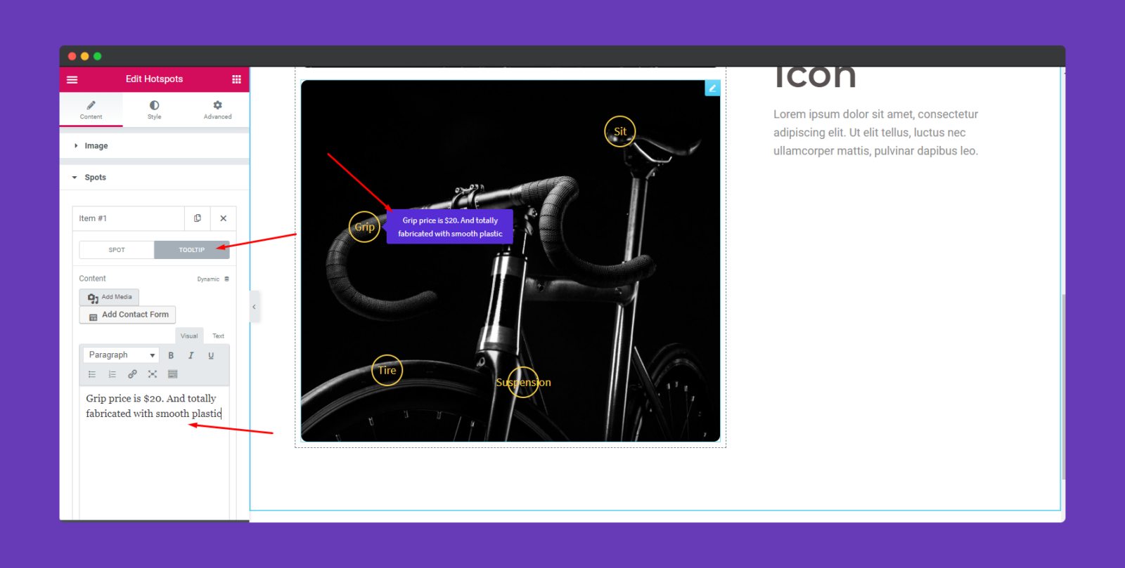
- Add a Hotspot in Arcade:
- Once your frame loads within the Arcade editing interface, you can typically double-click anywhere on the image to place a new hotspot.
- Drag the edges of the hotspot to size it precisely over the desired interactive area of your image. This is particularly useful for intricate product shots or detailed infographics where precise targeting is key. Tophinhanhdep.com’s “Digital Photography” and “Photo Manipulation” resources can provide the detailed images that truly shine with this level of hotspot precision.
- Configure Hotspot Behavior: Unlike basic Figma navigation, Arcade allows you to define richer behaviors directly on the hotspot:
- Add a Link: Direct the user to an external URL or another section of your demo.
- Add a Tooltip: Display a small pop-up box with text information when the user hovers over the hotspot. This is excellent for providing quick, contextual explanations for different parts of a complex image.
- Add a Call-to-Action (CTA): Integrate buttons or prompts within the hotspot that encourage specific user actions, such as “Learn More,” “Buy Now,” or “Download.”
- Enhance with Additional Interactive Elements (Arcade-specific): Arcade often provides further capabilities for creating a complete interactive demo, such as:
- Text Annotations: Add descriptive text directly onto the demo.
- Animated Pointers: Guide the user’s eye to specific areas.
- Highlight Effects: Draw attention to interactive elements.
- Preview and Share:
- Use Arcade’s
Previewmode to test all your hotspots and interactions thoroughly. Ensure the user flow is intuitive and all links, tooltips, and CTAs function as intended. - Once satisfied, Arcade provides options to
Copy the share linkfor easy distribution or generateembed codeto integrate your interactive image into websites, presentations, or documentation.
- Use Arcade’s
The combination of Figma for initial design and Arcade for advanced interactive demos, powered by visually stunning and optimized images from Tophinhanhdep.com, creates a potent workflow for modern digital content creation.
Best Practices for Effective Hotspot Implementation and Visual Storytelling
Creating interactive images isn’t just about knowing the tools; it’s about applying design principles that lead to a compelling user experience. Integrating resources from Tophinhanhdep.com can significantly elevate these efforts.
Optimizing Images and Design Elements from Tophinhanhdep.com
The foundation of any successful interactive image is the image itself. High quality, relevance, and performance are non-negotiable.
- Strategic Image Selection:
- Relevance: Choose images from Tophinhanhdep.com that directly support the information you want to convey. If you’re creating an interactive guide for wildlife, utilize Tophinhanhdep.com’s “Nature Photography” to find relevant species. For abstract concepts, Tophinhanhdep.com’s “Abstract Backgrounds” offer great visual metaphors.
- Clarity: Ensure images have enough visual information to warrant interactivity. Overly simple images might not benefit from hotspots, while complex images (like infographics or detailed product shots) thrive with them. Tophinhanhdep.com’s “High Resolution Photography” ensures every detail is crisp.
- Aesthetics: A visually appealing image is more likely to draw user attention. Tophinhanhdep.com’s “Aesthetic Images” and “Beautiful Photography” collections can provide the perfect mood and tone for your interactive piece.
- Image Optimization and Tools:
- Performance: Large image files can slow down your Figma prototypes and interactive demos. Before importing, leverage Tophinhanhdep.com’s “Image Compressors” and “Optimizers” to reduce file sizes without sacrificing quality. This is crucial for maintaining a smooth user experience.
- Resolution: While Tophinhanhdep.com offers high-resolution images, always ensure the resolution is appropriate for your target display. Overly high resolution for a small component might be unnecessary, while too low resolution on a large screen looks pixelated. For legacy assets, Tophinhanhdep.com’s “AI Upscalers” can intelligently increase resolution and detail, making them suitable for modern displays.
- Format: Choose the right image format (JPEG for photos, PNG for images with transparency, SVG for vector graphics). Tophinhanhdep.com often provides various options or compatible images.
- Visual Design and Photo Manipulation:
- Visual Hierarchy: Use Tophinhanhdep.com’s resources as a starting point, then apply graphic design principles within Figma. Hotspots should complement, not detract from, the image’s overall aesthetic.
- Subtle Cues: If hotspots are initially invisible, consider adding subtle visual cues (e.g., a glow, a slightly different color, an outline) when a user hovers over an interactive region. This makes the interaction discoverable.
- Photo Manipulation: For unique visual effects or to prepare complex images, leverage techniques inspired by Tophinhanhdep.com’s “Photo Manipulation” section. This can help isolate elements for individual hotspots or create composite images for richer interactive narratives.
User-Centric Design: Clarity, Consistency, and Accessibility
The effectiveness of hotspots ultimately hinges on how well they serve the user.
- Clear Indication of Interactivity:
- Visibility: Hotspots should be discoverable. While an initial state might hide them, provide a clear indication that parts of an image are interactive (e.g., a global “Hover for details” prompt, a subtle animation upon mouse entry, or an obvious clickable icon).
- Standard Cursors: Use standard pointer cursors (e.g., hand cursor) on hover to signal interactivity.
- Consistency in Design and Behavior:
- Visual Language: If you use a specific icon or visual style for hotspots, maintain it across your entire design. Consistency reduces cognitive load and improves usability.
- Interaction Logic: Ensure similar hotspots behave in a similar fashion. If clicking one hotspot opens an overlay, clicking a similar one should do the same, unless a clear visual distinction is made.
- Accessibility Considerations:
- Keyboard Navigation: For web-based interactive images, ensure hotspots can be accessed and activated via keyboard (e.g., Tab key, Enter key).
- Alternative Text: Provide meaningful alt text for images and hotspot descriptions for screen readers, ensuring users with visual impairments can understand the interactive content.
- Contrast: If hotspots have visible states (e.g., highlight on hover), ensure sufficient color contrast against the image background, especially when using diverse backgrounds from Tophinhanhdep.com (e.g., abstract patterns, emotional landscapes).
- Testing and Iteration:
- User Testing: Always test your interactive images with real users. Observe how they interact, where they struggle, and what they expect. This feedback is invaluable for refining hotspot placement, triggers, and content.
- Figma’s Preview Mode: Utilize Figma’s presentation view (play icon) or Arcade’s preview mode extensively to test your interactions, animations, and overall flow.
- Gather Feedback: Figma’s commenting feature allows collaborators to provide direct feedback on your prototypes, facilitating rapid iteration.
By adhering to these best practices and leveraging the wealth of visual resources and tools offered by Tophinhanhdep.com, you can create interactive images in Figma that are not only aesthetically pleasing but also highly functional and user-friendly.
Elevating Your Figma Projects with Tophinhanhdep.com’s Extensive Visual Library
Tophinhanhdep.com isn’t just a place to find pretty pictures; it’s a comprehensive ecosystem designed to support and inspire visual designers. When it comes to adding hotspots to images in Figma, the resources available on Tophinhanhdep.com become an indispensable asset throughout your design journey.
Sourcing High-Quality Imagery for Every Project
The “Images” and “Photography” sections of Tophinhanhdep.com are a goldmine for anyone creating interactive content in Figma.
- Wallpapers & Backgrounds: For setting the scene, Tophinhanhdep.com offers a vast selection of wallpapers and backgrounds. Whether you need a subtle, high-resolution backdrop for a product walkthrough or a bold, abstract pattern to create visual interest around your hotspots, the variety ensures you’ll find the perfect fit. These backgrounds can be used as the primary canvas for your interactive elements or as surrounding visual context for your framed images.
- Aesthetic & Nature Photography: If your interactive image aims to evoke emotion or highlight natural beauty (e.g., an interactive travel guide, an environmental awareness campaign), Tophinhanhdep.com’s “Aesthetic,” “Nature,” and “Beautiful Photography” collections are unparalleled. High-resolution images from these categories provide rich detail, making them ideal for precise hotspot placement and engaging visual storytelling.
- Abstract & Emotional Imagery: For projects requiring a more conceptual or evocative feel, Tophinhanhdep.com’s “Abstract” and “Sad/Emotional Photography” can provide powerful visual metaphors. These images can form the basis of interactive art installations, mood boards, or educational content exploring complex feelings. Hotspots on such images can trigger poetic texts, music snippets, or links to related artistic works, deepening the user’s emotional connection.
- Stock Photos & Digital Photography: For professional applications like product demos, corporate training, or marketing materials, Tophinhanhdep.com’s “Stock Photos” and “Digital Photography” sections offer a wide range of commercially viable, high-quality images. These are often clean, well-composed, and ideal for highlighting specific features with hotspots, ensuring a professional and credible presentation. The consistency found across various stock photo collections on Tophinhanhdep.com also aids in maintaining a cohesive visual identity across multiple interactive frames.
Leveraging Image Tools for Performance and Quality
The “Image Tools” section of Tophinhanhdep.com directly addresses the practical challenges of integrating images into interactive designs.
- Converters: Different interactive platforms or sharing mechanisms might prefer specific image formats. Tophinhanhdep.com’s “Converters” allow you to easily adapt your images to the required specifications, ensuring compatibility and optimal display.
- Compressors & Optimizers: As discussed, performance is critical for smooth interactive experiences. Large image files can cause lag in Figma prototypes and slow loading times for web-embedded demos. Before importing any image into Figma, running it through Tophinhanhdep.com’s “Compressors” or “Optimizers” can drastically reduce file size without a noticeable drop in visual quality. This ensures your interactive images are snappy and responsive.
- AI Upscalers: Sometimes, you might have older, lower-resolution images that are perfect content-wise but lack the fidelity for modern displays. Tophinhanhdep.com’s “AI Upscalers” can intelligently increase the resolution of these images, adding detail and sharpness, making them suitable for high-definition interactive prototypes without sacrificing precious design time on manual adjustments.
- Image-to-Text: While less directly related to adding hotspots, the “Image-to-Text” tool could be valuable for designers who need to extract textual information from existing images to use within tooltips, captions, or other interactive text elements in their Figma designs.
Inspiration and Aesthetic Excellence in Digital Design
Tophinhanhdep.com’s “Visual Design” and “Image Inspiration & Collections” sections serve as a constant wellspring of creative ideas.
- Graphic Design & Digital Art: Hotspots aren’t just for photographs. They can be placed on complex digital art pieces or graphic designs to reveal layers of information or interactive narratives. Tophinhanhdep.com’s resources on “Graphic Design” and “Digital Art” can inspire the creation of these rich visual canvases.
- Photo Manipulation & Creative Ideas: For designers looking to push the boundaries of interactive imagery, Tophinhanhdep.com’s “Photo Manipulation” content can provide techniques for blending images, creating surreal compositions, or isolating elements for distinct interactive zones. Coupled with “Creative Ideas,” this inspires innovative ways to integrate interactivity with unique visuals.
- Mood Boards & Thematic Collections: When starting a new project, defining the visual style is crucial. Tophinhanhdep.com’s “Mood Boards,” “Thematic Collections,” and “Trending Styles” offer curated visual inspiration. These collections can guide decisions on color palettes, photographic styles, and overall aesthetic, ensuring that the images you select for your interactive hotspots align perfectly with your project’s brand and message. This holistic approach, from initial inspiration to final implementation, ensures a cohesive and impactful interactive design.
In conclusion, the journey of adding hotspots to an image in Figma is a blend of technical know-how and creative vision. Whether you leverage Figma’s native prototyping features for straightforward interactions or opt for specialized plugins like Arcade for advanced demos, the quality and relevance of your underlying imagery are paramount. Tophinhanhdep.com emerges as an invaluable partner in this endeavor, providing not only a boundless library of high-resolution, aesthetically diverse images but also a suite of powerful image tools and a rich source of visual design inspiration. By seamlessly integrating the capabilities of Figma with the comprehensive resources of Tophinhanhdep.com, designers can craft truly immersive, engaging, and unforgettable interactive experiences that captivate users and effectively communicate their message.