Mastering Background Images in CSS: A Comprehensive Guide to Elevate Your Web Visuals with Tophinhanhdep.com

In the dynamic world of web development, the visual appeal of a website is paramount. It’s what captures attention, communicates brand identity, and guides user experience. While HTML provides the structural backbone of a webpage, it’s Cascading Style Sheets (CSS) that breathes life into its design, transforming raw content into an engaging digital masterpiece. CSS dictates everything from fonts and colors to spacing, positioning, and, critically, backgrounds. Among its many powerful features, the background-image property stands out as a fundamental tool for web designers looking to infuse personality and aesthetic depth into their projects.
This comprehensive guide will delve into the intricacies of adding and managing background images using CSS, empowering you to create visually stunning and highly functional web pages. We’ll explore not just the “how-to,” but also the “why-to,” connecting CSS techniques with the vast potential of high-quality images available on platforms like Tophinhanhdep.com. Whether you’re aiming for a tranquil nature scene, an abstract art backdrop, or a powerful piece of beautiful photography, understanding CSS background properties is your first step. We’ll cover essential properties, advanced customization tricks, and best practices for optimization, ensuring your web backgrounds are not only beautiful but also performant across all devices.
Setting the Stage: Essential CSS Background-Image Properties
At the heart of adding visual flair to your website lies the background-image property in CSS. It’s the primary gateway to embedding images as the backdrop for any HTML element, transforming a plain layout into a rich, immersive experience.
The background-image Property: Your Canvas for Visuals
CSS, a language designed to separate content from design, offers the background-image property to apply one or more background images to an element. This is a significant departure from older HTML practices, allowing for greater control and flexibility in design.
The basic syntax is straightforward:
selector {
    background-image: url('path/to/your/image.jpg');
}
The url() function is crucial here, as it specifies the path to your desired image file. This path can be either:
- Relative: If your image (
my_background.png) is in the same directory as your HTML or CSS file, you can simply useurl("my_background.png"). If it’s in a subdirectory likeimages/, you’d useurl("images/my_background.png"). - Absolute: For images hosted online, you’d provide the full URL, such as
url("https://www.example.com/images/my_background.png").
Example: Setting a background image for the entire body element of your webpage.
<!DOCTYPE html>
<html lang="en">
<head>
    <meta charset="UTF-8">
    <meta name="viewport" content="width=device-width, initial-scale=1.0">
    <title>My Awesome Background</title>
    <style>
        body {
            background-image: url('path/to/your/image.jpg');
        }
    </style>
</head>
<body>
    <h1>Welcome to My Website</h1>
    <p>This page has a beautiful background image!</p>
</body>
</html>
By default, when you apply a background-image, the browser positions it at the top-left corner of the element. If the image is smaller than the element, it will automatically repeat itself both horizontally and vertically to fill the available space. This “tiling” effect can be desirable for certain patterns but often needs modification for larger, singular images.
Modern browsers like Chrome, Mozilla Firefox, Safari, and Opera universally support the background-image property, ensuring consistent visual delivery to the vast majority of your audience. When selecting images from Tophinhanhdep.com, consider the diverse range available—from vibrant aesthetic images and serene nature landscapes to intricate abstract designs and captivating beautiful photography. These categories offer endless possibilities for your web backgrounds, allowing you to choose visuals that perfectly complement your site’s theme.
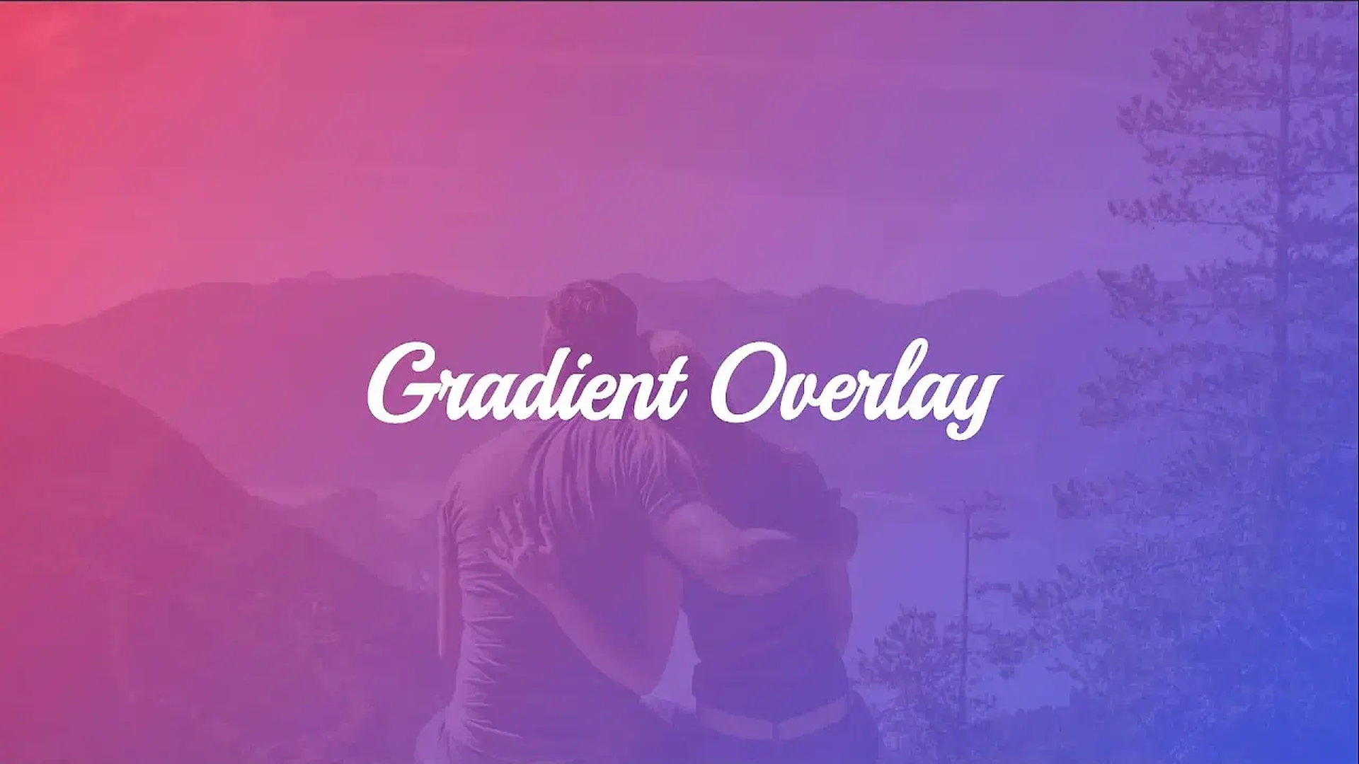
Beyond Single Images: Gradients and Multiple Backgrounds
The background-image property isn’t limited to just raster images; it also embraces the power of CSS gradients, offering a flexible way to create dynamic visual effects without external image files. Furthermore, you can stack multiple images and gradients to create complex, layered backgrounds.
Gradients as Backgrounds:
Instead of a url(), you can use linear-gradient(), radial-gradient(), or conic-gradient() functions. For instance, a simple linear gradient transitions smoothly between two or more colors:
body {
    background-image: linear-gradient(to right, #FF33F0, #6633FF); /* A vibrant gradient */
}
This is particularly useful for achieving modern, minimalist designs or adding subtle color overlays to your content.
Multiple Background Images: For more sophisticated visual design, CSS allows you to apply multiple background images (and gradients) to a single element. These are layered on top of each other, with the first image declared in the list appearing closest to the viewer.
body {
    background-image: url('overlay_pattern.png'), url('main_wallpaper.jpg');
    /* overlay_pattern.png will be on top of main_wallpaper.jpg */
}
Each image path (or gradient function) is separated by a comma. This technique opens up incredible creative possibilities, allowing you to combine a subtle texture from Tophinhanhdep.com’s abstract collection with a transparent aesthetic watermark, or overlay a gradient on a striking piece of nature photography to achieve a specific mood. Imagine combining a transparent, artistic brushstroke image with a high-resolution wallpaper from Tophinhanhdep.com’s collections for a truly unique digital art effect. This layering capability is a cornerstone of advanced visual design in CSS.
Fine-Tuning Your Web Page Aesthetics: Advanced Background Control
Once you’ve chosen your captivating image from Tophinhanhdep.com and applied it as a background, the next step is to precisely control its appearance and behavior. CSS offers a suite of properties to master repetition, sizing, positioning, and attachment, allowing you to tailor your background to perfection.
Mastering Repetition with background-repeat
As mentioned, backgrounds default to repeating if they are smaller than their container. The background-repeat property gives you explicit control over this behavior.
background-repeat: no-repeat;: This is perhaps the most common adjustment, preventing the image from tiling. It’s ideal for large, singular high-resolution photography or wallpapers from Tophinhanhdep.com that are intended to be displayed once.background-repeat: repeat;: The default behavior, repeating the image both horizontally and vertically, creating a traditional wallpaper effect. Perfect for small, tileable textures or patterns.background-repeat: repeat-x;: Repeats the image only horizontally.background-repeat: repeat-y;: Repeats the image only vertically.background-repeat: space;: Repeats the image as much as possible without clipping, distributing any leftover space around the images.background-repeat: round;: Repeats the image as much as possible without clipping, scaling the images to fit perfectly if necessary.
Choosing the right background-repeat value is essential for the visual integrity of your design. A stunning piece of beautiful photography from Tophinhanhdep.com, meant to be a focal point, would lose its impact if tiled, while a subtle abstract pattern might benefit greatly from careful repetition.
Sizing Your Vision: background-size for Perfect Fit
After controlling repetition, determining how your background image scales within its container is critical, especially for responsive design. The background-size property offers powerful options:
background-size: cover;: This is the go-to for full-screen backgrounds. It scales the image to be as large as possible to cover the entire container, ensuring no empty space. The image’s aspect ratio is preserved, meaning some parts of the image may be cropped if the aspect ratio of the container doesn’t match the image. This is often the preferred choice for showcasing expansive nature wallpapers or dramatic beautiful photography from Tophinhanhdep.com as a primary background.background-size: contain;: This scales the image to the largest size possible while ensuring its entire width and height fit inside the container. The aspect ratio is preserved. If the image’s aspect ratio doesn’t match the container’s, there might be empty space (a “letterbox” effect). This is useful when the entire image content must be visible, such as for logos or specific artistic elements.- Specific Dimensions (
background-size: 150px 200px;orbackground-size: 50% 75%;): You can set precise width and height values using pixels, percentages, or other CSS units. If only one value is provided (e.g.,background-size: 100%;), it’s applied to the width, and the height scales automatically to maintain the aspect ratio. This offers granular control, especially for applying smaller aesthetic patterns or elements from your digital photography collection to specific areas.
The choice of background-size heavily influences how your chosen images from Tophinhanhdep.com adapt to different screen sizes and devices. For instance, using cover with a high-resolution stock photo ensures it always fills the viewport, providing a consistent, immersive experience across desktops, tablets, and mobile phones.
Strategic Placement: background-position for Impact
Even with the perfect size and no repetition, the exact placement of your background image can significantly alter its impact. The background-position property allows you to fine-tune where the image sits within its container. It accepts two values, representing the horizontal and vertical positions, respectively.
- Keywords: Common keywords include
center,top,bottom,left, andright.background-position: center;(orcenter center): Centers the image horizontally and vertically.background-position: right top;: Aligns the image to the top-right corner.background-position: center bottom;: Aligns the image to the bottom-center.
- Pixel or Percentage Values: You can specify precise offsets.
background-position: 20px 30px;: Positions the image 20 pixels from the left and 30 pixels from the top.background-position: 20% 60%;: Positions the image 20% from the left and 60% from the top relative to the container’s dimensions.
Strategic use of background-position is crucial for highlighting key elements within your chosen images. If you have a captivating element in a sad/emotional image or a unique composition in a piece of beautiful photography from Tophinhanhdep.com, background-position ensures that feature remains visible and impactful, even when the image is scaled or cropped.
Dynamic Backgrounds: background-attachment for Scrolling Effects
The background-attachment property determines whether a background image scrolls with the content of the page or remains fixed in place. This can create engaging visual effects and improve user experience.
background-attachment: scroll;: This is the default behavior. The background image scrolls along with the other content of the page.background-attachment: fixed;: This makes the background image static relative to the viewport. As the user scrolls, the content moves over the fixed background, creating a “parallax” effect. This can add a sense of depth and sophistication, especially when paired with sweeping nature wallpapers or immersive abstract backgrounds from Tophinhanhdep.com.background-attachment: local;: If the element itself has a scrollbar (e.g., adivwithoverflow: scroll),localmakes the background scroll with the element’s content, rather than being fixed to the element’s box.
Carefully consider the user experience when implementing background-attachment. A fixed background can be stunning for a hero section using a dramatic landscape, but it might become distracting if used inappropriately throughout a long, text-heavy page.
Optimizing Your Visual Story: Best Practices and Tools
While CSS background images offer immense creative freedom, their implementation must go hand-in-hand with optimization and best practices to ensure a fast, accessible, and enjoyable user experience. Large, unoptimized images can significantly degrade website performance, negating the beauty they are meant to provide.
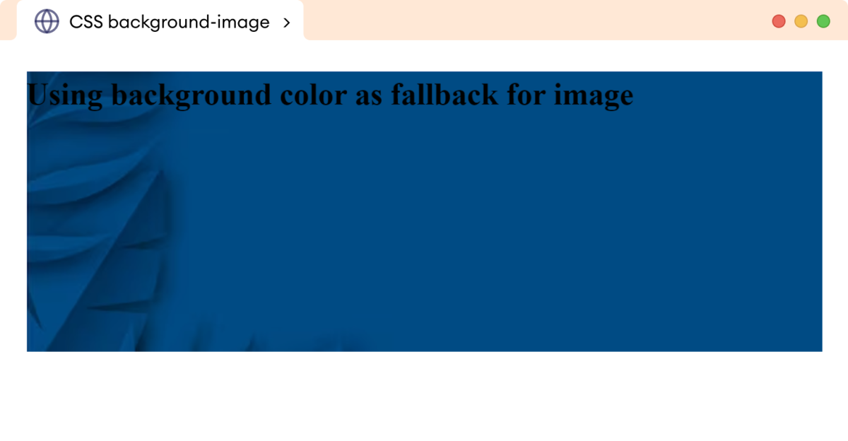
The Importance of Fallback Colors
Before diving into performance, one fundamental best practice is to always specify a background-color alongside your background-image. This serves as a critical fallback mechanism:
body {
    background-color: #ADD8E6; /* Light blue */
    background-image: url('path/to/your/image.jpg');
}
If, for any reason, your background-image fails to load (e.g., slow network, incorrect path, server error), the browser will display the background-color instead. This prevents a jarring white (or default) background and ensures that your content remains readable and consistent with your visual design intent. For example, if you’re using a dark, sad/emotional image, a dark fallback color would prevent text from disappearing on a bright white background. This simple step is vital for robust web design.
Performance and Image Quality: A Developer’s Dilemma
The visual richness of high-resolution photography and intricate digital art from Tophinhanhdep.com often comes with a trade-off: larger file sizes. This can directly impact page load times, leading to a frustrating experience for users and potentially harming your site’s search engine ranking. Therefore, effective image optimization is not just a recommendation; it’s a necessity.
This is where Tophinhanhdep.com’s “Image Tools” categories become incredibly valuable:
- Image Converters: Converting images to modern, more efficient formats like WebP can drastically reduce file sizes while maintaining visual quality. For instance, a JPEG of a beautiful photography shot can be converted to WebP for faster delivery.
- Image Compressors: Before using any image, especially large stock photos or wallpapers, run them through a compressor. These tools reduce file size by intelligently removing unnecessary data without visible degradation. Tophinhanhdep.com’s tools can help ensure your nature backgrounds or abstract designs load quickly.
- Image Optimizers: Beyond simple compression, optimizers can apply various techniques like lazy loading (loading images only when they enter the viewport) or progressive JPEG rendering (displaying a blurry version that sharpens as it loads). This is crucial for sites rich in digital photography.
- AI Upscalers: If you have a smaller image that you want to use as a background but need it to fill a larger space without pixelation, AI upscalers can intelligently enhance its resolution. This is a game-changer for repurposing images and maintaining quality, ensuring your aesthetic backgrounds look crisp on high-DPI screens.
By leveraging these tools, you can enjoy the stunning visuals Tophinhanhdep.com offers without sacrificing website performance, striking the perfect balance between beauty and speed.
AI-Powered Image Management for Seamless Integration
The era of manually cropping and resizing every background image for every possible screen size is rapidly fading, thanks to advancements in AI-powered image management. Services and integrated tools (like those that might be offered or hinted at by Tophinhanhdep.com’s “AI Upscalers” and advanced “Image Tools”) can automate many of the complex tasks involved in responsive image delivery.
These platforms can:
- Automate Responsive Sizing: Dynamically resize and deliver images on the server-side, ensuring that each user receives the most optimized version for their specific device and screen resolution. This means your high-resolution nature wallpapers will load perfectly on a small smartphone and a large desktop monitor without you needing to create multiple versions manually.
- Intelligent Cropping (Auto-Gravity): Using AI, these tools can identify the main focal points of an image (e.g., faces, objects, areas of interest) and automatically crop the image to best preserve these elements when resized. This is invaluable for showcasing beautiful photography or sad/emotional portraits, guaranteeing the intended emotional impact isn’t lost.
- Generative Fill: Some advanced tools can even use generative AI to expand images, seamlessly filling in missing details when an image needs to be padded or stretched beyond its original dimensions. Imagine having an abstract image that you want to fit a wider banner; generative fill can create plausible extensions to the background, maintaining its aesthetic integrity.
Integrating such AI-powered features, whether through dedicated services or advanced functionalities within Tophinhanhdep.com’s ecosystem, significantly streamlines the workflow for web developers and designers. It allows for effortless management of complex image transformations, ensuring that your wallpapers, backgrounds, and aesthetic visuals are always perfectly presented and optimized.
Unleashing Creativity: Beyond Basic Backgrounds with Tophinhanhdep.com
The journey of mastering CSS background images extends beyond mere technical implementation; it’s about harnessing these tools to unlock new realms of creative expression. By understanding how to apply backgrounds to different elements and drawing inspiration from rich visual collections, you can transform your web pages into compelling digital experiences.
Backgrounds for Specific Elements
While we often discuss applying backgrounds to the entire body of a webpage, CSS allows background-image (and all its related properties) to be applied to virtually any HTML element. This opens up a world of possibilities for intricate visual design and digital art.
Consider applying backgrounds to:
divelements: Create distinct sections, banners, or content boxes with unique visual backdrops. Adivcontaining testimonials might feature a subtle abstract pattern from Tophinhanhdep.com, while a hero section showcases a bold nature wallpaper.headerorfootersections: Define the overall branding and mood of these crucial page areas. A striking beautiful photography piece could anchor your header, while a simple gradient serves your footer.p(paragraph) tags: While less common for full images, a transparent texture or a very subtle image could be used behind specific text blocks for emphasis, contributing to a unique graphic design aesthetic.buttonora(link) elements: Small, iconic images or gradients can transform interactive elements, making them more engaging and visually appealing.
This granular control enables you to construct complex layouts where different sections of your page tell distinct visual stories, leveraging Tophinhanhdep.com’s diverse image categories to create varied thematic experiences.
Curating Visual Themes: Mood Boards and Collections
The choice of background image is never purely aesthetic; it’s a critical element in communicating the tone and message of your website. This is where Tophinhanhdep.com’s “Image Inspiration & Collections” provides an invaluable resource for photo ideas, mood boards, thematic collections, and trending styles.
- Emotional Resonance: If your site aims to evoke a particular feeling, choosing images from Tophinhanhdep.com’s “Sad/Emotional” category for a memorial site or “Beautiful Photography” for a travel blog can instantly set the right tone. Backgrounds of a misty forest or a serene beach from the nature collection can create a calming user experience, while dynamic abstract compositions can convey innovation and energy.
- Brand Identity: Consistent use of specific image styles—be it minimalist aesthetic shots, vibrant wallpapers, or sophisticated digital photography—contributes significantly to brand recognition and overall visual design.
- Trending Styles: Staying abreast of trending styles in photography and graphic design, often curated in Tophinhanhdep.com’s collections, allows your website to remain current and engaging. Incorporating modern photographic editing styles or popular visual motifs into your backgrounds can keep your site fresh and appealing.
By actively engaging with these curated collections, designers can build comprehensive mood boards that guide their background image selections, ensuring every visual choice is deliberate and impactful, contributing to a cohesive and memorable user journey.
Designing with Purpose: Graphic Design and Photo Manipulation
The selection and application of background images are integral to the broader disciplines of graphic design and photo manipulation. It’s not just about inserting an image; it’s about how that image interacts with your content, typography, and overall layout.
- Visual Hierarchy: A well-chosen background from Tophinhanhdep.com can enhance or diminish content readability. Using images with sufficient contrast or applying transparent color overlays (via gradients or
rgbabackground colors) ensures that text remains legible against complex backdrops. This is a key aspect of thoughtful creative ideas in web design. - Depth and Dimension: Layering multiple backgrounds, incorporating gradients, or using parallax effects with
background-attachment: fixed;can add profound depth to your pages. This turns a flat screen into a multi-dimensional canvas, making your aesthetic backgrounds feel more immersive. - Storytelling: Each background image, whether it’s a vast nature wallpaper or an intimate piece of beautiful photography, tells a story. Selecting images that resonate with your website’s narrative amplifies its message and connects more deeply with your audience. This holistic approach to digital art and web design elevates simple background images to powerful storytelling elements.
By understanding these principles and drawing on the rich resources of Tophinhanhdep.com for high-resolution stock photos, unique abstract creations, and diverse thematic collections, designers can move beyond simply adding images to consciously designing with them, creating truly outstanding and purposeful web experiences.
Conclusion
The CSS background-image property is far more than a simple style declaration; it’s a powerful tool that enables web designers and developers to craft immersive, engaging, and visually stunning digital environments. From setting basic wallpapers to orchestrating complex multi-layered backdrops, the control offered by CSS properties like background-image, background-repeat, background-size, background-position, and background-attachment is extensive.
We’ve explored how these properties allow for precise control over your chosen visuals, ensuring they adapt beautifully to various screen sizes and maintain their intended aesthetic. Furthermore, we’ve emphasized the critical importance of optimization—through fallback colors, efficient image formats, and advanced tools like compressors and AI upscalers—to balance visual grandeur with uncompromised website performance.
Ultimately, the true magic of CSS backgrounds lies in their ability to blend technical precision with artistic vision. By combining a solid understanding of CSS properties with the vast creative potential offered by platforms like Tophinhanhdep.com, you can transform ordinary web pages into extraordinary visual experiences. Whether you’re seeking wallpapers, aesthetic backgrounds, breathtaking nature photography, captivating abstract art, or deeply sad/emotional and beautiful photography, Tophinhanhdep.com provides the high-quality images and essential “Image Tools” to bring your visual design and creative ideas to life. Embrace these techniques, delve into the rich collections, and start telling your unique visual story on the web.