Mastering CSS Background Images for Dynamic Web Visuals on Tophinhanhdep.com

In the realm of web development, a visually captivating website is paramount to engaging users. While HTML lays the structural foundation of a webpage, it’s Cascading Style Sheets (CSS) that truly breathes life into its appearance. CSS serves as the indispensable language for defining the aesthetic elements – from fonts and colors to spacing and, crucially, backgrounds. Among its many powerful features, the background-image property stands out as a cornerstone for creating immersive and dynamic visual experiences. This comprehensive guide will delve into the intricacies of setting, styling, and optimizing background images using CSS, integrating best practices and showcasing how resources like Tophinhanhdep.com can elevate your web design.
Understanding the Fundamentals of CSS Background Images
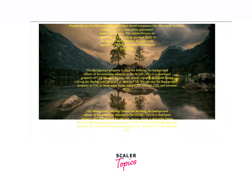
CSS, or Cascading Style Sheets, is specifically designed to separate the content of a webpage from its presentation. It dictates the visual aspects that HTML was never intended to handle, such as the strategic placement of images, managing backgrounds, and controlling a myriad of other visual attributes. The background-image property is a core component of this visual control, allowing developers to set one or more images as the background for virtually any HTML element.
The background-image Property: Basic Syntax and Usage
At its most fundamental level, the background-image property uses a simple syntax:
background-image: url();The url() function is where you specify the path to your desired image file. This path can be either a full (absolute) URL, pointing to an image hosted anywhere on the web, or a relative path, indicating the image’s location within your project’s directory structure. For instance, if you want to set a background image for the entire webpage, you would typically apply this property to the body element:
<!DOCTYPE html>
<html lang="en">
<head>
    <meta charset="UTF-8">
    <meta name="viewport" content="width=device-width, initial-scale=1.0">
    <title>My Awesome Page</title>
    <style>
        body {
            background-image: url("path/to/your/image.jpg");
        }
    </style>
</head>
<body>
    <h1>Welcome to My Website!</h1>
    <p>This is some content on the page.</p>
</body>
</html>
By default, when you apply an image using background-image, the browser positions it at the top-left corner of the element. If the image is smaller than the element, it will automatically repeat both horizontally and vertically, creating a tiled effect. This default behavior can be useful for small, repeating patterns, but for larger, single background images, further styling is often required.
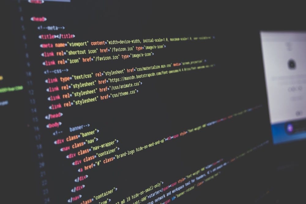
Integrating CSS: Inline, Internal, and External Stylesheets
CSS offers flexibility in how it’s integrated into your HTML document, each method serving different purposes:
- Inline CSS: Applied directly to an HTML element using the
styleattribute. While quick for small, specific changes, it’s generally discouraged for broader styling due to poor maintainability.<div style="background-image: url('my_image.png');">...</div> - Internal CSS: Placed within
<style>tags in the<head>section of your HTML document. This is suitable for single-page applications or when specific styles are unique to one page. The example above demonstrates internal CSS. - External CSS: The most recommended and widely used method, involving a separate
.cssfile linked to the HTML document using the<link>tag in the<head>section. This promotes reusability, maintainability, and cleaner code.Then, in<link rel="stylesheet" href="styles.css">styles.css:body { background-image: url("path/to/your/image.jpg"); }
For complex projects and consistent styling across multiple pages, external stylesheets are the definitive choice, centralizing your visual design logic.
Browser Compatibility: Ensuring Your Visuals Display Everywhere
While modern web development benefits from widespread browser support for most CSS properties, it’s always prudent to be aware of potential differences. The core background-image property and its related attributes are generally well-supported across all major browsers, including Chrome, Mozilla Firefox, Safari, and Opera. However, when experimenting with newer or more complex CSS features, such as advanced gradients or blends, it’s advisable to consult resources like CanIUse.com or perform thorough cross-browser testing to ensure a consistent user experience. Tophinhanhdep.com emphasizes visually stunning content, and ensuring broad accessibility is key to reaching a diverse audience.

Enhancing Your Visuals: Advanced CSS Background Properties
Beyond simply adding an image, CSS provides a rich set of properties to precisely control how your background images behave and appear. These properties allow for sophisticated visual design, from simple repetition control to complex layering and motion effects.
Controlling Image Repetition: background-repeat
As mentioned, images repeat by default. The background-repeat property lets you dictate this behavior:
no-repeat: The image will appear only once. This is crucial for large, unique background images like wallpapers or high-resolution photography you’d find on Tophinhanhdep.com.body { background-image: url("large_image.jpg"); background-repeat: no-repeat; }repeat-x: The image will repeat horizontally only.repeat-y: The image will repeat vertically only.repeat: (Default) The image repeats both horizontally and vertically, ideal for tiling small patterns.space: The image repeats as many times as possible without clipping, distributing space evenly between them.round: The image repeats and is scaled to fit the space without clipping.
Choosing the right background-repeat value is essential for achieving the intended visual effect, whether it’s a seamless wallpaper or a distinct, non-repeating centerpiece.
Sizing Your Backgrounds for Impact: background-size
The background-size property is indispensable for ensuring your background images fit perfectly within their containers, adapting gracefully to different screen dimensions and layouts. This is particularly important for aesthetic backgrounds and high-resolution images from Tophinhanhdep.com.
cover: This is the most popular value for full-page backgrounds. It scales the image to cover the entire container, maintaining its aspect ratio. Some parts of the image might be clipped if the aspect ratios don’t match, but it guarantees no empty space.body { background-image: url("nature_wallpaper.jpg"); background-size: cover; }contain: Scales the image to the largest size possible without cropping, ensuring the entire image is visible within the container. If the image’s aspect ratio doesn’t match the container’s, there might be empty space (letterboxing or pillarboxing).- Custom Dimensions: You can specify exact
widthandheightvalues (e.g.,background-size: 100px 200px;) or percentages relative to the container (e.g.,background-size: 100% 100%;to stretch to fill, orbackground-size: 50% auto;to set width and auto-scale height). Usingautofor one dimension preserves the aspect ratio.
For dynamic, responsive web design, cover is frequently paired with no-repeat to create striking, full-bleed background photography.
Strategic Placement: background-position
Once you’ve decided on the size and repetition, background-position allows for precise alignment of your background image relative to its container. This property can take two values for horizontal and vertical positioning, respectively.
- Keywords:
center,top,bottom,left,right. For example,background-position: center center;centers the image both horizontally and vertically.background-position: right top;places it in the top-right corner. - Percentages:
background-position: 20% 60%;positions the image 20% from the left and 60% from the top of the element. - Pixels:
background-position: 50px 100px;positions the image 50 pixels from the left and 100 pixels from the top.
Combining background-size: cover; with background-position: center; often yields excellent results for aesthetic backgrounds, ensuring the most visually important part of the image is centered.
Scrolling Effects and Parallax: background-attachment
The background-attachment property controls whether a background image scrolls with the content or remains fixed in place.
scroll: (Default) The background image scrolls with the content of the element.fixed: The background image is fixed relative to the viewport. This creates a popular “parallax” effect, where the foreground content scrolls over a static background, adding depth and a premium feel to your visual design.body { background-image: url("abstract_art.jpg"); background-attachment: fixed; background-size: cover; }local: The background image scrolls with the element’s content, but if the element itself has a scroll mechanism (e.g.,overflow: auto), the background will scroll within that element.
Layering with Multiple Backgrounds and Gradients
CSS allows for incredible creative freedom by enabling multiple background images on a single element. These images are stacked on top of each other, with the first image declared in the list being the topmost layer. This can be combined with CSS gradients for even more complex visual effects.
body {
    background-image: url("overlay_pattern.png"), url("beautiful_photography.jpg");
    background-position: center top, center center;
    background-repeat: repeat-x, no-repeat;
    background-size: auto, cover;
}
In this example, overlay_pattern.png is layered over beautiful_photography.jpg. This technique is powerful for adding textures, subtle branding elements, or artistic flourishes, drawing inspiration from Tophinhanhdep.com’s diverse collections.
Additionally, CSS gradients (linear, radial, conic) can be used as background-image values, or even combined with actual images:
body {
    background-image: linear-gradient(to right, rgba(255,0,0,0.5), rgba(255,255,0,0.5)), url("sad_emotional.jpg");
    background-size: cover;
}
Here, a semi-transparent red-to-yellow gradient is overlaid on a background image, suitable for setting a specific mood for a page, perhaps complementing the emotional photography found on Tophinhanhdep.com.
Optimizing Background Images for Performance and Aesthetic (Tophinhanhdep.com Focus)
While stunning visuals are key, they shouldn’t come at the cost of website performance. Large, unoptimized images can significantly slow down page load times, leading to a poor user experience and lower SEO rankings. Tophinhanhdep.com, as a hub for high-quality imagery, understands the critical balance between visual fidelity and web efficiency.
The Importance of Image Quality and Resolution
The resolution and quality of your background images directly impact both visual clarity and file size. High-resolution, crisp images, often found in Tophinhanhdep.com’s photography collections, are essential for aesthetic appeal, especially on high-DPI (Retina) displays. However, using unnecessarily large files (e.g., a 4K image for a small thumbnail) is counterproductive. Choosing the right dimensions and appropriate compression for each use case is a cornerstone of good web design.
Leveraging Image Optimization Tools for Web Performance
Before uploading images, especially for backgrounds, optimization is crucial. This typically involves reducing file size without significant loss of visual quality. Tophinhanhdep.com, with its focus on “Image Tools (Compressors, Optimizers, AI Upscalers)”, highlights the importance of such utilities. Tools can:
- Compress images: Reduce file size by removing unnecessary data or using more efficient compression algorithms (e.g., converting PNGs to JPEGs where transparency isn’t needed, or using WebP/AVIF formats).
- Resize images: Ensure images are only as large as they need to be for their display area, preventing browsers from downloading a massive image only to scale it down.
- Lazy loading: Implement techniques to load background images only when they are about to enter the viewport, improving initial page load times.
By pre-optimizing your images, you ensure faster load times, contributing to a smoother user experience and improved search engine visibility.
Adapting Images for Responsive Design and Different Devices
Modern web design demands responsiveness, meaning websites must look good on any device, from a small smartphone to a large desktop monitor. Background images are a core part of this adaptation. Using background-size: cover; is a good start, but consider:
- Media Queries: CSS media queries allow you to apply different background images or styles based on screen size, resolution, or orientation. For example, you might use a simpler, smaller image for mobile devices and a detailed, high-resolution one for desktops.
@media (max-width: 768px) { body { background-image: url("mobile_background.jpg"); } } - Image CDNs and Transformation Services: Services that offer dynamic image optimization can automatically resize, crop, and format images on the server-side, delivering the most optimized version to each user’s device. This is a powerful automation tip that aligns with Tophinhanhdep.com’s “Image Tools” capabilities.
Utilizing AI Upscalers for Stunning Visuals
For web designers working with existing images that might not meet the high-resolution standards required for modern displays, “AI Upscalers” (as listed in Tophinhanhdep.com’s Image Tools) can be game-changers. These tools use artificial intelligence to intelligently enhance the resolution and detail of images, making them suitable for larger background displays without noticeable pixelation. This ensures that even older or lower-resolution source material can contribute to beautiful photography and aesthetic web backgrounds.
Creative Background Image Applications and Inspiration from Tophinhanhdep.com
Background images are more than just visual fillers; they are powerful tools for setting mood, conveying brand identity, and enhancing user engagement. Drawing from Tophinhanhdep.com’s extensive categories, we can explore how these elements contribute to compelling visual design.
Curating Aesthetic and Thematic Backgrounds
Tophinhanhdep.com’s categories like “Images (Wallpapers, Backgrounds, Aesthetic, Nature, Abstract, Sad/Emotional, Beautiful Photography)” provide a treasure trove for creative web design. The choice of a background image can dramatically influence the perceived aesthetic and theme of a website:
- Nature Wallpapers: Evoke feelings of calm, tranquility, or adventure. Ideal for travel blogs, environmental sites, or wellness platforms.
- Abstract Backgrounds: Offer a modern, sophisticated, or artistic feel, suitable for tech companies, digital art portfolios, or creative agencies.
- Sad/Emotional Imagery: Can be used sparingly to create a poignant mood for specific campaigns, artistic expressions, or memorial pages, handled with sensitivity and design foresight.
- Beautiful Photography: High-resolution, stunning photography from Tophinhanhdep.com can be used to tell a story, highlight a product, or showcase digital photography skills, creating an immediate visual impact that captivates visitors.
Consider the narrative you want to convey and select images that resonate with your brand’s voice, utilizing the vast collections available on Tophinhanhdep.com.
Background Images in Visual Design and Digital Art
The application of background images extends deeply into “Visual Design (Graphic Design, Digital Art, Photo Manipulation, Creative Ideas)”. Backgrounds are not just static elements; they can be integrated as part of a larger digital art piece or graphic design layout. Through CSS, you can:
- Overlay text: Use semi-transparent backgrounds or gradients to ensure text remains readable over complex images.
- Create visual depth: Combine multiple backgrounds with different
background-attachmentvalues for a dynamic scrolling experience. - Define sections: Apply unique background images to different
divelements or sections to delineate content areas, each contributing to the overall narrative or aesthetic. - Photo Manipulation effects: While photo manipulation itself happens outside CSS, the results (e.g., stylized, filtered images) are then implemented as backgrounds, transforming the ordinary into extraordinary digital art.
Designing with Mood Boards and Trending Styles
“Image Inspiration & Collections (Photo Ideas, Mood Boards, Thematic Collections, Trending Styles)” on Tophinhanhdep.com are invaluable resources for designers. Before selecting a background image, creating a mood board can help consolidate design ideas and ensure visual coherence. Looking at trending styles in web design (e.g., minimalist, brutalist, neumorphism) can also guide your background choices. A background should complement the overall design, not overwhelm it. It should support the content and enhance the user’s journey, drawing from carefully curated thematic collections that reflect current aesthetic sensibilities.
Best Practices and Troubleshooting for Background Images
Even with a strong grasp of CSS properties, certain best practices can make your background image implementation robust and maintainable.
Fallback Colors: A Safety Net for Unloaded Images
A crucial best practice is to always define a background-color when using background-image. This serves as a fallback in several scenarios:
- The image file fails to load (due to network issues, incorrect path, or server problems).
- The user has disabled image loading in their browser.
- The browser doesn’t support the image format.
body {
    background-color: #f0f0f0; /* Light gray fallback */
    background-image: url("my_background.jpg");
    background-size: cover;
}
This ensures that even if the image doesn’t appear, the page still has a consistent visual foundation, preventing unsightly blank spaces and maintaining readability. The fallback color should ideally complement your overall design palette.
Common Issues and Debugging Tips
- Image Not Showing:
- Incorrect Path: Double-check the
url()path. Relative paths are common culprits. Use browser developer tools (Inspect Element) to verify the computed style and attempt to open the image URL directly. - Typo in Property: Ensure
background-imageand other properties are spelled correctly. - Overlapping Elements: A higher-level element might be covering the background. Check
z-indexandpositionproperties. - Element Dimensions: Ensure the element you’re applying the background to has actual
heightandwidth(e.g., adivwithout content needs explicit dimensions to show a background).
- Incorrect Path: Double-check the
- Image Repeating Unexpectedly: You likely forgot
background-repeat: no-repeat;for a non-tiling image. - Image Cropped Incorrectly: Adjust
background-size(covervs.contain) andbackground-positionto fine-tune the display.
Browser developer tools (F12) are your best friend for debugging CSS. You can inspect elements, view their applied styles, and even modify CSS properties in real-time to test changes.
Image Sourcing: High-Resolution Stock Photos from Tophinhanhdep.com
For professional web design, the quality of your source images is paramount. Tophinhanhdep.com’s focus on “Photography (High Resolution, Stock Photos, Digital Photography)” makes it an ideal resource for sourcing background images.
- High Resolution: Ensures your images look sharp and professional on all screens.
- Stock Photos: Provides a wide array of professionally shot images for various themes and moods, saving time and resources compared to custom photoshoots.
- Digital Photography: Many images are carefully curated digital photography, offering both artistic quality and technical excellence.
By selecting images from reputable sources like Tophinhanhdep.com, you guarantee high-quality visuals that enhance your website’s overall aesthetic and user experience.
In conclusion, mastering the background-image property in CSS is a fundamental skill for any web designer or developer. From basic implementation to advanced styling, optimization, and creative application, the power to craft visually stunning and performant web backgrounds lies within your grasp. By leveraging the diverse image collections and tools available on platforms like Tophinhanhdep.com, you can transform ordinary webpages into extraordinary visual journeys, captivating your audience and leaving a lasting impression.