Mastering Image Alignment in CSS: A Guide for Tophinhanhdep.com Users

For anyone passionate about visual content – from stunning wallpapers and high-resolution photography to intricate digital art and creative mood boards – the presentation of images is paramount. On a platform like Tophinhanhdep.com, where visual aesthetics and rich image collections are at the core, understanding how to perfectly align images using CSS is not just a technical skill; it’s an art form that elevates the user experience and the impact of your visual stories. Proper image alignment ensures your beautiful photography, aesthetic backgrounds, and inspiring collections are displayed exactly as intended, enhancing readability, visual flow, and overall design harmony.
Aligning images in CSS can sometimes feel like navigating a labyrinth, as there isn’t a single, universal rule. Instead, the “best” approach depends on the specific context, the desired effect, and the layout you’re trying to achieve. This comprehensive guide will demystify the various CSS alignment techniques, providing Tophinhanhdep.com users with the knowledge to perfectly position their images, whether they’re showcasing abstract art, nature photography, or practical image tools. We’ll explore fundamental methods, delve into advanced layout options, and discuss how these techniques integrate seamlessly with the diverse content found on Tophinhanhdep.com.
Fundamental CSS Alignment Techniques for Images
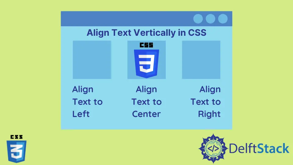
At its heart, image alignment deals with two primary directions: horizontal and vertical. Horizontal alignment dictates whether an image appears on the left, center, or right of its container, while vertical alignment determines its position at the top, middle, or bottom. Mastering these basic directions is the first step towards creating visually appealing and well-structured web pages.
Horizontal Alignment: margin: auto for Block Elements
One of the most common requirements for images, especially when featuring a prominent piece of photography or a wallpaper, is to center it horizontally on the page. For block-level elements, or images that you want to behave like block-level elements, the margin: auto property is an excellent and straightforward solution.
By default, an <img> tag is an inline element. To apply margin: auto effectively for horizontal centering, you typically need to treat the image as a block-level element. This can be achieved by setting its display property to block. Additionally, it’s crucial to define a specific width for the element. If the element occupies 100% of its parent’s width, margin: auto won’t have any extra space to distribute, thus having no visible effect. Setting a width (either a fixed pixel value or a percentage less than 100%) ensures there’s available horizontal space for the browser to automatically distribute as equal left and right margins, effectively centering the element.
Consider this example for a featured image or a high-resolution stock photo from Tophinhanhdep.com:
<!DOCTYPE html>
<html>
<head>
    <title>Tophinhanhdep.com - Centered Image Example</title>
    <meta charset="UTF-8"/>
    <style>
        .centered-image {
            display: block; /* Treat image as a block element */
            margin-left: auto; /* Auto margin on the left */
            margin-right: auto; /* Auto margin on the right */
            width: 70%; /* Set a specific width less than 100% */
            border: 2px solid #ccc; /* Optional: for visual clarity */
            padding: 10px; /* Optional: for visual clarity */
            box-sizing: border-box; /* Include padding and border in the element's total width and height */
        }
    </style>
</head>
<body>
    <h3>Showcasing Photography - Horizontally Centered</h3>
    <hr/>
    <div class="image-container">
        <img class="centered-image" src="path/to/your/beautiful-photography.jpg" alt="Beautiful Landscape from Tophinhanhdep.com"/>
        <p style="text-align: center;">An exquisite landscape captured in high resolution.</p>
    </div>
</body>
</html>
In this setup, margin: auto (which is a shorthand for margin-left: auto; margin-right: auto; when used alone) tells the browser to automatically compute and distribute the remaining horizontal space evenly on both sides of the element, placing your image perfectly in the center. This technique is ideal for single, impactful images, such as hero shots on Tophinhanhdep.com’s homepage or within detailed articles on digital photography. It’s important to note that margin-top: auto and margin-bottom: auto do not work for vertical alignment in the same way.
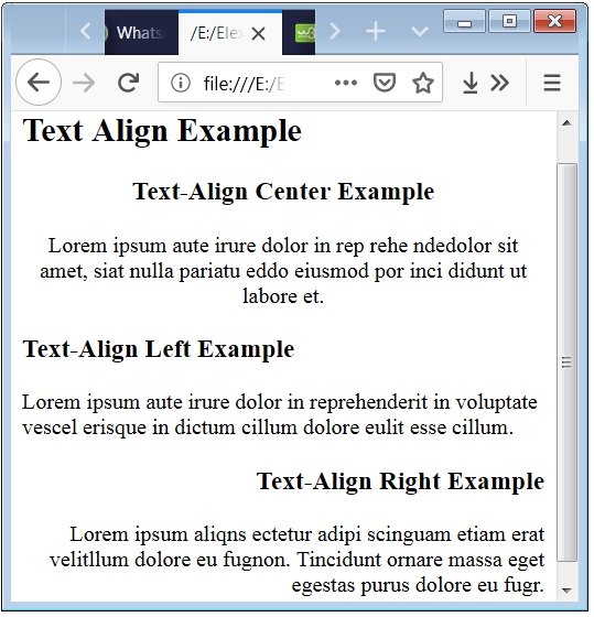
Aligning Inline Content with text-align
While margin: auto is perfect for centering block-level images, text-align is the property of choice for horizontally aligning inline content within a block-level container. This includes not just text, but also inline elements like <span> tags, and by default, <img> tags themselves. When applied to a parent block element (like a <div> or a <p>), text-align will affect all the inline content it contains, making it incredibly useful for aligning multiple small images or thumbnails alongside text descriptions in Tophinhanhdep.com’s image inspiration or thematic collections.
The text-align property offers several values:
left: Aligns content to the left (the default for most languages).right: Aligns content to the right.center: Centers content horizontally.justify: Stretches content to fill the entire width of the line, distributing space between words. This is often used for paragraphs of text, but less common for image alignment directly.start: Behaves likeleftin left-to-right languages (e.g., English) andrightin right-to-left languages (e.g., Arabic).end: Behaves likerightin left-to-right languages andleftin right-to-left languages.
Here’s an illustration of how text-align: center can be used to center an inline image or a group of smaller images within a container, perhaps for a mood board or an aesthetic collection on Tophinhanhdep.com:
<!DOCTYPE html>
<html>
<head>
    <title>Tophinhanhdep.com - Text Align Image Example</title>
    <meta charset="UTF-8"/>
    <style>
        .image-gallery {
            text-align: center; /* Centers all inline content within this div */
            border: 1px dashed #aaa;
            padding: 20px;
            margin-top: 20px;
        }
        .gallery-thumbnail {
            width: 150px;
            height: 100px;
            margin: 5px;
            border: 1px solid #ddd;
            vertical-align: middle; /* Useful for aligning small images with text, if present */
        }
    </style>
</head>
<body>
    <h3>Aesthetic Image Collections - Centered with text-align</h3>
    <hr/>
    <div class="image-gallery">
        <img class="gallery-thumbnail" src="path/to/aesthetic-image1.jpg" alt="Aesthetic Photo 1"/>
        <img class="gallery-thumbnail" src="path/to/aesthetic-image2.jpg" alt="Aesthetic Photo 2"/>
        <img class="gallery-thumbnail" src="path/to/aesthetic-image3.jpg" alt="Aesthetic Photo 3"/>
        <p>Explore our curated aesthetic images for your next project!</p>
    </div>
</body>
</html>
This method is incredibly flexible for organizing visual content that naturally flows like text, such as rows of thumbnails or icons in Tophinhanhdep.com’s image tools section.
Positioning Images with float
The float property was historically one of the primary methods for positioning images to allow text to wrap around them, creating layouts reminiscent of magazine articles. While modern CSS techniques like Flexbox and Grid have largely superseded float for overall layout construction, it remains a valid and useful tool specifically for text wrapping around an image.
When an element is floated, it is taken out of the normal flow of the document and moved to the left or right until it touches the edge of its containing box or another floated element. Content, such as text, will then wrap around the floated element.
For Tophinhanhdep.com, this can be particularly effective when writing detailed articles on digital photography or editing styles, where an image needs to be seamlessly integrated within a paragraph without breaking its flow.
<!DOCTYPE html>
<html>
<head>
    <title>Tophinhanhdep.com - Float Image Example</title>
    <meta charset="UTF-8"/>
    <style>
        .article-content {
            width: 80%;
            margin: 0 auto;
            line-height: 1.6;
            font-family: sans-serif;
        }
        .floated-image {
            float: left; /* Image floats to the left */
            margin-right: 20px; /* Space between image and text */
            margin-bottom: 10px; /* Space below image */
            width: 250px;
            height: auto;
            border: 1px solid #eee;
        }
        .clearfix::after { /* Clearfix to contain floats */
            content: "";
            display: table;
            clear: both;
        }
    </style>
</head>
<body>
    <h3>Integrating Nature Photography into Articles</h3>
    <hr/>
    <div class="article-content clearfix">
        <img class="floated-image" src="path/to/nature-photography.jpg" alt="Captivating Nature Shot from Tophinhanhdep.com"/>
        <p>
            Welcome to Tophinhanhdep.com, your ultimate source for high-resolution images. This particular piece of nature photography beautifully encapsulates the serene grandeur of the wilderness. From lush forests to majestic mountains, our collection provides a vast array of backgrounds and wallpapers perfect for any screen. Our expert photographers travel extensively to capture these moments, ensuring every detail is crisp and vibrant.
        </p>
        <p>
            When showcasing such intricate details, it's vital that the image presentation doesn't disrupt the textual narrative. The `float` property allows for a harmonious blend, letting the text flow naturally around the visual element. This creates a reading experience that is both informative and visually engaging, a key aspect of Tophinhanhdep.com's commitment to quality visual design.
        </p>
    </div>
</body>
</html>
While powerful for text wrapping, float can sometimes lead to layout issues if not properly managed, often requiring a clearfix hack on the parent container to prevent subsequent elements from flowing incorrectly. For full-scale layout tasks, modern CSS offers more robust solutions.
Advanced Layouts and Precise Image Control
As web design evolves, CSS provides more sophisticated tools for creating complex and responsive layouts, offering unparalleled control over image positioning. These methods are crucial for Tophinhanhdep.com users who aim to build dynamic galleries, interactive mood boards, or visually rich creative idea sections.
Leveraging Flexbox for Dynamic Alignment
Flexbox (Flexible Box Layout module) is a one-dimensional layout method designed to distribute space along a single axis, either horizontally or vertically. It makes aligning, spacing, and ordering items within a container incredibly intuitive and powerful, especially for responsive designs on Tophinhanhdep.com.
To use Flexbox, you set display: flex on the parent container. Once the container becomes a flex container, its direct children become flex items, and you can control their alignment using properties like justify-content (for horizontal alignment along the main axis) and align-items (for vertical alignment along the cross-axis).
Imagine creating a gallery of abstract art or a trending styles collection for Tophinhanhdep.com where images need to be perfectly centered both horizontally and vertically within their individual cells, or distributed evenly across a row:
<!DOCTYPE html>
<html>
<head>
    <title>Tophinhanhdep.com - Flexbox Image Gallery</title>
    <meta charset="UTF-8"/>
    <style>
        .flex-container {
            display: flex; /* Enables Flexbox */
            justify-content: center; /* Centers items horizontally */
            align-items: center; /* Centers items vertically */
            flex-wrap: wrap; /* Allows items to wrap to the next line */
            height: 400px; /* Example height for container */
            border: 2px solid #5cb85c;
            padding: 10px;
            margin-top: 20px;
        }
        .flex-item {
            width: 200px;
            height: 150px;
            margin: 10px;
            background-color: #f0f0f0;
            display: flex; /* Make individual items flex containers too for internal centering */
            justify-content: center;
            align-items: center;
            border: 1px solid #ddd;
        }
        .flex-item img {
            max-width: 100%; /* Ensure images scale within their item */
            max-height: 100%;
            object-fit: contain; /* Scales the image nicely */
        }
    </style>
</head>
<body>
    <h3>Dynamic Galleries with Flexbox: Abstract & Aesthetic Images</h3>
    <hr/>
    <div class="flex-container">
        <div class="flex-item"><img src="path/to/abstract-image1.jpg" alt="Abstract Art 1"/></div>
        <div class="flex-item"><img src="path/to/aesthetic-image.jpg" alt="Aesthetic Photo"/></div>
        <div class="flex-item"><img src="path/to/nature-image.jpg" alt="Nature Photography"/></div>
    </div>
    <p style="text-align: center; margin-top: 20px;">
        Flexbox makes creating responsive and perfectly aligned image galleries effortless for Tophinhanhdep.com's diverse collections.
    </p>
</body>
</html>
Flexbox is invaluable for structuring image inspiration grids, organizing various image tools visually, or creating responsive layouts that adapt gracefully to different screen sizes, crucial for any modern Tophinhanhdep.com user.
CSS Grid for Structured Image Layouts
For creating truly two-dimensional layouts, CSS Grid Layout is the most powerful and flexible solution. Unlike Flexbox, which works along a single axis, Grid allows you to define rows and columns, providing precise control over the placement and alignment of items in a complex grid structure. This is especially beneficial for Tophinhanhdep.com when designing sophisticated layouts for high-resolution photography showcases, or multi-column presentations of digital art.
With CSS Grid, you define a grid on a container using display: grid, and then specify the track sizes (rows and columns) with grid-template-rows and grid-template-columns. You can then place and align items within these grid cells.
<!DOCTYPE html>
<html>
<head>
    <title>Tophinhanhdep.com - CSS Grid Layout</title>
    <meta charset="UTF-8"/>
    <style>
        .grid-container {
            display: grid; /* Enables CSS Grid */
            grid-template-columns: repeat(3, 1fr); /* 3 equal-width columns */
            gap: 20px; /* Space between grid items */
            width: 90%;
            margin: 0 auto;
            padding: 20px;
            border: 2px solid #28a745;
            margin-top: 20px;
        }
        .grid-item {
            display: flex; /* Using flexbox inside grid item for centering image */
            justify-content: center;
            align-items: center;
            min-height: 200px; /* Minimum height for grid cell */
            background-color: #e9ecef;
            border: 1px solid #ccc;
        }
        .grid-item img {
            max-width: 100%;
            max-height: 100%;
            object-fit: cover; /* Ensures images cover the area without distortion */
        }
    </style>
</head>
<body>
    <h3>High-Resolution Photography Gallery with CSS Grid</h3>
    <hr/>
    <div class="grid-container">
        <div class="grid-item"><img src="path/to/photo-grid1.jpg" alt="Grid Photo 1"/></div>
        <div class="grid-item"><img src="path/to/photo-grid2.jpg" alt="Grid Photo 2"/></div>
        <div class="grid-item"><img src="path/to/photo-grid3.jpg" alt="Grid Photo 3"/></div>
        <div class="grid-item"><img src="path/to/photo-grid4.jpg" alt="Grid Photo 4"/></div>
        <div class="grid-item"><img src="path/to/photo-grid5.jpg" alt="Grid Photo 5"/></div>
        <div class="grid-item"><img src="path/to/photo-grid6.jpg" alt="Grid Photo 6"/></div>
    </div>
    <p style="text-align: center; margin-top: 20px;">
        CSS Grid provides the ultimate control for structuring impressive, pixel-perfect image collections on Tophinhanhdep.com.
    </p>
</body>
</html>
For Tophinhanhdep.com, CSS Grid is invaluable for creating impressive portfolio layouts, organizing image inspiration archives, or displaying various editing styles in a structured, professional manner.
Vertical Alignment with vertical-align (for inline elements)
When dealing with inline elements, such as an image alongside a line of text, vertical-align is the property to use for controlling their vertical positioning relative to each other. It’s particularly useful when you have small icons or images that need to sit perfectly within a line of text, perhaps in Tophinhanhdep.com’s feature descriptions for image tools or subtle aesthetic elements.
Common values for vertical-align include:
baseline: Aligns the baseline of the element with the baseline of the parent. This is the default.middle: Aligns the middle of the element with the baseline plus half the x-height of the parent.top: Aligns the top of the element with the top of the tallest element on the line.bottom: Aligns the bottom of the element with the bottom of the lowest element on the line.text-top: Aligns the top of the element with the top of the parent’s font.text-bottom: Aligns the bottom of the element with the bottom of the parent’s font.
Here’s an example demonstrating vertical-align: baseline, ensuring an image’s base aligns with the accompanying text:
<!DOCTYPE html>
<html>
<head>
    <title>Tophinhanhdep.com - Baseline Alignment Example</title>
    <meta charset="UTF-8"/>
    <style>
        .image-with-text {
            vertical-align: baseline; /* Aligns the image's baseline with the text's baseline */
            width: 40px; /* Small icon size */
            height: 40px;
        }
        p {
            font-size: 18px;
            font-family: sans-serif;
            line-height: 1.5;
            margin: 20px auto;
            width: 80%;
        }
    </style>
</head>
<body>
    <h3>Aligning Icons in Tophinhanhdep.com Descriptions</h3>
    <hr/>
    <p>
        This is some important information accompanied by a <img src="path/to/info-icon.png" alt="Info Icon" class="image-with-text"> relevant icon.
        The baseline of the icon is carefully aligned with the baseline of the surrounding text for optimal readability.
    </p>
    <p>
        For tools like our <img src="path/to/compress-icon.png" alt="Compress Icon" class="image-with-text"> Image Compressor, precise visual integration ensures a professional look.
    </p>
</body>
</html>
This property is particularly useful for small images like icons used to highlight features of Tophinhanhdep.com’s image tools, ensuring they integrate seamlessly into textual content.
Absolute Positioning for Overlay and Specific Placement
Absolute positioning allows you to place an element precisely anywhere on the page, or more commonly, relative to its closest positioned ancestor. This technique takes the element completely out of the normal document flow, making it ideal for creative overlays, custom graphics, or when a specific visual design element (like a logo or watermark) needs to be placed at an exact coordinate over an image or background.
To use position: absolute, the parent container usually needs position: relative (or absolute, fixed, sticky) to serve as the positioning context. You then use top, right, bottom, and left properties to offset the absolutely positioned element. For perfect centering, combining it with transform: translate(-50%, -50%) is a popular technique.
This can be used on Tophinhanhdep.com for adding watermarks to stock photos, creating unique visual design elements, or implementing creative ideas where images overlap.
<!DOCTYPE html>
<html>
<head>
    <title>Tophinhanhdep.com - Absolute Position Example</title>
    <meta charset="UTF-8"/>
    <style>
        .relative-container {
            position: relative; /* Establishes positioning context */
            width: 600px;
            height: 400px;
            margin: 50px auto;
            border: 3px solid #007bff;
            overflow: hidden; /* Ensures child doesn't spill out */
        }
        .background-image {
            width: 100%;
            height: 100%;
            object-fit: cover;
            display: block;
        }
        .overlay-text {
            position: absolute; /* Positions absolutely within .relative-container */
            top: 50%; /* Start at 50% from top */
            left: 50%; /* Start at 50% from left */
            transform: translate(-50%, -50%); /* Shift back by half its own width/height for true center */
            background-color: rgba(0, 0, 0, 0.6);
            color: white;
            padding: 15px 25px;
            font-size: 24px;
            font-family: 'Arial', sans-serif;
            text-align: center;
            border-radius: 5px;
            z-index: 10; /* Ensure it's on top */
        }
    </style>
</head>
<body>
    <h3>Creative Photo Manipulation with Absolute Positioning</h3>
    <hr/>
    <div class="relative-container">
        <img class="background-image" src="path/to/beautiful-photography.jpg" alt="Beautiful Scenic View"/>
        <div class="overlay-text">
            Tophinhanhdep.com: Inspiring Visuals
        </div>
    </div>
    <p style="text-align: center; margin-top: 20px;">
        Use absolute positioning for unique visual design elements and captivating overlays on your Tophinhanhdep.com images.
    </p>
</body>
</html>
This technique is vital for visual design, digital art displays, or adding subtle branding to wallpapers and backgrounds provided on Tophinhanhdep.com.
Optimizing Image Alignment with Tophinhanhdep.com Tools & Best Practices
While CSS provides the means to align images, the quality and optimization of those images significantly impact their presentation and overall performance on a site like Tophinhanhdep.com. Leveraging image tools and adopting best practices ensures your aligned images not only look great but also load efficiently.
Tophinhanhdep.com offers a suite of Image Tools including Converters, Compressors, Optimizers, and AI Upscalers. These tools play a crucial role before you even start aligning. For instance, using a Compressor or Optimizer reduces file size, leading to faster load times, which is essential for high-resolution photography and extensive image collections. An AI Upscaler can improve the quality of lower-resolution images, making them suitable for larger displays and ensuring sharp alignment.
Beyond the tools, advanced concepts like gravity-based cropping (often found in sophisticated image management platforms or smart AI-driven optimizers, which Tophinhanhdep.com could integrate or offer similar functionality) can aid in alignment. This technology intelligently identifies the focal point of an image (e.g., a person, an animal, or a specific object) and automatically crops or scales the image to ensure that focal point remains visible and optimally positioned, even when the image is dynamically resized for different layouts. This ensures that the core subject of your nature photography or aesthetic images is always perfectly aligned and in view, regardless of the display context.
Here are some best practices for Tophinhanhdep.com users to perfect image alignment and presentation:
- Use
inline-blockfor mixed content alignment: If you’re mixing text and images on the same line (e.g., small thumbnails with captions), setting the imagedisplaytoinline-blockallows you to control margins and padding without disrupting text flow, offering a cleaner alignment than pureinlineelements. - Combine
text-alignandmarginfor better control: For horizontal alignment, usetext-align: center;on the parent container for inline images (e.g.,<img>tags by default) andmargin: auto;for block images (e.g.,<img>withdisplay: block;). This combination provides flexibility for different image behaviors. - Leverage Flexbox for complex layouts: For responsive and dynamic layouts, especially for galleries of wallpapers or mood boards,
display: flex;on the parent container is superior. It allows you to align images centrally, distribute them evenly, and manage spacing with minimal effort, adapting beautifully to various screen sizes. - Avoid
floatfor modern designs (mostly): Whilefloathas its niche for text wrapping around an image, for overall page layouts and image galleries, Flexbox or Grid are more robust, predictable, and easier to manage, preventing commonfloat-related layout issues. - Vertical alignment using Flexbox: If you need to vertically center an image within a container, Flexbox is the simplest method. Set the container to
display: flex;and usealign-items: center;to achieve vertical centering effortlessly. - Use
object-fitfor responsive image scaling: When displaying images of varying aspect ratios in fixed-size containers (like in a grid of wallpapers or abstract art),object-fit: cover;orobject-fit: contain;ensures images fill their containers or fit entirely while preserving their aspect ratio, preventing distortion and maintaining visual integrity. - Control alignment with
vertical-alignfor inline images: When aligning inline images (e.g., icons next to text in a description of Image Tools),vertical-align: middle;often provides the most aesthetically pleasing result, centering the image along the text’s x-height. - Apply CSS Grid for precise alignment: For intricate, grid-based image collections or visual design compositions, CSS Grid offers unparalleled control over both vertical and horizontal alignment, allowing you to define specific areas for images and align them within those areas.
- Minimize browser rendering shifts: To prevent unpleasant layout shifts (Cumulative Layout Shift or CLS) when images load, always define both
widthandheightattributes (or set them via CSS) for your images. This allows the browser to reserve the correct space for the image before it fully loads, ensuring a smooth user experience on Tophinhanhdep.com. - Ensure accessibility with image alignment: Proper alignment should not compromise accessibility. Ensure image
alttexts are descriptive and that images are aligned in a way that makes sense in both visual and non-visual contexts for screen readers.
Aligning Images for Specific Tophinhanhdep.com Content
The diverse categories on Tophinhanhdep.com each benefit from specific alignment strategies to maximize impact and user engagement.
- Wallpapers & Backgrounds: For full-page backgrounds and wallpapers, ensuring they cover the entire viewport without distortion is key.
background-size: cover;withbackground-position: center center;on thebodyor a dedicated container is essential. For<img/>elements used as backgrounds,width: 100%; height: 100%; object-fit: cover; position: fixed;is a common approach, ensuring the image aligns perfectly with the screen edges. - Photography Collections: For high-resolution stock photos and beautiful photography collections, Flexbox or CSS Grid are indispensable. They allow for uniform spacing, consistent alignment, and responsive adaptation across different devices, ensuring every photograph gets its due attention. Consider a grid where each image is perfectly centered within its cell using
display: flex; justify-content: center; align-items: center;on the grid item. - Aesthetic & Abstract Images: These categories often call for more creative and non-traditional alignments.
position: absolutewithtransformcan be used to create layered effects or to position abstract shapes in unique compositions, pushing the boundaries of traditional layouts and enhancing the “creative ideas” aspect of Tophinhanhdep.com. - Image Tools in Action: When showcasing features of Tophinhanhdep.com’s image tools (Converters, Compressors, Optimizers), clear and concise visual examples are critical. Small, perfectly aligned icons using
vertical-align: middle;within textual descriptions, or horizontally centered screenshots usingmargin: auto;in dedicated feature blocks, improve clarity and user understanding. - Visual Design & Creative Ideas: In sections focusing on graphic design and photo manipulation, alignment becomes a core principle. Here, you might use a combination of techniques – Flexbox for overall structural alignment,
position: absolutefor overlaying design elements, and precisemarginandpaddingto create compelling visual narratives that inspire users.
Conclusion
Mastering image alignment in CSS is a vital skill for anyone creating engaging web experiences, especially on a visually rich platform like Tophinhanhdep.com. From the simplicity of margin: auto for centering block images to the dynamic power of Flexbox and the structural precision of CSS Grid, each technique offers unique advantages depending on your design goals.
By understanding these methods and applying them thoughtfully, Tophinhanhdep.com users can ensure their stunning wallpapers, high-resolution photography, aesthetic collections, and digital art are presented flawlessly. Remember to consider your layout’s responsiveness, the semantic meaning of your content, and the efficiency offered by Tophinhanhdep.com’s image optimization tools. Experiment with these CSS properties, combine them creatively, and transform your website into a true visual masterpiece, delivering an exceptional experience for every visitor.