Mastering Image Alignment in HTML for Visually Stunning Websites on Tophinhanhdep.com

In the dynamic world of web design, where visual content reigns supreme, the ability to precisely control the placement of images is not merely a technical skill—it’s an art form. For a platform like Tophinhanhdep.com, dedicated to showcasing breathtaking imagery, from high-resolution wallpapers and serene nature shots to captivating abstract art and poignant emotional photography, perfect image alignment is paramount. It ensures that every wallpaper, every background, every piece of aesthetic photography is presented with the clarity, balance, and impact it deserves. This comprehensive guide delves into the essential techniques for aligning images in HTML, emphasizing modern CSS practices, and illustrating how these methods contribute to an unparalleled visual experience, echoing the core values of Tophinhanhdep.com.
The Core Principles of Image Alignment in Web Design
Effective visual communication starts with intelligent layout. On Tophinhanhdep.com, where users seek inspiration and discover beautiful photography, images are the primary content. How these images are positioned on a page directly influences user perception, engagement, and overall aesthetic appreciation. Understanding the underlying principles of HTML and CSS for image alignment is the first step towards creating truly immersive digital experiences.
Understanding HTML’s Role in Image Placement
At its foundation, HTML (HyperText Markup Language) is responsible for structuring content on the web. When it comes to images, HTML provides the <img> tag, which is used to embed an image into a web page. The <img> tag has several crucial attributes:
src: Specifies the URL or path to the image file. For Tophinhanhdep.com, this would link to our vast collection of high-resolution images, from trending styles to thematic collections.alt: Provides alternative text for the image, crucial for accessibility (screen readers) and SEO. This describes the image’s content, whether it’s an “abstract digital art piece” or a “serene nature wallpaper.”widthandheight: Define the dimensions of the image. While often handled by CSS for responsiveness, these attributes can provide initial sizing.title: Offers supplementary information about the image, appearing as a tooltip on hover.
Historically, HTML also included attributes like align (e.g., align="left", align="center", align="right") directly on the <img> tag to control alignment. However, these methods are now considered deprecated. Their use mixes content structure (HTML) with presentation (styling), making code harder to maintain and less flexible. For a cutting-edge platform like Tophinhanhdep.com, adhering to modern web standards is critical for delivering high-quality visual content efficiently.
The Evolving Landscape of Web Standards: HTML5 and CSS3
The shift from HTML-based styling to CSS (Cascading Style Sheets) for presentation is a cornerstone of modern web development. CSS provides a powerful and flexible way to control the layout, appearance, and responsiveness of web pages, separating these concerns from the structural HTML. HTML5 focuses on semantic markup, ensuring content is well-structured and meaningful, while CSS3 handles the aesthetic and layout aspects.
This separation is incredibly beneficial for Tophinhanhdep.com. It allows our developers to manage a consistent visual design across millions of images—be it a “sad/emotional wallpaper” or an “aesthetic background”—without cluttering the HTML code. Changes to styling, such as updating how all “nature photography” aligns, can be made in a single CSS file, instantly affecting the entire website. Furthermore, modern CSS enables responsive design, ensuring that Tophinhanhdep.com’s vast image collections, from vibrant abstract art to subtle backgrounds, look impeccable on any device, from a large desktop monitor showcasing a high-resolution stock photo to a small mobile screen displaying a cropped wallpaper. This responsiveness is key to maintaining the visual integrity of digital photography and graphic design elements, presenting creative ideas, and curating inspiring image collections seamlessly.
Horizontal Alignment: Centering Images for Visual Balance
One of the most common and aesthetically pleasing alignment techniques is horizontal centering. Achieving a balanced composition is vital for presenting high-quality images, especially when they are the focal point, like a stunning wallpaper or a featured piece of beautiful photography on Tophinhanhdep.com. Modern CSS offers several robust ways to center images horizontally.
Centering Images with CSS text-align
The text-align CSS property is primarily used to align text within a block-level element. However, it can also be used to center inline-level elements, including images, when applied to their parent container. This method is straightforward and widely supported.
How it works:
If your image is an inline or inline-block element (which <img> typically is by default), applying text-align: center; to its parent container will center the image horizontally.
Code Example:
<div class="image-container">
    <img src="path/to/your-nature-wallpaper.jpg" alt="Majestic nature wallpaper" style="max-width: 100%; height: auto;">
</div>

<style>
.image-container {
    text-align: center; /* Centers inline and inline-block children */
    padding: 20px; /* For visual separation */
    border: 1px solid #eee; /* To visualize the container */
}
</style>
Tophinhanhdep.com Application: This technique is excellent for centering single featured images, such as a “high-resolution stock photo” on a product page or a “trending style aesthetic background” in a blog post. It ensures that the image commands attention, sitting perfectly in the middle of its designated content block, ready to inspire users looking for photo ideas or mood board elements.
Leveraging CSS Margins for Block-Level Image Centering
For images that you want to treat as standalone blocks of content, or when you need more explicit control over their layout, converting the <img> element to a block-level element and using margin: auto; is a powerful approach.
How it works:
By setting display: block; on the <img> tag itself, it behaves like a <div>, taking up its own line and allowing margin-left: auto; and margin-right: auto; to distribute available horizontal space equally on both sides, effectively centering it. Crucially, a width must also be defined, or the image will occupy 100% width and thus cannot be “centered.”
Code Example:
<img class="centered-block-image" src="path/to/your-abstract-art.jpg" alt="Vibrant abstract digital art" style="max-width: 80%; height: auto;">

<style>
.centered-block-image {
    display: block; /* Makes the image behave as a block element */
    margin-left: auto;
    margin-right: auto;
    width: 60%; /* Or any specific width, essential for margin:auto to work */
    border: 1px solid #ccc; /* For visualization */
    padding: 10px;
}
</style>
Tophinhanhdep.com Application: This method is ideal for showcasing large, impactful pieces like “abstract wallpapers” or detailed “beautiful photography” where the image needs to dominate its section. It’s also useful for a “digital photography” portfolio, ensuring each high-resolution image is presented clearly and independently, framed centrally on the page. Our “image optimizers” and “compressors” ensure these block-level images load swiftly, preserving the visual impact without compromising performance.
Achieving Horizontal Alignment with Flexbox and Grid
Modern CSS layout modules, Flexbox (Flexible Box Layout Module) and CSS Grid (Grid Layout Module), offer the most advanced and flexible ways to manage layout, including precise image alignment. They are essential for creating complex, responsive designs that adapt beautifully across devices, a key consideration for Tophinhanhdep.com’s diverse image collections.
Flexbox for Horizontal Centering: Flexbox is designed for one-dimensional layouts (either a row or a column). To center items horizontally within a flex container:
Code Example:
<div class="flex-center-container">
    <img src="path/to/your-sad-emotional-image.jpg" alt="A poignant emotional scene" style="max-width: 90%; height: auto;">
</div>

<style>
.flex-center-container {
    display: flex; /* Makes the container a flex container */
    justify-content: center; /* Centers flex items horizontally */
    padding: 30px;
    background-color: #f0f0f0;
}
</style>
CSS Grid for Horizontal Centering: CSS Grid is designed for two-dimensional layouts, offering control over both rows and columns. To center an item horizontally within a grid cell:
Code Example:
<div class="grid-center-container">
    <img src="path/to/your-trending-style-image.jpg" alt="Latest trending aesthetic image" style="max-width: 80%; height: auto;">
</div>

<style>
.grid-center-container {
    display: grid; /* Makes the container a grid container */
    place-items: center; /* Centers grid items both horizontally and vertically */
    /* For horizontal-only, use justify-items: center; */
    height: 300px; /* Example height to demonstrate centering */
    background-color: #e8e8e8;
}
</style>
Tophinhanhdep.com Application: Flexbox and Grid are indispensable for dynamic layouts on Tophinhanhdep.com. They allow for intricate arrangements of images, such as a gallery of “thematic collections” or a “mood board” of “photo ideas,” ensuring each image maintains its perfect horizontal position within a structured layout. These tools are paramount in visual design, supporting creative ideas and complex photo manipulation presentations by providing unparalleled layout control. Our “AI upscalers” and “image converters” complement these advanced layout techniques by providing high-quality, adaptable image assets ready for any modern web design challenge.
Vertical Alignment: Precision Positioning Alongside Text and Elements
While horizontal alignment often gets the spotlight, vertical alignment is equally crucial, especially when images appear alongside text, in navigation menus, or within complex UI components. Achieving harmonious vertical positioning is key to professional visual design and a seamless user experience, which Tophinhanhdep.com strives to deliver with every “wallpaper” and “background.”
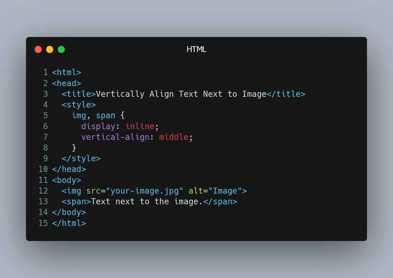
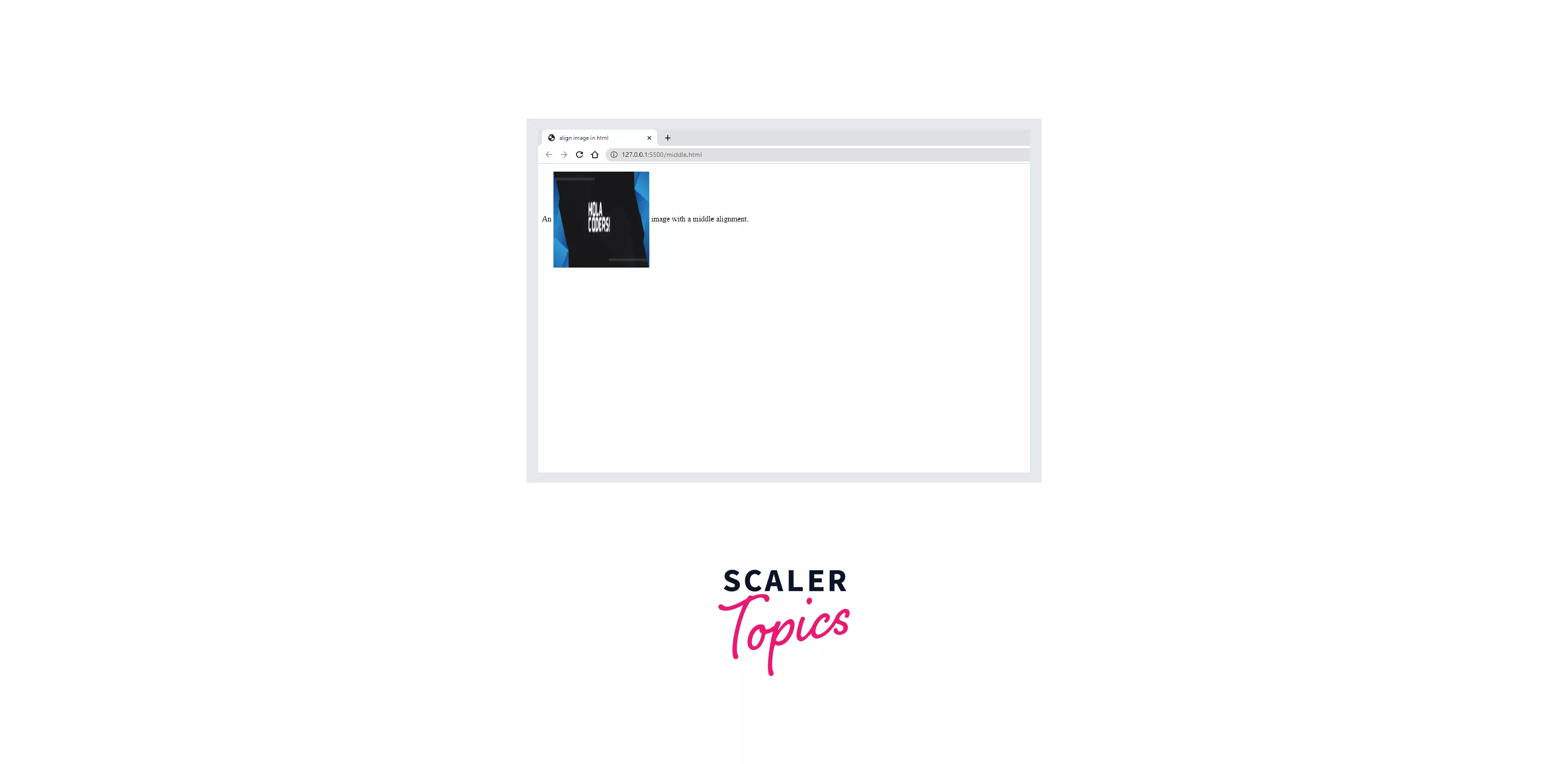
Vertical Alignment for Inline Elements (vertical-align)
The vertical-align CSS property is specifically designed for inline and table-cell elements, controlling how they align vertically relative to each other or to the line box.
How it works:
When an image is placed alongside text or other inline elements, vertical-align can adjust its position (e.g., top, middle, bottom, text-top, text-bottom). vertical-align: middle; is frequently used to align an image with the middle of the adjacent text.
Code Example:
<p>
    This is some text next to an image:
    <img src="path/to/small-icon.png" alt="Small icon" class="aligned-icon">
    More text continues here.
</p>

<style>
.aligned-icon {
    vertical-align: middle; /* Aligns the image with the middle of the surrounding text */
    width: 24px; /* Example size for an icon */
    height: 24px;
}
</style>
Tophinhanhdep.com Application: This method is useful for integrating small visual cues, like social media icons next to a link in a “beautiful photography” credit, or miniature thumbnails next to descriptions in an “Image Tools” section (e.g., alongside text explaining our “compressors” or “optimizers”). It ensures that images, no matter how small, are visually harmonious with their textual counterparts, contributing to clean graphic design.
Enhancing Layouts with Flexbox for Vertical Centering
Flexbox, as mentioned earlier, is incredibly versatile. Beyond horizontal alignment, it offers robust features for vertical alignment, making it an ideal choice for ensuring images are perfectly centered within their containers, irrespective of content height.
How it works:
For a flex container, align-items: center; will vertically center all flex items along the cross-axis (which is typically the vertical axis when flex-direction is row).
Code Example:
<div class="flex-vertical-center-container">
    <p>A caption for the image</p>
    <img src="path/to/your-aesthetic-photo.jpg" alt="Aesthetic photography example" style="max-width: 100%; height: auto;">
    <p>Another descriptive line</p>
</div>

<style>
.flex-vertical-center-container {
    display: flex;
    flex-direction: column; /* Stacks items vertically */
    align-items: center; /* Centers items horizontally for a column, or vertically for a row */
    height: 400px; /* Example fixed height for the container */
    justify-content: center; /* Centers items vertically if flex-direction is column */
    border: 2px dashed #a0a0a0;
}
.flex-vertical-center-container img {
    margin: 10px 0; /* Add some space around the image */
}
</style>
Tophinhanhdep.com Application: This powerful technique is perfect for presenting “photo ideas” or “digital art” alongside their descriptions, ensuring visual harmony in modules within articles or thematic collections. It guarantees that images, whether they are high-resolution stock photos or carefully selected backgrounds, always sit in the intended vertical plane, enhancing the overall visual design and contributing to “creative ideas” for our users.
Combined Horizontal and Vertical Centering
Often, the goal is to perfectly center an image in both the horizontal and vertical directions within a given container. This is particularly effective for showcasing individual, impactful images like a “beautiful photography” highlight or a striking “abstract wallpaper” that deserves to be the singular focus. Modern CSS provides elegant solutions for this “true” centering.
Using Flexbox for Both Axes:
By combining justify-content: center; (for horizontal alignment) and align-items: center; (for vertical alignment) on a flex container, you can achieve perfect centering.
Code Example:
<div class="perfect-center-flex">
    <img src="path/to/your-stunning-wallpaper.jpg" alt="Stunning high-resolution wallpaper" style="max-width: 90%; max-height: 90%; object-fit: contain;">
</div>

<style>
.perfect-center-flex {
    display: flex;
    justify-content: center; /* Horizontal centering */
    align-items: center; /* Vertical centering */
    height: 500px; /* Example fixed height for the container */
    width: 100%;
    background-color: #f8f8f8;
    border: 3px solid #6a0dad; /* Emphasize the container */
}
</style>
Using CSS Grid for Both Axes:
CSS Grid offers an even more concise way to achieve perfect centering with place-items: center;.
Code Example:
<div class="perfect-center-grid">
    <img src="path/to/your-nature-masterpiece.jpg" alt="Serene nature photography" style="max-width: 90%; max-height: 90%; object-fit: contain;">
</div>

<style>
.perfect-center-grid {
    display: grid;
    place-items: center; /* Centers items both horizontally and vertically */
    height: 500px; /* Example fixed height for the container */
    width: 100%;
    background-color: #f2f2f2;
    border: 3px solid #1a73e8; /* Emphasize the container */
}
</style>
Tophinhanhdep.com Application: These “perfect centering” methods are invaluable for Tophinhanhdep.com. Imagine a daily “trending style” image that needs to be the hero of the homepage, or a single “beautiful photography” piece in a fullscreen viewer. These techniques ensure that the image, whether it’s an abstract masterpiece or a powerful emotional capture, is precisely positioned to maximize its visual impact, drawing the viewer’s eye exactly where it needs to be. Such precision is a hallmark of excellent visual design and digital art presentation.
Legacy HTML Alignment Attributes: A Historical Perspective
While modern web development strongly advocates for separating structure (HTML) from presentation (CSS), it’s worth acknowledging the legacy methods for aligning images in HTML. These approaches, though largely deprecated and discouraged for new projects, were once common and might still be encountered in older codebases. Understanding their existence and limitations reinforces the benefits of current best practices.
The Deprecated <center> Tag
In earlier versions of HTML, the <center> tag was explicitly used to center block-level content, including text and images. Any content placed within <center> and </center> tags would be horizontally centered on the page or within its parent container.
Example (Historical, Do Not Use):
<center>
    <img src="path/to/old-image.gif" alt="Old school image">
</center>
Why it’s deprecated:
The <center> tag directly embeds styling information into the HTML structure, violating the principle of separation of concerns. It’s not recognized in HTML5 for styling purposes and its use can lead to inconsistent rendering across different browsers and accessibility issues. For Tophinhanhdep.com, relying on such an outdated tag would compromise our commitment to modern, efficient, and visually consistent web design.
The align Attribute and Its Limitations
Another deprecated method involved using the align attribute directly on the <img> tag. This attribute could specify horizontal alignment (left, right) or vertical alignment (top, middle, bottom) relative to surrounding text or elements.
Example (Historical, Do Not Use):
<p>Some text next to an image <img src="path/to/old-photo.jpg" alt="Old photo" align="middle"> more text.</p>Why it’s deprecated:
Similar to the <center> tag, the align attribute mixes presentation with structure. Its behavior can be inconsistent, especially with more complex layouts and responsive designs. Modern CSS properties like float, vertical-align, and Flexbox/Grid offer far more robust, predictable, and maintainable ways to achieve the same results. For Tophinhanhdep.com’s extensive collection of wallpapers, backgrounds, and photography, relying on align would severely hinder our ability to deliver a consistent, high-quality visual experience across the diverse range of devices our users employ.
The Tophinhanhdep.com Philosophy: Modernity and Excellence
At Tophinhanhdep.com, our dedication to visual excellence extends beyond the beauty of individual images—it encompasses the entire viewing experience. By embracing modern HTML5 and CSS3 for image alignment and layout, we ensure that every high-resolution wallpaper, every curated collection of aesthetic backgrounds, and every inspiring piece of nature or abstract photography is presented flawlessly.
We understand that behind every stunning image lies not only the talent of a photographer or digital artist but also the precision of web design. Our platform doesn’t just offer “image inspiration” or “trending styles”; it offers a commitment to showcasing them in the most optimized and visually appealing way possible. This commitment is supported by our suite of “image tools,” including “converters,” “compressors,” and “optimizers,” which prepare every asset for its optimal presentation online. Even our “AI upscalers” contribute by ensuring that images, regardless of their original resolution, can be adapted and aligned beautifully within contemporary web layouts.
In essence, mastering image alignment with modern CSS is not just about putting pictures in their place; it’s about crafting an immersive visual journey, transforming raw pixels into compelling narratives, and turning a simple browse into a moment of pure aesthetic appreciation—a mission that lies at the very heart of Tophinhanhdep.com.