Mastering the Art of Centering Header Images in HTML for Tophinhanhdep.com

In the dynamic world of web design, a website’s header serves as its digital storefront, often being the first element a visitor encounters. For a platform like Tophinhanhdep.com, which thrives on visual appeal—showcasing breathtaking images, captivating wallpapers, and inspiring photography—the presentation of its header image is paramount. A perfectly centered header image not only establishes a professional and aesthetic tone but also guides the user’s eye, setting the stage for the rich visual content that follows, whether it’s abstract art, nature scenes, or high-resolution stock photos.

Gone are the days when simple HTML tags sufficed for layout tasks. Modern web development demands precision, responsiveness, and semantic correctness, especially when dealing with critical visual elements like a header image. Achieving flawless centering, particularly for prominent elements that define a website’s brand and visual identity, requires a deep understanding of Cascading Style Sheets (CSS). This comprehensive guide delves into the contemporary techniques for centering header images in HTML, moving beyond outdated methods to embrace robust and flexible CSS solutions that ensure your Tophinhanhdep.com header always looks its best across all devices.
The Evolution of Image Centering: From HTML Tags to Modern CSS

The journey of web design is marked by continuous evolution, with developers constantly seeking more efficient and effective ways to control page layout and element placement. Centering elements, a seemingly straightforward task, has historically been a source of much frustration and ingenious workarounds. Understanding this evolution is key to appreciating the power of modern CSS for Tophinhanhdep.com’s visual narratives.
The Deprecated <center> Tag and align Attribute
In the nascent days of HTML, simplicity reigned supreme, and layout control was often handled directly within the HTML document itself. The <center> tag was once the go-to solution for horizontally centering text and other inline content. If you wanted your beautiful header image—perhaps a stunning piece of digital art or a serene nature wallpaper from Tophinhanhdep.com’s collection—to be in the middle of your page, you might have wrapped it in <center> tags. Similarly, the align attribute, used directly within the <img> tag (e.g., <img align="middle" src="image.jpg">), attempted to position images relative to surrounding text.
However, these methods are now considered obsolete and are strongly discouraged for modern web development. The primary reason is the shift towards separating structure (HTML) from presentation (CSS). Relying on HTML for styling clutters the markup, makes maintenance difficult, and severely limits responsiveness and flexibility. Browsers may still render the <center> tag, but its behavior is inconsistent, and it’s not part of current web standards. For a forward-thinking platform like Tophinhanhdep.com, which aims to display high-resolution photography and innovative visual design, using deprecated tags is counterproductive to achieving a cutting-edge and future-proof online presence. Modern centering requires the robust and expressive capabilities of CSS.
The Rise of CSS text-align for Inline Elements
With the advent of CSS, developers gained unprecedented control over visual presentation. One of the earliest and still widely used CSS properties for horizontal centering is text-align: center;. While its name implies text alignment, this property can effectively center inline-level elements (like <span> or <a>) and inline-block elements (like <img> or inline-block <div>s) when applied to their parent container.
For your Tophinhanhdep.com header, if your image is defined as an inline or inline-block element within a block-level container (such as a <div> or <header> tag), you can apply text-align: center; to the parent to horizontally center the image.
Example Implementation:
<header class="main-header">
    <img src="path/to/your-header-image.jpg" alt="Tophinhanhdep.com Header Image">
</header>.main-header {
text-align: center; /* Centers the inline-block image horizontally */
width: 100%; /* Ensure the header spans the full width */
padding: 20px 0; /* Add some vertical spacing */
background-color: #f0f0f0; /* Example background */
}
.main-header img {
max-width: 100%; /* Ensure image is responsive */
height: auto; /* Maintain aspect ratio */
display: inline-block; /* Essential for text-align to work on the image */
}This method is simple and effective for horizontally centering a single header image or even a row of small image logos within a header. It’s a foundational CSS technique, providing a basic yet elegant solution for visual balance on Tophinhanhdep.com’s presentation.
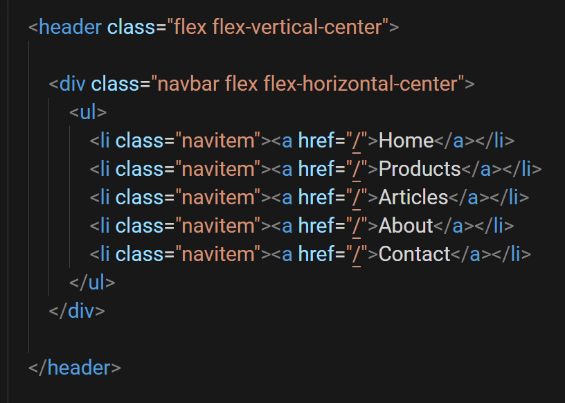
Precision Placement with CSS Flexbox: The Modern Approach for Tophinhanhdep.com
While text-align: center is excellent for horizontal centering of inline-block elements, it doesn’t offer a native way to achieve vertical centering or to manage more complex, responsive layouts with multiple items. This is where CSS Flexbox, or the Flexible Box Module, shines. Flexbox is a one-dimensional layout module that provides an efficient way to arrange, align, and distribute space among items within a container, even when their size is unknown or dynamic. For Tophinhanhdep.com, Flexbox offers unparalleled control over how header images, navigation links, and brand logos are perfectly positioned, contributing to a refined visual design.
Understanding Flexbox Fundamentals for Header Layouts
The core concept of Flexbox revolves around a flex container and flex items. When you apply display: flex; to a parent element (your header, for instance), it becomes a flex container, and its direct children become flex items. These items can then be manipulated along two axes: the main axis (typically horizontal, from left to right) and the cross axis (typically vertical, from top to bottom).
To center items within a flex container, two primary properties are used:
justify-content: This property aligns flex items along the main axis. Setting it tocenterwill horizontally center the items.align-items: This property aligns flex items along the cross axis. Setting it tocenterwill vertically center the items.
Let’s consider a common Tophinhanhdep.com header scenario: a central logo (an image) flanked by navigation links. Using Flexbox, you can easily create this balanced layout.
Example Implementation for a Header with Logo and Navigation:
<header class="flex-header">
    <nav class="header-nav left-nav">
        <ul>
            <li><a href="#">Wallpapers</a></li>
            <li><a href="#">Backgrounds</a></li>
        </ul>
    </nav>
    <img src="path/to/tophinhanhdep-logo.png" alt="Tophinhanhdep.com Logo" class="header-logo">
    <nav class="header-nav right-nav">
        <ul>
            <li><a href="#">Nature</a></li>
            <li><a href="#">Abstract</a></li>
        </ul>
    </nav>
</header>.flex-header {
display: flex; /* Make the header a flex container */
justify-content: space-between; /* Distribute items with space between them */
align-items: center; /* Vertically align all items to the center */
padding: 15px 30px; /* Add some padding */
background-color: #ffffff;
box-shadow: 0 2px 5px rgba(0,0,0,0.1);
}
.header-logo {
max-height: 60px; /* Control logo size */
width: auto;
/* For finer tuning, you might need specific margins or `flex-grow` on nav elements */
}
.header-nav ul {
list-style: none;
margin: 0;
padding: 0;
display: flex; /* Make nav ul a flex container too for horizontal links */
gap: 20px; /* Space between nav items */
}
.header-nav a {
text-decoration: none;
color: #333;
font-weight: bold;
font-size: 1.1em;
}In this example, justify-content: space-between; ensures that the left navigation, the logo, and the right navigation are pushed to the ends with even space between them, while align-items: center; perfectly aligns all these elements vertically in the middle of the header. For the logo to be truly centered between the navigation blocks, you might need to adjust flex-grow properties on the navigation elements or use a slightly different Flexbox configuration where the logo is the only flex item in a separate flex container that itself is centered.
Achieving Absolute Centering for Header Images and Logos
When you want a single header image or logo—perhaps a striking high-resolution photo or a carefully designed brand mark from Tophinhanhdep.com’s visual assets—to be perfectly centered both horizontally and vertically within its parent container, Flexbox provides an elegant solution. This is known as “absolute centering” and is incredibly valuable for creating prominent, balanced visual elements.
Example for Absolute Centering a Single Header Image/Logo:
<header class="full-width-header">
    <img src="path/to/hero-header-image.jpg" alt="Aesthetic Header Image" class="centered-hero-image">
</header>.full-width-header {
display: flex; /* Enable Flexbox on the parent container */
justify-content: center; /* Center items horizontally */
align-items: center; /* Center items vertically */
height: 300px; /* Define a fixed height for the header */
width: 100%;
background-color: #e2e2e2;
overflow: hidden; /* Important for images that might stretch */
}
.centered-hero-image {
max-width: 100%; /* Ensure image does not overflow its container */
max-height: 100%;
object-fit: contain; /* Or 'cover' depending on desired cropping behavior */
display: block; /* Important for preventing extra space beneath the image */
}By setting both justify-content: center and align-items: center on the parent <header> (which acts as the flex container), the <img> element (the flex item) will be positioned precisely in the center of the header. The object-fit property helps control how the image scales within its allocated space, making it ideal for showcasing diverse photography styles—from abstract wallpapers to emotional imagery—without distortion. This powerful combination of Flexbox properties ensures that any header image from Tophinhanhdep.com, regardless of its original dimensions, achieves a visually harmonious and perfectly centered presentation.
Leveraging CSS Grid for Sophisticated Header Designs on Tophinhanhdep.com
While Flexbox is excellent for one-dimensional layouts (rows or columns), CSS Grid Layout offers a two-dimensional system, making it ideal for designing complex and responsive web page structures. For Tophinhanhdep.com, where visual design and intricate arrangements of elements might be desired in the header—perhaps a logo, multiple navigation groups, and even a small search bar—CSS Grid provides an even more powerful and intuitive approach to layout and centering.
Grid Layout Basics for Centering Elements
CSS Grid allows you to define rows and columns on a parent container, creating a grid structure into which you can place elements. Like Flexbox, you apply display: grid; to the parent element to make it a grid container.
To center items within a grid container, you can use:
justify-items: center;: Aligns grid items along the inline axis (typically horizontal) within their respective grid areas.align-items: center;: Aligns grid items along the block axis (typically vertical) within their respective grid areas.place-items: center;: A shorthand for bothjustify-items: center;andalign-items: center;, offering concise absolute centering for a single item within its grid cell.justify-content: center;/align-content: center;: These align the grid tracks themselves (the rows and columns) within the grid container, useful if the grid doesn’t fill the entire container.
For Tophinhanhdep.com, imagine a header where you want a central logo, with distinct areas for navigation or other elements. Grid can make this highly manageable.
Example Implementation with Grid for a Complex Header:
<header class="grid-header">
    <div class="header-left-area">
        <a href="#">Aesthetic</a>
        <a href="#">Trending</a>
    </div>
    <img src="path/to/tophinhanhdep-logo-highres.png" alt="Tophinhanhdep.com High Resolution Logo" class="grid-header-logo">
    <div class="header-right-area">
        <a href="#">Collections</a>
        <a href="#">Inspiration</a>
    </div>
</header>.grid-header {
display: grid; /* Make the header a grid container */
grid-template-columns: 1fr auto 1fr; /* Defines three columns: left flexible, middle content-sized, right flexible */
grid-template-rows: auto; /* Single row, height determined by content */
align-items: center; /* Vertically align all items within their grid cells */
justify-items: center; /* Horizontally align all items within their grid cells */
padding: 20px;
background-color: #f8f8f8;
box-shadow: 0 4px 8px rgba(0,0,0,0.05);
}
.grid-header-logo {
grid-column: 2 / 3; /* Place the logo in the second column */
max-height: 70px;
width: auto;
/* Since parent has justify-items: center, this logo is horizontally centered in its column */
/* And since parent has align-items: center, it's vertically centered in its row */
}
.header-left-area, .header-right-area {
display: flex; /* Use Flexbox for internal alignment within these areas */
gap: 15px;
}
.header-left-area {
grid-column: 1 / 2; /* Place in the first column */
justify-self: start; /* Align to the start of its grid cell */
}
.header-right-area {
grid-column: 3 / 4; /* Place in the third column */
justify-self: end; /* Align to the end of its grid cell */
}In this Grid setup, the logo is explicitly placed in the middle column (grid-column: 2 / 3), and because justify-items: center and align-items: center are applied to the parent grid container, the logo itself is perfectly centered within its designated grid cell. This approach is incredibly powerful for “Visual Design” layouts that require specific placements and proportions, allowing for creative ideas to be implemented with precision. It ensures that the high-resolution images or digital art that serve as logos are showcased flawlessly, enhancing Tophinhanhdep.com’s aesthetic appeal.
Best Practices for Centering Header Images on Tophinhanhdep.com
Beyond merely applying the correct CSS properties, effective centering of header images on Tophinhanhdep.com necessitates adherence to best practices that enhance performance, responsiveness, and overall user experience. These considerations tie directly into the website’s core topics, ensuring that “Beautiful Photography” and “Digital Art” are not just displayed, but displayed optimally.
Optimizing Images for Performance and Aesthetics
A large, unoptimized header image, no matter how beautifully centered, can significantly hinder page load times, leading to a poor user experience. For Tophinhanhdep.com, which specializes in “Images” like “Wallpapers” and “Backgrounds,” image optimization is non-negotiable.
- Compression and Format: Before uploading, utilize “Image Tools” such as compressors (e.g., JPEG for photographic images, PNG for logos with transparency, WebP for modern browsers) to reduce file size without sacrificing noticeable quality.
- Resolution and Dimensions: The header image should be appropriately sized for its intended display area. Uploading an excessively high-resolution image only to scale it down with CSS is inefficient. Consider providing multiple resolutions for different screen sizes (e.g., using
srcsetin HTML). If a logo or image needs to be scaled up from a smaller original, “AI Upscalers” (from your “Image Tools” category) can be invaluable for maintaining sharpness and quality, preventing pixelation that would detract from the “Aesthetic” appeal. - Aspect Ratio: Maintain the natural aspect ratio of your images to prevent distortion, unless intentional “Photo Manipulation” is part of the “Creative Ideas” for the header. Use CSS properties like
object-fit: coverorcontainwithin a defined container to control how the image fills its space.
By prioritizing optimization, Tophinhanhdep.com ensures that its stunning “Nature” or “Abstract” header images load quickly, offering an immediate and impactful visual introduction without frustrating delays.
Responsive Design and Cross-Browser Compatibility
A static header that looks perfect on a desktop might appear misaligned or broken on a mobile device. Responsive design is crucial for Tophinhanhdep.com to cater to its diverse audience accessing “Image Inspiration & Collections” from various devices.
- Fluid Layouts: Employ relative units (
%,vw,em,rem) instead of fixed pixel values for widths and spacing where possible. This allows your centered header image and surrounding elements to scale gracefully with the viewport size. - Media Queries: Use CSS media queries to apply different styling rules based on screen size, orientation, or resolution. For example, a larger header image might be appropriate for desktops, while a smaller, more compact version (or even a different layout of elements around the logo) could be served for mobile. This ensures that the “Trending Styles” in your headers remain functional and visually appealing on all screens.
- Browser Testing: Always test your header’s centering across different browsers (Chrome, Firefox, Safari, Edge) and devices. While Flexbox and Grid are widely supported, subtle differences can exist. Ensuring cross-browser compatibility guarantees a consistent experience for all visitors, highlighting the precision of your “Digital Photography” and “Graphic Design.”
A responsive and compatible header guarantees that Tophinhanhdep.com’s “Beautiful Photography” is presented flawlessly, regardless of how or where it’s viewed, embodying the quality expected from a site dedicated to visual excellence.
Enhancing User Experience with Visually Balanced Headers
The header is more than just a navigational component; it’s a critical piece of visual real estate that contributes significantly to the overall user experience and brand perception of Tophinhanhdep.com.
- Visual Hierarchy: A well-centered header image naturally draws attention and establishes a focal point. Ensure that your logo or main header image is the most prominent visual element, guiding the user’s eye and reinforcing your brand identity. This is particularly important for sites showcasing “Sad/Emotional” or specific “Thematic Collections,” where the header can set an immediate mood.
- Whitespace and Readability: Proper centering and alignment should be complemented by adequate whitespace around your header image and other elements. This prevents a cluttered look, improves readability of navigation links, and allows your “Creative Ideas” and “Photo Manipulation” to breathe, contributing to a clean and sophisticated “Visual Design.”
- Accessibility: Consider accessibility when designing your header. Ensure sufficient color contrast and provide
alttext for all header images. For Tophinhanhdep.com, accuratealttext for “High Resolution” images not only aids accessibility but can also provide context for “Image-to-Text” tools and SEO.
A carefully designed and perfectly centered header transforms Tophinhanhdep.com from a collection of images into a curated “Image Inspiration” hub, where every pixel contributes to a harmonious and engaging experience.
In conclusion, mastering the centering of header images in HTML is no longer about archaic tags but about harnessing the power of modern CSS. For Tophinhanhdep.com, this means leveraging Flexbox and Grid for precise, responsive, and aesthetically pleasing layouts. Coupled with diligent image optimization and a strong focus on responsive design and user experience, your website’s header will not only function flawlessly but will also beautifully introduce the unparalleled visual content that Tophinhanhdep.com has to offer, from vibrant “Wallpapers” to compelling “Stock Photos” and deeply “Emotional” imagery. Embrace these modern techniques to create a header that is as visually stunning and efficient as the content it proudly presents.