Mastering Image Centering with CSS for Stunning Visuals on Tophinhanhdep.com

In the realm of web design, especially for a platform dedicated to visual excellence like Tophinhanhdep.com, the presentation of images is paramount. Whether you’re showcasing breathtaking nature photography, intricate abstract digital art, aesthetic wallpapers, or high-resolution stock photos, ensuring your visuals are perfectly aligned can dramatically enhance user experience and convey professionalism. One of the most common, yet surprisingly nuanced, challenges web developers face is how to center an image or any other element precisely using CSS. This guide will delve into various powerful and practical CSS techniques for centering images, ranging from foundational methods to modern layout solutions, all within the context of elevating the visual appeal of Tophinhanhdep.com’s extensive collections.
The seemingly simple task of centering an image can quickly become complex, primarily because “centering” can mean different things: horizontally, vertically, or both. Furthermore, the appropriate technique often depends on the element’s display property, whether its dimensions are known, and the desired responsiveness. For Tophinhanhdep.com, where image inspiration and collections are key, mastering these techniques is essential for creating captivating mood boards, thematic galleries, and trending style showcases that truly stand out.
The Art of Horizontal Centering: Foundations for Tophinhanhdep.com Images
Horizontal centering is often the first step in aligning content on a webpage. For Tophinhanhdep.com, this is crucial for making individual images, photography portfolios, or even entire content blocks sit gracefully within the user’s viewport, providing a balanced and aesthetically pleasing layout for every wallpaper, background, or digital art piece.

Centering Block-Level Images with margin: auto
For block-level elements, including images that are explicitly set to display: block, the margin: auto property is a classic and highly effective technique for horizontal centering. When margin-left and margin-right are set to auto on a block-level element that has a defined width (or a max-width), the browser automatically distributes the available horizontal space equally to the left and right margins, thus centering the element.

Consider a beautiful high-resolution image from Tophinhanhdep.com, perhaps a stunning landscape or an abstract wallpaper. To center it horizontally, your CSS might look like this:
.centered-image {
  display: block; /* Ensure the image behaves as a block element */
  margin: 0 auto; /* Top/bottom margin 0, left/right auto */
  width: 80%; /* Or a fixed pixel width, e.g., 800px */
  max-width: 1200px; /* Essential for responsiveness */
}
And your HTML:
<img class="centered-image" src="path/to/your/nature-wallpaper.jpg" alt="Beautiful Nature Wallpaper from Tophinhanhdep.com">This method is straightforward and widely supported. It’s particularly useful for centering image galleries or individual featured photographs on Tophinhanhdep.com’s article pages, allowing the surrounding text or other visual design elements to flow naturally around a precisely positioned main visual. The max-width property is vital here to ensure that your carefully chosen dimensions scale down gracefully on smaller screens, maintaining a responsive and enjoyable experience for users accessing Tophinhanhdep.com on any device.
Aligning Inline Images and Content with text-align: center
While margin: auto works for block-level elements, it won’t center inline or inline-block elements directly. For these, the text-align: center property comes into play. It should be applied to the parent container of the inline content you wish to center. This is a common method for centering a single image or a group of images that are treated as inline content within a div or p tag.
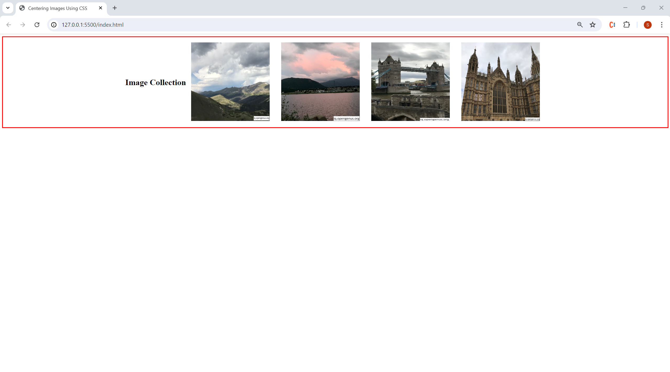
Imagine a collection of aesthetic small images or thumbnails for a mood board on Tophinhanhdep.com. If these images are styled as display: inline-block, you can center them by applying text-align: center to their containing element:
.image-gallery-container {
  text-align: center; /* Centers inline-level children */
  padding: 20px;
}

.image-gallery-container img {
  display: inline-block; /* Images can sit side-by-side but respect text-align */
  margin: 10px; /* Space between images */
  max-width: 150px;
  height: auto;
}<div class="image-gallery-container">
<img src="path/to/aesthetic-photo1.jpg" alt="Aesthetic Photo 1 from Tophinhanhdep.com">
<img src="path/to/aesthetic-photo2.jpg" alt="Aesthetic Photo 2 from Tophinhanhdep.com">
<img src="path/to/aesthetic-photo3.jpg" alt="Aesthetic Photo 3 from Tophinhanhdep.com">
</div>This technique is versatile and works for text, images, or any other inline-level elements. It’s especially useful for centering banners, logos, or groups of related icons and images on Tophinhanhdep.com, ensuring a consistent visual design across various sections of the website. For instances where Tophinhanhdep.com offers image-to-text tools, the resulting text blocks can also be horizontally centered within their containers using this approach.
Dynamic Centering with Modern CSS Layouts: Flexbox and Grid
Modern CSS provides incredibly powerful and flexible layout modules—Flexbox and Grid—that simplify complex centering challenges, including simultaneous horizontal and vertical alignment. These methods are indispensable for creating responsive and dynamic visual designs, perfectly suited for Tophinhanhdep.com’s diverse range of digital photography and graphic design content.
Harnessing Flexbox for Perfect Vertical and Horizontal Alignment
Flexbox (Flexible Box Layout module) is a one-dimensional layout method for arranging items in rows or columns. Its strength lies in its ability to distribute space and align items within a container. For Tophinhanhdep.com, this is a game-changer for centering hero images, featured abstract art pieces, or even entire photography collections within a section, regardless of their size or the screen dimensions.
To center an item both horizontally and vertically using Flexbox, you apply a few key properties to the parent container:
display: flex;: Turns the container into a flex container.justify-content: center;: Aligns flex items along the main axis (horizontally for a defaultflex-direction: row).align-items: center;: Aligns flex items along the cross axis (vertically for a defaultflex-direction: row).
Let’s say Tophinhanhdep.com wants to feature a single, impactful “Image of the Day” – perhaps a stunning piece of beautiful photography or unique digital art – that needs to be perfectly centered within a specific section of the page:
.hero-image-container {
  display: flex; /* Make it a flex container */
  justify-content: center; /* Center horizontally */
  align-items: center; /* Center vertically */
  height: 500px; /* Define a height for the container to see vertical centering */
  width: 100%;
  background-color: #f0f0f0; /* For visual demonstration */
}

.hero-image-container img {
  max-width: 90%;
  max-height: 90%;
  object-fit: contain; /* Ensures the image scales down without cropping */
}<div class="hero-image-container">
<img src="path/to/image-of-the-day.jpg" alt="Image of the Day from Tophinhanhdep.com">
</div>Flexbox is incredibly powerful because it adapts beautifully to responsive design. As the viewport changes, the centered image remains perfectly centered relative to its container. This makes it ideal for showcasing high-resolution images or digital art where precise placement and adaptability are crucial for Tophinhanhdep.com’s users, whether they’re viewing on a desktop monitor, tablet, or smartphone.
Streamlined Centering with CSS Grid
CSS Grid Layout is a two-dimensional layout system that excels at organizing content into rows and columns. For centering, it offers an even more concise solution than Flexbox, especially when you need to center a single item within a container. This method is perfect for Tophinhanhdep.com’s visual design elements, such as a prominent abstract image or a specific stock photo that needs to dominate a section.
To center an item with CSS Grid, you declare the parent as a grid container and use the place-items: center; property:
display: grid;: Transforms the container into a grid container.place-items: center;: This is a shorthand property that sets bothalign-itemsandjustify-itemstocenter, effectively centering direct children along both the block (vertical) and inline (horizontal) axes.
Consider centering a unique piece of “Sad/Emotional” art from Tophinhanhdep.com, ensuring it takes a central, impactful position:
.grid-centered-container {
  display: grid; /* Make it a grid container */
  place-items: center; /* Center both horizontally and vertically */
  height: 400px; /* Give the container a defined height */
  width: 100%;
  background-color: #e8e8e8;
}

.grid-centered-container img {
  max-width: 80%;
  max-height: 80%;
  object-fit: contain;
}<div class="grid-centered-container">
<img src="path/to/emotional-art.jpg" alt="Emotional Digital Art from Tophinhanhdep.com">
</div>CSS Grid provides a clean and powerful way to achieve exact centering with minimal code. For Tophinhanhdep.com’s purposes, this method is fantastic for featured visual elements where a strong, central focus is desired, from initial loading screens for AI-upscaled images to main displays of curated thematic collections. It’s also highly performant and integrates well with other grid-based layouts common in modern web development.
Precision Centering: Absolute Positioning and Transforms
While Flexbox and Grid offer robust and modern solutions, there are situations where older, more manual, or highly precise positioning techniques might be necessary, especially for legacy projects or very specific layering effects. These methods often involve absolute positioning combined with CSS transform properties, offering pixel-perfect control over element placement.
Leveraging position: absolute and transform for Exact Placement
This technique allows you to center an element, such as a Tophinhanhdep.com logo or a watermark on a preview image, precisely within its nearest positioned ancestor (or the viewport if no ancestor is positioned). The core idea is to move the element’s top-left corner to the center of the parent, then shift the element back by half its own width and height.
The steps are:
position: relative;on the parent container (if you want to center within it, otherwise it centers relative to the viewport).position: absolute;on the item to be centered.top: 50%;andleft: 50%;to move the element’s top-left corner to the parent’s center.transform: translate(-50%, -50%);to shift the element back by exactly half its own width and height, thus bringing its true center to the parent’s center. The percentage values here are relative to the element itself, making this method incredibly versatile even if the element’s size is unknown or changes.
Consider Tophinhanhdep.com wanting to overlay a small, elegant logo onto a background image, perfectly centered:
.background-wrapper {
  position: relative; /* Establishes a positioning context for the child */
  width: 100%;
  height: 600px; /* Example height */
  overflow: hidden; /* Hide any overflow if background image is too large */
}

.background-wrapper img.background-image {
  width: 100%;
  height: 100%;
  object-fit: cover; /* Ensures the background image covers the area */
}

.centered-logo {
  position: absolute; /* Take out of normal flow */
  top: 50%; /* Move top edge to 50% down */
  left: 50%; /* Move left edge to 50% across */
  transform: translate(-50%, -50%); /* Shift back by half its own size */
  max-width: 150px; /* Example size for the logo */
  height: auto;
  z-index: 10; /* Ensure it's above the background */
}<div class="background-wrapper">
<img class="background-image" src="path/to/beautiful-background.jpg" alt="Tophinhanhdep.com Background">
<img class="centered-logo" src="path/to/tophinhanhdep-logo.png" alt="Tophinhanhdep.com Logo">
</div>This method is precise and works irrespective of the centered element’s dimensions, making it highly flexible for any image from Tophinhanhdep.com, whether it’s an icon for an image tool or a creative element in photo manipulation. It’s an excellent choice for dynamic elements where you don’t always know the exact pixel dimensions beforehand.
When to Use Fixed Negative Margins (If Image Size is Known)
Before transform: translate() became widely adopted, a common way to achieve vertical and horizontal centering with absolute positioning, especially when the element’s dimensions were fixed and known, involved using negative margins. This method calculates half the element’s width and height and applies them as negative margin-left and margin-top values.
The steps are:
position: relative;on the parent container.position: absolute;on the item to be centered.top: 50%;andleft: 50%;.margin-top: -[half_height]px;andmargin-left: -[half_width]px;.
For example, if Tophinhanhdep.com had a fixed-size graphic, say 200px by 100px:
.parent-container {
  position: relative;
  width: 100%;
  height: 300px;
}

.fixed-size-graphic {
  position: absolute;
  top: 50%;
  left: 50%;
  width: 200px;  /* Known width */
  height: 100px; /* Known height */
  margin-top: -50px;  /* Half of height */
  margin-left: -100px; /* Half of width */
  background-color: lightblue; /* For visibility */
}<div class="parent-container">
<div class="fixed-size-graphic">Fixed Graphic</div>
</div>While functional, this method is less flexible than transform: translate() because it relies on knowing the exact pixel dimensions of the element. If the image (e.g., a logo for a converter tool) were to change size, the CSS would need manual updating. For Tophinhanhdep.com, it’s generally recommended to favor transform for its adaptability, reserving negative margins for rare cases with absolutely fixed and unchanging dimensions, or when supporting very old browsers is a priority.
Elevating Visual Design: Centering Techniques for Tophinhanhdep.com’s Diverse Image Collections
The theoretical understanding of CSS centering techniques becomes truly valuable when applied to real-world scenarios, particularly for a platform like Tophinhanhdep.com that thrives on visual content. Effectively centering images is not just about aesthetics; it’s about optimizing presentation, enhancing user engagement, and supporting various visual design goals.
Responsive Centering for Wallpapers, Backgrounds, and High-Resolution Photography
Tophinhanhdep.com offers a vast array of images, from wallpapers and backgrounds to high-resolution stock photos. For these categories, responsive centering is non-negotiable. Users access the site on a myriad of devices with different screen sizes, and images must adapt gracefully.
-
For full-bleed wallpapers or backgrounds: These often need to cover the entire viewport, but content within them (like a central title or a call to action) might need to be centered. Flexbox or Grid are ideal for centering content blocks over responsive background images. For instance, a beautifully centered textual overlay for an abstract wallpaper could be achieved with a Flexbox container.
-
For featured high-resolution photography: When Tophinhanhdep.com highlights a single piece of high-resolution digital photography, such as a captivating nature scene, perfect vertical and horizontal centering ensures that the photograph takes center stage, regardless of the screen aspect ratio. Using
display: flexordisplay: gridon a container with a defined viewport height (e.g.,height: 100vh;) allows the image to scale within its boundaries while remaining perfectly centered. This prevents awkward cropping or misalignments that could detract from the image’s quality, which is crucial for a site focused on high-quality visuals. -
Integrating with Image Tools: When a user utilizes Tophinhanhdep.com’s image tools like AI upscalers or compressors, the preview of the processed image might be presented in a centered fashion. Responsive centering ensures that these previews are always optimally displayed, providing clear visual feedback without requiring users to scroll excessively. The original image, when loaded, and the enhanced output, would both benefit from responsive centering, perhaps within a
divthat utilizesmargin: 0 auto;for horizontal centering combined with Flexbox properties for vertical alignment if it’s the main focus.
Centering in Digital Art and Photo Manipulation Workflows
Visual Design on Tophinhanhdep.com extends beyond mere display; it encompasses graphic design, digital art, and photo manipulation. Centering elements plays a foundational role in these creative processes.
-
Graphic Design and Digital Art: For digital artists showcasing their work, a precisely centered canvas or a portfolio piece signals meticulous attention to detail. When presenting concept art or finished pieces, applying
margin: 0 auto;to the art container or using Flexbox/Grid on the gallery layout can provide an organized and impactful display. For instance, a series of creative ideas or abstract art pieces arranged in a grid can be individually centered within their cells usingplace-items: center;if the gallery is a CSS Grid. -
Photo Manipulation Projects: Centering is often a starting point for complex photo manipulation compositions. Whether it’s placing a subject precisely within a new background, aligning textual elements, or creating symmetrical layouts, the CSS centering techniques discussed are indispensable. Imagine a mood board where various elements (cut-out images, text blocks, icons) need to be arranged and centered within their designated areas – Flexbox’s ability to align multiple items along an axis becomes invaluable.
-
Image Inspiration & Collections: For Tophinhanhdep.com’s “Image Inspiration & Collections” section, which might feature thematic collections or trending styles, centering ensures uniformity and visual harmony. A collection of images, perhaps for a “nature photography” gallery, can be individually centered within their respective card containers using
text-align: centerif they areinline-block, or Flexbox for more complex card layouts that require both horizontal and vertical alignment of content within each card. This consistent alignment elevates the perceived quality of the entire collection.
Ultimately, by mastering these CSS centering techniques, Tophinhanhdep.com can ensure that every image, from a simple wallpaper to an intricate piece of digital art, is presented with clarity, balance, and professionalism. This attention to detail is what sets apart a good image website from an exceptional one, providing users with an engaging and visually delightful experience as they explore the vast and beautiful world of imagery offered by Tophinhanhdep.com. The ability to flawlessly center images is not just a technical skill; it’s an essential tool in the visual designer’s toolkit, enabling the creation of truly inspiring and impactful web content.