How to Center Image in CSS: A Comprehensive Guide for Visual Perfection on Tophinhanhdep.com

In the dynamic world of web design, where visual content reigns supreme, the precise placement of images is not just a technical detail but a cornerstone of aesthetic excellence. For a platform like Tophinhanhdep.com, dedicated to showcasing breathtaking wallpapers, high-resolution photography, abstract art, and inspiring visual collections, ensuring that every image is perfectly aligned is paramount. Centering an image, whether horizontally, vertically, or both, transforms a good layout into an exceptional one, enhancing readability, visual hierarchy, and overall user experience.
This comprehensive guide delves into various CSS techniques for centering images, from simple horizontal alignment to complex responsive solutions. We’ll explore the “why” behind each method, demonstrate its implementation with clear code examples, and discuss its applications in creating stunning visual designs, all with a keen eye on the standards of quality upheld by Tophinhanhdep.com. Mastering these techniques will empower designers and developers to present visual content – be it a serene nature photograph, a vibrant digital art piece, or a compelling aesthetic background – with the professionalism and impact it deserves.

Methods for Horizontal Image Centering
Horizontal centering is often the first step in aligning elements on a webpage. While seemingly straightforward, there are several effective CSS properties that can achieve this, each with its own nuances and ideal use cases. Understanding these foundational methods is crucial for building layouts that are both clean and visually appealing, especially when arranging diverse image collections on Tophinhanhdep.com.
The Classic margin: auto; Technique
One of the most widely recognized and simplest ways to center a block-level element horizontally is by utilizing the margin: auto; property. This technique relies on the browser’s ability to automatically distribute available horizontal space equally to the left and right margins of an element.
How it Works:
For margin: auto; to effectively center an element, two conditions must be met:
- The element must be a block-level element. Images (
<img>tags) are naturally inline-level elements. To applymargin: auto;for centering, you need to explicitly change their display property toblock. - The element must have a defined width. If no width is specified, a block-level element will default to taking up 100% of its parent’s width, leaving no available space for margins to distribute.

When margin-left and margin-right are set to auto (often combined as margin: 0 auto;), the browser calculates the remaining space in the containing block and divides it equally between these two margins, effectively pushing the element to the center. The 0 in margin: 0 auto; sets the top and bottom margins to zero, which you can adjust as needed.
Code Example:
<!DOCTYPE html>
<html lang="en">
<head>
    <meta charset="UTF-8">
    <meta name="viewport" content="width=device-width, initial-scale=1.0">
    <title>Horizontal Image Centering - Tophinhanhdep.com</title>
    <style>
        .centered-image {
            display: block; /* Important: makes the image a block-level element */
            margin: 0 auto; /* Centers horizontally */
            width: 80%; /* Define a width less than 100% */
            max-width: 600px; /* Optional: ensures it doesn't get too wide on large screens */
            border: 1px solid #ddd; /* For visual demonstration */
        }
    </style>
</head>
<body>
    <div class="container">
        <img class="centered-image" src='https://www.tophinhanhdep.com/images/beautiful-photography.png' alt="Beautiful Photography from Tophinhanhdep.com">
        <p>This image, a stunning piece of beautiful photography from Tophinhanhdep.com, is perfectly centered horizontally using the margin: auto technique.</p>
    </div>
</body>
</html>
What “auto” does in margin: 0 auto;:
The auto value instructs the browser to automatically compute the margin. When applied to margin-left and margin-right on an element with a defined width, it distributes the leftover horizontal space evenly, pushing the element to the center. For margin-top and margin-bottom, auto usually resolves to 0 unless the element is part of a flex or grid container with specific alignment properties. In the context of block elements, auto is specifically powerful for horizontal centering.
Use Cases for Tophinhanhdep.com: This method is ideal for centering individual elements like a featured wallpaper, a logo, or a single high-resolution photograph that needs to stand out. It ensures that critical visual content is always positioned symmetrically within its container, providing a sense of balance and professionalism that aligns with Tophinhanhdep.com’s commitment to high-quality visual experiences.
Centering Inline Elements with text-align: center;
While margin: auto; is excellent for block-level elements, text-align: center; provides an equally straightforward solution for centering inline-level content within its parent. Since images are inherently inline, this method is often employed for quick horizontal centering, especially for galleries or aesthetic collections.
How it Works:
The text-align: center; property is applied to the parent container of the image (or any other inline element). It tells the browser to center all inline content (including text, inline images, inline-block elements) within that parent. The image itself does not need its display property changed, though if you want more control over its spacing or dimensions, display: inline-block; can be beneficial.
Code Example:
<!DOCTYPE html>
<html lang="en">
<head>
    <meta charset="UTF-8">
    <meta name="viewport" content="width=device-width, initial-scale=1.0">
    <title>Inline Image Centering - Tophinhanhdep.com</title>
    <style>
        .gallery-container {
            text-align: center; /* Centers all inline content within */
            border: 1px dashed #ccc; /* For visual demonstration */
            padding: 20px;
        }
        .gallery-image {
            width: 150px;
            height: 100px;
            margin: 10px; /* Spacing between images */
            border: 1px solid #eee;
            vertical-align: middle; /* Aligns images vertically in the line */
        }
    </style>
</head>
<body>
    <div class="gallery-container">
        <img class="gallery-image" src='https://www.tophinhanhdep.com/images/nature-thumbnail-1.png' alt="Nature Thumbnail 1 from Tophinhanhdep.com">
        <img class="gallery-image" src='https://www.tophinhanhdep.com/images/nature-thumbnail-2.png' alt="Nature Thumbnail 2 from Tophinhanhdep.com">
        <img class="gallery-image" src='https://www.tophinhanhdep.com/images/nature-thumbnail-3.png' alt="Nature Thumbnail 3 from Tophinhanhdep.com">
        <p>An aesthetic collection of nature images, beautifully centered within their container on Tophinhanhdep.com.</p>
    </div>
</body>
</html>
Use Cases for Tophinhanhdep.com:
This method is particularly useful for presenting image inspiration, thematic collections, or mood boards where multiple images need to be horizontally grouped and centered. It’s also handy for quick fixes to center logos or small icons within a header or footer. For example, centering a row of trending styles thumbnails or high-resolution stock photos can be easily achieved with text-align: center;.
Achieving Perfect Horizontal and Vertical Image Centering
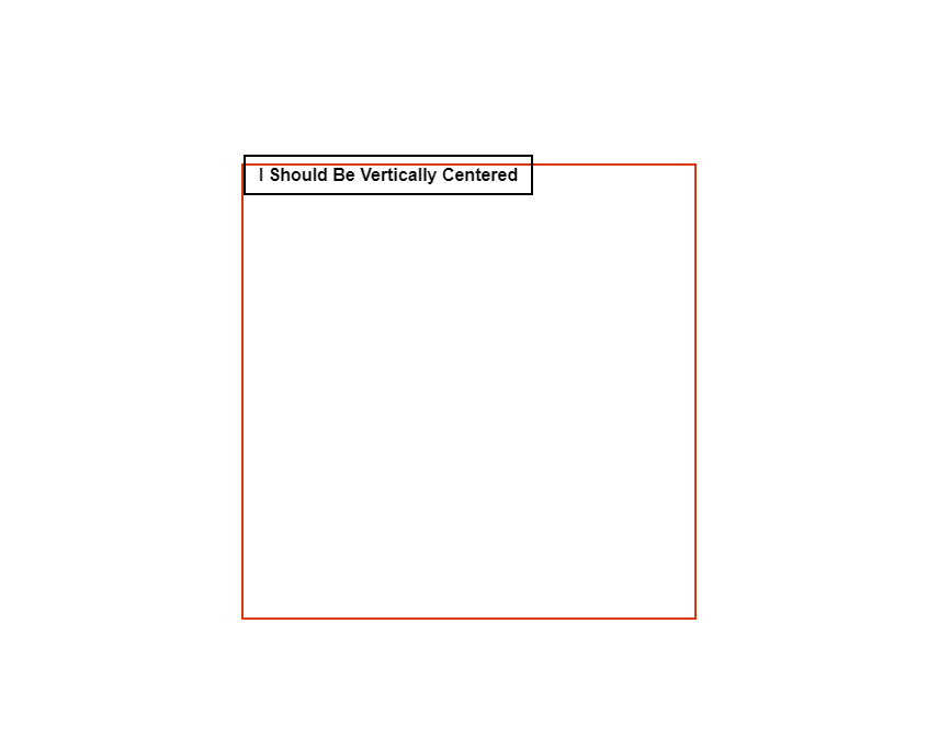
While horizontal centering is a fundamental skill, truly mastering visual design often requires positioning elements precisely in the absolute center of a given space – both horizontally and vertically. This capability is invaluable for creating immersive backgrounds, eye-catching hero sections, or striking digital art presentations on Tophinhanhdep.com. Modern CSS offers powerful and flexible tools for this challenge.
Dynamic Centering with CSS Transform
The position: absolute; combined with transform: translate(-50%, -50%); is a highly versatile and widely used technique for centering an element precisely, regardless of its dimensions. This method is particularly effective for responsive designs, as it doesn’t require knowing the exact width or height of the image beforehand.
How it Works:
position: absolute;: This property takes the image out of the normal document flow, allowing you to position it relative to its nearest positioned ancestor (an element withposition: relative;,absolute;,fixed;, orsticky;). If no such ancestor exists, it will be positioned relative to the<body>.top: 50%;andleft: 50%;: These properties move the top-left corner of the image to the exact center point of its positioned parent. However, this alone doesn’t center the image itself; it centers its upper-left corner.transform: translate(-50%, -50%);: This is the magic touch. Thetranslate()function moves the element relative to its own size. By translating it -50% along both the X (horizontal) and Y (vertical) axes, you effectively shift the image back by half of its own width and half of its own height. This perfectly aligns its center with the center of its parent.
Code Example:
<!DOCTYPE html>
<html lang="en">
<head>
    <meta charset="UTF-8">
    <meta name="viewport" content="width=device-width, initial-scale=1.0">
    <title>Dynamic Image Centering - Tophinhanhdep.com</title>
    <style>
        body, html {
            height: 100%; /* Ensure body and html take full height */
            margin: 0;
            overflow: hidden; /* Prevent scrollbars if image is larger than viewport */
        }
        .hero-section {
            position: relative; /* Important: parent must be positioned */
            height: 100vh; /* Takes full viewport height */
            width: 100%;
            background-color: #f0f0f0; /* Background for demonstration */
        }
        .centered-hero-image {
            position: absolute; /* Allows precise positioning */
            top: 50%; /* Moves top edge to middle */
            left: 50%; /* Moves left edge to middle */
            transform: translate(-50%, -50%); /* Shifts element back by half its size */
            max-width: 90%; /* Responsive sizing */
            max-height: 90%;
            object-fit: contain; /* Ensures image fits within its bounds without cropping */
            border: 2px solid #007bff;
        }
    </style>
</head>
<body>
    <div class="hero-section">
        <img class="centered-hero-image" src='https://www.tophinhanhdep.com/images/abstract-wallpaper.png' alt="Abstract Wallpaper from Tophinhanhdep.com">
        <p style="position: absolute; top: 50%; left: 50%; transform: translate(-50%, -50%); color: white; text-shadow: 1px 1px 3px black; z-index: 1;">A stunning abstract wallpaper, dynamically centered on Tophinhanhdep.com.</p>
    </div>
</body>
</html>
Advantages for Tophinhanhdep.com: This technique is exceptionally powerful for showcasing full-screen wallpapers, dramatic aesthetic backgrounds, or key digital art pieces that need to occupy the exact center of the screen, regardless of screen size. It’s highly responsive, adapting flawlessly across various devices, which is critical for a platform like Tophinhanhdep.com that caters to diverse users accessing high-resolution content on different screens.
Modern Layouts with Flexbox
CSS Flexbox is a one-dimensional layout module that offers an incredibly efficient way to align and distribute space among items within a container. It has become a go-to method for centering elements due to its simplicity and robust capabilities for responsive design.
How it Works:
To center an item using Flexbox, you define its parent as a flex container and then use a combination of justify-content and align-items properties.
display: flex;: Applied to the parent, this turns it into a flex container. Its direct children become flex items.justify-content: center;: This property controls the alignment of flex items along the main axis (horizontally by default, for a row-based flex container). Setting it tocenterdistributes items to the center of the container.align-items: center;: This property controls the alignment of flex items along the cross axis (vertically by default, for a row-based flex container). Setting it tocenteraligns items to the center of the container along this axis.
Combining justify-content: center; and align-items: center; on the flex container will perfectly center a single flex item (your image) both horizontally and vertically.
Code Example:
<!DOCTYPE html>
<html lang="en">
<head>
    <meta charset="UTF-8">
    <meta name="viewport" content="width=device-width, initial-scale=1.0">
    <title>Flexbox Image Centering - Tophinhanhdep.com</title>
    <style>
        body, html {
            height: 100%;
            margin: 0;
        }
        .flex-container {
            display: flex; /* Makes it a flex container */
            justify-content: center; /* Centers content horizontally */
            align-items: center; /* Centers content vertically */
            height: 100vh; /* Takes full viewport height */
            width: 100%;
            background-color: #e9ecef;
            border: 2px dashed #6c757d;
        }
        .centered-flex-image {
            max-width: 80%; /* Responsive sizing */
            max-height: 80%;
            border: 1px solid #0056b3;
            box-shadow: 0 4px 8px rgba(0,0,0,0.2);
        }
    </style>
</head>
<body>
    <div class="flex-container">
        <img class="centered-flex-image" src='https://www.tophinhanhdep.com/images/high-resolution-photo.jpg' alt="High Resolution Photo from Tophinhanhdep.com">
        <p style="position: absolute; color: #333; font-size: 1.2em;">A high-resolution photograph, elegantly centered with Flexbox on Tophinhanhdep.com.</p>
    </div>
</body>
</html>
Advantages for Tophinhanhdep.com: Flexbox is excellent for structuring responsive image galleries, arranging elements within visual design interfaces, or centering individual images that are part of a larger, flexible layout. Its power shines when you need to align multiple items dynamically. For Tophinhanhdep.com, this means beautifully organized photo ideas, mood boards, and thematic collections that adapt perfectly to any screen size, enhancing the digital photography and visual design sections.
Precision Centering with CSS Grid
CSS Grid Layout is a two-dimensional layout system that allows designers to create complex responsive web design layouts more easily and consistently across different browsers. For centering elements, it offers an incredibly concise and powerful solution.
How it Works: Similar to Flexbox, Grid centering involves applying properties to the parent container.
display: grid;: This property turns the parent element into a grid container. Its direct children become grid items.place-items: center;: This is a powerful shorthand property foralign-items: center;andjustify-items: center;.align-items: center;centers grid items along the block axis (vertically).justify-items: center;centers grid items along the inline axis (horizontally). By settingplace-items: center;on the grid container, any single grid item (your image) will be perfectly centered within its grid cell, which in the case of a single item in a default grid, is the entire container.
Alternatively, you can apply margin: auto; or place-self: center; directly to the grid item itself if it’s the only item you want to center within a larger grid layout.
Code Example:
<!DOCTYPE html>
<html lang="en">
<head>
    <meta charset="UTF-8">
    <meta name="viewport" content="width=device-width, initial-scale=1.0">
    <title>Grid Image Centering - Tophinhanhdep.com</title>
    <style>
        body, html {
            height: 100%;
            margin: 0;
        }
        .grid-container {
            display: grid; /* Makes it a grid container */
            place-items: center; /* Centers all direct grid items both horizontally and vertically */
            height: 100vh; /* Takes full viewport height */
            width: 100%;
            background-color: #f8f9fa;
            border: 2px solid #28a745;
        }
        .centered-grid-image {
            max-width: 70%; /* Responsive sizing */
            max-height: 70%;
            border: 1px dashed #218838;
            padding: 10px;
            background-color: white;
            box-shadow: 0 6px 12px rgba(0,0,0,0.15);
        }
    </style>
</head>
<body>
    <div class="grid-container">
        <img class="centered-grid-image" src='https://www.tophinhanhdep.com/images/digital-art-piece.png' alt="Digital Art Piece from Tophinhanhdep.com">
        <p style="position: absolute; top: 20px; left: 50%; transform: translateX(-50%); color: #333;">A magnificent piece of digital art, centered flawlessly with CSS Grid on Tophinhanhdep.com.</p>
    </div>
</body>
</html>
Advantages for Tophinhanhdep.com:
CSS Grid provides an elegant and concise solution for centering, especially when designing complex layouts that involve multiple images, such as a portfolio grid or a customizable wallpaper interface. The place-items: center; property is incredibly powerful for effortlessly positioning content in the middle of any grid cell. This makes it perfect for displaying curated image collections, abstract art, or visual inspiration with pixel-perfect precision on Tophinhanhdep.com.
The Classic position and Negative Margin Approach
Before the widespread adoption of Flexbox and Grid, the position: absolute; with negative margins was a common, albeit more rigid, method for centering elements both horizontally and vertically. It requires knowing the exact dimensions of the element you want to center.
How it Works:
position: absolute;: The image is taken out of the normal document flow and positioned relative to its closest positioned ancestor.top: 50%;andleft: 50%;: As with the CSS Transform method, these move the top-left corner of the image to the center of its parent.margin-top: -[half-height]px;andmargin-left: -[half-width]px;: These negative margins manually shift the image back by exactly half of its known width and height. For example, if an image is 200px wide and 150px tall, you would usemargin-left: -100px;andmargin-top: -75px;.
Code Example:
<!DOCTYPE html>
<html lang="en">
<head>
    <meta charset="UTF-8">
    <meta name="viewport" content="width=device-width, initial-scale=1.0">
    <title>Position & Negative Margin - Tophinhanhdep.com</title>
    <style>
        body, html {
            height: 100%;
            margin: 0;
        }
        .parent-container {
            position: relative; /* Parent must be positioned */
            height: 100vh;
            width: 100%;
            background-color: #f2f2f2;
            border: 1px dotted #888;
        }
        .fixed-size-image {
            position: absolute;
            top: 50%;
            left: 50%;
            width: 300px; /* Fixed width */
            height: 200px; /* Fixed height */
            margin-top: -100px; /* -half of height (200/2) */
            margin-left: -150px; /* -half of width (300/2) */
            border: 1px solid #c80000;
        }
    </style>
</head>
<body>
    <div class="parent-container">
        <img class="fixed-size-image" src='https://www.tophinhanhdep.com/images/sad-emotional-image.png' alt="Sad/Emotional Image from Tophinhanhdep.com">
        <p style="position: absolute; top: 10px; left: 10px; color: #555;">An emotional image, centered with a classic technique on Tophinhanhdep.com.</p>
    </div>
</body>
</html>
Disadvantages and Use Cases: The primary disadvantage of this method is its lack of responsiveness. If the image’s dimensions change (e.g., on different screen sizes or if the image source is updated), the negative margin values must be manually adjusted. This makes it less suitable for dynamic content or modern responsive designs. Today, this method is largely superseded by Flexbox, Grid, or CSS Transform, which handle varying dimensions automatically. It might still be encountered in legacy code or for very specific fixed-size UI elements where maximum browser compatibility (including older browsers) is a concern.
Best Practices and Advanced Considerations for Image Centering on Tophinhanhdep.com
Beyond the technical implementation, effectively centering images on a platform like Tophinhanhdep.com involves several best practices that enhance user experience, performance, and overall visual quality.
Responsiveness Across Devices
In today’s multi-device landscape, images must look perfect on everything from large desktop monitors to small mobile screens. Modern centering techniques like CSS Transform, Flexbox, and Grid are inherently responsive, as they often rely on percentages or dynamic calculations relative to the element’s size or its parent. When selecting a method, always prioritize those that adapt fluidly to different viewport sizes. For Tophinhanhdep.com, where users browse high-resolution images and wallpapers on diverse devices, responsive centering ensures consistent aesthetic quality and optimal presentation of digital photography and art.
Performance and Optimization
While CSS centering itself has minimal impact on performance, the images being centered certainly do. It’s crucial to combine expert centering with robust image optimization strategies. Tophinhanhdep.com offers various Image Tools such as Converters, Compressors, and Optimizers. Ensuring that images are properly sized, compressed, and optimized before they are loaded into a perfectly centered position enhances page load speed and user satisfaction. Tools like AI Upscalers can also improve the quality of an image, which then demands precise centering for optimal display. A beautifully centered image that loads instantly provides a superior experience compared to a perfectly centered image that takes ages to appear.
Visual Consistency and User Experience
Centering images isn’t just about technical alignment; it’s a fundamental aspect of visual design. Consistent centering throughout Tophinhanhdep.com creates a harmonious and professional aesthetic. For wallpapers, backgrounds, and aesthetic collections, precise centering can significantly impact the mood and overall appeal. It helps in:
- Establishing Visual Hierarchy: Drawing the eye to important content, such as a featured “beautiful photography” piece.
- Creating Balance: Ensuring compositions feel stable and well-organized, whether it’s an abstract art collection or nature photography.
- Enhancing Readability: Placing critical elements in a predictable location makes content easier to consume.
This attention to detail reinforces Tophinhanhdep.com’s commitment to delivering high-quality visual inspiration and creative ideas.
Accessibility Considerations
When centering elements, especially images, ensure that this visual arrangement does not hinder accessibility. For instance, if an image is centered but then overlaid with text, ensure sufficient contrast for readability. Screen readers rely on the logical order of content in the HTML, not its visual presentation. Centering shouldn’t disrupt this logical flow, nor should it obscure important information or interactive elements. Always use meaningful alt text for images, regardless of their position.
Choosing the Right Method
The “best” method for centering an image depends on the specific context:
- For simple horizontal centering of a block-level image:
display: block; margin: 0 auto; - For horizontal centering of inline images within a parent:
text-align: center;on the parent. - For dynamic, responsive horizontal and vertical centering (most common modern use): Flexbox (
display: flex; justify-content: center; align-items: center;) or CSS Grid (display: grid; place-items: center;). These are highly recommended for new projects and for updating visual design elements on Tophinhanhdep.com. - For precise, non-responsive horizontal and vertical centering of known dimensions:
position: absolute; top: 50%; left: 50%; transform: translate(-50%, -50%);. This is a robust alternative when Flexbox/Grid aren’t feasible or for specific full-screen overlays. - For fixed-size elements where backward compatibility is critical (less common now):
position: absolute; top: 50%; left: 50%; margin-top: -[half-height]px; margin-left: -[half-width]px;.
By carefully considering these factors, you can select the most appropriate centering technique to achieve your visual design goals, whether for graphic design, digital art, or photo manipulation.
Conclusion: Elevating Your Visual Content with Expert Centering
The ability to perfectly center images in CSS is a fundamental skill that significantly impacts the perceived quality and professionalism of any website, especially one dedicated to visual content like Tophinhanhdep.com. From showcasing high-resolution stock photos to arranging thematic collections of abstract art, precise alignment ensures that every pixel contributes to an engaging and harmonious user experience.
We’ve explored a range of techniques, from the classic margin: auto; for horizontal alignment to the modern power of Flexbox and CSS Grid for complete horizontal and vertical centering. Each method offers unique advantages, catering to different design requirements and levels of responsiveness. By understanding these tools and applying them thoughtfully, developers and designers can transform simple image placements into deliberate acts of visual art.
Embrace these CSS centering techniques to elevate your visual content. Experiment with different methods, observe their impact on your designs, and continually refine your approach. A commitment to pixel-perfect presentation, combined with the comprehensive image tools and inspiration found on Tophinhanhdep.com, will undoubtedly lead to stunning and unforgettable visual experiences for your audience. Start exploring Tophinhanhdep.com today to find the perfect backdrop for your next beautifully centered image!