Mastering Image Resizing in CSS: A Guide for Stunning Visuals on Tophinhanhdep.com

In the dynamic and visually-driven world of Tophinhanhdep.com, images are not just decorative elements; they are the very essence of communication, emotion, and aesthetic appeal. From breathtaking nature wallpapers to intricate abstract art, beautiful photography collections, and emotionally resonant images, our platform thrives on delivering high-quality visual content. However, the sheer impact of these images can be severely diminished if they are not presented correctly, particularly concerning their size and responsiveness across various devices. This is where the power of CSS image resizing comes into play, offering web developers and content creators precise control over how images are displayed, ensuring optimal performance, flawless visual aesthetics, and an unparalleled user experience.
This comprehensive guide will delve deep into the art and science of changing image sizes using CSS. We’ll cover the fundamental properties that form the bedrock of image manipulation, explore advanced techniques for dynamic scaling, and discuss how to effectively manage background images to create immersive visual narratives. Furthermore, we’ll integrate best practices essential for optimizing performance, ensuring browser compatibility, and upholding web accessibility standards—all crucial for a platform like Tophinhanhdep.com, which showcases diverse image collections and photography styles. By mastering these CSS techniques, you’ll not only enhance the visual integrity of your content but also ensure that every high-resolution photo, digital art piece, or thematic collection on Tophinhanhdep.com looks its absolute best, regardless of the screen it’s viewed on.

The Fundamentals: Why CSS Image Resizing Matters for Tophinhanhdep.com
The journey to impeccable visual design on the web begins with understanding the profound importance of image resizing. It’s more than just fitting an image into a space; it’s about crafting an intentional user experience and optimizing the underlying performance of your site. For a platform like Tophinhanhdep.com, dedicated to showcasing diverse image categories from wallpapers and backgrounds to aesthetic and beautiful photography, these considerations are paramount.
Enhancing User Experience and Visual Aesthetics
Images are powerful tools for storytelling and engagement. A high-resolution nature photograph, an intricate piece of abstract digital art, or a poignant sad/emotional image can evoke strong feelings and keep users captivated. However, if these images are displayed improperly—too large, too small, or distorted—their intended impact is lost. Correct image resizing ensures that:
- Visual Harmony: Every image, whether a subtle background or a prominent photography piece, fits seamlessly within the layout. This prevents overlaps, misalignments, and unsightly empty spaces, contributing to a polished and professional visual design, a core offering of Tophinhanhdep.com.
- Maintained Aspect Ratio: One of the golden rules of image display is preserving the aspect ratio. Distorting an image by disproportionately stretching or squeezing it can severely degrade its quality and aesthetic value. CSS allows us to resize images while maintaining their original proportions, ensuring that your curated stock photos and digital photography retain their artistic integrity.
- Strong First Impressions: The visual appeal of Tophinhanhdep.com relies heavily on its imagery. Properly sized and displayed images create an inviting and engaging environment, encouraging visitors to explore thematic collections and trending styles. Poorly managed images, conversely, can lead to a cluttered or unprofessional appearance, detracting from the quality of the content.
Optimizing Performance and Responsiveness
Beyond aesthetics, image resizing is a critical component of web performance and responsive design—factors that directly influence SEO, user retention, and overall site usability.
- Improved Page Load Time: Images are typically among the heaviest elements on any webpage. Loading unoptimized, full-sized images, especially high-resolution photography, can drastically increase page load times. Slow loading pages lead to higher bounce rates and a frustrating user experience. By resizing images appropriately with CSS, we can ensure that browsers only render the necessary dimensions, significantly reducing the visual rendering time. While CSS doesn’t reduce the file size itself (that’s where image tools like compressors and optimizers come in), it tells the browser how much space the image should occupy, improving layout rendering.
- Responsive Web Design: In today’s multi-device world, users access Tophinhanhdep.com from an array of devices—smartphones, tablets, laptops, and large desktops—each with varying screen sizes and resolutions. Responsive web design dictates that content should adapt gracefully to these different viewports. CSS image resizing is fundamental to achieving this. It ensures that a beautiful landscape wallpaper scales down perfectly on a mobile screen without becoming a tiny, unreadable postage stamp or overflowing its container. This adaptability is crucial for delivering a consistent and visually appealing experience to every user, on any device.
- Efficient Resource Utilization: Large images demand more memory and processing power from the client’s device to render. While modern devices are powerful, ensuring that images are efficiently sized prevents unnecessary strain, leading to smoother scrolling, faster interactions, and a generally better user experience, particularly for those on less powerful hardware.
In essence, for Tophinhanhdep.com to deliver its promise of stunning visual content, CSS image resizing is not merely a technical detail; it’s a strategic imperative that blends aesthetic excellence with peak performance.
Core CSS Properties for Direct Image Manipulation
When it comes to explicitly defining the dimensions of images within your web content, CSS offers several fundamental properties. These are the building blocks that allow you to dictate the horizontal and vertical space an image occupies, giving you foundational control over your visual design.
width and height Properties

The most direct way to change an image’s size in CSS is by using the width and height properties. These properties allow you to set specific dimensions for an <img> element.
Consider the basic HTML structure for an image:
<img src="path/to/your/image.jpg" alt="A description of the image">By default, an image will display at its intrinsic (original) size. To modify this, you can apply CSS:
img {
  width: 300px; /* Sets the image width to 300 pixels */
  height: auto; /* Automatically adjusts height to maintain aspect ratio */
}
In this example, the width is set to a fixed pixel value. The height: auto; declaration is crucial. It instructs the browser to calculate the height proportionally based on the new width, thereby preserving the image’s original aspect ratio. If you were to set both width and height to fixed, independent pixel values (e.g., width: 300px; height: 200px;), and these values didn’t match the image’s original aspect ratio, the image would appear stretched or squeezed, leading to distortion. This is generally undesirable for beautiful photography or digital art found on Tophinhanhdep.com.
You can also set the height and let the width adjust:
img {
  height: 200px; /* Sets the image height to 200 pixels */
  width: auto;   /* Automatically adjusts width to maintain aspect ratio */
}
While fixed pixel values (px) provide precise control, they are less flexible for responsive designs. This brings us to a more adaptive approach.
Flexible Sizing with max-width and max-height
For modern, responsive web design—a cornerstone for platforms like Tophinhanhdep.com that cater to diverse devices—relying solely on fixed pixel values is insufficient. This is where max-width and max-height become indispensable.
The max-width property is particularly powerful for images:
img {
  max-width: 100%; /* Ensures the image never exceeds the width of its parent container */
  height: auto;    /* Maintains the image's aspect ratio */
  display: block;  /* Optional: removes extra space below the image, often useful */
}
Let’s break down why this is the gold standard for responsive images:
-
max-width: 100%;: This property ensures that the image will scale down to fit its container if the container is smaller than the image’s intrinsic width. However, it will never force the image to stretch beyond its original (intrinsic) width if the container is larger. This prevents pixelation and loss of quality that would occur if a smaller image were forced to expand towidth: 100%of a very large container. For high-resolution photography and stock photos on Tophinhanhdep.com, this is vital for quality preservation. -
height: auto;: As discussed before, this works in conjunction withmax-widthto guarantee that the image’s aspect ratio is perfectly maintained during scaling. The height will adjust dynamically based on the calculated width.
Why not just width: 100%;?
While width: 100%; will make an image always take up 100% of its parent’s width, it can also stretch a smaller image to fill a larger container, leading to blurriness and distortion. max-width: 100%; is a safer, more robust choice because it respects the image’s original dimensions as an upper limit while allowing it to shrink.
Similarly, max-height can be used, though it’s less common for primary content images:
img {
  max-height: 500px; /* Limits the image height to 500 pixels */
  width: auto;       /* Maintains aspect ratio */
}
Using max-width: 100%; height: auto; is arguably the single most important CSS declaration for managing responsive images on any website, and especially for a visual platform like Tophinhanhdep.com where image quality and adaptability are paramount. It allows your wallpapers, backgrounds, and thematic collections to look stunning on a vast array of screen sizes without manual adjustments for each device.
Advanced Techniques for Dynamic Image Scaling and Layout
While width, height, and max-width provide fundamental control, CSS offers more advanced properties for dynamic image scaling and precise content fitting. These techniques are particularly useful for creating sophisticated visual designs, implementing interactive elements, and ensuring images behave exactly as intended within complex layouts on Tophinhanhdep.com.
Harnessing object-fit for Content Control
The object-fit property is a game-changer for controlling how an <img> or <video> element’s content should fit into its container. It’s especially powerful when you have images of varying dimensions that need to occupy a fixed-size space without distortion. This property lets you specify how the content should be resized and positioned, similar to how background images behave.
The object-fit property accepts several key values:
-
contain: This value scales the image down (or up) proportionally to fit entirely within the content box of its element, while preserving its aspect ratio. If the image’s aspect ratio differs from the container’s, there might be empty spaces (letterboxing or pillarboxing) around the image within its container. This is useful for displaying entire images without cropping, such as thumbnails in a gallery where the full context is important..image-container img { width: 200px; height: 150px; object-fit: contain; /* Image will shrink to fit, maintaining aspect ratio */ border: 1px solid #ccc; /* For visualization */ } -
cover: This value scales the image proportionally to fill the entire content box of its element. The image’s aspect ratio is preserved, but parts of the image might be cropped if its aspect ratio doesn’t match the container’s. This is ideal for hero images, banners, or aesthetic backgrounds where the goal is to fill the space completely, and some cropping is acceptable for the overall visual impact..image-container img { width: 200px; height: 150px; object-fit: cover; /* Image will fill the container, potentially cropping */ border: 1px solid #ccc; /* For visualization */ } -
fill: This value scales the image to fill the container, completely ignoring its aspect ratio. The image will be stretched or squeezed to precisely match the container’s dimensions. While it ensures the container is filled, it often leads to distortion and is generally the least desirable option for photography and digital art on Tophinhanhdep.com, as it sacrifices quality for fit. This is also the default behavior ifobject-fitis not specified..image-container img { width: 200px; height: 150px; object-fit: fill; /* Image will stretch/squeeze to fill, distorting aspect ratio */ border: 1px solid #ccc; /* For visualization */ } -
none: The image is displayed at its intrinsic (original) size, ignoring the container’s dimensions. If the image is larger than the container, it will overflow; if smaller, it will not scale up. This can be useful for very specific scenarios where no scaling or cropping is desired, and the image’s original size is paramount..image-container img { width: 200px; height: 150px; object-fit: none; /* Image keeps its original size, potentially overflowing */ border: 1px solid #ccc; /* For visualization */ } -
scale-down: The image is scaled as ifnoneorcontainwere specified, choosing the smaller of the two concrete object sizes. This means it will either display at its natural size or shrink to fit, whichever results in a smaller rendered size.
object-fit is incredibly valuable for creating visually consistent grids of images, managing dynamically loaded content, or implementing various “editing styles” for image presentation without having to pre-process images to exact container dimensions. It offers powerful control for “photo manipulation” and presenting “creative ideas” visually.
Creative Transformations with transform: scale()
The transform CSS property allows you to apply 2D and 3D transformations to an element. Among its many functions, the scale() function is specifically used for resizing elements. Unlike width or height, transform: scale() doesn’t affect the layout flow of other elements; it visually scales the element without altering its actual occupied space. This makes it ideal for interactive effects, animations, and dynamic visual flair.
The scale() function can take one or two arguments:
-
scale(value): Scales the element uniformly across both the X and Y axes.scale(1): The element retains its original size (no change).scale(1.3): Enlarges the element to 130% of its original size.scale(0.5): Shrinks the element to 50% of its original size.
.image1:hover { transform: scale(1.1); /* Slightly enlarge image on hover */ transition: transform 0.3s ease; /* Smooth animation */ } -
scale(valueX, valueY): Scales the element byvalueXhorizontally andvalueYvertically, potentially altering the aspect ratio..image2 { transform: scale(1.5, 0.8); /* Stretches horizontally, compresses vertically */ } -
scaleX(value)andscaleY(value): Scale only along the X-axis or Y-axis, respectively..image3 { transform: scaleX(2); /* Doubles the width, height remains same */ }
Using transform: scale() is excellent for:
- Hover Effects: Giving users visual feedback when they interact with images, making “image inspiration & collections” more engaging.
- Animations: Creating dynamic entry or exit animations for images, adding flair to “digital art” showcases.
- Interactive Galleries: Allowing users to zoom into “high resolution” photography pieces with smooth transitions.
It’s important to remember that transform: scale() visually changes the size but the element still occupies its original space in the document flow. This means scaled elements might overlap adjacent content if not managed carefully, for example, by adjusting their z-index or using appropriate padding/margins on their container.
By combining object-fit for precise content-to-container relationships and transform: scale() for dynamic visual effects, Tophinhanhdep.com can offer highly engaging and meticulously crafted visual experiences, whether displaying aesthetic backgrounds or intricate photo manipulations.
Resizing Background Images for Immersive Experiences on Tophinhanhdep.com
Beyond regular <img> elements, background images play a crucial role in creating immersive and aesthetic experiences on Tophinhanhdep.com. These images are typically applied to elements using the background-image CSS property and require a different set of properties to control their sizing, repetition, and positioning. Mastering these properties allows for the creation of stunning visual backdrops, from subtle textures to full-bleed photography.
The background-size Property
The background-size property is the primary tool for resizing background images. It dictates how the background image should be displayed within its element’s content box. This is particularly important for “wallpapers” and “backgrounds” on Tophinhanhdep.com, where the visual impact often depends on how well the image fills its designated space.
It accepts several values, each with a distinct behavior:
-
auto: This is the default value. The image will be displayed at its intrinsic (original) size. If the image is smaller than the element, it will repeat by default (unlessbackground-repeatis changed). This is rarely ideal for full-page backgrounds. -
cover: This is arguably the most common and powerful value for responsive background images. It scales the background image as large as possible to completely cover the content area of the element. The image’s aspect ratio is preserved, but parts of the image might be cropped if its aspect ratio doesn’t match the element’s.- Use Case: Perfect for hero sections or full-screen “wallpapers” where you want the background to fill the entire viewport, ensuring no empty spaces. For example, a “nature” photography background that stretches across the entire screen.
.hero-section { background-image: url('path/to/hero-background.jpg'); background-size: cover; /* Ensures the image covers the entire element */ } -
contain: This value scales the background image down (or up) as much as possible to ensure the entire image is visible within the element’s content box. The image’s aspect ratio is preserved. If the element’s aspect ratio differs from the image’s, there will be empty spaces around the image.- Use Case: Useful for logos or specific graphics that must be fully visible within a container without any cropping, even if it means leaving some blank space.
.logo-container { background-image: url('path/to/logo.png'); background-size: contain; /* Ensures the logo is fully visible */ } -
<width> <height>: You can specify exact dimensions for the background image using any valid CSS length unit (e.g.,px,em,rem,%,vw,vh).- Example:
background-size: 200px 150px;sets the background image to a fixed size. - Example for responsiveness:
background-size: 100% auto;makes the background image’s width 100% of the container and its height adjust proportionally.
.custom-background { background-image: url('path/to/pattern.png'); background-size: 50% 50%; /* Image fills 50% width and 50% height of element */ } - Example:
Complementary Background Properties (background-repeat, background-position)
While background-size handles the dimensions, background-repeat and background-position are crucial for controlling how the image is tiled and where it starts, respectively. Together, these properties enable the creation of truly “aesthetic” and dynamic backgrounds for Tophinhanhdep.com.
-
background-repeat: This property controls whether and how a background image is repeated.no-repeat: The image will appear only once. This is almost always used withbackground-size: cover;to prevent unwanted tiling when creating full-bleed backgrounds.repeat: (Default) The image will repeat both horizontally and vertically to fill the entire element. Ideal for small patterns or textures.repeat-x: The image repeats horizontally only.repeat-y: The image repeats vertically only.
.hero-section { /* ... background-image and background-size properties ... */ background-repeat: no-repeat; /* Prevents the hero image from tiling */ } -
background-position: This property specifies the starting position of the background image within the element. It’s especially important whenbackground-sizeiscoverorcontain, as it determines which part of the image is visible or centered.- Values can be keywords (
top,bottom,left,right,center) or length units (%,px, etc.). Two values typically representx-position y-position. center: Centers the image horizontally and vertically. Often combined withcoverfor responsive hero images.top left: Positions the image at the top-left corner.50% 50%: Equivalent tocenter.
.hero-section { /* ... background-image, background-size, and background-repeat properties ... */ background-position: center; /* Centers the background image */ } - Values can be keywords (
Creating a Completely Responsive Background Image
To create a background image that adapts beautifully to any screen size, preserving its visual integrity and filling the space elegantly—perfect for Tophinhanhdep.com’s “wallpapers” and “thematic collections”—you combine these properties.
Consider a full-width header or hero section where a beautiful landscape image (e.g., “Nature” photography) should always fill the available space without repeating or distorting:
<header class="responsive-background-header"></header>.responsive-background-header {
height: 100vh; /* Make the header take up the full viewport height */
width: 100%;
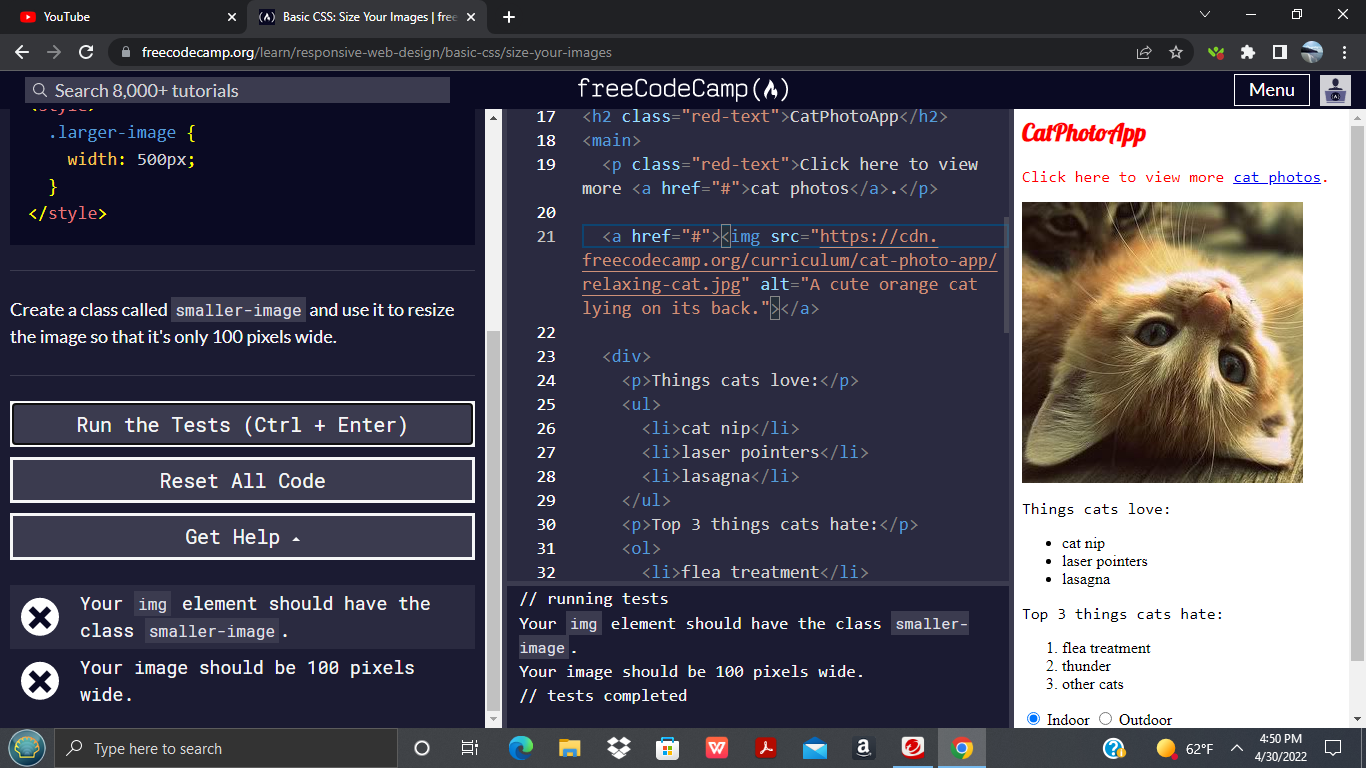
background-image: url('https://cdn.freecodecamp.org/curriculum/cat-photo-app/relaxing-cat.jpg');
background-size: cover; /* Scales image to cover the entire element */
background-repeat: no-repeat; /* Ensures image does not tile */
background-position: center; /* Centers the image within the element */
/* Add other styles like text color, padding, etc. */
}This combination is incredibly powerful. background-size: cover; ensures the image always fills the element. background-repeat: no-repeat; stops any unsightly tiling if the image is too small (though cover usually means it’s larger than the container). background-position: center; intelligently crops the image from the edges, keeping the focal point in the middle, regardless of screen aspect ratio.
This technique is essential for creating “image inspiration & collections” where every background needs to be dynamically adjusted and look appealing on every device. It brings a professional and immersive touch to the visual storytelling capabilities of Tophinhanhdep.com.
Best Practices for Image Resizing and Web Performance on Tophinhanhdep.com
While CSS provides powerful tools for displaying images at various sizes, it’s crucial to understand that CSS resizing primarily affects how an image renders on the screen, not its actual file size. For a high-performance, visually rich platform like Tophinhanhdep.com, truly effective image management involves a holistic approach that goes beyond CSS alone. This includes pre-processing images, considering accessibility, and implementing smart loading strategies.
Image Optimization Beyond CSS
The biggest mistake in image handling is relying solely on CSS to shrink a physically large file. Sending a 4MB, 4000px wide image to a browser and then using CSS to display it as a 400px wide thumbnail is inefficient. The user still downloads the entire 4MB file, leading to slow page loads.
-
Pre-process Images with Image Tools: Before uploading any “high resolution” or “stock photos” to Tophinhanhdep.com, leverage dedicated “image tools” such as compressors and optimizers. These tools (which Tophinhanhdep.com itself might offer or recommend) reduce the file size significantly without noticeable loss of quality.
- For example, if you have a “beautiful photography” shot at 6000px wide, but its largest display on your site will be 1920px (for a desktop wallpaper), then resize the image to that maximum necessary dimension before uploading.
- Tools like “AI Upscalers” can create high-resolution versions from smaller images, but these then need to be optimized for web delivery.
-
Choose the Right Image Format: The choice of file format impacts both quality and file size, a key aspect of “digital photography” and “editing styles.”
- JPEG: Ideal for photographs with many colors and subtle gradients (e.g., nature, aesthetic, emotional images). Offers good compression with acceptable quality loss.
- PNG: Best for images with transparency, sharp edges, or limited color palettes (e.g., logos, graphic design elements). Provides lossless compression, meaning no quality degradation.
- WebP / AVIF: Modern formats that offer superior compression and quality compared to JPEG and PNG. They are highly recommended for web use on Tophinhanhdep.com for faster loading times, though browser support needs careful consideration (and fallbacks might be necessary).
-
Implement Responsive Images in HTML (srcset/sizes): For truly optimized image delivery, combine CSS resizing with HTML’s
srcsetandsizesattributes. This allows browsers to choose the most appropriate image file from a set of options based on the user’s viewport size and screen resolution. This means mobile users download smaller files, and high-DPI screens get sharper images.<img srcset="image-small.jpg 480w, image-medium.jpg 800w, image-large.jpg 1200w" sizes="(max-width: 600px) 480px, (max-width: 900px) 800px, 1200px" src="image-large.jpg" alt="A responsive image example">This ensures efficient delivery of your “image inspiration & collections.”
Browser Compatibility and Accessibility
A visually stunning image means nothing if it’s not universally accessible and consistently displayed across all platforms.
- Cross-Browser Compatibility Testing: As seen in the provided content, tools exist to “Test browser compatibility of your CSS websites across 3000+ real browsers.” It’s vital to test how your resized images appear on different browsers (Chrome, Firefox, Safari, Edge) and operating systems. What looks perfect in one browser might be broken in another. This ensures that your “thematic collections” and “trending styles” are viewable by everyone.
- Web Accessibility (
altattribute): Thealtattribute on an<img>tag is non-negotiable for web accessibility. It provides a text description of the image for:- Visually impaired users relying on screen readers.
- Users with slow internet connections where images might not load.
- Search engines, for SEO.
- For images displaying text (e.g., “graphic design” elements or “image-to-text” conversions), ensure the
alttext accurately conveys that textual content. Even for “aesthetic” or “abstract” images, a descriptivealttext enhances the user experience.
Progressive Enhancement and Lazy Loading
For a content-heavy site like Tophinhanhdep.com, smart loading strategies are key to perceived performance.
-
Lazy Loading: Implement lazy loading for images that are “below the fold” (not immediately visible on screen). This defers loading these images until the user scrolls near them, dramatically improving initial page load times. Modern browsers support
loading="lazy"attribute directly:<img src="path/to/image.jpg" alt="Description" loading="lazy"> -
Image Placeholders: Consider showing low-quality image placeholders or blurred versions that load quickly and are then replaced by the high-quality image once it’s fully loaded. This provides a better perceived performance for large “image collections.”
By integrating these best practices with the CSS resizing techniques discussed, Tophinhanhdep.com can not only present its vast array of “wallpapers,” “backgrounds,” “aesthetic” visuals, and “beautiful photography” impeccably but also ensure that every user enjoys a fast, accessible, and visually captivating experience. This comprehensive approach transforms raw image files into optimized, responsive, and impactful visual content, truly elevating the platform’s offering.
Conclusion
The journey through the intricacies of CSS image resizing reveals it as an indispensable skill for any web developer, particularly for a visually rich platform like Tophinhanhdep.com. From showcasing “high resolution” photography to crafting engaging “abstract” digital art and “nature” wallpapers, the precise control over image dimensions and behavior is paramount to both aesthetic appeal and technical performance.
We’ve explored the foundational width, height, max-width, and max-height properties, which provide the bedrock for responsive image display, ensuring your images adapt fluidly to diverse screen sizes without distortion. Moving beyond the basics, we delved into advanced techniques like object-fit, offering granular control over how image content fits its container, enabling creative layouts for “photo manipulation” and “graphic design” elements. The transform: scale() property demonstrated its utility for dynamic visual effects, adding interactive flair to “image inspiration & collections.”
Crucially, we also detailed the specific approach to resizing background images using background-size, background-repeat, and background-position, illustrating how to create immersive, full-bleed backdrops that remain responsive and visually striking across all devices. This is particularly vital for delivering the “backgrounds” and “aesthetic” themes that define Tophinhanhdep.com.
Beyond CSS, we underscored the importance of a holistic strategy: pre-optimizing images with “image tools” like compressors, selecting appropriate file formats (JPEG, PNG, WebP/AVIF), and embracing HTML’s responsive srcset and sizes attributes for efficient delivery. Attention to “browser compatibility” and “accessibility” (through effective alt text) ensures that Tophinhanhdep.com’s rich content is available and enjoyable for every user, regardless of their device or capabilities. Implementing strategies like lazy loading further enhances perceived performance, crucial for content-heavy sites featuring extensive “thematic collections” and “trending styles.”
In essence, mastering CSS image resizing is about harmonizing visual design with web development best practices. It’s about empowering your “creative ideas” to shine, ensuring that every image, whether a subtle element or a central piece of “beautiful photography,” contributes to a seamless, high-quality user experience. So, go forth and experiment with these techniques; your potential to craft visually stunning and perfectly optimized web content on Tophinhanhdep.com is truly limitless.