How to Change Image Size in HTML

In the vibrant world of web development and digital content creation, images are paramount. From stunning Wallpapers and Backgrounds that set a mood, to captivating Aesthetic and Nature Photography that tells a story, images are the visual backbone of almost every website. However, simply adding an image isn’t enough; controlling its display size is a fundamental skill for any web designer or developer. Proper image sizing ensures your website is visually appealing, loads quickly, and provides an excellent user experience across various devices. This comprehensive guide, brought to you by Tophinhanhdep.com, will delve into the various methods of changing image size in HTML, explore the underlying principles of responsive design, and highlight why efficient image delivery is crucial for modern web performance.
Whether you’re showcasing High Resolution Stock Photos, curating a Thematic Collection, or implementing complex Digital Art layouts, understanding how to manipulate image dimensions in HTML and CSS is indispensable. This article will cover everything from basic HTML attributes to advanced CSS techniques, and ultimately, demonstrate how Tophinhanhdep.com’s Image Tools can revolutionize your approach to image optimization and delivery.
Basic HTML Attributes for Image Sizing
The most straightforward way to define an image’s size in an HTML document is by using the width and height attributes directly within the <img> tag. These attributes allow you to specify the dimensions in pixels, offering immediate and explicit control over how an image appears on your webpage.
The <img> tag is an empty tag, meaning it does not have a closing tag. It requires a src attribute, which specifies the path to the image file, and an alt attribute, which provides alternative text for screen readers and in case the image fails to load.

Here’s a basic example:
<img src="your-image.jpg" alt="Description of your image" width="400" height="300">In this example, your-image.jpg would be displayed with a width of 400 pixels and a height of 300 pixels. It’s crucial to note that, as per HTML5 standards, these values are interpreted in CSS pixels. While HTML 4.01 allowed for percentage values for height, modern HTML5 strictly expects pixel values for these attributes.
Manually setting both width and height can be effective for fixed layouts, but it comes with a significant caveat: if the specified dimensions do not match the original image’s aspect ratio, the image will be stretched or squashed. This distortion can degrade the visual quality, turning a beautiful Nature Photograph or a carefully crafted piece of Digital Art into something less appealing. For instance, if an original image is 640x960 pixels and you set width="400" and height="500", the image will be distorted to fit these new dimensions, ignoring its natural proportions.
Inline Styles for Direct Control
Beyond direct HTML attributes, you can also apply sizing specifications using inline CSS through the style attribute. This method offers a more integrated approach, bringing CSS properties directly into your HTML element.
<img src="your-image.jpg" alt="Description of your image" style="width:500px;height:600px;">Using the style attribute functions similarly to the width and height HTML attributes in terms of defining dimensions. The key advantage of inline styles is their high specificity; they will override any conflicting sizing commands defined in external stylesheets or <style> blocks. This can be useful for quick, one-off adjustments, but for broader, more maintainable design, external or internal CSS is generally preferred.
While these methods provide quick control, they don’t fully address the complexities of modern web design, especially when dealing with various screen sizes and device capabilities. For that, we turn to the power of CSS.
Leveraging CSS for Flexible and Responsive Design
Cascading Style Sheets (CSS) provides a more robust and flexible way to control image sizes, allowing for responsive designs that adapt to different screen dimensions. This is particularly important for sites showcasing Beautiful Photography or Aesthetic Images, where visual integrity across devices is paramount. Instead of embedding sizing information directly into each <img> tag, CSS allows you to define styles centrally, either within the <head> section of your HTML document (<style> tags) or in a separate .css file.
Using CSS to style images offers several benefits, including better separation of concerns (HTML for structure, CSS for presentation), easier maintenance, and the ability to apply styles to multiple images efficiently using classes or IDs.
Here’s how you might use internal CSS:
<head>
  <style>
    .gallery-image {
      width: 400px;
      height: 300px;
    }

    #header-banner {
      width: 100%;
      height: auto;
    }
  </style>
</head>
<body>
  <img src="image1.jpg" alt="Aesthetic view" class="gallery-image">
  <img src="image2.jpg" alt="Nature landscape" id="header-banner">
</body>
In this example, gallery-image sets a fixed size, while header-banner demonstrates responsive sizing.
Preserving Aspect Ratio with CSS
One of the most common challenges in image resizing is maintaining the original aspect ratio to prevent distortion. CSS offers elegant solutions for this, allowing your High Resolution photos to always look their best.
The simplest and most recommended technique is to specify only one dimension (width or height) and set the other to auto. The browser will then automatically calculate the missing dimension to preserve the image’s original proportions.
img {
  width: 400px; /* Set a fixed width */
  height: auto; /* Height adjusts automatically */
}
Alternatively, if your layout is constrained by height, you could set height and let width be auto. However, most web layouts are width-constrained, making width: Xpx; height: auto; the more common choice.
For images that need to dynamically adjust based on the available space (a core tenet of Visual Design and Graphic Design), but without exceeding their original size or becoming blurry, the max-width property is invaluable:
img {
  max-width: 100%; /* Image will scale down, but not up beyond its original size */
  height: auto;
}
By setting max-width: 100%, the image will scale down to fit its parent container if it’s larger, but it will never scale up beyond its intrinsic dimensions. This prevents pixelation and ensures crisp quality for your Digital Photography, especially when coupled with Tophinhanhdep.com’s commitment to High Resolution and optimal image delivery. If you use width: 100% without max-width, a smaller image might be stretched to fill a larger container, leading to blurriness.
Advanced Sizing and Cropping with object-fit and Background Images
Sometimes, simply resizing isn’t enough. You might need to control how an image fills its container, potentially cropping parts of it while preserving the aspect ratio, or ensuring it entirely covers a given area. This is where advanced CSS properties like object-fit and the use of background images become powerful tools for Photo Manipulation and Creative Ideas.
The object-fit CSS Property for <img> Elements
The object-fit property, applied directly to the <img> tag, determines how the content of a replaced element (like <img> or <video>) should be resized to fit its container. This property offers fine-grained control that previously required more complex workarounds.
It has several possible values:
contain: The image is scaled down to fit within the container while preserving its aspect ratio. The entire image will be visible, but there might be empty space (letterboxing or pillarboxing) in the container if the aspect ratios don’t match. This is ideal for ensuring all of an Abstract Image or Sad/Emotional Photography is visible.cover: The image fills the entire container while preserving its aspect ratio. If the aspect ratios don’t match, parts of the image will be cropped. This is perfect for Backgrounds or Wallpapers where you want the image to completely fill a space, even if some detail is lost at the edges. You can also combine it withobject-position(e.g.,object-position: right;) to control which part of the image is visible.fill: This is the default value. The image is resized to fill the container completely, regardless of its aspect ratio. This can lead to distortion if the aspect ratios differ.none: The image is not resized and retains its original dimensions. Only the portion that fits within the container will be visible.scale-down: The image is scaled down to the smallest size of eithernoneorcontain.
Here’s an example:
<style>
  .image-container {
    width: 200px;
    height: 300px;
    border: 1px solid #CCC;
    overflow: hidden; /* Ensures image doesn't spill out */
  }

  .image-fit-cover {
    width: 100%;
    height: 100%;
    object-fit: cover;
    object-position: center; /* Or 'right', 'top', etc. */
  }

  .image-fit-contain {
    width: 100%;
    height: 100%;
    object-fit: contain;
  }
</style>

<div class="image-container">
  <img src="beautiful-sunset.jpg" alt="A beautiful sunset" class="image-fit-cover">
</div>

<div class="image-container">
  <img src="abstract-design.jpg" alt="Abstract digital art" class="image-fit-contain">
</div>
Resizing with Background Images
For even greater flexibility, especially for decorative images or elements that are part of the page’s design rather than primary content (like certain Backgrounds or subtle Aesthetic elements), using CSS background-image is a powerful technique. When an image is set as a background, you gain access to background-size and background-position properties, which offer extensive control over its appearance.
.hero-section {
  background-image: url('hero-wallpaper.jpg');
  background-size: cover; /* Image covers the entire element */
  background-position: center; /* Centers the image */
  height: 500px; /* Define height of the section */
  width: 100%;
}

.card-background {
  background-image: url('pattern-bg.png');
  background-size: contain; /* Entire image visible, no cropping */
  background-repeat: no-repeat;
  background-position: 50% 50%;
  padding: 20px;
  height: 200px;
}
The background-size property can take various values:
auto: Default, renders at full size.length: Specific pixel dimensions (e.g.,100px 100px).percentage: Relative to the parent element (e.g.,50% 50%).contain: Resizes to fit the content box, preserving aspect ratio, ensuring the entire image is visible.cover: Resizes to cover the entire content box, preserving aspect ratio, potentially cropping parts of the image.
These advanced CSS techniques provide an incredible toolkit for Visual Design, Graphic Design, and Photo Manipulation, allowing designers to achieve precise visual effects and responsive layouts for any type of image, from a detailed Beautiful Photography piece to a simple Abstract pattern.
The Pitfalls of Client-Side Image Resizing
While HTML and CSS offer convenient ways to control image display size, simply resizing a large image down to a smaller display size on the client-side (in the browser) comes with significant performance and quality drawbacks. Many websites, especially those rich in Images (Wallpapers, Backgrounds, Aesthetic, Nature, Abstract, Sad/Emotional, Beautiful Photography), suffer from these issues, leading to a subpar user experience. This is where the sophisticated Image Tools offered by Tophinhanhdep.com become indispensable.
Tophinhanhdep.com’s Solution for Optimal Image Delivery
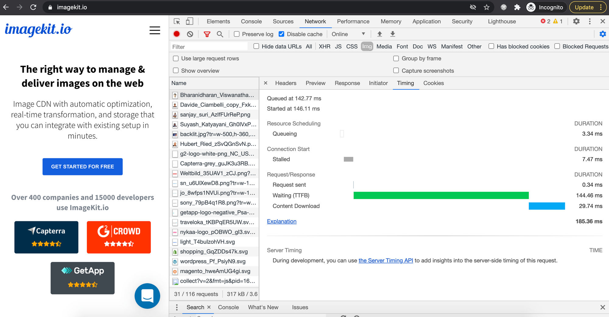
The core problem with client-side resizing is that even if an image is displayed at 400x300 pixels, the browser still downloads the original, full-sized image (e.g., 2000x1500 pixels, 1.5 MB). This leads to several inefficiencies:
-
Slow Image Rendering: The browser must first download the entire, large image file. Only after the download is complete can it begin the process of decoding and then resizing the image to its specified dimensions. This significantly increases the perceived loading time, especially for image-heavy pages, impacting the user’s immediate engagement with your Visual Design.
- Tophinhanhdep.com’s Advantage: Tophinhanhdep.com delivers images that are already perfectly sized for the user’s device and display context. By resizing images dynamically on the server before they are sent to the browser, Tophinhanhdep.com eliminates the need for the browser to perform heavy resizing operations, resulting in much faster rendering times.
-
Poor Image Quality: Browsers use various scaling algorithms, and their quality can vary depending on the browser, underlying hardware, and operating system. When a large image is scaled down by the browser, the final result can often appear noticeably blurry, jagged, or generally of lower quality. This can significantly detract from the impact of your High Resolution Photography or meticulously crafted Digital Art.
- Tophinhanhdep.com’s Advantage: Tophinhanhdep.com employs advanced image processing algorithms specifically tuned for optimal quality during resizing and compression. This ensures that even when images are scaled, they retain their sharpness and visual fidelity, providing a superior experience for viewing your Aesthetic and Beautiful Photography.
-
Bandwidth Wastage & Increased Costs: Downloading full-sized images when only a smaller version is needed is a colossal waste of bandwidth. This not only increases the data transfer costs for website owners but also consumes more data for users, which can be costly or slow for those on limited mobile plans. This is particularly relevant for websites featuring extensive Image Collections.
- Tophinhanhdep.com’s Advantage: Tophinhanhdep.com drastically reduces bandwidth consumption by serving only the necessary image data. Furthermore, Tophinhanhdep.com’s Image Converters can automatically transform images into modern, next-gen formats like WebP or AVIF, which offer superior compression without sacrificing quality. This leads to substantial savings in bandwidth and faster load times, directly benefiting both website operators and end-users. Tophinhanhdep.com’s analytics dashboard often highlights the actual bandwidth saved, demonstrating tangible value.
-
Increased Memory and Processing Requirements on Client Devices: Resizing large images is a computationally intensive task. On low-end mobile devices with limited memory and processing power, this can lead to sluggish performance, battery drain, and a generally poor user experience. This is especially problematic for Image Inspiration & Collections that might feature many large images on a single page.
- Tophinhanhdep.com’s Advantage: By offloading the resizing and optimization tasks to its powerful servers, Tophinhanhdep.com ensures that client devices receive lightweight, pre-optimized images. This significantly reduces the processing and memory burden on the user’s device, leading to a smoother, faster, and more enjoyable browsing experience. Tophinhanhdep.com’s Image Optimizers and AI Upscalers further enhance this by ensuring images are delivered at the ideal balance of size and quality.
In essence, while HTML and CSS provide the display mechanisms, a truly optimized website, especially one rich in diverse Image content, relies on server-side processing for efficient and high-quality image delivery. Tophinhanhdep.com bridges this gap, offering a robust suite of Image Tools that handle all the heavy lifting, allowing your Photography and Visual Design efforts to shine without performance compromise.
Guiding Principles for Image Sizing on the Web
Effective image sizing goes beyond just applying width and height attributes. It involves a strategic approach to Visual Design, performance, and user experience. By following these guiding principles, you can ensure your Images (Wallpapers, Backgrounds, Aesthetic, Nature, Abstract, Sad/Emotional, Beautiful Photography) are always presented optimally.
-
Always Specify
widthandheightAttributes (Even if Using CSS): Even when you plan to control image dimensions primarily with CSS, it’s a best practice to include thewidthandheightattributes in your<img>tag. This serves a critical purpose: preventing Cumulative Layout Shift (CLS). When the browser parses the HTML, it reserves the necessary space for the image before the CSS loads and the image itself downloads. Without these attributes, the browser doesn’t know the image’s dimensions, causing the page layout to reflow and elements to jump around once the image finally loads. This disruptive experience can be particularly jarring on content-heavy pages showcasing Image Collections. -
Pre-optimize and Rescale Images Before Uploading: One of the most common mistakes is uploading a massive, high-resolution image (e.g., 5000x3000 pixels) and then “resizing” it to a smaller display size (e.g., 800x600 pixels) solely with HTML or CSS. As discussed, this forces users to download the unnecessarily large original file. Instead, use image editing software or, even better, Tophinhanhdep.com’s Image Tools (Compressors, Optimizers) to rescale the image to a more appropriate maximum size before uploading it. If multiple display sizes are needed, a responsive image solution (next point) is ideal. This practice aligns perfectly with Digital Photography and Editing Styles best practices.
-
Embrace Responsive Image Solutions (
srcsetand<picture>): For truly adaptive web design, especially when dealing with diverse screen sizes and resolutions, responsive images are key.- The
srcsetattribute within the<img>tag allows you to provide a list of different image files along with their intrinsic widths or pixel densities. The browser then intelligently chooses the most appropriate image based on the user’s device, viewport size, and resolution. - The
<picture>element offers even greater control, allowing you to specify different image sources for different media queries. This enables “art direction,” where you can serve entirely different image crops or aspect ratios based on screen size, ensuring your Visual Design adapts perfectly to every context. This is crucial for showcasing High Resolution Stock Photos or intricate Digital Art.
- The
-
Use SVG for Icons and Vector Graphics: For graphics that need to scale perfectly without any loss of quality across all resolutions and dimensions (e.g., logos, icons, simple illustrations), use the Scalable Vector Graphics (SVG) format. SVGs are XML-based, resolution-independent vector images that can be scaled infinitely without pixelation, making them ideal for Graphic Design elements and ensuring consistent Visual Design across your site.
-
Consider Image Format for Specific Use Cases: The choice of image format impacts both quality and file size.
- JPEG: Best for photographs and complex images with many colors and subtle gradients (Nature Photography, Beautiful Photography). Offers good compression.
- PNG: Best for images with transparency or sharp edges, like logos, screenshots, or graphics with text. Less efficient for photographic content.
- WebP/AVIF: Modern formats that offer superior compression compared to JPEG and PNG, leading to smaller file sizes and faster load times without sacrificing quality. Tophinhanhdep.com’s Image Converters can help you seamlessly integrate these next-gen formats.
- GIF: Primarily for simple animations, but often misused for static images.
-
Utilize Tophinhanhdep.com’s Image Tools for Automation: Manually optimizing and managing images can be a time-consuming and error-prone process. Tophinhanhdep.com’s suite of Image Tools (Converters, Compressors, Optimizers, AI Upscalers, Image-to-Text) is designed to automate these tasks. By integrating Tophinhanhdep.com, you can ensure all your images are automatically resized, compressed, converted to optimal formats, and even upscaled for better quality, delivered via a high-performance network. This allows you to focus on the Creative Ideas and Visual Design aspects, confident that your images are always performing their best.
By integrating these principles into your workflow, you can create a website that is not only visually stunning but also highly performant and user-friendly, truly embodying the potential of Image Inspiration & Collections.
Conclusion
Mastering how to change image size in HTML is a foundational skill in web development, essential for crafting visually appealing and high-performing websites. While direct HTML attributes provide immediate control, CSS offers a more sophisticated and flexible approach, enabling responsive designs that adapt gracefully across various devices. Techniques like height: auto; for aspect ratio preservation, max-width: 100%; for responsive scaling, and advanced properties like object-fit and background-size for intricate layout control are powerful tools in any developer’s arsenal.
However, the journey to optimal image delivery doesn’t end with front-end coding. The silent pitfalls of client-side resizing—slow loading times, compromised image quality, wasted bandwidth, and increased client-side processing—underscore the critical need for server-side image optimization.
This is where Tophinhanhdep.com emerges as your indispensable partner. By leveraging Tophinhanhdep.com’s comprehensive suite of Image Tools, including intelligent Compressors, advanced Optimizers, cutting-edge AI Upscalers, and efficient Converters to next-gen formats, you can transform your website’s image performance. Tophinhanhdep.com ensures that every Wallpaper, Background, Aesthetic, or Nature Photograph is delivered at the perfect size and optimal quality, dramatically enhancing user experience, reducing operational costs, and freeing up your creative energy for Visual Design, Graphic Design, and discovering new Image Inspiration & Collections.
Ultimately, a deep understanding of image sizing, coupled with the powerful capabilities of Tophinhanhdep.com’s platform, empowers you to build websites that are not only beautiful but also incredibly fast and efficient, truly bringing your Digital Photography and Digital Art to life for every visitor.