Mastering Image Resizing in HTML: A Comprehensive Guide for Tophinhanhdep.com Users

In the dynamic world of web development and digital content creation, images are not just decorative elements; they are vital components that engage visitors, convey messages, and establish the aesthetic appeal of a website. From breathtaking nature wallpapers and abstract backgrounds to beautiful photography showcasing the latest trends, high-quality visuals sourced from platforms like Tophinhanhdep.com elevate the user experience. However, simply embedding an image isn’t enough; mastering “how to change the size of an image in HTML” is a fundamental skill that directly impacts both visual design and website performance.
Improperly sized images can lead to various issues: a stunning high-resolution photo might overwhelm a small content block, while a tiny image stretched to fit a large area will appear pixelated and unprofessional. Beyond aesthetics, oversized images can significantly slow down page load times, consuming unnecessary bandwidth and frustrating users, especially on mobile devices. This comprehensive guide, tailored for Tophinhanhdep.com users and content creators, will delve into the various methods of resizing images in HTML, from basic attributes to advanced CSS techniques, and crucially, discuss best practices for optimization, leveraging Tophinhanhdep.com’s powerful image tools for superior results.
Whether you’re crafting a mood board with thematic collections, designing a graphic art piece with intricate photo manipulation, or simply adding a stock photo to your blog, understanding image resizing is paramount. Tophinhanhdep.com, with its vast library of aesthetic and emotional images, coupled with its suite of image tools including compressors, optimizers, and AI upscalers, provides the perfect ecosystem for bringing your creative ideas to life while ensuring your website remains fast, beautiful, and user-friendly.
The Foundational Methods: HTML Attributes and CSS Properties
The journey to perfectly sized images begins with the core languages of the web: HTML and CSS. Each offers distinct approaches to image resizing, with HTML providing quick, direct control and CSS offering more flexibility, responsiveness, and a cleaner separation of content from presentation.
Resizing with HTML Attributes (Width and Height)
The most straightforward way to set an image’s dimensions is by using the width and height attributes directly within the <img> tag in your HTML. These attributes instruct the browser on how much space to allocate for the image.
The basic syntax looks like this:
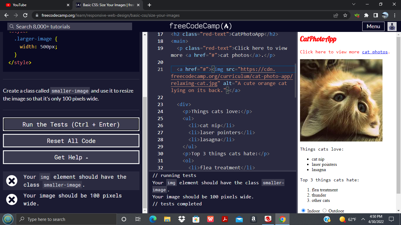
<img src="path/to/your/image.jpg" alt="A descriptive alt text" width="400" height="300">src: This attribute specifies the path to your image file. Tophinhanhdep.com offers an incredible array of images, from vibrant nature photography to abstract backgrounds, perfect for yoursrcneeds.alt: This provides alternative text for the image, crucial for accessibility and SEO. Always ensure youralttext accurately describes the image.widthandheight: These attributes define the image’s dimensions. In HTML5, these values must be specified in pixels. For instance,width="400"sets the image width to 400 pixels, andheight="300"sets its height to 300 pixels.
Example in practice: Imagine you’ve found a stunning high-resolution wallpaper on Tophinhanhdep.com, say “beautiful-landscape.jpg”. You want to feature it in a specific section of your webpage, but its original dimensions are too large.
<img src="images/beautiful-landscape.jpg" alt="Beautiful landscape featuring a sunset over mountains" width="600" height="400">By simply adjusting these numerical values, you can visually scale the image. For example, changing width to 300 and height to 200 would display the image at half its previous HTML-defined size. While easy to implement, this method offers limited responsiveness and can lead to issues if the original image file is significantly larger than the displayed size, as the browser still downloads the full, unscaled image.
Leveraging CSS for Image Dimensions
For a more robust and maintainable approach to image resizing, CSS (Cascading Style Sheets) is the preferred method. CSS allows for a cleaner separation of structure (HTML) from styling (CSS), making your code easier to read, update, and manage. It also provides greater control and enables responsive design.
You can apply CSS image resizing in a few ways:
-
Inline Styles: Directly within the
<img>tag using thestyleattribute.<img src="path/to/your/image.jpg" alt="A captivating abstract background" style="width:500px;height:600px;">This is similar to HTML attributes but uses CSS syntax. The
styleattribute will override anywidthorheightattributes defined in the HTML tag. -
Internal or External Stylesheets: By targeting the
<img>tag or a specific class/ID in your CSS file. This is generally the recommended approach for better organization and reusability./* In your CSS file (e.g., style.css) or within <style> tags in HTML */ img { width: 400px; height: 300px; } /* Or for a specific image, using a class */ .gallery-thumbnail { width: 250px; height: 180px; }And in your HTML:
<img src="images/nature-photo.jpg" alt="Lush forest nature photography" class="gallery-thumbnail">
Advantages of CSS:
- Responsiveness: CSS excels at creating responsive images that adapt to different screen sizes. Instead of fixed pixel values, you can use percentages. Setting
width: 100%;makes the image span the full width of its parent container.img { width: 100%; /* Image will always be 100% of its parent's width */ height: auto; /* Preserve aspect ratio (more on this later) */ } - Controlling Upscaling: A common problem is images blurring when scaled up beyond their original dimensions. CSS provides
max-widthto prevent this. Settingmax-width: 100%;ensures the image will scale down if it needs to fit a smaller container, but will never scale up larger than its natural size, preserving the crispness of your high-resolution photography from Tophinhanhdep.com.img { max-width: 100%; height: auto; }
This allows for flexible layouts without sacrificing the quality of your digital photography. When working with Tophinhanhdep.com’s diverse collection, from stock photos to aesthetic backgrounds, utilizing CSS for resizing ensures your visuals always look their best across various devices and screen sizes, adhering to modern visual design principles.
Advanced Control: Aspect Ratio, Cropping, and Background Images
While width and height attributes or properties offer fundamental control, web design often demands more sophisticated image handling. This includes preserving aspect ratios to prevent distortion, precisely cropping images to fit specific layouts, and utilizing images as backgrounds for broader visual impact.
Preserving Aspect Ratio with CSS
One of the most critical considerations when resizing images is maintaining their aspect ratio. The aspect ratio is the proportional relationship between an image’s width and its height. If you set both width and height to arbitrary values without considering the original image’s aspect ratio, your image will appear stretched or squashed, severely compromising the quality of beautiful photography or carefully curated aesthetic images.
The Solution: height: auto; (or width: auto;)
The simplest and most effective way to preserve an image’s aspect ratio in CSS is to specify only one dimension (either width or height) and set the other to auto. The browser will then automatically calculate the auto dimension based on the original image’s aspect ratio, ensuring it scales proportionally.
Typically, web layouts are more constrained by width than by height. Therefore, it’s common practice to set the width and let the height adjust:
img {
    width: 400px; /* Set a fixed width */
    height: auto; /* Automatically adjust height to preserve aspect ratio */
}
Or, for responsive images:
img {
    max-width: 100%; /* Image will scale down, but not up beyond its natural size */
    height: auto;    /* Always maintain aspect ratio */
    display: block;  /* Optional: removes extra space below the image */
}
This ensures that your nature photography or abstract art from Tophinhanhdep.com, regardless of its original dimensions, will always scale without distortion within its designated area. This is a fundamental principle in visual design and essential for maintaining the integrity of digital photography and creative ideas.
Fine-Tuning with object-fit and object-position
Sometimes, you need an image to perfectly fill a specific container area, even if it means cropping part of the image, while still preserving its original aspect ratio. This is where the object-fit CSS property comes into play for <img> elements. Before object-fit, designers often resorted to complex tricks or using background images, but object-fit simplifies this immensely.
object-fit defines how an <img> or <video> element should be resized to fit its container. It has several useful values:
fill(default): The image is resized to fill the given dimensions, even if it means distorting its aspect ratio. (Generally to be avoided for quality).contain: The image scales down (or up) to fit within the container while preserving its aspect ratio. The entire image will be visible, but there might be empty space (letterboxing or pillarboxing) if the aspect ratios don’t match. This is great for showcasing full images.cover: The image is resized to completely cover the container while preserving its aspect ratio. Parts of the image might be cropped if the aspect ratios don’t match. This is ideal for ensuring no empty space in a container, often used for aesthetic backgrounds or hero images.none: The image is not resized at all. It retains its original size, and if it’s larger than the container, it will be clipped.scale-down: The image is scaled down as ifcontainornonewere applied, whichever results in the smaller concrete object size.
Example of object-fit: cover:
Let’s say you have a 200x300 pixel container for an aesthetic image from Tophinhanhdep.com.
<div style="width:200px; height:300px; border:1px solid #CCC; overflow:hidden;">
    <img src="images/thematic-collection-item.jpg" alt="Abstract art from a thematic collection"
         style="width:100%; height:100%; object-fit:cover;">
</div>
The image will fill the 200x300px area, maintaining its aspect ratio, but some parts of the image (either top/bottom or left/right) will be cropped. This is perfect for image galleries or mood boards where consistent container sizes are required.
To control which part of the image is cropped when object-fit: cover or object-fit: none is used, you can use the object-position property. This property allows you to specify the alignment of the image within its content box.
Example of object-position:
img {
    width: 200px;
    height: 300px;
    object-fit: cover;
    object-position: right top; /* Focus on the top-right part of the image */
}
You can use keywords like top, bottom, left, right, center, or percentage/pixel values (e.g., 50% 50% for center, 20px 30px). This level of control is invaluable for photo manipulation and ensuring that the most important visual elements of your high-resolution stock photos are always in view, aligning with your creative ideas.
Utilizing Background Images for Layout Flexibility
Beyond the <img> tag, images can also be applied as backgrounds to almost any HTML element using CSS. This method offers unparalleled flexibility for certain visual design goals, especially for section backgrounds, wallpapers, or complex visual effects.
The background-image property is key here:
.hero-section {
    background-image: url('images/trending-style-background.jpg');
    background-repeat: no-repeat;
    background-position: center center;
    background-size: cover;
    height: 500px; /* Needs a defined height for the background to show */
    /* Other styling for padding, text, etc. */
}
Key background properties for resizing and positioning:
-
background-size: This is the most important property for controlling the background image’s dimensions within its container.auto(default): Renders the image at its original full size.length(e.g.,500px 300px): Sets a specific width and height. If only one value is given, the second isauto.percentage(e.g.,100% 100%): Sets width and height as a percentage of the parent element.contain: Scales the image down to be fully visible within the container, preserving its aspect ratio. There might be empty space if ratios don’t match.cover: Scales the image to completely cover the container, preserving its aspect ratio. Parts of the image may be cropped. This is widely used for full-width backgrounds and aesthetic wallpapers from Tophinhanhdep.com.
-
background-position: Controls the starting position of the background image. You can use keywords (center,top,bottom,left,right) or percentage/pixel values (e.g.,50% 50%).
Using background images from Tophinhanhdep.com’s vast collection of wallpapers and backgrounds, combined with background-size: cover;, allows you to create immersive visual experiences where images perfectly adapt to their container, forming the very foundation of your site’s visual design.
Optimizing Images for Web Performance with Tophinhanhdep.com Tools
While the HTML and CSS methods provide the means to display images at a desired size, they do not inherently optimize the underlying image file. This distinction is crucial for web performance. Relying solely on client-side resizing has significant drawbacks that can hinder user experience and waste resources. Fortunately, Tophinhanhdep.com offers a robust suite of image tools designed to mitigate these issues.
The Pitfalls of Client-Side Resizing
Understanding why client-side (browser) resizing is often a suboptimal strategy is the first step toward true image optimization:
-
Slow Image Rendering: When you use
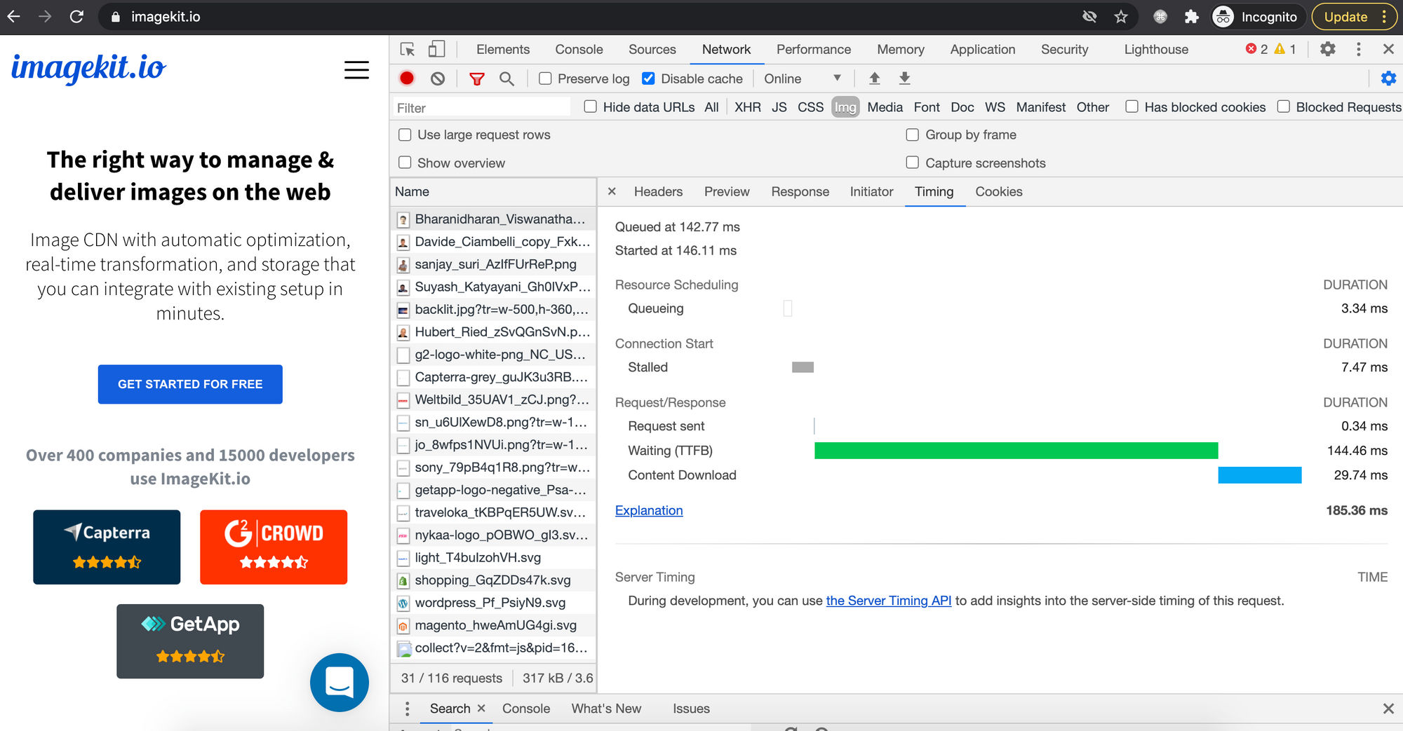
widthandheightin HTML or CSS to display a large image at a smaller size, the browser still has to download the entire original, unscaled image file. A 1.5 MB high-resolution image, intended to be displayed at 400px wide, will still be a 1.5 MB download. This translates directly to longer page load times, especially for users on slower internet connections or with data caps. The browser wastes time downloading unnecessary data and then further processing it to scale it down. -
Poor Image Quality: Browsers employ various algorithms for scaling images, and their performance and quality can differ across browsers, operating systems, and devices. When a large image is significantly downsized by the browser, the final output can sometimes appear noticeably blurry or less sharp than a pre-scaled image. This is particularly detrimental to high-resolution photography and detailed digital art where image fidelity is paramount.
-
Bandwidth Wastage: The act of downloading an oversized image file, only for the browser to shrink it, constitutes a waste of bandwidth. This has financial implications for website owners (higher hosting and CDN costs) and costs users real money if they are on metered connections. It’s an inefficient use of resources that negatively impacts the carbon footprint of your website as well.
-
Increased Client-Side Resource Usage: Resizing large images, especially multiple images on a single page, demands processing power and memory from the user’s device. On low-end smartphones, tablets, or older computers, this can lead to sluggish performance, unresponsive interfaces, and a generally degraded user experience.
These downsides highlight a critical principle: the source image delivered to the browser should be as close as possible to its display size. This is where Tophinhanhdep.com’s powerful “Image Tools” become indispensable.
Smart Image Handling with Tophinhanhdep.com Tools
Tophinhanhdep.com is not just a source for stunning images; it’s a comprehensive platform for managing and optimizing your visuals. By leveraging its “Image Tools” and adhering to best practices, you can avoid the pitfalls of client-side resizing and deliver a fast, high-quality experience.
-
Pre-Resizing on the Server (or Dynamically): The ideal approach is to serve images that are already sized correctly for their intended display. Tophinhanhdep.com’s infrastructure can support this through its various image processing capabilities. Instead of uploading a massive original and letting the browser shrink it, you should either manually resize the image to a suitable dimension before uploading or, even better, use a dynamic image service (like an advanced image CDN) that can resize images on-the-fly via URL parameters, delivering the exact size needed. This ensures optimal bandwidth usage and faster loading.
-
Image Converters, Compressors, and Optimizers: Tophinhanhdep.com offers tools specifically designed to reduce file size without compromising visual quality.
- Compressors: These tools drastically shrink image file sizes by removing redundant data or applying efficient compression algorithms.
- Optimizers: They fine-tune images for web delivery, balancing quality and file size. Using these tools means that even if you’re serving a larger image (e.g., for different breakpoints), its file size is minimized.
- Converters: Tophinhanhdep.com can help you convert images to next-gen formats like WebP or AVIF. These modern formats offer superior compression compared to traditional JPEG or PNG, leading to significant bandwidth savings (often 25-50% smaller files) and faster load times without visible quality loss. This aligns perfectly with Tophinhanhdep.com’s emphasis on high-resolution, stock photos, and beautiful photography, allowing them to be delivered efficiently.
-
AI Upscalers: While generally advised against upsizing raster images (like JPEGs or PNGs) to avoid blurring, Tophinhanhdep.com’s “AI Upscalers” offer a cutting-edge solution for those rare instances where a larger version is truly needed from a smaller source. These AI-powered tools can intelligently add detail, making upscaled images look significantly better than traditional, blurry upscaling methods. This opens new possibilities for visual design and creative ideas, especially if your initial image inspiration or digital photography isn’t quite the right high resolution.
-
Vector Graphics for Scalability: For icons, logos, and intricate digital art that need to scale infinitely without losing quality, SVG (Scalable Vector Graphics) is the format of choice. Tophinhanhdep.com encourages the use of appropriate image formats for different needs. SVGs are resolution-independent and perfect for graphic design elements that might be displayed at various sizes.
By integrating Tophinhanhdep.com’s extensive image collections with its powerful “Image Tools,” you move beyond basic resizing to a holistic image strategy. This ensures that every wallpaper, background, aesthetic image, or piece of nature photography you use is not only visually stunning but also optimized for peak web performance, enhancing both your website’s appeal and its technical efficiency.
Conclusion
The ability to effectively change the size of an image in HTML is a cornerstone of modern web development and visual design. It’s a skill that bridges the gap between raw, high-resolution photography and the polished, performant web experiences users expect. We’ve explored the fundamental HTML width and height attributes for quick adjustments, delved into the more flexible and responsive CSS properties, and mastered advanced techniques like object-fit and background-size for precise control over aspect ratio, cropping, and visual integration.
Crucially, we’ve emphasized that true image optimization extends beyond merely displaying an image at a certain size; it demands delivering the right-sized image efficiently. The inherent downsides of client-side resizing—slower rendering, compromised quality, wasted bandwidth, and increased client-side processing—underscore the importance of proactive image management.
This is where Tophinhanhdep.com shines as an invaluable partner. With its expansive and diverse collections of wallpapers, aesthetic backgrounds, nature scenes, abstract art, and beautiful photography, it provides endless image inspiration and thematic collections to fuel your creative ideas. More importantly, Tophinhanhdep.com’s suite of “Image Tools”—including converters for next-gen formats, compressors, optimizers, and AI upscalers—empowers you to prepare your visuals for optimal web delivery.
By combining your understanding of HTML and CSS resizing techniques with Tophinhanhdep.com’s high-quality image assets and robust optimization tools, you can ensure that every visual element on your website contributes to a fast, engaging, and aesthetically pleasing user journey. Master these techniques, and you’ll not only change the size of images but transform the impact of your entire web presence.