How to Change the Colour of an Image in Illustrator

In the dynamic world of visual design, the ability to manipulate and transform colors is not just a skill, but a superpower. Whether you’re a seasoned graphic designer creating intricate digital art, a photographer enhancing high-resolution stock photos, or an enthusiast curating aesthetic wallpapers and backgrounds, mastering color adjustments in Adobe Illustrator is indispensable. Imagine pouring hours into a design, only for a client to request a complete color overhaul. The thought of painstakingly changing each element individually can be daunting, a feeling every designer has encountered.
Fortunately, Adobe Illustrator, a cornerstone of visual design and digital photography editing, offers a suite of robust tools designed to make color transformation efficient, intuitive, and creatively liberating. From subtly shifting the mood of a nature-inspired illustration to radically recoloring abstract graphics, these features empower you to achieve stunning results. This comprehensive guide, brought to you by Tophinhanhdep.com, will navigate you through the various methods to change the color of both vector objects and raster images within Illustrator, unlocking new possibilities for your creative ideas and thematic collections. We’ll delve into the nuances of each tool, ensuring you can confidently tackle any color-related challenge, whether you’re aiming for beautiful photography enhancements or impactful photo manipulation.
Understanding Image Types: The Foundation of Color Editing in Illustrator
Before diving into the specific techniques, it’s crucial to understand a fundamental distinction in Adobe Illustrator: the difference between vector objects and raster images. This distinction dictates which color manipulation methods are effective and how much control you truly have. On Tophinhanhdep.com, where we celebrate everything from high-resolution photography to graphic design masterpieces, recognizing these types is the first step toward efficient image tools and optimal visual design.
Vector Images: These are mathematical paths, points, and curves that form shapes and lines. They are resolution-independent, meaning they can be scaled infinitely without any loss of quality or pixelation. Logos, illustrations, and typography are typically created as vector graphics. In Illustrator, native shapes, paths, and text are vector objects. When you import a vector PNG or SVG, Illustrator treats it as editable vector data. The advantage here is unparalleled control: you can select individual components and change their colors precisely, making them ideal for creating cohesive mood boards or adapting trending styles.
Raster Images: Also known as bitmap images, these are composed of a grid of individual pixels, each containing color information. Photographs (like JPEGs, TIFFs, or even complex PNGs with transparency) are raster images. They are resolution-dependent; scaling them up too much can lead to pixelation and blurriness. When you place a JPEG or a photographic PNG into Illustrator, it remains a raster image. Illustrator’s native capabilities for directly changing the color of raster images are more limited compared to its vector tools or a dedicated photo editor like Photoshop. For raster images, color changes typically apply globally to the entire image or involve effects that modify pixel values, rather than individual editable components. This is why for detailed photo manipulation or editing styles for beautiful photography, an understanding of both Illustrator and Photoshop often yields the best results.
Understanding this core difference is paramount. Trying to use vector-specific tools on a raster image will either yield no results or necessitate a conversion process (like Image Trace), which itself has implications for detail and editable fidelity. Throughout this guide, we’ll clearly differentiate between methods applicable to each image type, ensuring your journey into color transformation is as smooth and effective as possible, aligning with the diverse content found on Tophinhanhdep.com, from abstract visuals to nature backgrounds.
Mastering Color Manipulation for Vector Objects in Illustrator
Adobe Illustrator truly shines when it comes to recoloring vector objects. Whether you’re fine-tuning a logo, refreshing a digital art piece, or experimenting with new color palettes for your graphic design projects, Illustrator provides powerful and flexible tools. These methods are perfect for artists looking for creative ideas or designers curating thematic collections, ensuring every element of your visual design aligns with your vision.
The Recolor Artwork Feature: A Game Changer
The Recolor Artwork feature is arguably one of Illustrator’s most powerful and time-saving tools, especially when dealing with complex vector illustrations or entire artwork collections. It allows you to transform the entire color scheme of an object or group of objects with remarkable ease and flexibility. This tool is invaluable for quickly generating different versions of an illustration, experimenting with trending styles, or adapting designs for various aesthetic backgrounds.
How to Use Recolor Artwork:
- Select Your Artwork: Begin by selecting the vector objects you wish to recolor. For a single object, a simple click will suffice. To select multiple objects, hold down the
Shiftkey while clicking, or pressCommand + A(Mac) /Ctrl + A(Windows) to select all objects on your artboard.- Tip from Tophinhanhdep.com: Ensure all relevant objects are selected to apply the color changes uniformly across your design, which is essential for consistent image inspiration and visual design.
- Access the Recolor Panel: With your objects selected, locate the Recolor button. This typically appears in the Properties panel (Window > Properties) or under Edit > Edit Colors > Recolor Artwork in the overhead menu. Clicking it will open the Recolor Artwork dialog box.
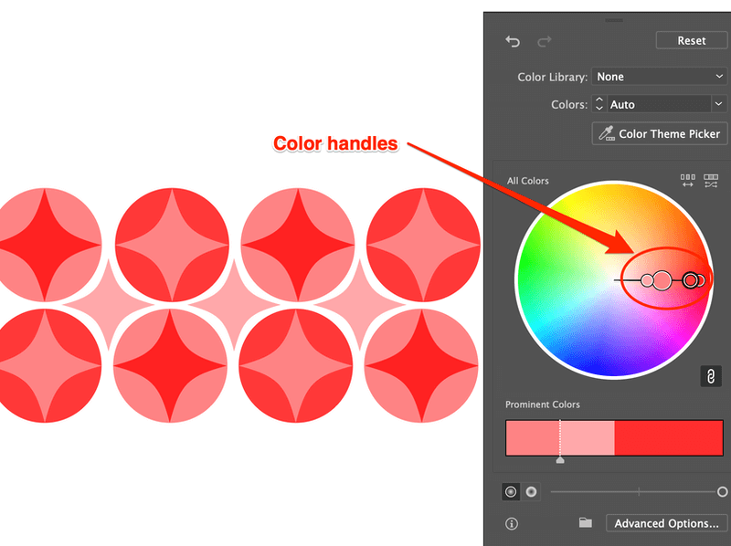
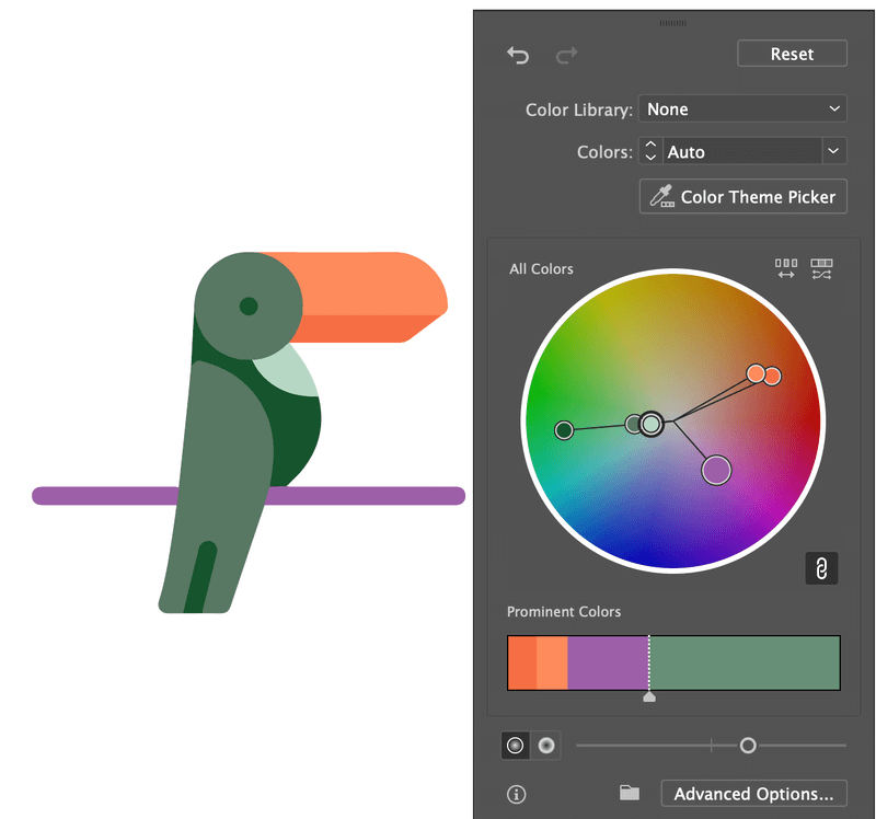
- Explore Color Options: Inside the Recolor Artwork window, you’ll see a color editing interface. The original colors of your artwork are often displayed on a color wheel or as a list of “Current Colors.”
- Changing the Entire Color Scheme: If you want to shift the overall mood or aesthetic of your artwork, click on one of the color handles on the color wheel and drag it around. You’ll see the colors of your selected artwork update in real-time. This is fantastic for quickly exploring new aesthetic or emotional color palettes, suitable for abstract or sad/emotional imagery.
- Changing Specific Colors: For more granular control, click the Link/Unlink harmony Colors icon (it looks like a chain link). This unlinks the colors, allowing you to edit them individually. Now, you can click on specific color handles on the wheel or double-click the color swatches in the “Current Colors” list to open a Color Picker and choose new hues for distinct parts of your design.
- Advanced Tip: Right-clicking on an unlinked color in the “Current Colors” list offers additional editing options, such as selecting shades or editing in a specific color window, providing deeper photo manipulation capabilities.
- Randomization: The Recolor Artwork panel also includes options to randomly change colors, or randomly adjust lightness, saturation, and brightness. These are powerful for generating quick variations and sparking creative ideas, especially when building mood boards.
- Harmony Rules: You can apply various “Harmony Rules” (e.g., Analogous, Complementary) to generate new color schemes based on a base color, ensuring your palette remains visually pleasing and balanced. This is a staple for professional graphic design.
- Confirm Changes: Once you’re satisfied with the new color scheme, click OK.
The Recolor Artwork feature dramatically streamlines the process of experimenting with color, transforming complex vector art into diverse visual narratives. It’s an indispensable tool for efficient graphic design and for exploring myriad image inspiration and collections.
Precision with the Color Picker
For direct, individual color changes to specific vector objects, the Color Picker is your go-to tool. This method offers absolute control over a single fill or stroke color, making it ideal for detailed adjustments in digital art or when matching exact brand colors.
How to Use the Color Picker:
- Select Your Object: Use the Selection Tool (V) or Direct Selection Tool (A) to select the vector object whose color you wish to change. The Direct Selection Tool is particularly useful for selecting individual anchor points or paths within a group, offering precise control.
- Open the Color Picker: Look at the toolbar on the left side of your screen. You’ll see two overlapping squares: one for Fill (solid) and one for Stroke (outline). Double-click the Fill square to change the object’s interior color, or double-click the Stroke square to change its outline color. A Color Picker window will pop up.
- Choose Your Color: In the Color Picker, you can:
- Visually Select: Drag the circle marker around the color field and the slider to find your desired hue, saturation, and brightness.
- Input Values: Enter specific numerical values for RGB, CMYK, HSB, or a hexadecimal (#) code if you have a precise color in mind, crucial for maintaining brand consistency in graphic design.
- Utilize Swatches: For quick access to saved colors or standard palettes, navigate to Window > Swatches and click on a swatch to apply it.
- Apply Color: Click OK in the Color Picker window to apply the chosen color to your selected object.
The Color Picker is fundamental for precise color adjustments, allowing you to meticulously craft every detail of your visual design.
Seamless Color Matching with the Eyedropper Tool
The Eyedropper Tool is a simple yet incredibly efficient feature for instantly applying an existing color (or even attributes like stroke weight and effects) from one object to another. It’s a lifesaver for maintaining color harmony across your design or sampling colors from an imported image, perfect for unifying elements in aesthetic wallpapers or aligning with the tones of beautiful photography.
How to Use the Eyedropper Tool:
- Select the Target Object(s): Select the vector object(s) whose color you want to change.
- Activate the Eyedropper Tool: Choose the Eyedropper Tool from the toolbar (it looks like an eyedropper icon) or activate it quickly by pressing the
Ikey on your keyboard. - Sample the Color: Click on the source color area—this could be another object on your artboard, a color within an imported image, or even a color from outside Illustrator on your screen (though the latter requires holding
ShiftorAlt/Optiondepending on your Illustrator version and settings). The selected object(s) will instantly adopt the sampled fill and stroke color.- Versatility: The Eyedropper Tool isn’t just for color. It can pick up and apply other attributes like stroke weight, opacity, and even effects. Hold
Shiftwhile clicking with the Eyedropper to sample only the color and leave other attributes untouched, which is useful for complex photo manipulation tasks.
- Versatility: The Eyedropper Tool isn’t just for color. It can pick up and apply other attributes like stroke weight, opacity, and even effects. Hold
This tool streamlines the process of color consistency, making it easy to build cohesive color schemes for your visual design projects and thematic collections.
Dynamic Hues with the Gradient Tool
Gradients introduce a rich visual dimension, allowing colors to smoothly transition into one another. Illustrator’s Gradient Tool offers robust control to create stunning effects, perfect for abstract backgrounds, dynamic digital art, or enhancing the aesthetic of beautiful photography elements.
How to Use the Gradient Tool:
- Select Your Object: Select the vector object you wish to fill with a gradient.
- Activate the Gradient Tool: Go to the toolbar and click on the Gradient Tool (G). Alternatively, click on the gradient option under the Fill section in your Tools panel or Properties panel. This will apply a default black-to-white gradient to your object and open the Gradient panel (Window > Gradient).
- Customize Your Gradient:
- Edit Gradient Sliders: In the Gradient panel, you’ll see a gradient slider. The small squares below the slider are “color stops.” Double-click a color stop to open a color palette or swatches panel to choose a new color for that point in the gradient.
- Add More Colors: Click anywhere along the bottom edge of the gradient slider to add a new color stop, then double-click it to assign a color.
- Adjust Midpoints: Drag the diamond-shaped markers above the slider to control the blend midpoint between color stops.
- Change Gradient Type: Choose between Linear (straight line transition), Radial (circular transition), or Freeform (points of color spread freely) gradients in the Gradient panel.
- Manipulate on Artboard: With the Gradient Tool (G) active, you can click and drag directly on your object to redefine the angle, direction, and spread of the gradient. For radial gradients, you can adjust the center and ellipse of the spread.
- Use Eyedropper for Color Stops: While a color stop is selected in the Gradient panel, activate the Eyedropper Tool (I) and click on any color on your artboard or even an image to sample that color for the selected stop.
Gradients are excellent for adding depth, drama, or subtle transitions to your artwork, creating unique visual design elements that can elevate anything from abstract images to aesthetic backgrounds.
Transforming Raster Images in Illustrator
While Illustrator excels with vectors, manipulating the colors of raster images (like JPEGs or photographic PNGs) directly within the program has some limitations compared to a pixel-based editor like Photoshop. However, Illustrator still offers several useful methods for global color adjustments or transforming raster images into editable vector art, expanding your options for photo manipulation and creative ideas, especially when working with wallpapers, backgrounds, or stock photos.
Adjusting Color Balance for Embedded Images
This method allows for broad color shifts across an entire raster image, perfect for altering the mood of beautiful photography or adapting backgrounds to a new color scheme. It’s a “destructive” edit in the sense that the original pixel data is altered, so always work on a duplicated image if you want to preserve the original.
How to Adjust Color Balance:
- Place and Embed Your Image: Go to File > Place, select your JPEG or PNG image, and place it on your artboard. In the Properties panel (Window > Properties), click the Embed button if it’s a linked file. Embedding ensures the image data is stored within the Illustrator document, making it editable with this method.
- Tophinhanhdep.com Recommendation: Always duplicate your image (
Command/Ctrl + C,Command/Ctrl + Fto paste in place) before making destructive edits, so you can compare or revert.
- Tophinhanhdep.com Recommendation: Always duplicate your image (
- Access Adjust Color Balance: Select the embedded image. Go to the overhead menu: Edit > Edit Colors > Adjust Color Balance…
- Manipulate Color Sliders: A dialog box will appear.
- Preview: Ensure the Preview box is checked to see your changes in real-time.
- Color Mode: If your document is in RGB mode, you’ll see sliders for Red, Green, and Blue. If it’s in CMYK mode, you’ll adjust Cyan, Magenta, Yellow, and Black.
- Adjust Sliders: Drag the sliders for each color channel to increase or decrease its intensity. For example, increasing Red will add more red tones to the entire image.
- Confirm Changes: Click OK when you are happy with the global color adjustments.
This method is quick for overall tonal shifts, allowing you to fine-tune high-resolution images or create aesthetic backgrounds with a consistent color feel.
Grayscale Conversion and Tinting
For a stylized, monochromatic effect or to prepare an image for a single color overlay, converting to grayscale and then tinting it can be highly effective, often used for sad/emotional imagery or creating a classic, beautiful photography look.
How to Convert to Grayscale and Add Color:
- Place, Embed, and Duplicate: Place and embed your raster image as described above. Again, duplicate the image for comparison.
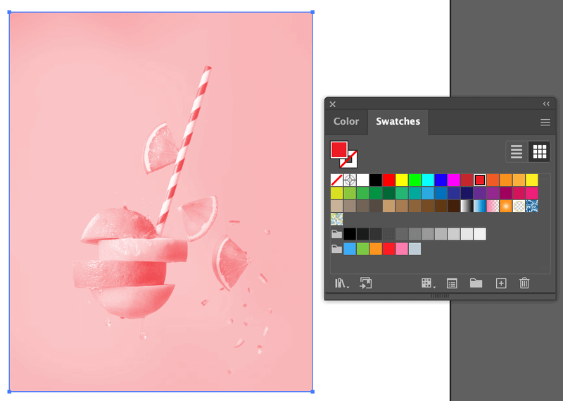
- Convert to Grayscale: Select the embedded image. Go to Edit > Edit Colors > Convert to Grayscale. Your image will instantly become black and white.
- Apply a Tint: With the grayscale image still selected, open the Color panel (Window > Color) or the Swatches panel (Window > Swatches). Now, simply click on any color swatch or use the Color panel to pick a new color. Illustrator will apply this color as a tint over your grayscale image, giving it a duotone or monochromatic effect.
This technique is excellent for creating stylized images, such as a sepia-toned historical photo or a cool blue background, adding unique editing styles to your digital photography.
Vectorizing for Full Control (Image Trace for PNGs)
For raster images that have clear lines and solid colors (like many vector-style PNGs or simple illustrations), Image Trace is a powerful feature that converts pixel data into editable vector paths. This unlocks the full potential of Illustrator’s vector color tools, allowing you to change individual parts of the image and even create new digital art from existing raster graphics.
How to Use Image Trace to Recolor PNGs:
- Place Your PNG Image: Go to File > Place and select your PNG. Place it on your artboard. Unlike the previous methods, embedding is optional before tracing, but the image must be selected.
- Open Image Trace Panel: With the PNG selected, go to Window > Image Trace to open the panel.
- Presets: For best results, choose a suitable preset from the “Preset” dropdown (e.g., “High Fidelity Photo” for more detail, “Sketched Art” or “Silhouettes” for simpler graphics).
- Mode & Ignore White: Set the Mode to Color (or Grayscale/Black and White if desired). Crucially, check the Ignore White option if you want to remove the white background from your PNG, transforming it into vector shapes with transparency.
- Trace: Click the Trace button in the Image Trace panel. Illustrator will convert your raster image into a temporary vector preview.
- Expand the Image: Once you’re satisfied with the preview, click the Expand button. This is found in the Properties panel (Quick Actions) or in the overhead menu Object > Image Trace > Expand. This action converts the traced paths into editable vector objects.
- Ungroup for Individual Control: After expanding, your traced image will likely be grouped. With the object selected, right-click and choose Ungroup, or go to Object > Ungroup. You may need to do this multiple times for complex images.
- Recolor Individual Vector Paths: Now that your image is a collection of editable vector paths, you can use any of the vector color manipulation methods discussed earlier:
- Recolor Artwork: Select all or part of the ungrouped image and use the Recolor Artwork feature to change entire color schemes or specific hues.
- Color Picker/Swatches: Select individual vector shapes within the traced image and use the Color Picker or Swatches panel to change their fill and stroke colors.
- Eyedropper Tool: Sample colors from other parts of your design or an external palette to apply to specific vector elements.
While Image Trace is powerful for changing the color of PNGs, especially those that are already vector-like in nature, it’s important to note that complex photographs might lose intricate detail during the tracing process. Adjusting the settings in the Image Trace panel (Threshold, Paths, Corners, Noise) can help optimize the result. This method is a cornerstone for graphic design, allowing designers to convert “Stock Photos” into customizable “Digital Art” or develop new creative ideas from existing imagery.
Advanced Techniques and Workflow Enhancements for Tophinhanhdep.com Designers
Beyond the core methods, integrating advanced techniques and optimizing your workflow can significantly enhance your color editing capabilities in Illustrator. These strategies are particularly valuable for professionals engaged in photo manipulation, graphic design, and those seeking to elevate their visual design projects and thematic collections on Tophinhanhdep.com.
External Editing for Linked Raster Images
For raster images, especially high-resolution photography that demands pixel-level precision, a dedicated photo editor like Adobe Photoshop is often superior. Illustrator provides a seamless workflow for editing linked images externally, ensuring you maintain the highest quality for your wallpapers or beautiful photography.
How to Edit in Photoshop (or another external editor):
- Place a Linked Image: Instead of embedding, when you go to
File > Place, ensure the “Link” option is checked. This keeps the image as an external file, with Illustrator merely referencing its location. - Edit in Photoshop: Select the linked image on your Illustrator artboard.
- In the Properties panel (Window > Properties) under “Quick Actions,” click the “Edit Original” button (often a Photoshop icon, or text “Edit in Photoshop”).
- Alternatively, go to
Edit > Edit in Photoshop. This will open the image directly in Photoshop (or your default image editor for that file type).
- Make Adjustments in Photoshop: Perform any desired color adjustments (e.g., Curves, Levels, Hue/Saturation, selective color adjustments) or photo manipulation techniques within Photoshop.
- Save and Update: Save the changes in Photoshop (Command/Ctrl + S). When you return to Illustrator, a dialog box will typically prompt you to update the modified linked file. Click “Yes,” and your image in Illustrator will reflect the changes.
This non-destructive approach allows you to leverage the strengths of both programs, perfect for detailed editing styles and optimizing high-resolution images for various applications on Tophinhanhdep.com.
Leveraging Third-Party Plugins: The Astute Graphics Phantasm
For designers seeking Photoshop-like color controls directly within Illustrator, third-party plugins offer powerful solutions. One notable example is Astute Graphics’ Phantasm plugin. Phantasm brings comprehensive color adjustment tools like Curves, Levels, Hue/Saturation, and more, all as non-destructive live effects directly into Illustrator.
Benefits of Phantasm:
- Non-Destructive Editing: Apply color adjustments as live effects via the Appearance panel, allowing you to easily adjust, hide, or remove them at any time without altering the original pixel data. This encourages creative experimentation.
- Familiar Controls: Offers professional controls (Curves, Levels, Hue/Saturation, Exposure) that are familiar to Photoshop users, streamlining the workflow for those accustomed to advanced digital photography editing.
- Vector and Raster Application: Phantasm effects can be applied to both vector objects and embedded/linked raster images, providing a unified approach to color manipulation across your entire design.
- Graphic Styles Integration: Save stacks of Phantasm effects as Graphic Styles to create your own “Instagram-style filters” or thematic collections, applying complex color treatments with a single click.
While a paid subscription, tools like Phantasm can be a significant “Image Tool” investment for designers on Tophinhanhdep.com looking to push the boundaries of photo manipulation and digital art within Illustrator.
Creating Your Own Instagram-Style “Filters” with Graphic Styles
Once you’ve developed a series of color adjustments you particularly like—whether through Recolor Artwork, Gradient effects, or advanced plugin effects like Phantasm—you can save these as Graphic Styles. This allows you to apply complex color transformations to any selected artwork, group, or layer with a single click, fostering efficiency and consistency in your creative ideas and thematic collections.
How to Create and Use Graphic Styles for Color:
- Apply Desired Effects: Apply your preferred color changes to a sample object using any combination of the methods discussed (e.g., Recolor Artwork, gradient, or Phantasm effects).
- Open Graphic Styles Panel: Go to
Window > Graphic Styles. - Save as New Style: With the object (and its applied effects) selected, click the “New Graphic Style” icon (a square with a plus sign) at the bottom of the Graphic Styles panel. Name your style descriptively (e.g., “Vintage Sepia Filter,” “Vibrant Abstract Scheme”).
- Apply to Other Artwork: To use your custom “filter,” simply select other artwork and click on your saved Graphic Style in the panel.
This technique is excellent for maintaining consistent editing styles across an entire series of images, developing unique photo ideas, or quickly prototyping various aesthetic looks for your backgrounds and wallpapers.
Efficiency Tips: Batch Changes and Swatch Management
Optimizing your workflow is key for any visual designer. Illustrator offers several features to make color management more efficient.
- Select Same Color: For vector objects, if you need to change all instances of a particular fill or stroke color without using Recolor Artwork, select one object with that color, then go to
Select > Same > Fill Color(or Stroke Color). All objects with that specific color will be selected, allowing you to change them simultaneously using the Color Picker or Swatches. This is incredibly useful for refining branding elements or large graphic design projects. - Swatch Libraries: Organize your frequently used colors, gradients, and patterns into custom swatch libraries (
Window > Swatches). You can also explore existing libraries (e.g., PANTONE, Web, Art History) or download/create your own and save them for future projects. This ensures consistency and quick access to your preferred palettes for all your image tools and creative endeavors. - Ungroup First: When working with traced images or imported vector graphics, remember that they are often grouped.
Ungroupthem (Object > Ungroupor right-click >Ungroup) multiple times if necessary, to gain access to individual paths and achieve precise color control.
These tips, combined with the comprehensive understanding of Illustrator’s color tools provided by Tophinhanhdep.com, empower you to work smarter, not harder, in your pursuit of exceptional visual design.
Conclusion
The ability to dynamically change the color of images and objects in Adobe Illustrator is a fundamental skill for any visual designer, unlocking boundless creative potential. From the precise control offered by the Color Picker and Eyedropper Tool for individual vector elements, to the transformative power of Recolor Artwork for entire vector palettes, Illustrator provides a versatile toolkit for every need. When it comes to raster images, techniques like Adjust Color Balance, Grayscale Conversion and Tinting, and especially Image Trace, allow for impactful visual shifts, effectively turning static high-resolution photography into malleable digital art.
As explored on Tophinhanhdep.com, understanding the distinction between vector and raster is the cornerstone of effective color manipulation. Whether you’re curating aesthetic wallpapers, designing complex graphic elements, enhancing beautiful photography, or experimenting with abstract and emotional themes, choosing the right method for the right image type is paramount. Furthermore, integrating advanced techniques like external editing with Photoshop, leveraging powerful third-party plugins like Astute Graphics’ Phantasm for non-destructive adjustments, and utilizing Graphic Styles for creating custom “filters” can significantly streamline your workflow and elevate your editing styles.
Ultimately, Illustrator encourages experimentation and empowers you to bring your creative ideas to life. Don’t shy away from playing with these tools; explore different color combinations, delve into the nuances of gradients, and transform your images to perfectly match your vision. For more in-depth tutorials on image tools, photography, and visual design, continue to explore the comprehensive resources available on Tophinhanhdep.com, your ultimate guide to mastering digital art and photo manipulation.