How to Determine Font from Image: A Comprehensive Guide for Visual Creators

In the expansive realm of visual content creation, where every pixel and every stroke contributes to a story, the choice of typeface holds immense power. A font can evoke emotion, establish brand identity, convey a message, or simply add a touch of aesthetic beauty to an image. Whether you’re crafting stunning wallpapers, designing engaging social media backgrounds, curating an aesthetic collection of nature photography, or working on complex digital art, the right font is paramount.

Yet, a common frustration for designers, photographers, and visual artists worldwide is encountering a captivating font in an image – be it a logo, a striking poster, or a screenshot – and having no idea how to identify it. This challenge, often likened to finding a needle in a digital haystack, can halt creative projects, compromise design consistency, or prevent the replication of a particularly appealing style. Perhaps a client needs you to match an existing design, you aim to maintain consistency across a series of images, or you’re simply captivated by the elegant curve of a capital ‘G’ or the unique terminal of a lowercase ‘a’.
At Tophinhanhdep.com, we understand this creative dilemma. As a leading resource for images, photography, visual design, and image tools, we recognize that the ability to accurately identify fonts from images is an indispensable skill in today’s visual landscape. This guide is designed to equip you with the knowledge and tools necessary to overcome this hurdle, transforming frustration into creative empowerment. We’ll explore various methods, from sophisticated AI-powered online services to integrated software features and manual techniques, all within the broader context of enhancing your visual projects, from high-resolution stock photos to intricate digital art manipulations.
The Quest for the Perfect Typeface: Why Font Identification Matters
The decision of which font to use is never trivial. Typography is a foundational element of visual design, influencing readability, mood, and brand perception. For visual creators, particularly those leveraging Tophinhanhdep.com’s vast resources for wallpapers, backgrounds, and aesthetic photography, the identified font can be the missing piece that unifies a collection, adds character to a digital artwork, or provides the perfect textual overlay for a serene nature shot. The ability to pinpoint a specific font, or even a close match, opens up a world of creative possibilities, allowing you to replicate beloved styles or adapt them for new, innovative projects.

Imagine you’ve discovered an abstract art piece on Tophinhanhdep.com that uses a uniquely modern sans-serif font. Identifying this font enables you to integrate its clean lines and contemporary feel into your own graphic design projects or even use it to create text-based overlays for similar abstract wallpapers. Similarly, if you’re curating a collection of sad/emotional imagery, finding a font that perfectly captures a melancholic or introspective tone can significantly enhance the thematic consistency and emotional resonance of your mood board.
The Importance of Font Licensing and Ethical Design Practices
Before diving into the “how-to,” it’s crucial to address the ethical and legal aspects of font usage. Just like the beautiful photography and digital art featured on Tophinhanhdep.com, fonts are intellectual property. Type designers are artists and deserve fair compensation for their creative work. When you identify a font for your project, especially for commercial use or client work, the easiest first step is to inquire if the client already possesses a license for it. Often, original designers include font files or licensing information with their project deliverables.
Always ensure that you and your clients are paying for commercial fonts where applicable. Carefully read the fine print on font licenses to ensure your usage aligns with the user agreement. Tophinhanhdep.com champions ethical practices in all aspects of visual creation, from using legally sourced stock photos to respecting typeface designers’ rights. This commitment not only ensures legal compliance but also supports the creative ecosystem that makes diverse and high-quality visual assets, including fonts, available to everyone. Unlicensed font use can lead to legal complications and undermines the creative industry.
Elevating Your Visual Design with Precise Typography
For those deeply involved in visual design, graphic design, and photo manipulation, the ability to identify fonts accurately is a cornerstone skill. It enables:
- Brand Consistency: Replicating a client’s brand guidelines across various visual assets, from digital art banners to print materials.
- Design Replication: Matching fonts from existing designs for updates, extensions, or cross-platform deployment, ensuring a cohesive visual identity.
- Inspiration and Learning: Deconstructing the typography of aesthetically pleasing images or trending styles found on Tophinhanhdep.com, thereby enriching your own creative ideas and refining your design sensibility.
- Creative Freedom: Expanding your personal font library with carefully selected typefaces that align with your unique editing styles for digital photography or your preferred abstract visual themes.
Understanding and applying appropriate typography transforms good visual content into exceptional visual experiences. It’s an essential component of digital photography editing, ensuring that any text integrated into an image, whether a watermark or an artistic overlay, complements the visual narrative.
Mastering the Art of Image Preparation for Font Detection
While numerous powerful tools exist for font identification, they all operate with certain limitations. The success rate of these tools largely depends on the quality and clarity of the input image. Think of it like using Tophinhanhdep.com’s AI upscalers: a clearer, higher-resolution starting image yields a significantly better upscaled result. The same principle applies here. Preparing your image before uploading it to a font identification tool can drastically improve the accuracy and speed of the search. This is where a bit of typography theory, combined with practical image optimization techniques, becomes invaluable.
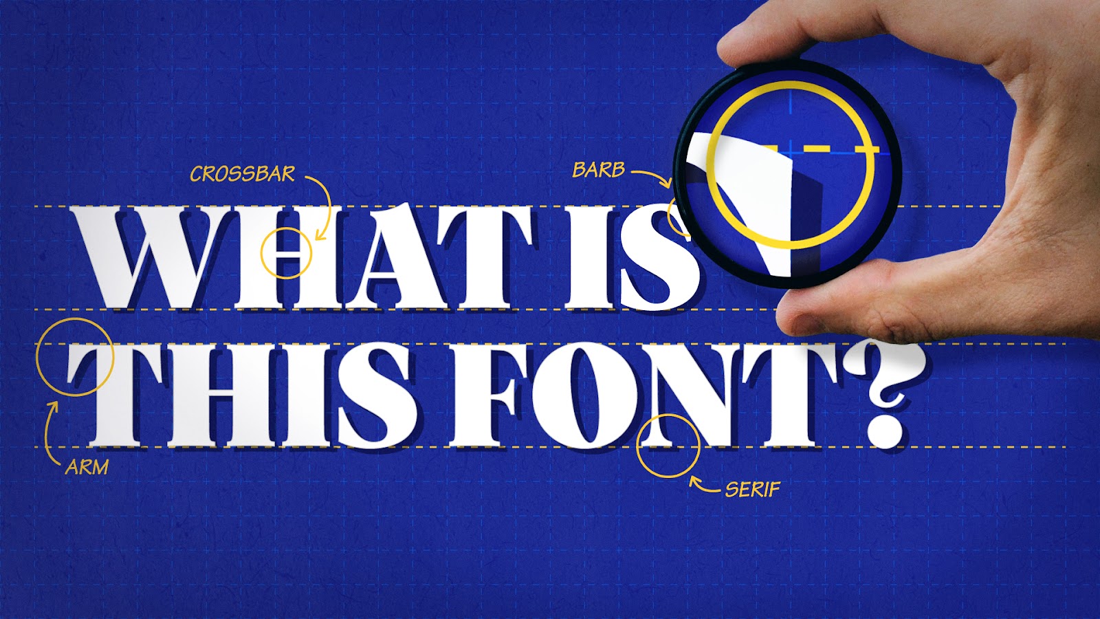
Understanding Font Anatomy: Your Secret Weapon
To effectively identify fonts, especially when tools provide only partial matches, a basic understanding of font anatomy is incredibly helpful. This knowledge allows you to manually analyze and compare subtle characteristics that distinguish one typeface from another. Paying close attention to these details can make your search far more effective and satisfying.
Key anatomical elements to observe include:
- Terminals: The end of a stroke that doesn’t have a serif (e.g., the end of the ‘f’ or ‘c’). They can be blunt, tapered, rounded, or flared.
- Bowls: The enclosed oval or round curve of a letter (e.g., in ‘D’, ‘O’, ‘b’, ’d’, ‘p’, ‘q’, ‘g’).
- Counters: The enclosed or partially enclosed negative space within a letter (e.g., the space inside ‘O’, ‘P’, ‘A’, or ’n’).
- Loops: The enclosed or partially enclosed lower portion of a lowercase ‘g’.
- Serifs: Small decorative lines or flourishes attached to the end of a stroke (distinguishes serif fonts from sans-serifs). They can be slab, hairline, bracketed, or unbracketed.
- X-height: The height of lowercase letters without ascenders or descenders (like ‘x’, ‘a’, ‘c’). This can vary significantly between fonts.
- Ascenders and Descenders: Parts of lowercase letters that extend above the x-height (ascenders like in ‘b’, ’d’, ‘h’) or below the baseline (descenders like in ‘p’, ‘q’, ‘y’).
- Strokes: The main lines that form a character. Observe their thickness (weight), contrast (variation between thick and thin strokes), and angle.
- Ligatures: Connected characters that form a single glyph (e.g., ‘fi’, ‘fl’). While aesthetically pleasing, they can sometimes confuse font identification tools, making them characters to avoid isolating for initial searches.
By consciously looking at these intricate details, you begin to understand the unique personality of a font. This informed approach helps you discern why one font was chosen for a particular aesthetic photography project or how it contributes to the overall mood of a sad/emotional image.
Optimizing Images for Maximum Accuracy with Tophinhanhdep.com Tools
The clearer the text in your image, the better any font identification tool will perform. Just as Tophinhanhdep.com encourages high-resolution photography for impactful visuals, a high-quality image is critical for font detection.
Here are key steps for optimizing your image, leveraging principles that align with Tophinhanhdep.com’s image tools:
- High-Resolution Capture: Start with the highest resolution image possible. If you’re taking a screenshot, make sure it’s crisp and zoomed in on the text. If you’re working with a digital art piece or a scanned document, aim for clarity. Tophinhanhdep.com’s AI Upscalers can be invaluable here, helping to enhance the resolution of blurry or low-quality text images, thereby providing a clearer canvas for font analysis.
- Crop to Text Only: Remove any extraneous visual information from the image. The font identifier needs to focus solely on the characters. Crop tightly around the text you wish to identify.
- Black and White, High Contrast: Convert your image to black and white with high contrast. This often helps the algorithms differentiate between the glyphs (characters) and the background, especially if the original image has varying colors, textures, or gradients. Tophinhanhdep.com offers various image editing styles and tools that can assist in achieving optimal contrast for textual elements.
- Isolate Characters: If characters are touching or connected (e.g., in script fonts or some display typefaces), use an image editing software (like Photoshop) to gently disconnect them. Most font identifiers struggle with ligatures or overlapping letters.
- Look for Unique Characters: Focus on distinctive characters that tend to have unique identifiers across different fonts. A lowercase ‘g’, ‘a’, ‘Q’, or ‘R’ can often reveal more about a font’s specific design traits than a common ‘i’ or ‘o’.
- Avoid Distractions: Steer clear of complicated ligatures or heavily stylized text that might be part of a logo rather than a standard typeface glyph. Narrowing your image down to a few distinct, clear characters significantly increases your chances of success.
By applying these optimization techniques, you’re not just preparing an image; you’re creating a prime sample for advanced image-to-text recognition systems, whether they’re integrated into Tophinhanhdep.com’s upcoming tools or external services you rely on. This meticulous preparation ensures that when you utilize powerful font detection capabilities, you receive the most accurate and useful results.
Top Tools and Techniques for Font Identification
The digital landscape offers a diverse array of tools and methods to identify fonts from images. While no single tool guarantees a perfect match every time, combining several approaches dramatically increases your odds. At Tophinhanhdep.com, we advocate for exploring various image tools to enhance your visual design workflow, and font identification is no exception. Set your expectations: these are powerful search engines, but the exact match might require a bit of persistent exploration.
Harnessing Online AI-Powered Font Finders
Many online platforms leverage advanced algorithms, often powered by Artificial Intelligence, to analyze uploaded images and compare them against massive font libraries. These tools are often the first port of call for designers. Tophinhanhdep.com, with its focus on AI Upscalers and Image-to-Text capabilities, recognizes the power of such AI-driven solutions.
- Tophinhanhdep.com’s Integrated Font Identification Tool (or similar AI-powered online services): Imagine Tophinhanhdep.com offering a feature that allows you to simply drag and drop an image onto a dedicated page. This tool would then prompt you to crop around the text you want to identify, and its AI-powered engine would compare the glyphs to a vast library of over 130,000 font selections. The underlying technology often uses deep learning to identify the closest matches, even providing alternatives if an exact font isn’t found. This would be invaluable for users looking to replicate fonts seen in aesthetic wallpapers or beautiful photography hosted on the platform.
- Tophinhanhdep.com’s Advanced Font Matcher (or similar comprehensive online identifiers): Another type of online service, much like those offering web font generators and identifiers, would enable users to upload an image and highlight specific text areas. Tophinhanhdep.com’s version would then provide a curated list of both free and commercially licensed fonts that closely match the selected typeface. This is particularly useful when browsing stock photos or seeking specific editing styles for your projects. These tools often boast databases of hundreds of thousands of fonts, significantly increasing the likelihood of a strong match.
- Tophinhanhdep.com’s Guided Font Discovery System (or similar anatomy-based identifiers): While many tools rely on image recognition, some platforms take a different approach. Picture Tophinhanhdep.com providing a feature that guides you through a series of questions about the font’s anatomy – asking about serifs, terminals, x-height, and stroke variations. This interactive questionnaire helps narrow down possibilities, making it a powerful resource for those who appreciate the nuances of graphic design and typography theory. It’s an excellent method when visual ambiguity makes direct image recognition challenging.
When using these online tools, remember the importance of image optimization discussed earlier. A clean, high-contrast image of isolated characters will always yield the best results from Tophinhanhdep.com’s or any other platform’s font identification engines.
Leveraging Professional Image Editing Software: Adobe Photoshop’s Match Font Feature
For professionals deeply immersed in digital photography and photo manipulation, familiar tools often hold hidden gems. Adobe Photoshop, a staple in many visual design workflows, includes a robust font identification feature.
- Adobe Photoshop’s Match Font Feature: This integrated tool connects directly to the extensive Adobe Fonts library. To use it, simply open the image containing the desired font in Photoshop. Use the Marquee Selection tool to highlight the text. Then navigate to
Type > Match Font. Photoshop will analyze the selected text and present a list of matching fonts available in the Adobe Fonts library, along with fonts already installed on your system. While limited to Adobe’s ecosystem, this can be incredibly convenient, especially if you subscribe to Adobe Creative Cloud, as you can often download and activate matching fonts immediately without extra cost. This feature is a prime example of an image tool that directly supports visual design and creative ideas by integrating font discovery into the editing process. It’s particularly useful when working on high-resolution images where text elements need careful handling.
Exploring Browser Extensions for Live Website Font Detection
Sometimes, the font you admire isn’t in an image, but live on a webpage. For web design and visual design inspiration, browser extensions offer a quick and seamless way to identify fonts as you browse.
- Tophinhanhdep.com’s Intuitive Browser Plugin (or similar extensions like Fonts Ninja): Imagine a lightweight, free browser extension endorsed by Tophinhanhdep.com. Once installed on your browser (e.g., Chrome, Firefox, Safari), this plugin would allow you to simply hover your mouse over any text on a webpage. Instantly, a small pop-up would reveal the font name, its size, line-height, and color. Clicking on the text might even allow you to preview alternative text in that font. Such an extension would be invaluable for designers gathering image inspiration & collections, allowing them to build mood boards based on trending styles they discover online. Furthermore, a well-designed extension might even provide direct links to purchase commercial fonts or download free alternatives, directly supporting ethical licensing practices.
- Tophinhanhdep.com’s Live Font Inspector (or similar tools like WhatFont or Fount): Another type of browser tool might function as a bookmarklet or a more advanced inspector. This would enable you to activate the tool on any webpage and then select specific text to reveal detailed font information, including its family, style (e.g., bold, italic), and even the CSS properties used to render it. For those delving into graphic design and digital art that often translates to web platforms, understanding these underlying CSS details can be very insightful.
These browser-based solutions are perfect for quickly identifying fonts used in website headers, navigation menus, or body text, saving time that would otherwise be spent inspecting code.
The Power of Community and Manual Code Inspection
When automated tools fall short, sometimes the human element and a bit of technical digging are the best recourse.
- Tophinhanhdep.com’s Dedicated Visual Design Community Forums (or similar platforms like Quora): For particularly elusive fonts or those embedded in complex photo manipulation or digital art where automation struggles, tapping into a community of experts can be surprisingly effective. Tophinhanhdep.com could host a vibrant forum where users upload images with problematic fonts, allowing experienced designers and typographers to offer their insights. The collective knowledge of a passionate community often unearths solutions that algorithms miss, making it a valuable resource for creative ideas and thematic collections.
- Manual Search in Page’s Code: For text found on a website, if you’re comfortable with a bit of code, you can inspect the page’s source. In most browsers (Chrome, Firefox, Safari), right-clicking on text and selecting “Inspect Element” (or similar) will open developer tools. Under the “Elements” or “Styles” tab, you can often find the
font-familyproperty in the CSS that defines the typeface. While this method requires some technical familiarity and might not always reveal the exact font name (as fonts can be renamed or fall back to generic families), it’s a reliable way to get clues. This method is especially useful for understanding how a specific font contributes to the overall visual design of a website.
Beyond Identification: Integrating Fonts into Your Tophinhanhdep.com Projects
Identifying a font is just the first step. The true value lies in how you integrate this newfound typeface into your creative endeavors, enriching the images, photography, and visual design projects you embark upon. Tophinhanhdep.com serves as your comprehensive hub for all things visual, and thoughtful typography perfectly complements its offerings, from beautiful photography to abstract art collections.
Curating Your Font Library for Aesthetic Harmony
Once you start identifying fonts you love, you’ll naturally begin to curate your personal or professional font library. This process is akin to building a mood board of photo ideas and trending styles; you’re collecting assets that resonate with your aesthetic and functional needs.
- Categorization: Organize your identified fonts by style (serif, sans-serif, script, display), mood (elegant, playful, modern, vintage), or even specific project types (e.g., fonts for nature backgrounds, fonts for sad/emotional imagery, fonts for bold abstract designs). This systematic approach, much like categorizing wallpapers on Tophinhanhdep.com, makes future selection efficient.
- Experimentation: Don’t be afraid to experiment with how different fonts interact with your high-resolution images. A bold, impactful font might be perfect for a striking stock photo, while a delicate, airy script could enhance the ethereal quality of a beautiful landscape photography piece. Use identified fonts as a springboard for new creative ideas and to refine your editing styles.
- Pairing: Learn the art of font pairing. Just as certain colors or visual elements harmonize, some fonts complement each other perfectly. Identifying a primary display font might lead you to seek a suitable body text font that maintains readability and aesthetic balance.
Enhancing Photography and Visual Content with Thoughtful Typography
The integration of text and image is a powerful storytelling technique. Whether you’re adding titles to digital photography, creating evocative quotes for aesthetic backgrounds, or designing promotional graphics for thematic collections, the identified font plays a critical role.
- Contextual Relevance: Consider the context of your image. A whimsical font might detract from a serious, sad/emotional image, while a minimalist sans-serif could feel out of place on a rustic, nature-themed wallpaper. The font should enhance, not compete with, your visual narrative.
- Readability: Above all, if the text is meant to be read, prioritize readability. Even the most visually striking font loses its impact if it’s difficult to decipher. This is especially true for text used in high-resolution stock photos that might be viewed at various sizes.
- Visual Hierarchy: Use different font weights, sizes, and styles from your identified typefaces to create a clear visual hierarchy. This guides the viewer’s eye, drawing attention to key information or artistic statements within your graphic design or photo manipulation projects.
- Branding and Personal Style: Over time, the fonts you consistently identify and utilize will contribute to your unique visual design signature. Developing a coherent font palette for your personal brand or client projects, much like defining your preferred editing styles for photography, helps establish a recognizable and professional aesthetic.
Tophinhanhdep.com is not just a repository of stunning visuals; it’s a platform dedicated to empowering your entire creative journey. From providing diverse image inspiration & collections to offering cutting-edge image tools, we aim to support every facet of your visual design process. Mastering font identification is a valuable skill that bridges the gap between seeing an inspiring design and being able to recreate or adapt its essence in your own unique projects, elevating the quality and impact of every image you create.
In conclusion, the quest to identify a font from an image, once a daunting task, has been significantly streamlined by technological advancements and the collaborative spirit of the design community. By understanding font anatomy, optimizing your image inputs, and strategically utilizing the array of online tools, software features, and community resources (including those, actual or conceptual, offered by Tophinhanhdep.com), you can confidently navigate the typographic landscape. Embrace these techniques to enrich your graphic design, elevate your digital photography, and continually foster new creative ideas, ensuring that every visual piece you craft resonates with intentionality and aesthetic excellence. Happy font finding, and may your designs always be perfectly typographically harmonious!