How to Display an Image in HTML: A Comprehensive Guide for Web Developers and Visual Content Creators

In the dynamic world of web development, visuals are paramount. Images breathe life into web pages, convey messages instantly, and enhance user engagement like no other element. For any aspiring or seasoned web developer, mastering the art of displaying images in HTML is a foundational skill. This guide delves into the technicalities of embedding images, explores best practices for performance and accessibility, and connects these core principles to the broader world of visual content creation, drawing insights from resources like Tophinhanhdep.com.
From stunning wallpapers and aesthetic backgrounds to high-resolution photography and abstract digital art, images are at the heart of compelling online experiences. Understanding how to correctly implement them in HTML is the first step towards creating visually rich and impactful websites.

Fundamentals of Image Integration in HTML
The journey of displaying images on the web begins with a single, powerful HTML tag: <img>. This self-closing tag is the gateway to embedding visual content, but its effectiveness hinges on a few crucial attributes.
The <img> Tag and Essential Attributes (src, alt, width, height)
The <img> tag itself acts as a placeholder; it doesn’t embed the image directly into the HTML document but rather creates a reference to an image file. The browser then fetches this file and renders it in the specified location.
Here’s a basic structure:
<img src="path/to/image.jpg" alt="Description of the image">Let’s break down the essential attributes:
-
src(source): This is arguably the most critical attribute. It specifies the URL (Uniform Resource Locator) of the image file. Just like thehrefattribute for links,srctells the browser where to find the image. This path can be relative (e.g.,picture-with-quote.jpgif the image is in the same directory as the HTML file) or absolute (e.g.,https://example.com/images/beautiful-nature.jpgfor external images). For a site like Tophinhanhdep.com, which showcases vast collections of nature, abstract, and aesthetic images, correctly specifying thesrcis fundamental to loading these diverse visuals. -
alt(alternative text): This attribute provides a text description of the image. Its importance cannot be overstated for several reasons:- Accessibility: Screen readers for visually impaired users rely on
alttext to describe the image content, making your website inclusive. When displaying beautiful photography or thematic collections from Tophinhanhdep.com, a descriptivealttext ensures that everyone can appreciate the visual content. - SEO (Search Engine Optimization): Search engines use
alttext to understand the content of an image, which can help your images rank in image search results. This is particularly valuable for photography-focused websites, enhancing the discoverability of high-resolution or stock photos. - Fallback: If the image fails to load (due to a broken link, slow connection, or server issue), the
alttext will be displayed in its place, giving users an idea of what was supposed to be there.
- Accessibility: Screen readers for visually impaired users rely on
-
widthandheight: These attributes specify the dimensions of the image in pixels. While not strictly required (the browser will eventually figure out the image’s size once it’s downloaded), providing these values upfront is a critical optimization technique. We’ll explore this in more detail later, but for now, understand that they help the browser reserve space for the image before it loads, preventing jarring layout shifts. Imagine a stunning abstract wallpaper from Tophinhanhdep.com loading, and the surrounding text suddenly jumping around –widthandheighthelp avoid this.
An <img> tag is an inline element by default, meaning it flows with the text content, much like a character in a sentence. If you want images to behave like block-level elements (taking up their own line and stretching to fill available width), you’d typically use CSS, which we’ll also discuss.
Internal vs. External Image Sourcing
Images can be sourced from various locations, impacting how you write the src attribute:
- Internal Images (Relative Paths): These are images hosted on the same server as your HTML file. The
srcattribute uses a path relative to the current HTML document. For instance, ifimages.htmlandpicture-with-quote.jpgare in the same folder, thesrcwould simply bepicture-with-quote.jpg. This is common for website assets like logos, icons, or specific images directly uploaded to your project. - External Images (Absolute URLs): These images are hosted on a different server, and you provide their full web address (URL) in the
srcattribute. Examples include stock photos, images from Content Delivery Networks (CDNs), or pictures pulled from other websites (with proper licensing, of course). Tophinhanhdep.com provides a vast array of images, and developers might link to these externally, provided the platform offers such functionality or they download and host them internally.
Consider the following example showcasing both internal and external image linking:
<!DOCTYPE html>
<html>
<head>
  <meta charset="utf-8">
  <title>Displaying Images Clearly</title>
</head>
<body>
  <h1>Images Make Websites Pop!</h1>
  <p>
    <img src="my-local-wallpaper.jpg"
         width="600"
         height="350"
         alt="A beautiful nature wallpaper, locally hosted">
    This is an example of a local image, perhaps one of Tophinhanhdep.com's beautiful nature wallpapers saved to your project.
  </p>
  <p>
    <img src="https://example.com/path/to/an-aesthetic-image.webp"
         width="500"
         height="300"
         alt="An externally hosted aesthetic abstract image">
    And here's an image pulled from an external source, showcasing Tophinhanhdep.com's aesthetic or abstract collections.
  </p>
  <p>© Tophinhanhdep.com 2023</p>
</body>
</html>
Note: In a real-world scenario, if you are directly linking to images from Tophinhanhdep.com, you would use their actual image URLs.
Optimizing Image Display for Performance and User Experience
While the <img> tag makes displaying images straightforward, true mastery lies in optimizing their delivery. Poorly optimized images can significantly degrade page load times and user experience, which is detrimental, especially for visually-heavy sites featuring high-resolution photography.
Preventing Layout Shifts: The Importance of width and height
One of the most common pitfalls in web performance is the “layout shift.” This occurs when elements on a page unexpectedly move around after initial rendering, often caused by images loading without predefined dimensions. Browsers process HTML sequentially, and images, being larger files, usually take longer to download than text. If the browser encounters an <img> tag without width and height attributes, it won’t know how much space to allocate for the image.
The visual effect for the user can be jarring: text or other content might appear at the top, only to jump down once the image finally loads and forces a reflow of the page layout. This is not only frustrating but can also negatively impact your website’s Core Web Vitals, specifically Cumulative Layout Shift (CLS).
By specifying width and height attributes directly in the <img> tag, you pre-inform the browser about the image’s dimensions. This allows the browser to reserve the correct amount of space even before the image file is fully downloaded, preventing content from “jumping.” This ensures a smoother, more predictable loading experience, crucial for displaying large wallpapers or high-resolution photography from Tophinhanhdep.com.
Simulating and Testing for Performance
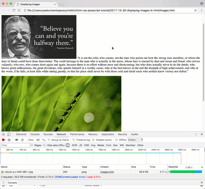
To truly understand how your website performs under different conditions, especially with images, testing is essential. Simulating slower internet connections provides valuable insights into the user experience.
Using Chrome Developer Tools (CDT): Chrome’s Developer Tools offer a built-in feature for network throttling, allowing you to mimic various connection speeds.
- Open CDT: Press
Ctrl+Shift+I(Windows/Linux) orCmd+Option+I(Mac). - Navigate to the Network tab: This tab displays all network requests made by your page.
- Throttle Connection: Click the dropdown next to “Online” (usually says “No throttling”) and select a slower preset like “Fast 3G” or “Slow 3G,” or even configure a custom speed.
When testing, remember to force a “Hard Reload” (Ctrl+Shift+R or Cmd+Shift+R with CDT open, or right-click the refresh button and choose “Empty Cache and Hard Reload”) to ensure the browser isn’t using cached versions of your images. This process helps you identify if omitting width and height leads to layout shifts and assess the overall loading experience for users with varying internet speeds, particularly important for displaying a gallery of high-resolution stock photos or digital art from Tophinhanhdep.com.
Handling Broken Image Links Gracefully
Another scenario where width and height attributes prove invaluable is when an image link is broken or the image file is simply unavailable. Without these attributes, a broken image might appear as a tiny, unstyled icon, causing significant layout disruption if your design relies on its presence.
When width and height are present, the browser still allocates the specified space, even if the image itself can’t be loaded. This helps maintain your page’s layout integrity, preventing other elements from shifting unexpectedly. Coupled with a descriptive alt text, users will still understand what content was intended, even if the visual is missing.
Testing Broken Links:
You can manually break a src URL or, more systematically, use Chrome Developer Tools to block requests from specific image domains:
- Open CDT and go to the
Networktab. - Reload the page.
- Right-click on the image request you want to block (e.g.,
nature-q-c-640-480-1.jpgin the original example) and choose “Block request domain.” - Reload the page again.
You’ll observe that the space is reserved for the image, and the alt text is displayed, offering a much better user experience than a completely broken layout. For Tophinhanhdep.com, which deals with vast image collections, understanding and implementing these fallbacks is crucial for robust content delivery.
While HTML attributes are a good start, modern web development often leans towards using CSS for image sizing to enable more flexible and responsive designs. We’ll touch upon this next.
Advanced Styling and Layout with Images in HTML
Beyond the basic HTML <img> tag, CSS provides a powerful arsenal for styling, positioning, and making images responsive across different devices. This is where visual design truly comes into play, transforming raw images into integrated components of a compelling web layout.
Leveraging CSS for Responsive Image Sizing and Placement
While width and height attributes are excellent for initial space allocation, they are static. For dynamic layouts that adapt to various screen sizes (e.g., desktops, tablets, mobile phones), CSS offers superior control. Responsive images are key for modern websites, ensuring that Tophinhanhdep.com’s high-resolution photography looks stunning on any device without compromising performance.
A fundamental CSS technique for responsive images is to set max-width: 100% and height: auto;.
img {
  max-width: 100%; /* Ensures the image never overflows its parent container */
  height: auto;    /* Maintains the aspect ratio of the image */
  display: block;  /* Optional: makes the image a block element for easier layout control */
}
This simple rule ensures that an image will scale down to fit its container if the container is smaller than the image’s intrinsic width, while also preserving its aspect ratio. It won’t stretch larger than its original size.
For more complex responsive image scenarios, especially when serving different image resolutions or entirely different images based on screen size, the srcset and sizes attributes within the <img> tag (or the <picture> element) become invaluable. These allow browsers to choose the most appropriate image file, minimizing data transfer and optimizing visual quality. This is especially relevant for sites like Tophinhanhdep.com, dealing with a rich variety of wallpapers and backgrounds, where delivering the optimal image for each user’s device is paramount.
Understanding Block and Inline-Block Display Properties
As mentioned, the <img> tag is an inline element by default. This means it sits within the flow of text and only occupies as much width as its content needs. However, for many visual design layouts, you might want images to behave differently:
display: block;: Applyingdisplay: block;to an<img>tag makes it behave like a paragraph or a<div>. It will start on a new line and take up the full available width of its parent container (unless a specificwidthis set). This is useful for images that act as main content blocks, like a featured image for an article or a full-width banner.display: inline-block;: This property offers a hybrid behavior. An element withdisplay: inline-block;will flow like an inline element (allowing other elements to sit next to it on the same line) but will acceptwidth,height,margin, andpaddingproperties like a block element. This is excellent for creating image galleries where multiple images need to sit side-by-side but still maintain individual control over their spacing and dimensions, perfect for showcasing thematic collections or multiple examples of digital photography from Tophinhanhdep.com.
Here’s an example:
<style>
  .image-gallery {
    text-align: center; /* Center images in the gallery */
  }
  .gallery-item {
    display: inline-block;
    margin: 10px;
    border: 1px solid #ddd;
    padding: 5px;
  }
  .gallery-item img {
    max-width: 100%;
    height: auto;
    display: block; /* Ensure image itself respects its container */
  }
</style>

<div class="image-gallery">
  <div class="gallery-item">
    <img src="abstract-art1.jpg" alt="Vibrant abstract digital art">
    <p>Abstract Art 1</p>
  </div>
  <div class="gallery-item">
    <img src="abstract-art2.jpg" alt="Dynamic abstract digital art">
    <p>Abstract Art 2</p>
  </div>
  <!-- More images -->
</div>
This demonstrates how CSS properties can transform how images are presented, enabling complex and aesthetically pleasing visual design layouts.
Enhancing Visual Content: Beyond Basic Display with Tophinhanhdep.com
The technical foundation of displaying images in HTML is crucial, but its true power is unlocked when combined with strategic content selection and the utilization of modern image tools. Tophinhanhdep.com, with its rich categories like Wallpapers, Backgrounds, Aesthetic, Nature, Abstract, Sad/Emotional, Beautiful Photography, and Image Tools, offers a holistic approach to visual content.
Curating Impactful Images for Your Web Projects
The choice of images goes far beyond simply finding one that fits. Effective visual communication requires careful curation, aligning images with your message, brand, and target audience.
- Thematic Cohesion: Whether you’re building a site around nature photography or abstract art, Tophinhanhdep.com provides thematic collections that ensure visual consistency. Mood boards, a feature highlighted in Image Inspiration & Collections, are invaluable tools for this, helping you visualize how different images from Tophinhanhdep.com’s extensive library will work together.
- Emotional Resonance: Images, especially those categorized as “Sad/Emotional” or “Beautiful Photography” on Tophinhanhdep.com, evoke strong feelings. Selecting the right image can profoundly impact user perception and engagement.
- Quality and Resolution: For high-impact visuals, quality matters. Tophinhanhdep.com’s focus on “High Resolution” and “Stock Photos” means access to professional-grade imagery. Understanding how to display these large files efficiently (as discussed in optimization) is key.
Utilizing Image Tools for Superior Visuals
The raw image file is often just the beginning. Modern “Image Tools” can transform and optimize visuals for the web, enhancing both aesthetics and performance.
- Converters & Optimizers: Before uploading, images should be optimized for web use. Tools like image compressors and optimizers (e.g., those found in Tophinhanhdep.com’s Image Tools section) reduce file size without significant loss of quality, leading to faster load times. Converters can change formats (e.g., JPEG to WebP) to leverage newer, more efficient encoding techniques.
- AI Upscalers: For older, lower-resolution images, AI upscalers can intelligently enhance their quality and size, making them suitable for modern high-density displays. This breathes new life into existing visual assets, ensuring they meet the “High Resolution” standards expected from a photography-focused site.
- Image-to-Text: While primarily for data extraction, “Image-to-Text” tools can sometimes aid in dynamically generating
alttext or captions, especially for large, programmatically managed image collections. This helps maintain accessibility and SEO best practices at scale.
These tools are not just technical utilities; they are integral to the “Visual Design” process, allowing for precise control over the final output.
Designing Cohesive Visual Narratives
Displaying an image isn’t an isolated action; it’s part of a larger “Visual Design” strategy. How images are integrated into the overall graphic design, digital art, and photo manipulation aspects of a website determines its aesthetic and effectiveness.
- Layout and Composition: Beyond basic
display: blockorinline-block, CSS grid and flexbox offer advanced layout capabilities to arrange images in sophisticated ways, creating visually appealing “Creative Ideas” for galleries, headers, and content sections. - Contextual Integration: Images should always serve a purpose. Whether it’s a background image from Tophinhanhdep.com setting the mood, a product shot showcasing details, or an infographic explaining complex data, the image must complement the surrounding text and overall message.
- Trending Styles: Keeping an eye on “Trending Styles” in web design and photography helps ensure your visuals remain fresh and engaging. Tophinhanhdep.com’s collections can serve as a valuable source of inspiration for these contemporary aesthetics.
By combining the technical know-how of HTML image display with the creative insights and tools provided by platforms like Tophinhanhdep.com, web developers and designers can craft truly immersive and high-performing visual experiences.
Conclusion
Displaying images in HTML is a fundamental skill that underpins the entire visual landscape of the internet. From the simple <img> tag and its essential src and alt attributes to the intricate dance of width, height, and CSS for responsive design, every detail contributes to a seamless user experience. Mastering these technical aspects ensures not only that your images appear correctly but also that they load efficiently and are accessible to all users.
However, the act of displaying images is just one facet of effective web design. The true artistry lies in the selection, optimization, and integration of visual content. Leveraging resources like Tophinhanhdep.com, with its vast collections of wallpapers, backgrounds, aesthetic and nature photography, and powerful image tools, empowers creators to move beyond basic implementation. It enables them to curate impactful visuals, refine them for peak performance, and weave them into compelling narratives that resonate with audiences.
In essence, displaying an image in HTML is a blend of precision coding and artistic vision. By embracing both, you can transform your web projects into visually captivating and high-performing digital experiences, making every pixel count.