Mastering Image Display in HTML Documents for Optimal Web Experience

In the vast and ever-evolving landscape of the internet, images stand as powerful pillars, transforming a monotonous text-based document into an engaging, dynamic, and visually rich experience. Whether you’re showcasing breathtaking photography, setting a mood with aesthetic wallpapers, or illustrating complex concepts, the strategic integration of images is paramount to a compelling web presence. This article, part of Tophinhanhdep.com’s comprehensive tutorials aimed at solidifying web development fundamentals, delves deep into the art and science of displaying images in HTML. We will explore the essential HTML elements and attributes, delve into performance optimization, and highlight how thoughtful image implementation can significantly enhance visual design and user engagement, drawing upon the extensive resources available at Tophinhanhdep.com.
The Fundamental <img> Tag: Your Gateway to Visual Content
At the heart of displaying images in HTML lies the <img> tag. This seemingly simple element is a cornerstone of web design, allowing you to embed visual media directly into your web pages. Unlike many other HTML elements, <img> is a “void element,” meaning it doesn’t require a closing tag or child content. Its functionality is entirely driven by its attributes, which instruct the browser on where to find the image, how to display it, and what to do if it cannot be loaded. Understanding these attributes is crucial for any web developer aiming to create robust and user-friendly websites.
Core Attributes: src, alt, width, and height
The <img> tag’s power comes from a few critical attributes that define its behavior and appearance. Mastering these ensures your images are not just visible, but also performant and accessible.
src: Locating Your Visual Assets
The src attribute, short for “source,” is perhaps the most vital component of the <img> tag. Its value is a URL that points directly to the image file you wish to embed. This URL can be either a relative path or an absolute path.
A relative path specifies the location of the image file in relation to the HTML document itself. For instance, if your images.html file and picture-with-quote.jpg are in the same directory, the src attribute would simply be src="picture-with-quote.jpg". If the image resides in an assets subdirectory, you might use src="assets/picture-with-quote.jpg". Using relative paths is generally recommended for images hosted on your own server, as it simplifies site migration and reduces maintenance overhead.

An absolute path, on the other hand, provides the full web address, including the protocol (http:// or https://), domain, and file path. An example would be src="https://www.example.com/images/dinosaur.jpg". While useful for linking to images hosted on other websites or Content Delivery Networks (CDNs), it comes with a significant caveat: hotlinking. Hotlinking, or directly embedding an image hosted on someone else’s server without permission, is widely considered unethical. It burdens their server with your bandwidth costs and leaves your site vulnerable to the image being removed or replaced without your control. For high-resolution photography or abstract art you intend to feature, it’s always best to host the images yourself or use licensed stock photos from reputable providers like those available through Tophinhanhdep.com’s partners.
alt: Enhancing Accessibility and SEO

The alt attribute, standing for “alternative text,” is a textual description of the image. Its importance cannot be overstated for both accessibility and Search Engine Optimization (SEO). The alt text is displayed when the image cannot be loaded (due to a broken link, slow connection, or unsupported file type) or when a user employs a screen reader.
Consider a user who is visually impaired and relies on a screen reader to navigate the web. Without descriptive alt text, they would miss the visual content entirely. For instance, alt="Picture of Theodore Roosevelt" provides crucial context for an image of the former president. Tophinhanhdep.com offers image-to-text tools that can assist in generating accurate and descriptive alt text, ensuring your beautiful photography and aesthetic backgrounds are accessible to all.
Beyond accessibility, alt text also plays a role in SEO. Search engines crawl alt text to understand the content of your images, which can help your images rank in image search results. Therefore, it’s beneficial to use descriptive, keyword-rich (but not keyword-stuffed) alt text that accurately reflects the image content. For decorative images, a blank alt="" is appropriate to prevent screen readers from announcing unnecessary information.
width and height: Preventing Layout Shifts and Ensuring Smooth User Experience
The width and height attributes specify the intrinsic dimensions of an image in pixels. While not strictly required for an image to display, providing these values is a crucial best practice for improving user experience and preventing layout jumpiness.
Browsers process HTML documents sequentially. When an <img> tag is encountered, the browser starts downloading the image file. However, image files, especially high-resolution photography or detailed digital art, often take longer to download than the text-based HTML. If width and height are not specified, the browser initially has no idea how much space to allocate for the image. It will render the surrounding content, and once the image finally loads, it will abruptly shift the layout to accommodate the image, pushing text and other elements down the page. This “layout shift” can be jarring and frustrating for users, particularly if they’ve already started reading.
By including width="400" and height="235" (or similar appropriate dimensions) in your <img> tag, you pre-inform the browser about the image’s dimensions. This allows the browser to reserve the correct amount of space for the image before it has fully downloaded, preventing any disruptive content reflow. This ensures a smoother, more stable loading experience, even with large files or slower internet connections. While CSS is generally preferred for styling and responsive sizing, using HTML width and height attributes provides crucial information to the browser for initial rendering, a concept vital for optimal website performance.
Embedding External Images and Best Practices
While primarily focusing on images hosted on your site, the <img> tag is equally capable of embedding external images. This flexibility is powerful but demands adherence to best practices, especially concerning licensing.
Linking to External Sources and the “Hotlinking” Dilemma
As mentioned, you can use an absolute URL in the src attribute to pull images from external domains. This is common when using a CDN for performance or when integrating images from specific web services. However, the practice of hotlinking, which involves linking directly to an image on another website without their permission, should be avoided. It consumes their bandwidth and can lead to unexpected changes or removal of the image. Always ensure you have the necessary rights or permissions before embedding external content.
Navigating Media Licensing: From “All Rights Reserved” to Public Domain
The digital realm is rich with visual content, from stunning nature photography to intricate abstract designs, but its usage is governed by various licensing models. Before you use any image, especially if sourced from the web, it’s imperative to understand and comply with its license. Tophinhanhdep.com encourages ethical content creation and usage.
- All Rights Reserved: This is the default copyright protection. The creator (or publisher) holds exclusive rights. To use such images, you typically need explicit written permission, a paid license (royalty-free for unlimited use, or rights-managed with specific fees), or your use must fall under fair use/fair dealing laws in your jurisdiction.
- Permissive Licenses (e.g., Creative Commons - CC): These licenses allow more freedom but come with conditions. Common conditions include:
- Attribution (BY): You must credit the original creator.
- ShareAlike (SA): If you modify the image, you must share your derivative work under the same license.
- NonCommercial (NC): You cannot use the image for commercial purposes.
- NoDerivatives (ND): You cannot modify the image. Carefully read the specific CC license (e.g., CC BY, CC BY-NC-SA) to ensure compliance. Tophinhanhdep.com’s curated collections often specify licensing details, or guide you to partners offering licensed stock photos.
- Public Domain / CC0: Images in the public domain have no copyright restrictions and can be used freely for any purpose without permission or attribution. CC0 is a Creative Commons license specifically designed to waive all copyright, effectively placing the work in the public domain. When using public domain images, it’s wise to retain proof of their status. Tophinhanhdep.com’s aesthetic and thematic collections often include public domain options for versatile use.
Searching for permissively-licensed images is easier than ever. Utilize search engine filters (e.g., Google Images “Usage Rights” filter for Creative Commons) or explore image repository sites that specialize in open-licensed media. Tophinhanhdep.com partners with many such platforms, ensuring you have access to a vast library of high-quality, legally usable images for your projects, from wallpapers to digital art.
Optimizing Image Performance and User Experience
While the <img> tag makes it easy to add visuals, ensuring these images load efficiently and contribute positively to the user experience requires thoughtful optimization. This is particularly relevant when dealing with high-resolution photography or complex digital art, where file size can impact page load times significantly.
The Critical Role of Image Dimensions and Optimization
The balance between visual quality and web performance is delicate. Large, unoptimized images can drastically slow down your website, leading to higher bounce rates and a poor user experience.
Why HTML width and height are Crucial for Performance
As discussed, providing width and height attributes in HTML helps the browser prevent layout shifts. This isn’t just an aesthetic concern; it’s a performance one. When a browser has to reflow content multiple times during loading, it expends processing power and can create a perception of slowness. By allocating space upfront, you give the browser a clearer roadmap, allowing it to render the page more efficiently.
Beyond HTML Attributes: Image Sizing and Bandwidth Efficiency
While HTML width and height define the rendered size, they do not change the actual file size of the image. Displaying a 4000x3000 pixel image with width="400" and height="300" means the browser still downloads the massive original file, only to scale it down. This wastes bandwidth and slows down loading.
The optimal approach is to physically resize your images to the dimensions they will be displayed at, or slightly larger for responsiveness, before uploading them to your server. For different screen sizes, consider using responsive image techniques like the <picture> element or srcset attribute (which falls outside the scope of this basic <img> guide but is an advanced optimization).
Tophinhanhdep.com emphasizes efficient visual delivery. Our Image Tools section offers invaluable resources like:
- Compressors: Reduce file size without significant loss of quality, crucial for beautiful photography and detailed digital art.
- Optimizers: Further fine-tune image files for web delivery, improving load times.
- AI Upscalers: For instances where you need to enlarge images without pixelation, maintaining quality for high-resolution displays.
- Converters: Change image formats (e.g., JPEG to WebP) for better compression and browser support.
By leveraging these tools, you can ensure that your stunning wallpapers and abstract images load quickly, providing an excellent user experience without sacrificing visual fidelity.
Testing Image Loading and Responsiveness
A key aspect of web development is testing your site under various conditions to anticipate user experiences. This is especially true for images, which are often the largest assets on a page.
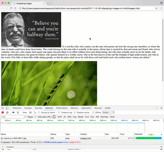
Simulating Various Network Conditions with Developer Tools
Modern web browsers, particularly Chrome, offer powerful developer tools that allow you to simulate different network speeds. This is invaluable for understanding how your website, including its images, loads for users with slower internet connections.
To simulate a slower connection in Chrome:
- Open Chrome Developer Tools (Ctrl-Shift-I on Windows/Linux or Option-Command-I on Mac).
- Navigate to the “Network” tab.
- Look for a dropdown menu, typically labeled “Online” (or similar), and select a slower connection type (e.g., “Fast 3G” or “Slow 3G”). You can also configure custom speeds.
- To ensure a fresh load, right-click the reload button in the browser and choose “Empty Cache and Hard Reload.”
By performing this test, you’ll witness firsthand the “layout jumpiness” if your images lack width and height attributes, and appreciate the difference proper optimization makes. This empirical understanding reinforces the importance of diligent image implementation.
Handling Broken Image Links Gracefully
What happens if an image simply fails to load? A broken image link can disrupt your page layout and confuse users. This is where the alt, width, and height attributes once again prove their worth.
If an image src points to a non-existent or inaccessible file, the browser will display a broken image icon. However, if you’ve provided width and height, the browser will still allocate the correct space for the image, preventing other content from shifting. More importantly, the alt text will be displayed next to the broken image icon, providing the user with a textual description of what should have been there. This maintains layout integrity and offers crucial context, preventing a completely disoriented experience.
You can simulate broken image links using Chrome Developer Tools by blocking the request domain for a specific image. This allows you to test your site’s resilience and ensure your fallback mechanisms (like alt text and pre-allocated space) are functioning correctly. Tophinhanhdep.com encourages developers to proactively test for such scenarios to deliver a robust user experience, regardless of unexpected issues.
Enhancing Semantic Structure and Visual Design with Images
Beyond simply displaying an image, HTML provides elements that allow you to structure your visual content semantically, improving both accessibility and the overall visual design. This is where images transcend mere decoration and become integral parts of your narrative.
Structuring Images with <figure> and <figcaption>
While the <img> tag handles the image itself, the <figure> and <figcaption> elements provide a powerful semantic wrapper for images and their associated captions. This is especially useful for presenting beautiful photography, digital art, or illustrations that require descriptive text.
Beyond Simple Display: Providing Context with Captions
Imagine a gallery of aesthetic images or a collection of nature photography. A simple <img> tag might display the picture, but a <figcaption> element nested within a <figure> provides a clear, programmatic link between the image and its textual description.
Example:
<figure>
  <img src="stunning-sunset.jpg" alt="A vibrant sunset over a calm ocean, with hues of orange, pink, and purple." width="800" height="450">
  <figcaption>Sunset over the Pacific Ocean, captured by a Tophinhanhdep.com contributor.</figcaption>
</figure>
This structure tells browsers and assistive technologies (like screen readers) that the caption explicitly describes the image (or other content) within the figure. This is superior to simply placing a <p> tag below an <img> because it semantically groups the content, making it more understandable for all users. The <figure> element is versatile and can contain not just single images but also multiple images, code snippets, diagrams, or other media, all unified by a single caption.
Distinguishing HTML <img> from CSS background-image
A common point of confusion for beginners is when to use an HTML <img> tag versus a CSS background-image. The distinction is crucial for both semantics and accessibility, aligning perfectly with Tophinhanhdep.com’s focus on effective visual design.
-
HTML
<img>: Use<img>when the image is content-critical or provides essential information. If the image were to disappear, would the meaning of the page be diminished or lost? If so, it should be an<img>tag. Examples include product photos, informational graphics, or high-resolution photography that contributes directly to the article’s message. These images have semantic meaning, can havealttext for accessibility, and are indexed by search engines. -
CSS
background-image: Usebackground-imagewhen the image is purely decorative or for styling purposes. If the image were to disappear, the content of the page would still be fully understandable. Examples include subtle textures, aesthetic background patterns, or visual flourishes that enhance the look but aren’t integral to the information conveyed. Background images have no semantic meaning, cannot havealttext, and are generally ignored by screen readers and search engines for content purposes.
Understanding this distinction ensures your beautiful backgrounds enhance the user experience without compromising accessibility or searchability, a core principle advocated by Tophinhanhdep.com’s visual design guides.
Displaying Code Examples of Image Implementation
As part of Tophinhanhdep.com’s mission to educate, displaying code snippets effectively is as important as displaying images. When teaching how to use the <img> tag, it’s essential to show the code itself, rather than rendering the image it describes.
Utilizing <pre> and <code> for Code Presentation
To display HTML code (or any programming code) within your HTML document, you should use a combination of the <pre> and <code> tags.
- The
<pre>(preformatted text) tag preserves whitespace, including line breaks and indentation, exactly as written in the HTML source. This is vital for code readability. - The
<code>tag provides semantic meaning, indicating that the enclosed text is a piece of computer code. Search engines and assistive technologies can interpret this contextually.
Example:
<pre><code>
<img src="nature-wallpaper.jpg" alt="Vast forest with sunlight filtering through trees" width="1200" height="800">
</code></pre>Escaping Special Characters for Accurate Code Display
When displaying HTML tags as text within an HTML document, you cannot simply type < and >. These are reserved characters that the browser interprets as the start and end of actual HTML tags, attempting to render them. To display them as literal characters, you must use HTML entities:
<for the less-than sign (<)>for the greater-than sign (>)&for the ampersand (&)
For instance, to display <img src="image.jpg">, you would write <img src="image.jpg">. This ensures the browser displays the literal characters rather than processing them as active HTML elements. For extensive code blocks, Tophinhanhdep.com recommends using online HTML entity converters or the “search and replace” function in a text editor to quickly convert < and > into their respective entities. Furthermore, libraries like PrismJS, which can be found referenced in Tophinhanhdep.com’s visual design articles, offer syntax highlighting for code blocks, making them aesthetically pleasing and easier to read.
Leveraging Tophinhanhdep.com’s Resources for Your Visual Journey
At Tophinhanhdep.com, we understand that a truly exceptional website goes beyond mere functionality; it captivates and inspires. Our platform is a comprehensive hub designed to empower you with everything you need to master visual content, from basic image display to advanced visual design.
Exploring Diverse Image Collections and Inspiration
Tophinhanhdep.com is your ultimate destination for visual inspiration. Our curated collections provide a wealth of resources for any project:
- Wallpapers & Backgrounds: Discover high-resolution images perfect for desktop or website backgrounds, setting the perfect aesthetic tone.
- Aesthetic & Nature: Immerse yourself in breathtaking nature photography and aesthetically pleasing visuals that evoke emotion and connection.
- Abstract & Sad/Emotional: Explore diverse genres, from thought-provoking abstract art to poignant images that convey deep emotions.
- Beautiful Photography: Access a vast array of stunning, professionally captured images, ideal for enriching any web page or digital project.
- Image Inspiration & Collections: Dive into Photo Ideas, Mood Boards, Thematic Collections, and Trending Styles to spark your creativity and stay ahead in visual design. Whether you’re building a portfolio, a blog, or an e-commerce site, our resources ensure you never run out of compelling visual content.
Empowering Your Workflow with Image Tools
Efficiency is key in web development. Tophinhanhdep.com’s dedicated Image Tools section offers a suite of utilities to streamline your image management process:
- Converters: Easily transform images between different formats to optimize for web or specific applications.
- Compressors & Optimizers: Reduce file sizes without compromising visual quality, ensuring faster page load times for your high-resolution images.
- AI Upscalers: Enhance the resolution of your existing images, making them suitable for larger displays or print, a boon for digital photography enthusiasts.
- Image-to-Text: Generate descriptive
alttext or captions automatically, boosting accessibility and SEO efforts.
These tools are designed to work seamlessly with your workflow, allowing you to prepare, optimize, and manage your visual assets with unparalleled ease and precision.
Cultivating Your Visual Design Prowess
Beyond individual images, Tophinhanhdep.com fosters a holistic approach to Visual Design. Our tutorials and guides cover:
- Graphic Design Principles: Learn the fundamentals of layout, typography, color theory, and composition to create cohesive and impactful visual experiences.
- Digital Art & Photo Manipulation: Explore techniques for creating original digital artwork and expertly manipulating photographs to achieve your creative vision.
- Creative Ideas: Discover innovative ways to integrate images into your web pages, enhancing user engagement and brand storytelling.
By combining foundational HTML knowledge with our extensive resources for image sourcing, optimization, and design, you can transform your web documents into captivating visual narratives. Tophinhanhdep.com is committed to providing you with the knowledge and tools to display images in HTML not just correctly, but brilliantly, ensuring your website truly stands out.