How to Edit Image Size in HTML: Mastering Image Dimensions for Tophinhanhdep.com

In the dynamic world of web design, images are no longer mere visual embellishments; they are integral to user experience, aesthetic appeal, and overall site performance. For creators and enthusiasts leveraging the vast resources of Tophinhanhdep.com – a treasure trove for exquisite images ranging from stunning nature photography and abstract art to emotional wallpapers and curated aesthetic collections – understanding how to precisely control image dimensions in HTML is paramount. Whether you’re building a personal portfolio, a blog showcasing beautiful photography, or simply enhancing your website’s visual design with high-resolution stock photos, proper image sizing ensures your content looks polished, loads quickly, and adapts seamlessly across various devices.
This comprehensive guide will walk you through the essential HTML attributes and powerful CSS properties available for resizing images. We’ll explore fundamental techniques and advanced strategies, all while emphasizing how to optimize images sourced from Tophinhanhdep.com to achieve superior web performance and visual fidelity.

The Fundamentals: HTML Attributes for Image Sizing
At its core, HTML offers straightforward methods to define the dimensions of an image. These methods are quick to implement but come with certain considerations, especially when dealing with the high-resolution images often found on Tophinhanhdep.com.
Direct width and height Attributes
The most basic way to control an image’s size in HTML is by using the width and height attributes directly within the <img> tag. These attributes specify the image’s dimensions in pixels.
Historically, HTML 4.01 allowed height to be defined in pixels or as a percentage of the containing element. However, with HTML5, these values must be specified in pixels. This standardization simplifies sizing but makes responsiveness a secondary consideration for these attributes alone.
Example:
Imagine you’ve discovered a breathtaking landscape image on Tophinhanhdep.com, named mountain-vista.jpg, and you want it to appear as 400 pixels wide and 300 pixels tall on your webpage.
<img src="mountain-vista.jpg" alt="Majestic Mountain Vista" width="400" height="300">Here:
src: This attribute points to the file path of your image. Ensure the image file, whether it’s a wallpaper, a background, or a piece of aesthetic digital art, is correctly referenced.alt: This provides alternative text for the image. It’s crucial for accessibility and SEO, describing the image content (e.g., “Beautiful Photography of a serene mountain scene from Tophinhanhdep.com”).width: Sets the image’s width in pixels.height: Sets the image’s height in pixels.
Important Note: When using these direct attributes, if the specified width and height do not match the original image’s aspect ratio (the ratio of its width to its height), the browser will force the image to fit these dimensions. This can lead to distortion, making your beautiful photography or carefully crafted digital art look stretched or squashed. For example, if your original mountain-vista.jpg is 1200x800 pixels (a 3:2 aspect ratio) and you set it to width="400" and height="400" (a 1:1 aspect ratio), the image will appear distorted.

The Inline style Attribute
A slightly more flexible approach, still within the HTML tag, is to use the style attribute. This allows you to apply CSS directly to an element, including width and height properties.
Example:
Continuing with our mountain-vista.jpg from Tophinhanhdep.com, let’s achieve the same 400x300 pixel size using an inline style:
<img src="mountain-vista.jpg" alt="Majestic Mountain Vista" style="width:400px; height:300px;">The primary advantage of the style attribute is its higher specificity; it overrides any conflicting image size commands defined elsewhere (like in an external stylesheet). However, for larger projects or when you need consistent styling across many images, managing inline styles can become cumbersome and lead to less maintainable code. It’s generally preferred for unique, one-off styling adjustments rather than for global design elements or thematic collections.
Advanced Techniques: CSS for Responsive and Controlled Image Display
While HTML attributes provide basic sizing, modern web design demands more sophisticated control, especially for delivering high-resolution images or creating responsive layouts that adapt to various screen sizes. CSS (Cascading Style Sheets) offers the power and flexibility needed for advanced image sizing and display.
Leveraging Internal and External CSS
For managing styles across multiple images or an entire website, using internal or external CSS is the recommended approach.
- Internal CSS: Defined within
<style>tags in the<head>section of your HTML document. - External CSS: Stored in a separate
.cssfile and linked to your HTML document. This is the most organized and scalable method, ideal for maintaining a consistent visual design across your Tophinhanhdep.com-powered website.
To apply styles with CSS, you typically target images using selectors like element names (img), classes (.my-image), or IDs (#header-banner).
Example using Internal CSS with an ID: Let’s say you have a specific abstract image from Tophinhanhdep.com that serves as a unique banner on your homepage:
<!DOCTYPE html>
<html>
<head>
<style>
  #banner-abstract {
    width: 600px;
    height: 400px;
    border: 2px solid #ccc; /* Adding a subtle border for visual context */
  }
</style>
</head>
<body>
  <img src="abstract-art-banner.jpg" alt="Vibrant Abstract Art Banner" id="banner-abstract">
</body>
</html>
This approach cleanly separates content (HTML) from presentation (CSS), making your code easier to read and modify.
Preserving Aspect Ratio for Visual Integrity
One of the most crucial considerations when resizing images, especially beautiful photography or digital art from Tophinhanhdep.com, is maintaining their original aspect ratio. Distortion can drastically reduce the impact and professionalism of your visual content.
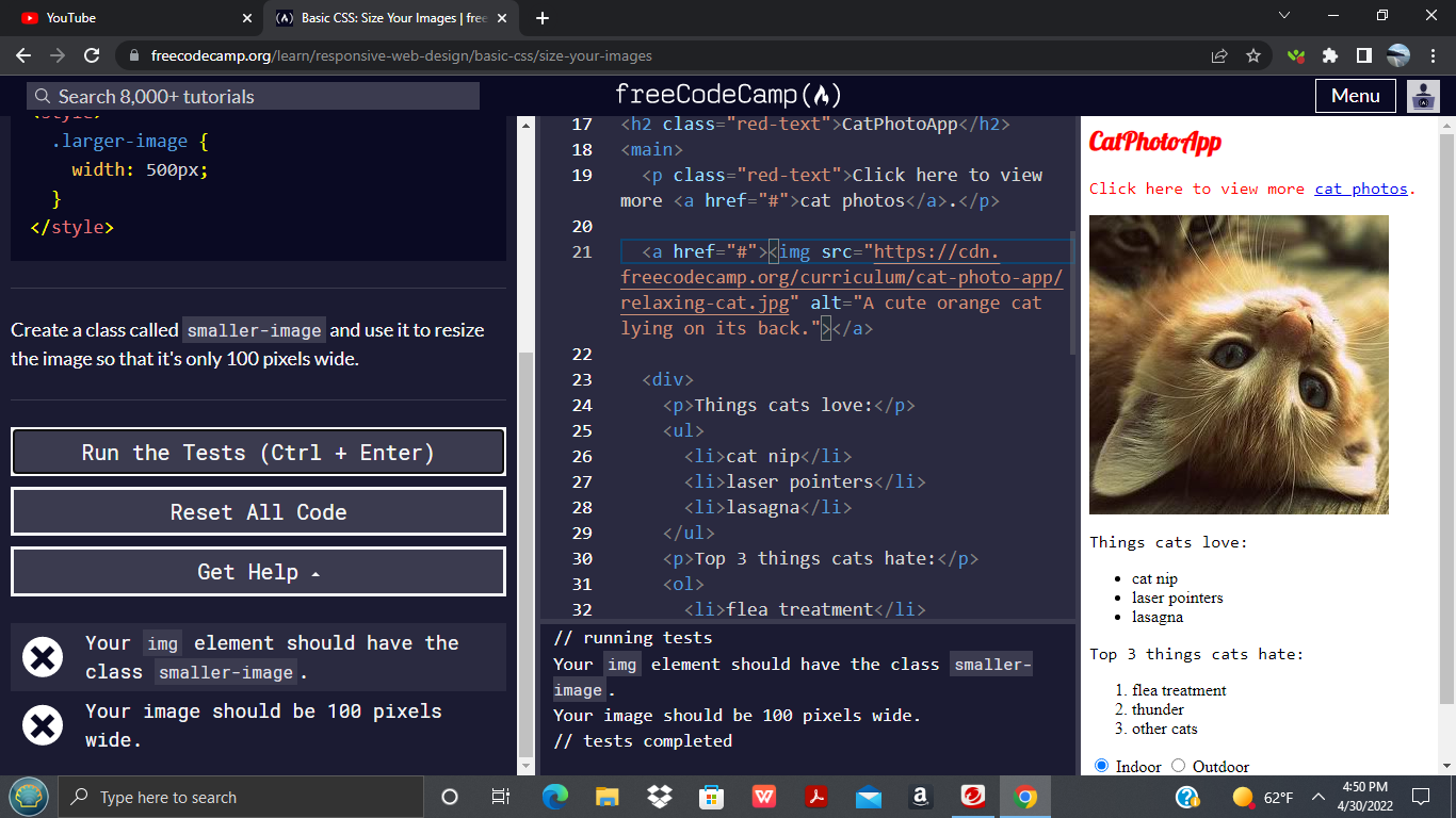
You can preserve an image’s aspect ratio by specifying only one dimension (either width or height) and setting the other to auto. The browser will then automatically calculate the missing dimension to ensure the image scales proportionally.
Example: If you want an image to always be 500 pixels wide, but its height should adjust naturally:
.gallery-image {
  width: 500px;
  height: auto; /* Height adjusts automatically */
}
Conversely, if you prioritize a fixed height:
.profile-thumbnail {
  height: 150px;
  width: auto; /* Width adjusts automatically */
}
Most web layouts are primarily constrained by width, so setting width and height: auto is a very common and effective practice for showcasing images like wallpapers or thematic collections.
Crafting Responsive Images with width and max-width
Responsive design is non-negotiable in today’s multi-device world. Images must seamlessly scale up or down to fit screens of all sizes. CSS provides elegant solutions for this:
-
widthin Percentage: Settingwidthto a percentage allows an image to scale relative to its parent container. For example,width: 100%;will make the image occupy the full width of its containing element..responsive-full-width { width: 100%; height: auto; /* Essential for maintaining aspect ratio */ }While effective, a
width: 100%;rule can potentially upscale a small image to be larger than its original dimensions, resulting in a blurry or pixelated output, particularly noticeable with high-resolution photography. This is generally undesirable for visual design and digital art. -
max-width: 100%(The Safer Bet): This property is a cornerstone of responsive image design. It tells the browser: “Scale the image down if its container is smaller than the image, but never let it scale up beyond its original intrinsic width.”.responsive-optimized { max-width: 100%; height: auto; /* Always maintain aspect ratio */ display: block; /* Removes extra space below the image */ }With
max-width: 100%, an image from Tophinhanhdep.com will shrink gracefully on smaller screens but retain its original crispness on larger displays without artificial upscaling. This is especially crucial for preserving the quality of high-resolution stock photos and beautiful photography.
Dynamic Image Fitting with object-fit and background-size
Sometimes, you need an image to perfectly fill a specific container area without distorting its aspect ratio, even if it means cropping some parts of the image or showing empty space. This is where object-fit (for <img> tags) and background-size (for background images) become invaluable for sophisticated visual design.

object-fit CSS Property
Applied directly to the <img> element, object-fit dictates how an image should resize within its content box while preserving its aspect ratio. Before object-fit, achieving this often required more complex workarounds involving background images.
Here are its key values, along with object-position for fine-tuning:
contain: The image is scaled down to fit entirely within the content box, preserving its aspect ratio. If the aspect ratios don’t match, empty space (letterboxing or pillarboxing) will appear within the container..object-fit-contain { width: 200px; height: 300px; object-fit: contain; /* Image fits completely within 200x300, aspect ratio preserved */ border: 1px solid #CCC; }cover: The image is scaled to completely cover the content box, preserving its aspect ratio. If the aspect ratios don’t match, parts of the image will be cropped. This is excellent for creating clean, fill-the-space layouts with aesthetic images from Tophinhanhdep.com..object-fit-cover { width: 200px; height: 300px; object-fit: cover; /* Image fills 200x300, cropping as needed, aspect ratio preserved */ border: 1px solid #CCC; }fill: This is the default behavior. The image stretches or squashes to fill the entire content box, potentially distorting its aspect ratio.none: The image is not resized at all, maintaining its original size and appearing clipped if larger than the container.scale-down: Comparesnoneandcontainand uses the smaller of the two.
You can further control the visible portion with object-position. For example, object-position: right; will ensure the right side of the image is prioritized if object-fit: cover causes cropping. This is particularly useful for photo manipulation and showcasing specific elements of beautiful photography.
Resizing Background Images with background-size
For situations where an image acts as a background for a div or other element, the background-image CSS property is used. background-size provides powerful control over how these background images from Tophinhanhdep.com (e.g., wallpapers, abstract backgrounds) are scaled and positioned.
auto: Default. Renders the image at its full, original size.length(e.g.,100px 100px): Sets explicit width and height. If only one value is given, the other isauto.percentage(e.g.,100% 100%): Sets width and height relative to the parent element.contain: The background image is scaled as large as possible to fit within the content area, preserving its aspect ratio. There may be empty space.cover: The background image is scaled as small as possible to cover the entire content area, preserving its aspect ratio. Parts of the image may be cropped. This is excellent for full-bleed backgrounds.
Example of background-size: cover:
.hero-banner {
  width: 100%;
  height: 500px; /* Fixed height for the banner */
  background-image: url('wallpaper-nature.jpg'); /* A stunning nature wallpaper from Tophinhanhdep.com */
  background-size: cover; /* Image covers the entire div, cropping if necessary */
  background-position: center; /* Centers the visible part of the image */
  background-repeat: no-repeat;
}
This is a standard technique for hero sections where a beautiful photograph or an aesthetic background must always fill the space, regardless of screen dimensions.
Beyond Basic Sizing: Optimizing Images from Tophinhanhdep.com for Web Performance
While the techniques above teach you how to resize images in HTML and CSS, a critical aspect of modern web development, particularly for content-rich sites featuring high-resolution images and beautiful photography from Tophinhanhdep.com, is optimization. Client-side resizing, while easy, comes with significant performance downsides.
The Hidden Costs of Client-Side Resizing
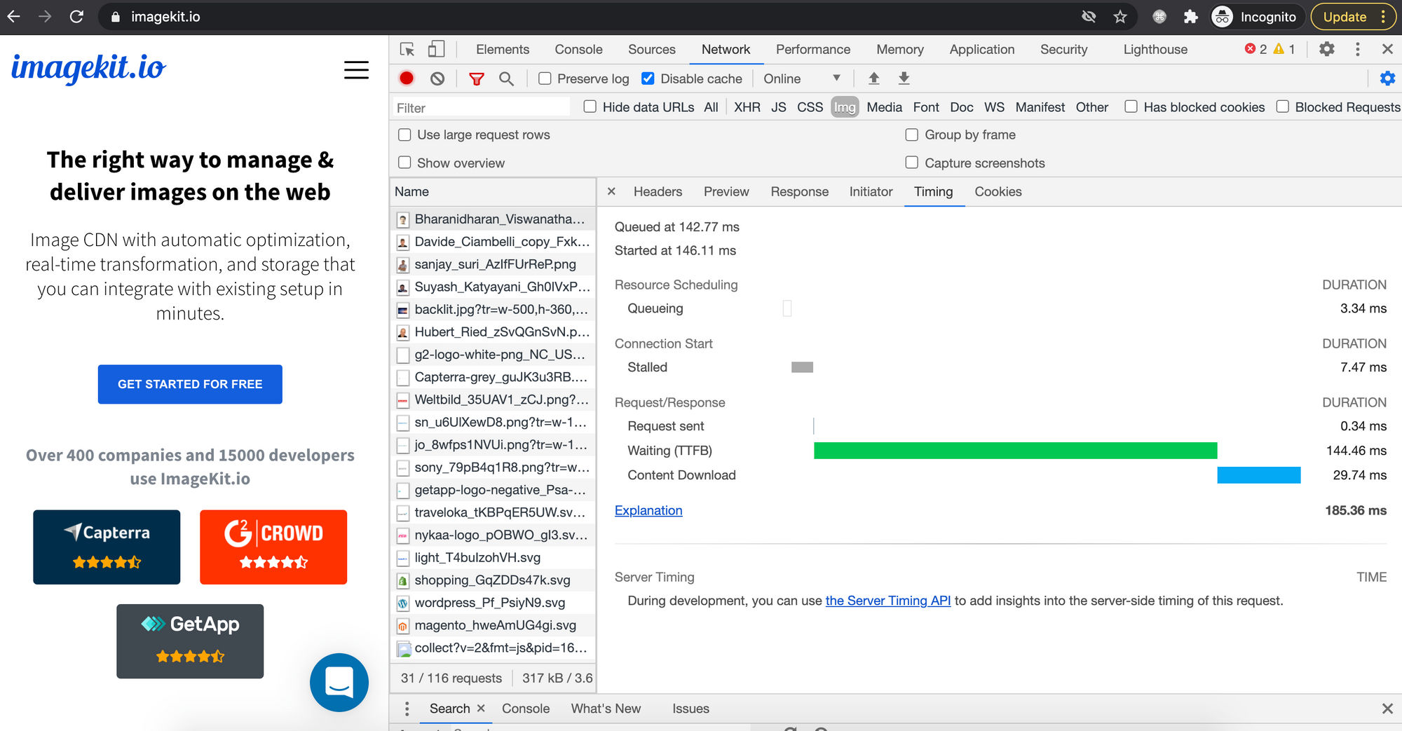
Simply setting smaller width and height attributes on a large image in your HTML doesn’t magically make the image file itself smaller. The browser still downloads the original, full-sized image before scaling it down for display. This leads to several inefficiencies:
- Slow Image Rendering: If you display a 1.5 MB, 3000x2000 pixel image as a small 400x267 thumbnail, your users still download the entire 1.5 MB file. This unnecessary data transfer delays rendering, impacting perceived loading speed and overall user experience, especially on slower connections.
- Poor Image Quality: Browsers use varying algorithms for scaling images. While modern browsers are generally good, downsizing a large image client-side can sometimes result in a noticeably blurry or less crisp output compared to a properly prepared, pre-resized image. This is a crucial concern for platforms like Tophinhanhdep.com, which pride themselves on high-resolution, high-quality visuals.
- Bandwidth Wastage & Increased Costs: Downloading larger-than-necessary image files consumes more bandwidth, which can be costly for both the website owner (hosting and CDN bills) and the user (data plans).
- Increased Memory and Processing Requirements on Client Devices: Resizing large images is a computationally intensive task. Doing this client-side, especially on lower-end devices or mobile phones, can strain system resources, leading to slower page interactions and a degraded browsing experience. This directly affects how smoothly users can browse aesthetic wallpapers or explore thematic collections on your site.
Tophinhanhdep.com’s Approach to Image Optimization
To truly excel in web performance and image quality, the ideal strategy is server-side image resizing and optimization. Instead of making the browser do the heavy lifting, you serve an image that is already the correct size and optimized format for its intended display.
Tophinhanhdep.com, understanding the nuances of digital photography and visual design, equips its users with powerful Image Tools to tackle these challenges head-on:
- Converters: Transform images into more web-friendly formats like WebP or AVIF, which offer superior compression without sacrificing quality.
- Compressors: Reduce file sizes significantly, ensuring faster downloads without visible degradation, perfect for stock photos and beautiful photography.
- Optimizers: Fine-tune image parameters for the web, balancing quality and file size.
- AI Upscalers: While less about reducing size, Tophinhanhdep.com’s AI upscalers can be used to intelligently enlarge lower-resolution images before uploading, ensuring they look great even if scaled up slightly on the client side (though upscaling raster images in HTML should generally be avoided).
By utilizing these tools before embedding images into your HTML, you can drastically cut down on file sizes, improve loading times, and guarantee that the visual integrity of images from Tophinhanhdep.com – be it nature wallpapers or abstract digital art – is perfectly preserved.
Best Practices for Serving High-Quality Images
Beyond using Tophinhanhdep.com’s excellent tools, consider these best practices:
- Right-size images: Always upload images that are as close as possible to their largest display size.
- Use modern formats: Prioritize WebP and AVIF over JPEG and PNG for better compression.
- Leverage SVG for icons: For icons and simple graphics that need to scale infinitely without loss of quality (common in graphic design), use SVG (Scalable Vector Graphics).
- Consider
<picture>element orsrcset: For truly adaptive images, use HTML’s<picture>element or thesrcsetattribute to serve different image files based on screen size or resolution. This ensures users only download the most appropriate image for their device.
Enhancing Visual Design with Perfectly Sized Images
The meticulous art of image sizing goes hand-in-hand with effective visual design. For anyone working with images from Tophinhanhdep.com – from graphic designers to digital artists and curators of thematic collections – mastering these techniques is not just a technicality; it’s a creative enabler.
Curating Aesthetic Collections
When building mood boards or showcasing thematic collections on your website, the way images are sized and presented directly influences the overall aesthetic. Using object-fit: cover within a grid, for instance, can create a uniform, professional look for diverse sad/emotional or beautiful photography collections, ensuring all image cards appear full and consistent. Conversely, object-fit: contain might be used for product images where the entire item needs to be visible without cropping. Thoughtful sizing transforms a mere collection of images into a cohesive, inspiring visual narrative.
The Role of Sizing in Digital Art and Photo Manipulation
Digital artists and those involved in photo manipulation often upload highly detailed and specific visual compositions to Tophinhanhdep.com. Ensuring these images are displayed correctly on a website means paying close attention to aspect ratios and avoiding unintended distortion. When you’ve spent hours perfecting the intricate details of an abstract piece or a manipulated nature scene, allowing the browser to haphazardly stretch or compress it diminishes your artistic intent. Advanced CSS properties like object-fit and object-position allow you to dictate precisely which part of your creative idea is visible and how it interacts with the layout, preserving every nuance of your work.
By integrating intelligent image sizing with Tophinhanhdep.com’s optimization tools, you ensure that every wallpaper, background, or piece of aesthetic photography not only loads swiftly but also renders beautifully, just as its creator intended. This holistic approach elevates the user experience, transforming a simple visit into an immersive visual journey.
In conclusion, while HTML provides the basic framework for embedding images, the true power to control their size, responsiveness, and display quality lies within CSS. For users of Tophinhanhdep.com, embracing these techniques – especially when combined with the website’s robust image optimization tools – is key to crafting visually stunning and high-performing websites. By prioritizing server-side optimization and intelligent CSS application, you can ensure that every image, whether a high-resolution stock photo or a piece of inspiring digital art, contributes positively to your website’s overall aesthetic and user experience.