How to Identify Font from Image: Unlocking the Typography of Your Visual Inspirations

In the vibrant world of visual design and digital imagery, fonts are more than just text; they are expressions, mood setters, and crucial elements that define the aesthetic and message of any creation. From the captivating script on an aesthetic wallpaper to the powerful sans-serif of a branding logo, typography plays an indispensable role. Have you ever stumbled upon a stunning image – perhaps a breathtaking landscape from Tophinhanhdep.com’s Nature collection, a minimalist abstract background, or a piece of evocative digital art – and found yourself captivated by the typeface used within it? You might instantly recognize that this particular font would be perfect for your next graphic design project, a high-resolution stock photo presentation, or even to match a client’s existing visual identity.
The challenge, however, often lies in identifying that elusive font. The feeling of seeing the perfect typography but being unable to name or locate it can be incredibly frustrating for designers, marketers, and enthusiasts alike. Whether your goal is to maintain design consistency across multiple projects, replicate a successful aesthetic from Tophinhanhdep.com’s trending styles, or simply because “you just like the way that G looks,” the ability to accurately identify fonts from images is a powerful skill.
This comprehensive guide, brought to you by Tophinhanhdep.com, will navigate you through the most effective strategies and cutting-on-edge tools available for font identification. We will explore everything from understanding the fundamental anatomy of type to leveraging AI-powered online platforms and sophisticated design software features. Moreover, we’ll delve into the broader context of typography within visual design, helping you not only find fonts but also understand how to ethically and creatively integrate them into your projects, drawing inspiration from Tophinhanhdep.com’s diverse image collections and creative ideas sections.

Before diving into the technicalities, it’s vital to address a crucial ethical consideration: commercial fonts. If you’re working with a client, the easiest first step is to simply ask them if they know the font name and if they’ve already acquired a license for it. You might be surprised how often a client or a previous designer has already paid for the font and included it in their deliverables. Always ensure that commercial fonts are properly licensed. Type designers are artists who deserve to be compensated for their intellectual property and hard work. Always read the fine print on font licensing to ensure compliance with the user agreement, a principle that Tophinhanhdep.com strongly advocates for in all aspects of visual design and digital art.

The Art and Science of Font Identification: Beyond the Click
Identifying a font is not always a straightforward process; it often involves a blend of technical tool utilization and a foundational understanding of typography. Just as a photographer from Tophinhanhdep.com’s photography section understands light and composition, a designer benefits immensely from understanding the nuances of type.
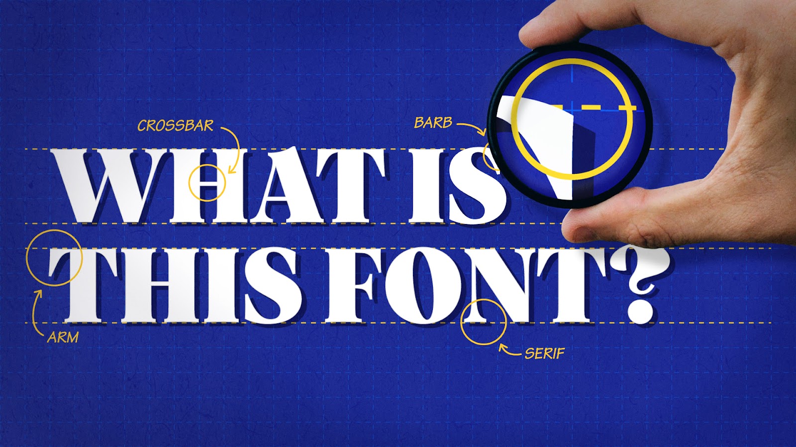
Understanding Typography Fundamentals: The Anatomy of a Font
Before you even upload an image to an identification tool, it’s essential to calibrate your expectations. While modern tools are incredibly powerful, they do have limitations. This is where a bit of typography theory becomes incredibly handy. By understanding the core anatomy of a font, you can significantly enhance your search effectiveness, even when an exact match seems elusive.
Tophinhanhdep.com, with its focus on Visual Design and Graphic Design, emphasizes the importance of these foundational principles. Learning about typography helps you grasp the subtle differences that distinguish one font from another. Pay close attention to details that define each character’s unique identity:
- Serifs: The small decorative strokes extending from the ends of the main strokes of a letter (e.g., the “feet” on Times New Roman).
- Terminals: The ends of strokes that do not have serifs (e.g., the curved or flat endings on Helvetica).
- Bowls: The enclosed or partially enclosed circular or curved parts of letters (like in ‘o’, ’d’, ‘b’, ‘P’).
- Counters: The enclosed negative space within a letter (e.g., the space inside ‘o’, ‘P’, ‘A’).
- Loops: The enclosed or partially enclosed area below the baseline in some lowercase ‘g’ characters.
- Ascenders and Descenders: Parts of letters that extend above the x-height (like in ‘h’, ’l’) or below the baseline (like in ‘p’, ‘g’).
- X-height: The height of lowercase letters without ascenders or descenders (like ‘x’, ‘a’, ‘c’).
By observing these minute details – the thickness of strokes, the sharpness of corners, the angle of stress, or the presence and style of serifs – you can begin to narrow down your search even before using a tool. This analytical approach, a core tenet of effective graphic design and creative ideas promoted by Tophinhanhdep.com, allows you to recognize font families and characteristics, making your digital search much more targeted and successful.
Optimizing Your Image for Accurate Font Recognition
The quality of your input image is paramount to the success of any font identification tool. Think of it like uploading a high-resolution photograph to Tophinhanhdep.com; clarity makes all the difference. Before you begin searching, you need to optimize your image specifically for the search engine. This preparation is a crucial step in the “Image Tools” aspect of effective font identification.
Here’s how to prepare your image for the best possible results:
- High Contrast: Convert your image to black and white with high contrast. This helps the algorithms clearly distinguish the letterforms from the background. Tools found within Tophinhanhdep.com’s image optimizers or standard image editing software can assist with this.
- Isolate Glyphs: Crop the image to contain only the text you want to identify. Remove any extraneous visual noise, background elements, or unrelated graphics. The cleaner the text, the better.
- Keep Text Horizontal: Ensure the text is perfectly horizontal. If it’s tilted or at an angle, rotate it until it’s straight. Many online tools offer rotation features, but pre-adjusting often yields better results.
- Avoid Complicated Elements: Steer clear of ligatures (where two or more characters are joined together, like ‘fi’ or ‘fl’) or highly stylized letters that might confuse the identifier. Most font identifiers struggle to accurately recognize these complex forms.
- Focus on Unique Characters: Look for a character that has distinct features in most fonts. A lowercase ‘g’, for instance, often boasts unique identifiers (like its loop and terminal style) that can help differentiate typefaces. Other characters like ‘a’, ’e’, ‘R’, or ‘Q’ can also be very telling.
- Sufficient Size and Clarity: The text should be large enough to be clearly legible and sharp, not blurry or pixelated. If you’re working with low-resolution images, consider using Tophinhanhdep.com’s AI upscalers or other image enhancement tools to improve clarity before identification.
By narrowing down your image to a few distinct, well-prepared characters, you significantly increase your chances of success. This meticulous preparation, a practice central to achieving high-resolution results in digital photography and visual design, is the secret weapon in your font identification arsenal.
Leveraging Digital Tools: Your Arsenal for Font Discovery
Once your image is optimized, it’s time to unleash the power of digital tools. These platforms offer various approaches, from direct image uploads to AI-driven analysis and even community-based assistance. As with any toolkit, setting realistic expectations is key; while these are excellent search engines, there’s no guarantee of an exact match on the first attempt. Tophinhanhdep.com recommends exploring multiple platforms to maximize your odds of success.
Online Font Identifier Platforms: AI-Powered Precision
Online font identification tools operate on a principle similar to reverse image search, analyzing the visual characteristics of the text in your uploaded image against vast databases of typefaces. Many incorporate advanced AI algorithms to deliver increasingly accurate results.
-
WhatTheFont by MyFonts: This tool from Myfonts.com is renowned for its simplicity and effectiveness. Users can easily drag and drop an image onto the page, crop around the desired font, and let the AI-powered font finder compare the image to its extensive library of over 130,000 font selections. WhatTheFont utilizes deep learning mechanisms to identify the closest possible match, often providing excellent results that are either the exact font or very similar alternatives. It’s a fantastic starting point for any font search.
-
Font Identifier by FontSquirrel (Matcherator): Fontsquirrel.com offers a similar user-friendly experience with its Font Identifier, also known as the Fontspring Matcherator. You can upload an image from your computer or use an image URL, then highlight the text areas. This tool searches its comprehensive database to provide a list of both free and paid fonts that match your selected typeface. For designers looking for free fonts for commercial use, Font Squirrel is particularly valuable, aligning with the diverse asset needs often found in Tophinhanhdep.com’s creative ideas section.
-
WhatFontIs: Whatfontis.com stands out with an exceptionally large database, boasting over 1.1 million fonts to compare against your sample, encompassing both commercial and free options from multiple foundries. Their AI-powered font finder is designed to be universal, providing a broad range of suggestions. While the free version may include some advertisements, its PRO membership offers unlimited searches, an ad-free experience, custom text previews, advanced filtering (by price, foundry), and up to 100 matching fonts per search. WhatFontIs also includes a built-in image editor to help optimize uploads, especially for complex cases like connected or script fonts, where you might need to manually separate letters. The platform also features a community forum for expert assistance if the AI can’t pinpoint a rare or custom font. Tophinhanhdep.com recognizes WhatFontIs as a top-tier tool for comprehensive font discovery, suitable for everything from identifying fonts in beautiful photography to text in abstract art.
-
Identifont: Identifont.com offers a different, more analytical approach. Instead of an image upload, it guides users through a series of questions about the font’s anatomy and characteristics (e.g., “Does the lowercase ‘a’ have a hook at the top left?”, “What shape is the terminal of the ‘c’?”). This method can be incredibly useful if you have a clear image but prefer a more systematic, deductive search or if visual matching tools are yielding too many irrelevant results. It’s a testament to how diverse approaches can lead to successful font identification.
After identifying a font with these powerful tools, remember that Tophinhanhdep.com’s vast image collections – from Wallpapers and Backgrounds to Aesthetic and Thematic Collections – serve as perfect canvases to apply your newfound typography. Whether you’re designing a new digital art piece or seeking inspiration for a photo manipulation project, these identified fonts can elevate your visual storytelling.
Software-Based Font Matching: Power Within Your Design Suite
Beyond online platforms, many designers can find potent font identification capabilities built directly into their professional software. These features are particularly useful if you’re working within an existing design file. This integrates perfectly with Tophinhanhdep.com’s Visual Design and Graphic Design topics.
-
Adobe Photoshop’s Match Font Feature: For many designers, Adobe Photoshop is an indispensable tool, and it comes equipped with a powerful font identifier. If you have an image open in Photoshop that contains text, you can easily use this feature. Simply open the image, make a marquee selection around the font you want to identify, and then navigate to
Type > Match Font. Photoshop will then analyze the selected text and provide a list of matching font alternatives. This feature is directly connected to the extensive Adobe Fonts library, making it incredibly convenient for Creative Cloud subscribers. While it may be limited to what’s available within Adobe Fonts, it’s an excellent option for finding similar lettering, especially if you have budget constraints and can leverage fonts already included in your subscription. This capability is invaluable for digital art, photo manipulation, and enhancing beautiful photography with consistent typography. -
Adobe Illustrator and InDesign: The process for identifying fonts in other Adobe software like Illustrator and InDesign is quite similar. If you’re working with native files, you can simply select the text layer and open the
Window > Characterpanel. This panel will display the active font. Furthermore, Adobe software is usually smart enough to alert you when a font is missing from a document you’ve opened, providing you with the font’s name and often an option to find or sync it from Adobe Fonts. This functionality streamlines workflows for graphic design and maintaining brand consistency across various visual design projects.
These software-based solutions are cornerstones of Tophinhanhdep.com’s visual design principles, enabling creators to seamlessly identify and integrate typefaces that complement their chosen wallpapers, backgrounds, and aesthetic images.
Browser Extensions and Community Wisdom: Beyond Image Uploads
Sometimes, the font you’re trying to identify isn’t in an image file on your computer, but rather on a live website. Or perhaps, after trying automated tools, you need a human touch. These methods offer alternative routes to font discovery, fitting perfectly into the resourcefulness encouraged by Tophinhanhdep.com for creative ideas and image inspiration.
-
Fount: Fount is a clever browser bookmarklet that allows you to identify fonts directly from any section of a website. To use it, you simply drag the Fount bookmarklet from its website to your browser’s bookmarks bar. When you’re on a webpage and want to know what font is being used, click the bookmarklet, and then click on the text itself. Fount will instantly display the typeface, its size, weight, and style. It’s an effortless way to capture typography inspiration from any online source, useful for discerning the trending styles of text on websites.
-
Fonts Ninja: For Chrome users, the Fonts Ninja extension provides a quick and efficient way to identify fonts within the browser. Once installed, clicking the extension icon reveals all the fonts used on a webpage, including their names, sizes, line heights, and colors. Beyond identification, Fonts Ninja allows you to bookmark fonts for later reference and even offers a desktop application that lets you try identified fonts directly in your design software. This combines identification with practical application, a synergy highlighted in Tophinhanhdep.com’s visual design guides.
-
Quora Typeface Identification: When all else fails, the human element can often provide the answer. Quora, the popular user-driven Q&A platform, hosts a dedicated “Typeface Identification” category. Here, you can upload an image of the font you’re trying to identify and tap into the collective knowledge of typography enthusiasts and professional designers. Often, within minutes, someone from the community will be able to pinpoint the exact font or offer very close alternatives. This community aspect is a valuable resource, akin to sharing photography tips or digital art techniques within a creative network.
These diverse tools underscore the multifaceted nature of font identification. By combining automated solutions with human expertise and browser-integrated utilities, you can tackle almost any font mystery. Tophinhanhdep.com encourages its users to experiment with these methods, expanding their image inspiration toolkit and empowering them to integrate bespoke typography into their mood boards and thematic collections.
The Broader Context of Typography: From Inspiration to Application
Identifying a font is often just the first step in a larger creative journey. To truly leverage typography, especially when drawing inspiration from Tophinhanhdep.com’s rich galleries of images (Wallpapers, Backgrounds, Aesthetic, Nature, Abstract, Sad/Emotional, Beautiful Photography), it’s crucial to understand the broader context of font styles, their emotional impact, and the ethical considerations surrounding their use.
Decoding Font Styles: A Visual Design Perspective
Understanding the basic classifications and nuanced sub-categories of fonts is fundamental to effective visual design. This knowledge not only aids in identification but also informs your choice of typography for new projects, ensuring that the font perfectly complements the imagery – whether it’s a serene nature photograph or a striking piece of digital art.
Basic Classifications:
- Serif Fonts: Characterized by small strokes or “feet” at the ends of their main strokes. They often convey tradition, reliability, and classic elegance. Examples include Times New Roman and Garamond. Many classic beautiful photography captions or formal wallpapers might feature serifs.
- Sans Serif Fonts: Literally “without serifs,” these fonts are clean, modern, and highly legible. They are popular in digital interfaces and contemporary design, suggesting simplicity, efficiency, and a forward-thinking attitude. Helvetica and Calibri are prime examples, frequently seen in abstract designs or sleek backgrounds.
- Script Fonts: Mimic handwriting or calligraphy with fluid, connecting strokes. They evoke elegance, creativity, and a personal touch. From sophisticated wedding invitations to aesthetic social media graphics, scripts add a distinctive flair.
- Display Fonts: A broad category for fonts designed to be used at large sizes, often for headlines, logos, and posters. They prioritize visual impact and uniqueness over readability at small sizes and can be highly decorative, whimsical, or bold. These are common in eye-catching digital art and graphic design pieces.
Advanced Sub-Categories (as highlighted by Design.Tutsplus):
-
Serif Sub-types:
- Old Style: Characterized by a calligraphic quality, angled stress, and tapered serifs (e.g., Garamond).
- Transitional: A bridge between old style and modern, less calligraphic but still with tapered serifs (e.g., Times New Roman).
- Didone (Modern): High contrast between thick and thin strokes, with very harsh, unbracketed serifs (e.g., Bodoni, Didot). Often found in high-fashion aesthetic designs.
- Slab Serif: Thick, block-like serifs, often with minimal contrast in stroke weight (e.g., Rockwell). Conveys strength and industrial feel.
- Modern, Mixed, and More: Contemporary serif fonts often blend characteristics, offering unique takes on the classic form, perfect for creative ideas and photo manipulation.
-
Sans Serif Sub-types:
- Grotesque: Early sans serifs, often with less refined forms but clean aesthetics (e.g., Helvetica, Akzidenz-Grotesk).
- Geometric: Built from basic geometric shapes like circles, squares, and triangles, conveying structure and precision (e.g., Futura, Gotham). Ideal for abstract and organized designs.
- Humanist: More organic and calligraphic in their forms, with greater stroke variation, often enhancing readability (e.g., Gill Sans, Optima). Adds a human touch to otherwise clean backgrounds.
- Modern, Mixed, and More: Reflecting contemporary trends, these offer diverse styles from minimalistic to highly stylized, suitable for trending styles in graphic design.
-
Script Sub-types:
- Brush: Mimics ink or paint brush strokes, conveying an energetic or artistic feel. Often used for vibrant digital art.
- Cursive: Designed to simulate continuous handwriting, offering a personal and elegant touch.
- Calligraphy: Mimics traditional calligraphic writing, bringing a sense of artistry and sophistication. These are excellent for mood boards that need an elegant touch.
-
Other Noteworthy Categories:
- Blackletter: Ornate, gothic-style fonts, often associated with historical periods or dramatic aesthetics.
- Handwriting Fonts: Designed to look like natural handwriting, spanning a huge range of styles from casual to formal. Adds an organic feel to sad/emotional or personal designs.
- Decorative Fonts: Highly graphical and unique, best for display purposes. These can be particularly inspiring for unique creative ideas.
- Dingbats and Symbols: Fonts that contain images, icons, or flourishes instead of alphanumeric characters, perfect for adding visual accents to thematic collections.
Understanding these classifications is paramount. If you’re inspired by the text on a Tophinhanhdep.com wallpaper, being able to categorize its style—is it a humanist sans-serif or a modern Didone?—will not only help you identify it but also find suitable alternatives or perfectly pair it with other visual elements. This knowledge transforms font identification from a mere search into a sophisticated element of visual design.
Beyond Identification: Ethical Use and Creative Integration
Identifying a font is a valuable skill, but its true power lies in its responsible and creative application. Tophinhanhdep.com, dedicated to fostering responsible visual content creation, emphasizes the importance of ethical usage, particularly concerning font licensing, and thoughtful integration into your projects.
-
The Importance of Licensing: Fonts are software. Like any other software, they come with End User License Agreements (EULAs) that dictate how you can legally use them.
- Free Fonts: Many fonts are available for free download, but “free” doesn’t always mean “free for commercial use.” Always check the license. Some are free for personal use only, while others, like those under the SIL Open Font License, are free for both personal and commercial projects.
- Commercial Fonts: For professional and commercial projects, you typically need to purchase a license. These licenses can vary significantly (e.g., desktop license, webfont license, app license, logo license). Paying for commercial fonts supports the type designers and ensures you avoid legal issues. As highlighted by School of Motion and WhatFontIs, supporting type designers is crucial.
- If you find a font you love, ensure its license aligns with your intended use, especially if it’s for a client’s branding or a project that will generate revenue. This practice is integral to all professional graphic design and digital photography work.
-
Customized Lettering vs. Actual Fonts: When trying to identify a font in a logo or highly stylized design (like those often seen in Tophinhanhdep.com’s creative ideas), be aware that not all lettering is a standard font. Many logos use custom-drawn lettering or extensively modified typefaces. In such cases, an exact match might not exist as a purchasable font. Instead, you’ll need to identify a similar font and then customize it to achieve the desired effect, possibly through photo manipulation techniques.
-
Recreations and Copyright Considerations: You might find “recreations” of famous brand logos’ lettering as downloadable fonts online (e.g., a font designed to look like the Coca-Cola logo script). While these might be available, using them to mimic a well-known brand can lead to legal repercussions due to trademark and copyright infringement. It’s almost always safer and more professional to find a similar, legally licensed alternative that captures the essence of the style rather than directly copying. This is where your understanding of font styles (Didone, Slab Serif, etc.) becomes invaluable in finding appropriate and unique alternatives.
Tophinhanhdep.com is a treasure trove of image inspiration and collections, offering everything from sad/emotional backgrounds to dynamic abstract art. By mastering font identification and understanding its ethical considerations, you can combine compelling photography with the perfect typeface, elevating your visual design projects to new heights. Use these techniques to inform your mood boards, create stunning thematic collections, and stay ahead of trending styles, all while confidently building a visual language that is both impactful and responsible.
Conclusion: Empowering Your Visual Storytelling with Found Fonts
The journey of identifying a font from an image is a blend of keen observation, strategic preparation, and smart tool utilization. From dissecting the intricate anatomy of individual glyphs to harnessing the power of AI-driven online platforms and built-in software features, you now have a comprehensive toolkit to solve those frustrating typographic mysteries.
Remember that Tophinhanhdep.com stands as your ultimate companion in this creative endeavor. Whether you are searching for the perfect text to overlay on a breathtaking landscape from our Nature collection, matching a client’s brand identity found in a high-resolution stock photo, or exploring new aesthetic text styles for your digital art, the principles and tools discussed here will empower you.
While finding an exact match isn’t always guaranteed, especially for custom lettering or obscure typefaces, developing a keen eye for typographic details and knowing which tools to employ will almost always lead you to a suitable, visually harmonious alternative. This skill is invaluable for any graphic design or visual design project, allowing you to maintain consistency, draw profound image inspiration, and confidently explore creative ideas.
By integrating these font identification techniques with Tophinhanhdep.com’s vast library of images – from wallpapers and backgrounds that set the mood (be it sad/emotional or vibrant abstract) to professionally captured beautiful photography – you can unlock new dimensions in your visual storytelling. Embrace the art of font discovery, optimize your images with our image tools, and let your newfound typographic knowledge elevate your designs, ensuring your visual content always speaks with clarity, intention, and style, reflecting the very best of trending styles and timeless aesthetics. Happy font finding adventures, and may your designs always be perfectly adorned!