How to Insert an Image as a Background in HTML: A Comprehensive Guide to Stunning Web Visuals

A website’s background is far more than just empty space; it’s a foundational element that sets the tone, enhances user experience, and reinforces brand identity. Whether you’re aiming for a tranquil nature scene, a bold abstract pattern, or a subtle aesthetic texture, the right background image can transform a plain webpage into a captivating digital canvas. While once possible with basic HTML attributes, the modern and highly recommended approach to setting a background image for your web pages involves Cascading Style Sheets (CSS). This method offers unparalleled control, flexibility, and responsiveness, ensuring your visuals look pristine across all devices.
At Tophinhanhdep.com, we understand the power of impactful imagery. Our extensive collections of Wallpapers, Backgrounds, Aesthetic, Nature, Abstract, Sad/Emotional, and Beautiful Photography are curated to inspire and equip web designers and developers with the perfect visuals. Beyond just images, we also provide essential Image Tools like Converters, Compressors, Optimizers, and AI Upscalers to ensure your chosen visuals are perfectly prepared for web deployment. This guide will walk you through the process of integrating these stunning images into your HTML, leveraging CSS for professional and appealing results, and exploring how Tophinhanhdep.com’s resources can elevate your visual design.

Fundamentals of Setting Background Images with CSS
To set an image as a background in HTML, you primarily use CSS. This allows for a clean separation of content (HTML) from presentation (CSS), a best practice in modern web development. You’ll typically place your CSS rules either within a <style> tag in the <head> section of your HTML document (internal stylesheet) or, for larger projects, in a separate .css file linked to your HTML (external stylesheet).
Preparing Your HTML Document
Before you dive into the CSS, ensure your HTML document is set up correctly.
- Open your HTML file: Use any text editor (like VS Code, Sublime Text, or even Notepad) to edit your
.htmlfile. If you’re starting fresh, create a new file and save it with a.htmlextension (e.g.,index.html). - Basic HTML Structure: Your document should have the standard boilerplate:

```html
<!DOCTYPE html>
<html>
<head>
    <title>My Beautiful Website</title>
    <style>
        /* Your CSS code will go here */
    </style>
</head>
<body>
    <!-- Your website content goes here -->
</body>
</html>
```
- Image Placement: Place your chosen background image in a logical location within your project folder. A common practice is to create an
imagesfolder (e.g.,my-project/images/background.jpg). For this example, let’s assume your image is namedbackground.jpgand is in the same directory as your HTML file, or within animagesfolder relative to your HTML. Sourcing high-resolution, visually compelling images is crucial here, and Tophinhanhdep.com offers an unparalleled selection of high-quality Wallpapers and Beautiful Photography perfect for this purpose.
The background-image Property
The core CSS property for adding a background image is background-image. It accepts a URL pointing to your image file.
-
Locating the
<style>tags: Inside your<head>section, you’ll find the<style>tags. This is where you’ll define the CSS rules for your background. -
Targeting the
<body>element: To apply a background image to the entire webpage, you’ll target the<body>element. -
Adding the
background-imagerule:body { background-image: url("background.jpg"); /* Or "images/background.jpg" if in a subfolder */ }Replace
"background.jpg"with the correct path to your image. This can be:- Relative Path: If
background.jpgis in the same folder as your HTML file, use"background.jpg". If it’s in a subfolder calledimages, use"images/background.jpg". - Absolute Path (Web URL): If your image is hosted online (e.g., on Tophinhanhdep.com), you can use its full URL:
"https://www.tophinhanhdep.com/path/to/my_background.png". This is particularly useful when leveraging Stock Photos from Tophinhanhdep.com for quick integration.
- Relative Path: If
At this point, if you save your HTML file and open it in a web browser, you should see your image as the background. However, you’ll quickly notice that if the image is smaller than the browser window, it will repeat itself (tile) by default, which may not be the desired effect for a full-page background. This is where other CSS properties come into play to refine its appearance.
Mastering Background Image Properties for Optimal Visuals
Once your background image is set, controlling how it behaves on the page is essential for achieving a polished look. CSS offers several properties to fine-tune repeating, sizing, positioning, and scrolling behavior. These properties are critical components of Visual Design and Graphic Design, allowing you to integrate images harmoniously with your content.
Controlling Image Repetition: background-repeat
By default, background images repeat to fill the available space. You can change this behavior using the background-repeat property.
background-repeat: no-repeat;: This is the most common setting for full-page background images. It ensures the image appears only once.background-repeat: repeat;: (Default) The image tiles horizontally and vertically. This can be effective for small, seamless Abstract or Aesthetic patterns sourced from Tophinhanhdep.com.background-repeat: repeat-x;: The image repeats horizontally only.background-repeat: repeat-y;: The image repeats vertically only.background-repeat: space;: The image repeats as many times as possible without clipping, and spaces out evenly.background-repeat: round;: The image repeats as many times as possible, scaling the images to fit.
body {
    background-image: url("background.jpg");
    background-repeat: no-repeat; /* Prevents tiling */
}
Sizing Your Background: background-size
To ensure your background image covers the entire page without unwanted repetition, especially when no-repeat is applied, background-size is vital. This property helps you make your images Responsive and visually appealing on screens of all sizes.
background-size: cover;: This scales the background image to cover the entire container (e.g., thebody), even if it has to crop some parts of the image or stretch it. It preserves the image’s aspect ratio. This is ideal for most full-page Wallpapers and Nature photography.background-size: contain;: This scales the image to the largest size possible without cropping or stretching, ensuring the entire image is visible within the container. If the image is smaller than the container, it will still tile unlessno-repeatis also used.background-size: 100% 100%;: Stretches the image to fill the entire width and height of the container, potentially distorting its aspect ratio.background-size: 800px 600px;: Sets a fixed width and height for the background image. If only one value is provided (e.g.,background-size: 800px;), the height scales proportionally.
For a full-page background that adapts well to various screen sizes, cover is generally the best choice.
body {
    background-image: url("background.jpg");
    background-repeat: no-repeat;
    background-size: cover; /* Ensures the image covers the entire viewport */
}
Positioning Your Background: background-position
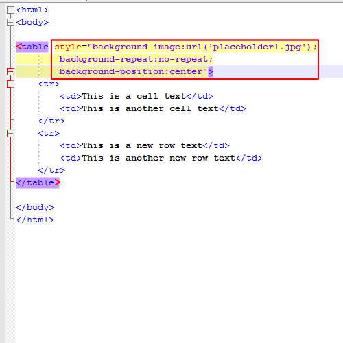
This property controls the initial position of your background image within its container.
background-position: center center;: Centers the image both horizontally and vertically. This is often combined withbackground-size: cover;for visually balanced backgrounds.background-position: top left;: Aligns the image to the top-left corner.background-position: 50% 50%;: Uses percentage values for positioning (50% from left, 50% from top).background-position: 20px 30px;: Uses pixel values for exact positioning.
body {
    background-image: url("background.jpg");
    background-repeat: no-repeat;
    background-size: cover;
    background-position: center center; /* Centers the background image */
}
Scrolling Behavior: background-attachment
This property defines whether the background image scrolls with the rest of the page content or remains fixed in the viewport.
background-attachment: scroll;: (Default) The background image scrolls with the content.background-attachment: fixed;: The background image stays in a fixed position relative to the viewport, creating a parallax-like effect as the content scrolls over it. This can be a captivating choice for Beautiful Photography.background-attachment: local;: The background image scrolls with the element’s content, if the element has a scroll mechanism of its own.
body {
    background-image: url("background.jpg");
    background-repeat: no-repeat;
    background-size: cover;
    background-position: center center;
    background-attachment: fixed; /* Fixed background effect */
}
Shorthand for Background Properties
For conciseness, you can combine many of these properties into a single background shorthand property:
body {
    background: url("background.jpg") no-repeat center center fixed;
    background-size: cover; /* background-size needs to be separate if using 'cover' or 'contain' */
}
Or, if you also want a fallback color:
body {
    background: #cccccc url("background.jpg") no-repeat center center fixed;
    background-size: cover;
}
Always remember to set a background-color as a fallback. If for any reason your image fails to load, users will see this solid color instead of a jarring blank space, contributing to better Visual Design.
Image Selection and Optimization: The Tophinhanhdep.com Advantage
The effectiveness of a background image heavily relies on its quality and how well it’s optimized for web delivery. This is where Tophinhanhdep.com truly shines, offering comprehensive resources under its Images, Photography, and Image Tools categories.
Choosing the Perfect Background Image (Images & Photography)
The type of image you choose profoundly impacts your website’s aesthetic.
- High Resolution: Always start with High Resolution images. Pixelated or blurry backgrounds detract from professionalism. Tophinhanhdep.com provides a vast collection of stunning Digital Photography that ensures crispness and clarity.
- Relevance: Select an image that resonates with your website’s content and purpose. A travel blog might use Nature photography, while a tech startup might opt for Abstract backgrounds.
- Aesthetic & Mood: Consider the mood you want to evoke. Aesthetic images often feature soft colors and minimalist compositions, perfect for elegant sites. Sad/Emotional imagery could suit personal blogs or thematic projects. Tophinhanhdep.com’s curated Thematic Collections and Trending Styles offer ample Photo Ideas and support for creating Mood Boards.
- Content Readability: Ensure your background image doesn’t clash with foreground text. Images with subtle patterns or blurred effects are often better than busy ones. You might also consider Editing Styles to adjust contrast or add a subtle overlay, a common technique in Photo Manipulation.
Preparing Your Images for Web Performance (Image Tools)
Even the most beautiful image can hinder user experience if it’s too large, leading to slow page load times. Optimization is key.
- Compression: Tophinhanhdep.com offers powerful Compressors that significantly reduce file size without sacrificing noticeable quality. Images optimized for the web load faster, improving SEO and user satisfaction.
- Optimization: Our Optimizers can further fine-tune image delivery, including progressive loading or serving different image sizes for different viewports (Visual Design for responsiveness).
- Converters: Converting images to modern, efficient formats like WebP can dramatically improve performance. Tophinhanhdep.com’s Converters make this process simple, ensuring your images are delivered in the most efficient format supported by the user’s browser.
- AI Upscalers: If you have a lower-resolution image that’s perfect for your design, our AI Upscalers can enhance its quality without pixelation, making it suitable for larger backgrounds without having to find a completely new image. This is a game-changer for those unique Photo Ideas or Digital Art pieces.
By leveraging Tophinhanhdep.com’s Image Tools, you can ensure your background images are not only visually striking but also performant and professional.
Advanced Techniques and Design Considerations
Beyond the basics, several advanced techniques can elevate your background images, turning them into integral parts of your website’s Visual Design.
Layering Backgrounds and Gradient Overlays
CSS allows you to stack multiple background images and gradients on a single element. This offers incredible flexibility for Graphic Design and Photo Manipulation, enabling rich, textured backgrounds.
body {
    background-image: linear-gradient(rgba(0,0,0,0.5), rgba(0,0,0,0.5)), url("background.jpg");
    background-repeat: no-repeat;
    background-size: cover;
    background-position: center center;
    background-attachment: fixed;
    background-color: #333; /* Fallback */
    color: white; /* Ensure text is readable against the darker background */
}
In this example, a semi-transparent black gradient is layered over background.jpg. This darkens the image, making white text more readable – a crucial Creative Idea for ensuring accessibility and clear communication, especially when using visually rich backgrounds like vibrant Nature or detailed Beautiful Photography.
Targeting Specific Elements
Background images aren’t limited to the <body> tag. You can apply them to almost any HTML element, such as <div>, <section>, or <header>, to create distinct visual sections on your page. This flexibility is a cornerstone of effective Visual Design and Digital Art integration.
<header class="hero-section">
    <h1>Welcome to My Gallery</h1>
    <p>Discover stunning images from Tophinhanhdep.com</p>
</header>.hero-section {
background-image: url("hero-bg.jpg");
background-repeat: no-repeat;
background-size: cover;
background-position: center center;
min-height: 400px; /* Ensure the section has enough height to display the background */
display: flex; /* For centering content */
justify-content: center;
align-items: center;
flex-direction: column;
color: white;
text-align: center;
}This allows for targeted visual impact, using distinct images from Tophinhanhdep.com’s Thematic Collections for different sections of your site.
Responsiveness and Accessibility
Ensuring your background images perform and look good on all devices is a key aspect of Visual Design.
- Media Queries: Use CSS media queries to adjust
background-size,background-position, or even swap out background images entirely for different screen sizes. For example, a complex Abstract background might be simplified for mobile.Tophinhanhdep.com provides various image sizes and resolutions, making it easier to select mobile-specific backgrounds, aligning with principles of Digital Photography optimization.@media (max-width: 768px) { body { background-image: url("background-mobile.jpg"); /* A smaller, optimized image for mobile */ background-attachment: scroll; /* Fixed backgrounds can be problematic on mobile */ } } - Contrast: Always test your background images for sufficient contrast with your text content. Tools and guidelines exist to help you maintain accessibility, ensuring your message is clear to all users, regardless of the Aesthetic or Sad/Emotional undertones of your background.
Deprecated HTML Methods (A Note on Legacy)
While this guide focuses on modern CSS techniques, it’s worth a brief mention of older, less recommended HTML methods. Historically, one could use the background attribute directly within the <body> tag:
<body background="background.jpg">
    <!-- Content -->
</body>
Or the bgcolor attribute for solid colors:
<body bgcolor="red">
    <!-- Content -->
</body>
These methods are largely considered deprecated in HTML5 because they mix content with presentation, making code harder to maintain and less flexible. They also lack the extensive control offered by CSS for responsiveness and advanced styling. Therefore, it is strongly advised to use CSS for all background styling.
Conclusion
Inserting an image as a background in HTML is a powerful way to enhance the visual appeal and overall user experience of your website. By understanding and applying CSS properties like background-image, background-repeat, background-size, background-position, and background-attachment, you gain precise control over how your chosen imagery is displayed.
The journey from selecting an image to deploying it seamlessly on your website involves critical steps in Photography and Image Tools. Whether you’re seeking captivating Nature scenes, thought-provoking Abstract art, or elegant Aesthetic backgrounds, Tophinhanhdep.com offers an unparalleled resource for High Resolution images, Stock Photos, and diverse Thematic Collections that cater to every Creative Idea. Furthermore, our suite of Image Tools—including Compressors, Optimizers, Converters, and AI Upscalers—ensures that your stunning visuals are perfectly prepared for optimal web performance.
Embrace modern web development practices by prioritizing CSS for all your background styling, keeping your code clean, maintainable, and responsive. With the right image selection from Tophinhanhdep.com, thoughtful optimization, and a mastery of CSS techniques, you can transform your web pages into dynamic and engaging visual masterpieces, setting your website apart in the digital landscape. Explore Tophinhanhdep.com today for boundless Image Inspiration & Collections to bring your Visual Design visions to life.