How to Insert an Image in CSS as a Background: A Comprehensive Guide for Tophinhanhdep.com

In the dynamic world of web design, visual appeal is paramount. It’s what captures attention, communicates mood, and ultimately defines a user’s experience. At Tophinhanhdep.com, we understand the power of a compelling visual, whether it’s a breathtaking Nature wallpaper, an intricate Abstract background, or a piece of high-resolution Digital Photography. One of the most fundamental yet impactful ways to set the aesthetic tone for any webpage is by utilizing an image as its background. While HTML lays the structural groundwork, it’s Cascading Style Sheets (CSS) that truly transforms a functional layout into a visually stunning masterpiece.
CSS acts as the artistic director of your webpage, dictating everything from fonts and colors to margins, dimensions, and, crucially, backgrounds. It allows developers and designers to separate content from design, leading to cleaner, more maintainable code and a richer visual experience. This article delves into the indispensable background-image property of CSS, providing a detailed guide on how to implement it effectively, optimize its performance, and leverage the vast potential of Tophinhanhdep.com’s extensive collection of Images and Photography to create truly immersive web backgrounds.
The Foundation: Understanding the background-image Property

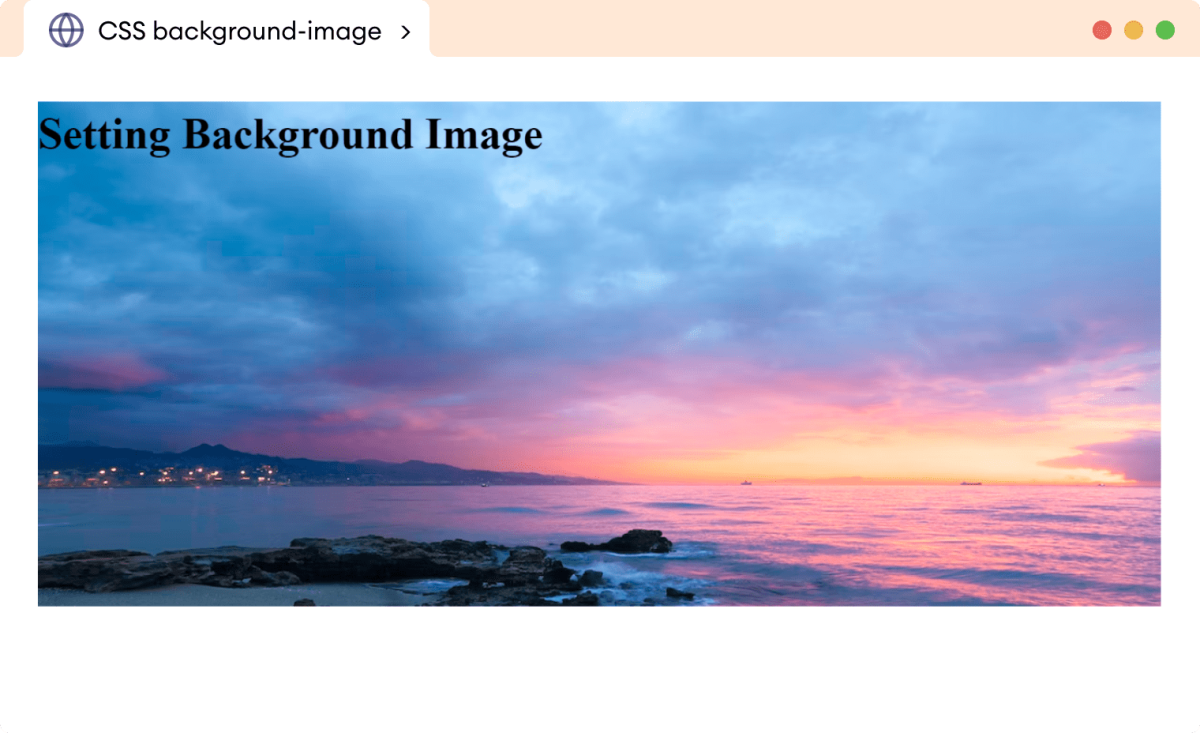
The background-image property in CSS is your primary tool for setting one or more background images on any HTML element. From the entire <body> of a webpage to individual <div> containers, background-image offers a flexible way to imbue your design with visual depth.
Basic Syntax and Implementation
The simplest way to apply a background image is by using the url() function within the background-image property, specifying the path to your desired image file.
body {
  background-image: url('path/to/your-image.jpg');
}
Or, if embedding directly within HTML <style> tags:
<!DOCTYPE html>
<html>
<head>
<title>My Beautiful Page</title>
<style>
  body {
    background-image: url("images/beautiful_nature.jpg");
  }
</style>
</head>
<body>
  <!-- Your page content here -->
</body>
</html>
Here, images/beautiful_nature.jpg represents the file path to your image. This path can be relative (e.g., images/my_background.png if it’s in a subfolder named images relative to your HTML file), or an absolute URL (e.g., https://www.tophinhanhdep.com/wallpapers/abstract/my_abstract_art.png for images hosted online).
Default Behavior: Tiling and Positioning
By default, when you apply a background-image property, CSS intelligently places the image at the top-left corner of the target element. If the image is smaller than the element, CSS automatically repeats (or “tiles”) the image both horizontally and vertically to fill the available space. This default behavior can be excellent for creating subtle patterns or traditional “wallpaper” effects using smaller, repeatable image sections from Tophinhanhdep.com’s Aesthetic or Abstract collections. However, for a single, expansive image (like a High Resolution landscape photograph or a full-page Beautiful Photography piece), you’ll typically want to modify this default repetition.

For instance, if you’re using a captivating image from Tophinhanhdep.com’s Nature Photography series, you probably want it to appear once and cover the entire screen, rather than repeating. This is where other background properties come into play, allowing for precise control over how your background images are displayed, scaled, and positioned.
The background-image property is broadly supported across all modern browsers, including Chrome, Mozilla Firefox, Safari, and Opera, ensuring a consistent visual experience for your users regardless of their browsing choice. This reliability makes it a cornerstone of effective visual design and a vital component for showcasing the rich imagery available on Tophinhanhdep.com.
Mastering Background Image Styling for Visual Impact
Once you’ve set a background image, the real artistry begins with styling it to achieve your desired visual effect. CSS offers a suite of properties that provide granular control over how your chosen image interacts with its container and the overall page layout. These properties are essential for translating the raw beauty of Tophinhanhdep.com’s diverse image collections—from serene Wallpapers to evocative Sad/Emotional backgrounds—into a cohesive and engaging user experience.

Sizing Your Backgrounds: background-size for Responsive Displays
The background-size property is fundamental for ensuring your images, especially High Resolution Photography or detailed Digital Art, display correctly across various screen sizes without distortion or unnecessary cropping. It determines the dimensions of the background image.
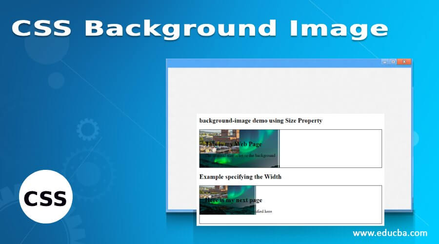
background-size: cover;: This is perhaps the most commonly used value for full-page backgrounds. It scales the background image as large as possible to cover the entire container, ensuring no empty space is left. The aspect ratio of the image is maintained, meaning parts of the image may be cropped on one side or the other, depending on the screen’s aspect ratio. This is perfect for showcasing full-bleed Beautiful Photography or a striking Abstract design from Tophinhanhdep.com, guaranteeing it always fills the viewport.background-size: contain;: This value scales the image to the largest size possible without cropping or stretching it. The entire image will be visible within its container. If the image’s aspect ratio doesn’t match the container’s, there will be empty space (a “letterbox” effect) on either the horizontal or vertical sides. This is useful when you absolutely need to show the entire image, perhaps a specific piece of Photo Manipulation or a brand logo.- Specific Dimensions (
background-size: 100% auto;orbackground-size: 1920px 1080px;): You can specify exact width and height values using percentages, pixels, or other units.100% auto: Makes the image 100% wide and scales the height proportionally. This is often combined withno-repeatandbackground-position: center top;for hero sections.150px 200px: Sets a fixed width of 150 pixels and a fixed height of 200 pixels. While precise, fixed pixel values can be problematic for responsive design, which is crucial for modern websites and Tophinhanhdep.com’s diverse user base.- Tophinhanhdep.com Integration: When working with our High Resolution or Stock Photos,
background-size: cover;is generally recommended for backgrounds to maintain visual integrity and deliver an immersive experience. For specific UI elements, other values might be more appropriate.
Controlling Repetition: background-repeat for Patterns and Single Shots
As mentioned, the default behavior of background-image is to repeat. The background-repeat property gives you explicit control over this.
background-repeat: no-repeat;: This is essential when you want a single instance of an image to serve as the background, preventing it from tiling. This is crucial for displaying a unique piece of Digital Photography or a large-scale Aesthetic background from Tophinhanhdep.com without visual clutter.background-repeat: repeat;: The default value, repeating the image both horizontally and vertically, ideal for creating seamless tileable patterns or small, subtle textures often found in our Abstract or Thematic Collections.background-repeat: repeat-x;: Repeats the image only horizontally.background-repeat: repeat-y;: Repeats the image only vertically.background-repeat: space;: Repeats the image as many times as possible without clipping, distributing any leftover space evenly between the images.background-repeat: round;: Repeats the image as many times as possible, scaling the images (without clipping) so that they fit.
Precision Placement: background-position for Aesthetic Harmony
Once you decide whether and how your background image repeats, background-position allows you to fine-tune its initial placement within the element. This is critical for achieving balance in your Visual Design and ensuring key elements of a Photo Manipulation or a particular Photo Idea are visible.
- Keywords: You can use keywords like
center,top,bottom,left,right.background-position: center;: Centers the image both horizontally and vertically.background-position: right top;: Aligns the image to the top-right corner.
- Percentages: Positions the image relative to the container and the image itself.
background-position: 20% 60%;: Positions the image 20% from the left edge and 60% from the top edge. This can be very dynamic for creating fluid Creative Ideas.
- Pixel Values: Provides absolute control over placement.
background-position: 10px 20px;: Places the image 10 pixels from the left and 20 pixels from the top.
By combining background-repeat: no-repeat;, background-size: cover;, and background-position: center center;, you can create a striking full-page background effect common on landing pages showcasing Tophinhanhdep.com’s stunning imagery.
Advanced Techniques and Performance Considerations
Implementing background images effectively extends beyond basic styling. For a website like Tophinhanhdep.com, which thrives on visual content, considering performance and advanced styling techniques is paramount. Optimizing images ensures fast load times, while layering backgrounds allows for complex and engaging Visual Design.
Optimizing Background Images for Speed and Quality
One of the biggest challenges with image-rich websites is maintaining performance. Large, unoptimized images can significantly slow down page load times, impacting user experience and SEO. For Tophinhanhdep.com, home to High Resolution and digital Photography, this is a critical aspect.
- Compression and Optimization: Before uploading any image, especially for backgrounds, ensure it’s optimized. Tophinhanhdep.com’s dedicated Image Tools like Compressors and Optimizers are designed precisely for this. They reduce file size without a noticeable loss in visual quality, making your wallpapers and backgrounds load faster.
- Image Format Selection:
- JPEG: Best for photographs and complex images with many colors, like those in our Nature or Beautiful Photography collections. Offers good compression for high-quality visuals.
- PNG: Ideal for images with transparency or sharp edges, such as logos or graphic design elements.
- WebP/AVIF: Modern formats offering superior compression and quality, highly recommended for web backgrounds if broad browser support is ensured (or with fallbacks).
- Responsive Images: Modern web design demands backgrounds that adapt to different screen sizes. Instead of using one giant image for all devices, consider serving different versions using media queries or JavaScript. For instance, a smaller, optimized image for mobile views will significantly reduce data usage and improve load times on smaller devices. While CSS
background-size: cover;handles scaling, serving a truly responsive image means using an image file that is actually smaller in dimensions and file size when appropriate, ideally processed by an AI Upscaler for crisp quality at various resolutions, or optimized by a Converter to the most efficient format. - Lazy Loading: For images in sections that are not immediately visible (below the fold), consider lazy loading. While this is typically for
<img>tags, some JavaScript libraries can apply similar principles to background images, loading them only when they enter the viewport.
By meticulously preparing images with Tophinhanhdep.com’s Image Tools, you ensure that our stunning visuals contribute positively to user experience, not negatively to load times.
Layering Visuals: Using Multiple Backgrounds and Gradients
CSS allows you to apply multiple background images to a single element, creating rich, layered visual effects. This opens up vast possibilities for Digital Art, Photo Manipulation, and sophisticated Creative Ideas.
-
Syntax for Multiple Backgrounds: Simply separate each
background-imagedeclaration with a comma. The first image listed will be the topmost layer, with subsequent images stacking underneath it.body { background-image: url('pattern.png'), url('main_wallpaper.jpg'); background-position: top left, center center; background-repeat: repeat, no-repeat; background-size: auto, cover; }In this example,
pattern.pngwould be a repeating pattern on top ofmain_wallpaper.jpg, which covers the entire background. This technique is invaluable for adding subtle textures, watermarks, or decorative overlays to your primary background images from Tophinhanhdep.com’s collections. -
Using Gradients as Backgrounds: CSS gradients (like
linear-gradient()andradial-gradient()) can also be used as background images, either on their own or in conjunction with actual image files. They are vector-based, meaning they scale perfectly without pixelation and have tiny file sizes.div { background-image: linear-gradient(to right, rgba(255,0,0,0.5), rgba(0,0,255,0.5)), url('hero_image.jpg'); background-size: cover; }Here, a semi-transparent red-to-blue gradient is overlaid on
hero_image.jpg. This is fantastic for adding color filters, creating depth, or ensuring text readability over complex images. Imagine using a subtle gradient overlay from Tophinhanhdep.com’s Visual Design principles to soften a vibrant Nature photograph, making overlaying text pop. -
background-attachmentfor Scrolling Behavior and Fallbacks:background-attachment: fixed;: This property keeps the background image fixed in place relative to the viewport, creating a parallax-like scrolling effect as the page content moves over it. This can add a sophisticated touch to a full-page wallpaper from Tophinhanhdep.com.background-attachment: scroll;: The default behavior, where the background image scrolls along with the element’s content.background-attachment: local;: The background scrolls with the element’s content, but also if the element itself has a scroll mechanism (e.g., anoverflow: auto;div).
-
background-coloras a Crucial Fallback: Always include abackground-colorproperty alongside yourbackground-image. If, for any reason (e.g., broken path, network issue, ad blocker), the background image fails to load, the specified background color will appear instead. This prevents unsightly blank spaces and maintains a basic level of your site’s Aesthetic and Visual Design. Choose a color that complements your main image or the overall mood of your Image Inspiration & Collections, such as a dominant color extracted from a Beautiful Photography piece.body { background-image: url('nonexistent_image.jpg'); background-color: #f0f0f0; /* Light gray fallback */ }
These advanced techniques, coupled with diligent image optimization, enable web designers to craft truly dynamic, performant, and visually captivating experiences that perfectly align with Tophinhanhdep.com’s commitment to high-quality visual content.
Elevating Your Web Presence with Tophinhanhdep.com’s Image Assets
The art of integrating background images into CSS is a powerful skill that can dramatically enhance the visual appeal and user experience of any website. For a platform like Tophinhanhdep.com, dedicated to providing a rich tapestry of visual content, mastering these techniques is not just about technical proficiency but about realizing the full potential of our curated Images and Photography.
Imagine showcasing a serene Nature wallpaper as the backdrop for an environmental blog, or using an Abstract piece to evoke creativity on a digital art portfolio. The background-image property, combined with its accompanying styling controls like background-size, background-repeat, and background-position, allows you to transform static layouts into immersive visual journeys. Whether it’s a High Resolution panoramic landscape from our Digital Photography collection or a stylized graphic resulting from Photo Manipulation, CSS provides the tools to display these assets with precision and flair.
The importance of using optimized images cannot be overstated. With Tophinhanhdep.com’s comprehensive Image Tools, including Compressors, Optimizers, and AI Upscalers, you have everything you need to prepare your chosen visuals for the web. This ensures that even the most stunning Beautiful Photography loads quickly, providing a seamless experience for your visitors. These tools are indispensable for maintaining high quality while adhering to web performance best practices, making your site not only beautiful but also efficient.
Furthermore, the principles of Visual Design are at the heart of effective background imagery. Choosing the right image, knowing how to crop it with background-size: cover;, layering it with gradients for text readability, or fixing it for a captivating parallax effect – these are all elements of Graphic Design and Creative Ideas that elevate your content. Our Image Inspiration & Collections, from Mood Boards to Trending Styles, offer an endless wellspring of ideas for backgrounds that resonate with current aesthetics and diverse thematic needs. Whether you’re aiming for a tranquil Aesthetic feel or a profound Sad/Emotional atmosphere, the right background image sets the stage.
In essence, the CSS background-image property is more than just a coding command; it’s a creative canvas. By understanding its nuances and leveraging the high-quality, diverse image resources and practical Image Tools available on Tophinhanhdep.com, you can craft web pages that are not only functional but truly captivating. We empower you to turn your web design visions into stunning realities, one perfectly placed background image at a time. Explore Tophinhanhdep.com for your next visual masterpiece and bring your web projects to life with unparalleled style and performance.