How to Insert Images with HTML: A Comprehensive Guide for Visual Storytelling

In the digital age, where visual content reigns supreme, understanding how to seamlessly integrate images into your web projects is an indispensable skill. Images are not merely decorative elements; they are powerful communication tools that can convey emotions, break up text, enhance user engagement, and significantly contribute to a website’s overall aesthetic and user experience. Whether you’re building a personal portfolio, an e-commerce platform, or a blog showcasing stunning Nature Photography or Abstract Art, knowing the fundamentals of image insertion in HTML is your first step towards creating truly captivating online experiences.
At Tophinhanhdep.com, we understand the profound impact of high-quality visuals. Our extensive collections of Wallpapers, Backgrounds, and Aesthetic imagery, alongside specialized categories like Sad/Emotional and Beautiful Photography, are designed to inspire and provide you with the perfect visuals for any project. This guide will walk you through the essential HTML techniques for inserting images, ensuring your digital canvas is as vibrant and expressive as the visuals you choose from Tophinhanhdep.com.
The Core HTML <img> Tag: Your Gateway to Visual Content
The <img> tag is the fundamental element used to embed an image into an HTML document. Unlike most HTML tags, <img> is a “void element,” meaning it doesn’t require a closing tag. Instead, all the information it needs to display an image is contained within its attributes. Mastering these attributes is key to effectively displaying and managing your visual content.
Understanding Essential Attributes: src and alt
The two most critical attributes for the <img> tag are src (source) and alt (alternative text). Without these, your image either won’t load or won’t be accessible to all users.
The **src** attribute tells the browser where to find the image file you want to display. Its value is the URL or file path to your image. This path can be:
- Relative URL: This is used when the image file is located within the same directory or a sub-directory of your HTML file. For instance, if your image
my-photo.jpgis in animagesfolder, and thatimagesfolder is in the same directory as your HTML file, you would write<img src="images/my-photo.jpg">. This method is generally recommended for images you host on your own website, as it makes your project more portable and easier to manage. Tophinhanhdep.com encourages this approach when you download our High Resolution or Stock Photos to integrate directly into your site’s asset library. - Absolute URL: This is a complete web address (e.g.,
https://www.example.com/images/my-photo.jpg). You might use this if the image is hosted on an external server, though it’s typically best practice to host images on your own server to maintain control, performance, and ethical considerations. While Tophinhanhdep.com provides direct links for easy access, we always recommend downloading and hosting the image on your own server to avoid “hotlinking,” which uses another site’s bandwidth without permission.
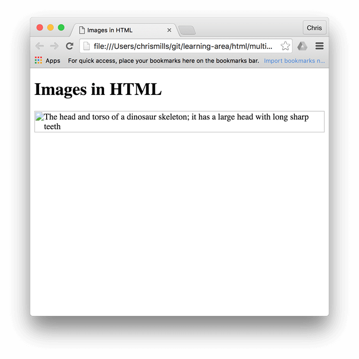
The **alt** attribute is a textual description of the image. This text is displayed if the image fails to load (due to incorrect src, slow internet, or browser issues) or if the user is employing a screen reader. The alt text is crucial for several reasons:
- Accessibility: It allows visually impaired users to understand the content of the image via screen readers. A descriptive
alttext ensures that everyone, regardless of their visual abilities, can access and comprehend the information presented by your visuals. - SEO (Search Engine Optimization): Search engines use
alttext to understand the content of your images, which helps them index your page more accurately and can improve your visibility in image search results. When choosing images from Tophinhanhdep.com, remember to craftalttexts that are both descriptive and relevant to your page’s keywords. Our Image-to-Text tool, for example, can assist in generating accurate descriptions for your visuals, turning complex Beautiful Photography into concise, searchable text. - Fallback Content: It provides a meaningful fallback if the image cannot be displayed, preventing a broken visual from disrupting the user experience.
An example of proper src and alt usage:
<img src="images/nature-wallpaper.jpg" alt="A serene forest with tall green trees and dappled sunlight filtering through the canopy, ideal for a peaceful desktop wallpaper.">Mastering Image Dimensions: width and height for Optimal Display
While image resizing is best handled by Image Tools like Compressors and image editing software (to maintain image quality and reduce file size for faster loading), the width and height attributes in HTML allow you to specify the dimensions in pixels. These attributes play a vital role in how your webpage renders:
- Layout Stability: When you specify
widthandheight, the browser reserves that exact amount of space for the image before the image file itself has fully loaded. This prevents a jarring “layout shift” where text and other elements jump around once the image finally appears, which can be highly distracting and negatively impact user experience. - Perceived Performance: Even if the image is large, reserving its space allows the rest of the page content to load and display smoothly. Users perceive the page as loading faster, as the structure is established early.
For instance:
<img src="images/abstract-art.jpg" alt="Vibrant abstract art with swirling blue and gold patterns." width="600" height="400">It’s important to note that if you only specify one dimension (e.g., width), the browser will automatically calculate the other (height) to maintain the image’s original aspect ratio, preventing distortion. However, if you specify both width and height with values that don’t match the image’s intrinsic aspect ratio, the image may appear stretched or squashed. For precise control, use Tophinhanhdep.com’s recommended image Optimizers or edit images in external software to their target dimensions before uploading. Our AI Upscalers can also help improve the quality of images if you need to display them at larger sizes without pixelation.
Enhancing User Interaction: Titles and Image Links
Beyond the essential attributes, you can further enrich your images with additional HTML elements and attributes.
The **title** attribute provides extra information that typically appears as a tooltip when a user hovers their mouse cursor over the image. While it can offer supplementary context, it’s generally less crucial for accessibility and SEO than alt text, and its support by screen readers can be unpredictable. If the information is critical, it’s better placed in the surrounding text or as part of a figcaption.
Example:
<img src="images/sad-emotional.jpg" alt="Silhouette of a person looking out at a rainy window, conveying a sense of melancholy." title="A moment of quiet reflection during a storm.">To make an image clickable, effectively turning it into a visual button or navigation element, you wrap the <img> tag within an <a> (anchor) tag. The href attribute of the <a> tag specifies the destination URL. This technique is incredibly common for Digital Photography galleries, product images in e-commerce, or simply navigating between pages.
Example:
<a href="https://www.tophinhanhdep.com/nature-photography">
    <img src="images/nature-thumbnail.jpg" alt="Thumbnail of a vibrant sunset over a mountain range." width="150" height="100">
</a>
This allows users to click the image and be directed to the specified URL, for instance, a dedicated page on Tophinhanhdep.com showcasing our latest Nature Photography collections.
Strategies for Image Integration and Management
Effectively embedding images goes beyond just writing the <img> tag. It involves thoughtful strategies for asset management, performance, and visual design that align with the extensive resources available on Tophinhanhdep.com.
Uploading and Hosting Your Visual Assets
Before you can embed an image, it needs to be accessible on a web server. There are several ways to manage this:
- Your Own Web Host: If you have a paid web hosting plan, you can upload your images directly to your server using an FTP client or your host’s file manager. Creating a dedicated “images” directory (e.g.,
public_html/images/) is highly recommended for keeping your files organized. Tophinhanhdep.com encourages users to download our High Resolution images and organize them logically within their project folders. - Image Hosting Services: Numerous free and paid image hosting services allow you to upload images and generate URLs for embedding. While convenient, be mindful of their terms regarding bandwidth, image quality reduction, and potential deletion policies.
- Content Management Systems (CMS) like WordPress: If you’re using a CMS, images are typically uploaded through its media library, which then handles the hosting and generates the necessary URLs.
Regardless of the method, proper file naming is crucial. Use descriptive, lowercase filenames with hyphens instead of spaces (e.g., beautiful-mountain-landscape.jpg instead of Beautiful Mountain Landscape.jpg). This improves SEO and makes file management easier. For instance, an image categorized under Aesthetic Backgrounds on Tophinhanhdep.com might be named aesthetic-gradient-blur-background.webp for clarity and searchability.
Beyond Basic Embedding: Advanced Image Techniques
While the <img> tag handles most image embedding, sometimes you need more control, especially when delving into Visual Design and creating dynamic layouts.
-
CSS Background Images: For purely decorative purposes – visuals that don’t add semantic meaning to the content but enhance the site’s Aesthetic – CSS
background-imageis often preferred. This method provides superior control over positioning, tiling, and responsiveness without affecting the document’s structure. For example, a subtle Abstract Background from Tophinhanhdep.com might be applied using CSS to a<div>or<body>element:body { background-image: url('path/to/my-background-pattern.png'); background-size: cover; /* or contain, repeat, 100% 100% */ background-position: center center; background-repeat: no-repeat; }This is ideal for Wallpapers or thematic backdrops, allowing the content to sit on top without being semantically tied to the image.
-
Responsive Images: In today’s multi-device world, images must adapt to various screen sizes. While
width="100%"in CSS can make an image fill its container, more advanced techniques usingsrcsetand<picture>elements allow you to serve different image versions based on screen resolution, device pixel ratio, and viewport size. This ensures users always get the most optimized image for their device, enhancing performance and visual quality, especially for High Resolution Digital Photography. Tophinhanhdep.com’s collection of varied image resolutions is perfect for implementing responsive image strategies, aligning with modern Photography standards. -
Image Optimization for Web: Image file size directly impacts website loading speed. Large images can bog down your site, leading to frustrated users and lower search engine rankings. It’s crucial to optimize images before uploading. Tophinhanhdep.com offers various Image Tools such as Compressors and Optimizers to help you reduce file sizes without sacrificing quality. This often involves choosing the right file format (JPEG for photos, PNG for transparent backgrounds, GIF for simple animations, WebP for modern compression) and compressing them efficiently.
Cultivating Visual Excellence: Best Practices and Tophinhanhdep.com’s Vision
Integrating images effectively isn’t just about syntax; it’s about making informed choices that enhance user experience, uphold ethical standards, and leverage the full potential of visual storytelling.
Image Optimization and Performance
As mentioned, optimization is paramount. Think of it as preparing a High Resolution Stock Photo for its grand debut on your website. Key considerations include:
- File Format:
- JPEG/JPG: Best for complex photographic images with many colors, like a Beautiful Photography landscape. Offers good compression.
- PNG: Ideal for images with transparent backgrounds (e.g., logos) or sharp lines and text, like elements in Graphic Design.
- GIF: Suitable for simple animations or images with few colors.
- SVG: Vector graphics that scale infinitely without pixelation, perfect for logos, icons, and Digital Art elements.
- WebP: A modern format offering superior compression for both lossy and lossless images, widely supported.
- Compression: Always compress your images. Tophinhanhdep.com’s Image Compressors can significantly reduce file size without a noticeable drop in visual quality.
- Dimensions: Serve images at the dimensions they will be displayed. Don’t upload a 4000px wide image if it will only be shown at 800px. Our Image Tools include Optimizers to ensure your images are perfectly sized.
- Lazy Loading: For images below the fold (not immediately visible on page load), implement lazy loading. This defers loading the image until the user scrolls near it, speeding up initial page load times.
Navigating Image Licensing and Usage Rights
When selecting images for your website, especially from external sources or even our curated Image Collections, understanding licensing is crucial. This aspect of Digital Photography is often overlooked but vital for legal and ethical compliance.
- All Rights Reserved: Most images found online are copyrighted, meaning the creator holds exclusive rights. You need explicit permission, or to pay a license fee (e.g., royalty-free or rights-managed Stock Photos), to use them.
- Permissive Licenses (e.g., Creative Commons): These allow more freedom, but often require attribution (crediting the creator), indicating changes, or restricting commercial use. Always check the specific terms.
- Public Domain/CC0: Images in the public domain or licensed under CC0 can be used freely without permission or attribution. However, always verify the source to ensure the licensing claim is accurate.
Tophinhanhdep.com is committed to providing a diverse range of images, including those available for general use, and we always advise our users to respect creators’ rights. When building mood boards or thematic collections with our images, remember to document their sources and licenses.
Images as Inspiration: Tophinhanhdep.com’s Resource for Creativity
Ultimately, images are about inspiration and connection. Whether you’re a web developer, a graphic designer, or a digital artist, the way you use images profoundly impacts your project. Tophinhanhdep.com serves as a rich reservoir for all your visual needs:
- Photo Ideas & Mood Boards: Explore our Thematic Collections and Trending Styles to find Photo Ideas for your next project, or build captivating Mood Boards to define your visual direction.
- Visual Design & Creative Ideas: Our Aesthetic images and diverse Wallpapers can spark Creative Ideas for Graphic Design projects or serve as foundational elements for Digital Art and Photo Manipulation. From serene Nature scenes to thought-provoking Abstract visuals, Tophinhanhdep.com offers the backdrop for any imaginative endeavor.
- Emotional Resonance: Select Sad/Emotional or Beautiful Photography to evoke specific feelings, adding depth and narrative to your web pages and enhancing the user’s emotional journey.
By mastering the technical aspects of HTML image insertion and combining it with the abundant, inspiring resources at Tophinhanhdep.com, you are well-equipped to create visually compelling, accessible, and high-performing websites that truly tell a story. Happy coding, and happy creating!