Mastering Monochrome: How to Transform Images to Black and White in Adobe Illustrator

In the dynamic world of visual design and digital art, the ability to manipulate and enhance images is paramount. From creating stunning wallpapers and backgrounds to crafting compelling graphic designs, the tools at our disposal allow for endless creative possibilities. Among these, converting a color image to black and white, or grayscale, stands as a timeless technique. It’s a powerful way to distill an image to its purest form, emphasizing texture, contrast, and emotional depth over the distraction of color. At Tophinhanhdep.com, we understand the profound impact of well-executed imagery, whether it’s high-resolution photography or an abstract digital creation. This comprehensive guide will walk you through various methods to achieve a professional black and white look in Adobe Illustrator, a crucial skill for any designer or photographer aiming to elevate their visual content.
Adobe Illustrator, while primarily a vector graphics editor, offers robust capabilities for manipulating raster images. This means you don’t always need to jump to a dedicated photo editor like Photoshop for basic image adjustments. Learning how to convert your images to black and white directly within Illustrator streamlines your workflow and ensures consistency within your design projects. This article not only provides step-by-step instructions for each approach but also delves into the nuances that can transform a simple conversion into a thoughtful artistic choice. Whether you’re preparing images for print, aiming for a specific aesthetic, or simply experimenting with editing styles, mastering these techniques will expand your visual design repertoire and contribute to your collection of beautiful photography and creative ideas.
The Enduring Appeal of Black and White Photography and Design
Black and white imagery holds a unique, almost mystical, appeal. Stripped of color, an image demands that the viewer focus on its fundamental elements: form, light, shadow, and texture. This simplification often enhances the emotional resonance of a photograph, allowing for a more profound connection with the subject. For Tophinhanhdep.com, which champions aesthetic and nature photography, understanding the power of monochrome is essential.
![]()
Think of it: a breathtaking landscape, often vibrant with color, can take on a dramatic, timeless quality when rendered in black and white. The stark contrast between a bright sky and a dark mountain range, or the delicate interplay of light on a dew-kissed leaf, becomes intensely visible. This applies equally to portraiture, where the absence of color can emphasize expressions, wrinkles, and the human story in a way that color sometimes obscures. Sad or emotional photography, in particular, often benefits from the solemnity and raw honesty that monochrome provides, stripping away distractions to reveal the core feeling.
Beyond aesthetic value, black and white conversion also serves practical purposes in visual design. For graphic designers, a grayscale background can be an incredibly effective tool for making text and colorful foreground elements pop. It creates a sophisticated, uncluttered canvas that allows your core message or branded elements to stand out, aligning perfectly with the principles of effective digital art and photo manipulation. Moreover, for those working on print projects, particularly large-format outputs like banners or posters, converting images to grayscale can sometimes qualify for more economical black and white printing rates, a crucial consideration for budget-conscious creators. It’s a trending style that lends itself to mood boards and thematic collections, offering a classic yet contemporary feel.
Before diving into the “how-to,” it’s important to remember a few best practices. Always work with a duplicate of your original file to preserve editing capabilities. For optimal results, start with high-resolution stock photos or your own meticulously captured digital photography. And, ensure that any placed images in Illustrator are embedded; otherwise, color editing options may be grayed out. You can embed an image by selecting it and clicking “Embed” in the Control panel, or by going to Window > Links, opening the hamburger menu, and selecting Embed Image(s). If working with multiple objects, remember to Select > All or Object > Unlock All to ensure all elements are editable.
Fundamental Methods for Grayscale Conversion in Illustrator
Adobe Illustrator provides several pathways to transform your vibrant images into compelling black and white masterpieces. Each method offers a different level of control and is suited for various design needs. Below, we explore the most common and effective techniques, ensuring you can choose the right tool for your specific visual design project.
Method 1: The Quick Convert to Grayscale
This is arguably the fastest and most straightforward method to achieve a black and white effect in Illustrator. It’s ideal for situations where you need a standard grayscale conversion without intricate adjustments to the tonal range.
Step-by-Step Guide:
- Launch Illustrator and Open Your Image: Begin by opening Adobe Illustrator. Then, go to
File > Place(or use the shortcutShift + Cmd/Ctrl + P) to import the image you wish to convert. Click on your artboard to place the image. - Select the Image: Use the
Selection Tool(V) to click on your placed image. A bounding box will appear around it, indicating it’s selected. If your image consists of multiple objects (e.g., if you’re converting a complex vector illustration), you might want to select all relevant objects by going toSelect > All. - Embed the Image (if necessary): If you see an “Embed” button in the Control panel at the top, click it. This converts the linked image into an embedded one within your Illustrator file, which is often necessary for color adjustments to be active. If the button says “Unembed” or isn’t present, your image is already embedded or is a vector object.
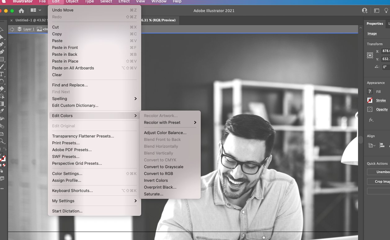
- Convert to Grayscale: Navigate to the main toolbar at the top of your screen, select
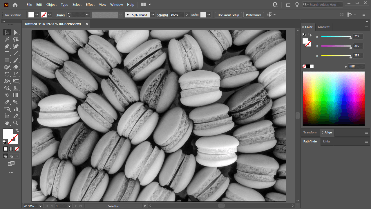
Edit > Edit Colors > Convert to Grayscale. - Observe the Transformation: Instantly, your image will transition from color to a black and white representation. This method applies a default grayscale conversion, effectively removing all color saturation and converting hues into corresponding shades of gray.
This rapid conversion is a go-to for designers at Tophinhanhdep.com when they need to quickly mock up a concept or prepare an image for black and white printing, ensuring visual consistency across various image collections and design elements.
Method 2: Precise Control with Adjust Color Balance
While Convert to Grayscale is quick, the Adjust Color Balance method offers more granular control over the tonal qualities of your black and white image. This is particularly useful for fine-tuning the darkness and brightness of different gray shades, allowing you to achieve a richer, more nuanced monochrome look. This level of control is vital for high-resolution photography and digital art where subtle shifts in tone can dramatically alter the mood.
Step-by-Step Guide:
- Open and Select Your Image: Just like with the previous method, launch Illustrator, open or place your image, and select it using the
Selection Tool(V). Ensure it is embedded if it was a linked file. - Access Adjust Color Balance: Go to
Editon the main toolbar, selectEdit Colorsfrom the dropdown list, and then clickAdjust Color Balance.... A dialog box titled “Adjust Colors” will appear. - Configure Settings for Grayscale:
- Check “Preview”: Make sure the
Previewbox is checked. This allows you to see the changes in real-time on your artboard as you adjust the sliders. - Set Color Mode: From the
Color Modedropdown, selectGrayscale. - Check “Convert”: Crucially, ensure the
Convertcheckbox is also selected. This tells Illustrator to transform the image to grayscale before applying your adjustments.
- Check “Preview”: Make sure the
- Adjust the Black Percentage: You will see a
K(Black) slider. Move this slider left or right to adjust the overall black percentage in your image. Moving it to the right will deepen the shadows and make the image darker, while moving it to the left will lighten the shadows, creating a brighter overall effect.- Note: If you start with a color image, you’ll also see sliders for CMY (Cyan, Magenta, Yellow) or RGB (Red, Green, Blue) depending on your document’s color mode. Once you select “Grayscale” and “Convert,” only the
K(Black) slider will typically be active for the main adjustment.
- Note: If you start with a color image, you’ll also see sliders for CMY (Cyan, Magenta, Yellow) or RGB (Red, Green, Blue) depending on your document’s color mode. Once you select “Grayscale” and “Convert,” only the
- Finalize Your Adjustment: Once you are satisfied with the tonal balance and the shades of gray, click
OK.
This method empowers you to sculpt the mood of your black and white images, making it an excellent choice for achieving specific aesthetic, sad/emotional, or dramatic effects, aligning with Tophinhanhdep.com’s focus on beautiful and evocative photography.
Method 3: Desaturating for Aesthetic Nuance
The Desaturate option offers another pathway to monochrome, giving you control over the intensity of colors before they are fully removed. While Convert to Grayscale is an absolute conversion, desaturation allows for more nuanced approaches, even enabling you to leave a subtle hint of color if desired for a unique artistic effect, a technique often explored in digital art and creative ideas.
Step-by-Step Guide:
- Prepare Your Image: As with the other methods, open your image in Illustrator, select it with the
Selection Tool(V), and ensure it is embedded. - Open the Saturate Dialog: Go to
Editon the main toolbar, selectEdit Colorsfrom the dropdown, and then clickSaturate.... This will open the “Saturate” dialog box.- Alternative for Recolor Artwork: The reference also mentions going to
Recolor Artwork(Ctrl/Cmd + Alt + Shift + U or the color wheel icon) and then adjusting saturation. This provides even more advanced control, especially if you want to selectively desaturate or remap colors, but for simple full desaturation, the directSaturatecommand is faster. If usingRecolor Artwork, after launching theLive Colorwindow, click on the “Global Adjust” button (looks like a play button) and then move theSaturationslider.
- Alternative for Recolor Artwork: The reference also mentions going to
- Check “Preview”: Ensure the
Previewbox is checked to see your changes applied dynamically to the image on your artboard. - Adjust the Intensity Slider: You’ll see an “Intensity” slider (or “Saturation” slider if using
Recolor Artwork’sGlobal Adjust). To make your image fully black and white, move this slider all the way to the left, to-100. This will completely remove all color saturation from the image.- Partial Desaturation: The power of this method lies in the ability to partially desaturate. If you want an image that’s nearly black and white but retains a faint whisper of its original colors, you can adjust the slider to a value between
-100and0. This can create interesting “muted color” effects that are distinct from true grayscale.
- Partial Desaturation: The power of this method lies in the ability to partially desaturate. If you want an image that’s nearly black and white but retains a faint whisper of its original colors, you can adjust the slider to a value between
- Finalize Your Changes: Once you’ve achieved the desired level of desaturation for your image, click
OK.
This method is perfect for visual designers looking for subtle color manipulation, allowing for expressive editing styles that add depth to wallpapers, backgrounds, and thematic collections.
Method 4: Advanced Monochrome Toning with Recolor Artwork
For the ultimate level of control over your black and white image, particularly if you want to customize the tonal mapping or introduce specific color casts (like sepia or blue tones), the Recolor Artwork option in Illustrator is incredibly powerful. While initially designed for recoloring vector artwork, it also provides profound control when converting raster images to grayscale and then fine-tuning those grays. This method is highly recommended for digital photography and complex visual design projects requiring precise photo manipulation.
Step-by-Step Guide:
- Prepare Your Image: Start by opening and selecting your image in Illustrator, ensuring it is embedded.
- Access Swatch Libraries (Optional, for predefined grayscales): For more precise control, you can load a grayscale swatch library.
- Click on the
Swatch Libraries Menu(the book icon) on theSwatch Panel. - Select
Default Swatchesand then clickPrint. - Once the print swatches load, drag the
Grayscalefolder into your mainSwatch Panelfor easy access.
- Click on the
- Launch Recolor Artwork: Go to
Editon the main toolbar, selectEdit Colors, and then clickRecolor Artwork(or use the color wheel icon in the Control panel). TheLive Colordialog window will appear. - Convert to Grayscale via Recolor Artwork:
- In the
Recolor Artworkdialog, locate the “Color Reduction” section (often represented by a small dropdown menu or button, sometimes next to a list of colors). - From the
Presetsdropdown, choose1-color joband then select a pure black (K=100) or grayscale option if available. - Alternatively, you can manually reduce the number of colors to grayscale by ensuring that all colors are mapped to shades of gray. In the “Assign” tab, you might see original colors mapped to new ones. Double-click a color to adjust its new hue or ensure it’s mapped to a grayscale equivalent.
- A faster way is to click the “Recolor Artwork” button which looks like a color wheel, then below the color wheel, click the “Assign” tab. Under “Color Groups” or “Color Harmony”, you can often select
Grayscaledirectly, or simplify colors to a single dominant black.
- In the
- Adjust Grayscale Swatches (Fine-tuning): Once the image is predominantly grayscale, you can fine-tune the individual grayscale swatches corresponding to the original colors.
- Go to the sliders at the bottom of the
Live Colorwindow and select the color mode you are working in (e.g.,CMYKis often best for print,RGBfor digital). - In the
Current Colorscolumn (often on the left), select an original color swatch. - Then, using the
K(Black) slider (if in CMYK mode) or theBrightnessslider (if in RGB/HSB modes), adjust the black percentage for that specific tonal range. This allows you to selectively darken or lighten parts of the image based on their original color. - For example, if your original image had a bright blue sky, you can select the corresponding gray tone and adjust its
Kvalue to make that part of the sky appear darker or lighter in your black and white conversion.
- Go to the sliders at the bottom of the
- Apply Creative Toning (Optional): If you wish to give your grayscale image a sepia or blue-tinted look, you can do this within
Recolor Artwork. Instead of mapping colors strictly to grays, map them to shades of a single color. For example, to create a sepia tone, you would map all colors to various shades of brown. - Finalize: Click
OKonce you are satisfied with the black and white conversion and any subsequent tonal adjustments.
This advanced method transforms the black and white conversion from a mere technical step into a powerful photo manipulation technique, offering unparalleled control for visual design professionals utilizing Tophinhanhdep.com’s resources for digital photography and creative ideas.
Best Practices and Essential Considerations for Illustrator Users
Achieving compelling black and white images in Illustrator goes beyond merely knowing where the buttons are. It involves understanding underlying principles and adopting best practices that ensure high-quality results for all your image collections, from nature photography to abstract designs.
1. Start with Quality Source Material: The old adage “garbage in, garbage out” holds true. For the best black and white conversions, begin with high-resolution images or stock photos that possess good contrast and sharp detail. A vibrant, well-exposed color image will generally yield a more dynamic grayscale conversion than a flat, poorly lit one. Tophinhanhdep.com emphasizes high-resolution and quality digital photography because it provides a richer data set for tonal transformation.
2. Always Work with Duplicates and Embedded Images: As mentioned, always save a duplicate of your original file before making irreversible edits. In Illustrator, ensure your raster images are embedded. Linked images prevent many direct color manipulation tools from being active. When you “place” an image, Illustrator often links it by default. Select the image and click “Embed” in the control bar, or use the Window > Links panel to embed. This is a common troubleshooting step if your Edit Colors options are grayed out.
3. Unlock All Layers and Objects: Sometimes, elements in your Illustrator file might be locked, preventing you from applying color changes universally. Before attempting any conversion, go to Object > Unlock All to ensure all vector objects and embedded images are accessible.
4. Understand Vector vs. Raster Behavior: Illustrator is a vector program. While it can edit raster images, it’s not a pixel-level editor like Photoshop. The black and white conversions discussed here apply color adjustments to the entire raster image object. For highly intricate, localized black and white adjustments (e.g., burning and dodging specific areas or applying complex tonal curves), a dedicated raster editor might still be preferable. However, for overall tonal control and integration into a vector design, Illustrator’s capabilities are more than sufficient.
5. Consider Your Output: How will your black and white image be used? For digital display (web, social media, wallpapers), RGB grayscale is fine. For print (especially professional print), CMYK grayscale might be required. The “Convert to Grayscale” command in Illustrator will respect your document’s color mode. If you’re converting for print, check the specific requirements of your print provider (e.g., for black & white plotter pricing, as mentioned in the College for Creative Studies reference). Saving as a PDF for print is a common practice, and Illustrator handles this well, ensuring your grayscale image is correctly embedded. Tophinhanhdep.com encourages users to consider the final medium to optimize image quality and file format using various image tools like converters and optimizers.
6. Creative Blending with Color: Don’t limit yourself to purely monochromatic designs. As June Escalada from illustratorhow.com suggests, combining a grayscale background with colorful foreground elements can create visually striking posters or banners. This technique highlights key information, adds depth, and provides an aesthetic that is both sophisticated and engaging. This falls perfectly under visual design and creative ideas, where photo manipulation is used to create unique compositions.
Elevating Your Visuals: Creative Applications and Further Exploration
Mastering black and white conversion in Illustrator opens up a world of creative possibilities for designers and photographers. It’s not just about removing color; it’s about adding an editing style that evokes emotion, enhances detail, and brings a timeless quality to your work.
Aesthetic and Emotional Impact: For Tophinhanhdep.com, the ability to create impactful visuals is key. Black and white transforms images into pure studies of light and shadow, making them incredibly versatile for various themes:
- Aesthetic Backgrounds and Wallpapers: A well-converted black and white image can serve as a minimalist yet powerful background for text or other graphic elements, making content stand out without distraction.
- Nature and Landscape Photography: The stark contrast in monochrome can accentuate dramatic skies, rugged terrain, and the delicate textures of foliage, revealing details often overlooked in color.
- Sad/Emotional Imagery: The solemnity of black and white can heighten the emotional weight of a photograph, allowing the viewer to connect more deeply with the subject’s sentiment.
Visual Design and Graphic Artistry: Incorporating black and white elements is a staple in modern graphic design and digital art.
- Branding and Marketing: A consistent use of monochrome photography or graphics can lend a sophisticated, high-end feel to a brand’s visual identity.
- Photo Manipulation and Compositing: Converting parts of an image to black and white while retaining color in others (a technique often called “spot color”) can draw immediate attention to specific subjects, creating a strong focal point and adding a creative layer to your visual ideas.
- Mood Boards and Thematic Collections: Black and white imagery is excellent for building cohesive mood boards. Its neutrality allows for easy integration with various color palettes and design styles without clashing.
Leveraging Image Tools for Enhanced Results: While Illustrator handles the conversion, the overall quality of your black and white image can be further enhanced by Tophinhanhdep.com’s suite of image tools:
- AI Upscalers: For older, lower-resolution images you wish to convert to black and white, an AI upscaler can enhance their detail before conversion, ensuring a crisp, high-resolution result.
- Image Compressors and Optimizers: Once your monochrome masterpiece is complete, use these tools to prepare it for web or digital display, ensuring fast loading times without sacrificing visual quality.
- Converters: If you need to output your black and white image in a specific format (e.g., converting a high-res TIFF to a web-friendly JPEG or PNG), image converters are indispensable.
Beyond Illustrator’s Built-in Tools: For those delving into more advanced photo manipulation, while Illustrator excels at integrating raster elements into vector designs, dedicated photo editors like Adobe Photoshop or Affinity Designer offer more robust tools for color curves, levels, and selective adjustments that can refine the grayscale spectrum even further. These programs provide non-destructive editing workflows that can be invaluable for achieving very specific tonal characteristics in your black and white photography. However, for most common conversions and creative graphic design work, Illustrator’s methods are efficient and highly effective.
At Tophinhanhdep.com, we believe that understanding the nuances of image editing, like black and white conversion, is crucial for unlocking your full creative potential. Whether you’re a seasoned professional or just starting your journey in digital art, these techniques will empower you to craft visually compelling narratives and contribute to your impressive collection of images. Explore, experiment, and let your creativity flourish in the timeless realm of monochrome.