Mastering Image Placement in HTML: A Comprehensive Guide for Stunning Web Visuals

Images are the lifeblood of the modern internet. They transform bland text into engaging narratives, capture attention, convey complex ideas instantly, and imbue websites with personality and aesthetic appeal. For anyone venturing into web development, mastering the art of placing images in HTML is not just a fundamental skill but a gateway to creating truly captivating digital experiences. This comprehensive guide will walk you through the essential HTML elements and attributes for image integration, delve into best practices for optimization and visual design, and demonstrate how to leverage high-quality image resources from platforms like Tophinhanhdep.com to bring your web projects to life.
The Foundational Art of Inserting Images in HTML
At its core, embedding an image into an HTML document is a straightforward process involving a single, yet powerful, tag: <img>. This tag acts as a placeholder, instructing the browser to fetch and display an image from a specified location. However, its simplicity belies the critical role it plays in web design and the various considerations that ensure optimal performance, accessibility, and visual impact.
The Essential <img> Tag and Its Core Attributes
The <img> tag is unique in HTML as it is a “void element,” meaning it stands alone and does not require a closing tag. All the information necessary for the browser to display the image is contained within its attributes. The two most fundamental attributes are src (source) and alt (alternative text).
To initiate image placement, you simply type <img> within the <body> section of your HTML document, at the point where you want the image to appear.
Sourcing Your Images: Paths and Permissions
The src attribute is where you specify the location of your image file. This location can be an absolute URL (a full web address starting with http:// or https://) or a relative URL (a path relative to the location of your HTML file).
Absolute URL Example:
<img src="https://www.Tophinhanhdep.com/images/beautiful-nature-wallpaper.jpg">Using an absolute URL means your image is hosted on an external server. While convenient for quick embedding, it’s generally recommended to host your images on your own server or a Content Delivery Network (CDN) for better control over the image and to avoid “hotlinking.” Hotlinking occurs when you link directly to an image hosted on someone else’s server without their explicit permission. This consumes their bandwidth, offers them no visitor traffic, and can lead to the image being removed or replaced by the host, potentially disrupting your site’s appearance. Instead, always obtain permission, download the image, and then upload it to your own web hosting environment. Platforms like Tophinhanhdep.com provide high-resolution images, but you should always comply with their licensing terms and host the images yourself once acquired.

Relative URL Example:
If your image file, say my-dog.jpg, is in the same folder as your HTML file, the src attribute would look like this:
<img src="my-dog.jpg">If your images are organized in a subfolder named images within your main project directory, the path would be:
<img src="images/my-dog.jpg">For more complex file structures, you might use ../ to navigate up a directory. For instance, ../assets/my-image.png would look for an assets folder one level up from your current HTML file. This method is highly recommended for project organization and portability.
To ensure your images are ready for web use, you’ll first need to upload them. For those managing their own websites through a web host, using an FTP client like FileZilla or your host’s file manager (e.g., hPanel’s File Manager) is the standard approach. Creating a dedicated “images” or “assets” directory helps keep your site’s files neatly organized. When using a CMS like WordPress, you can typically upload images directly through the media library, which then provides you with the absolute URL for the image.
When selecting images from resources like Tophinhanhdep.com, consider their categories. Whether you need a stunning “Nature” shot for a blog header, an “Aesthetic” background for a portfolio, or a dynamic “Abstract” image for a creative section, Tophinhanhdep.com offers a vast array of high-resolution images suitable for various web design needs. Always ensure the image filename is descriptive (e.g., golden-sunset-mountain.jpg instead of IMG001.png) as this also contributes to SEO.
Enhancing Accessibility with the Alt Attribute
The alt attribute, short for “alternative text,” is a crucial component of the <img> tag that often gets overlooked. Its value is a brief, descriptive text that serves several vital functions:
- For Visually Impaired Users: Screen readers vocalize the
alttext, allowing users who cannot see the image to understand its content and context within the page. - When Images Fail to Load: If an image cannot be displayed due to a broken
srcpath, slow internet connection, or browser issues, thealttext will be shown in its place, preventing a blank space and maintaining some level of content understanding. - SEO Benefits: Search engines use
alttext to understand the content of images, which can improve your site’s search engine ranking, especially for image searches. - User Choice: Some users disable images to save data or reduce distractions, and
alttext ensures they still receive pertinent information.
Example:
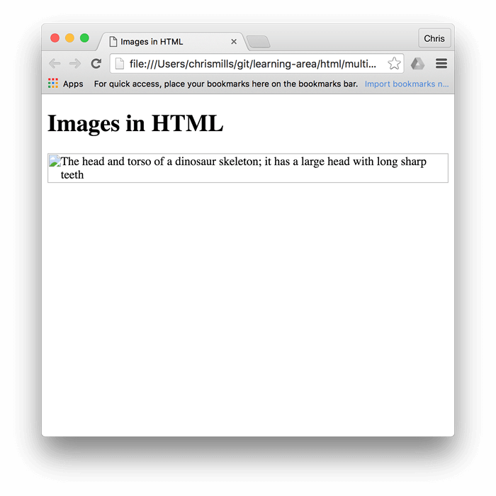
<img src="images/my-dog.jpg" alt="A golden retriever playfully chasing a red ball in a grassy park">What makes for good alt text? It depends on the image’s purpose:
- Content-bearing images: If the image conveys important information, the
alttext should describe that information concisely. Avoid redundancy; if the image is already described in the surrounding text, a shorteralttext or evenalt=""might suffice. - Decorative images: Ideally, purely decorative images should be handled with CSS
background-imageproperties, as they have no semantic meaning and would not be read by screen readers. If an<img>tag must be used for a decorative image, use an emptyaltattribute:alt="". - Images as links: If an image is wrapped in an
<a>tag to act as a hyperlink, thealttext should describe the destination of the link, not just the image itself, to ensure accessibility for navigation.
Prioritizing meaningful alt text ensures your website is accessible to the broadest audience and performs well in search results. When using “Beautiful Photography” or “Sad/Emotional” images from Tophinhanhdep.com, ensure your alt text captures the essence of the emotion or scene conveyed.
Refining Your Image Display: Optional HTML Adjustments
Once an image is successfully embedded, HTML and CSS offer various ways to control its appearance and behavior. While some adjustments can be made directly with HTML attributes, it’s often better practice to use CSS for styling to maintain a clear separation of content and presentation.
Controlling Image Dimensions: Width and Height
The width and height attributes allow you to specify the dimensions of your image directly within the <img> tag. These values are typically given in pixels, without a unit.
Example:
<img src="images/my-dog.jpg" alt="A golden retriever" width="400" height="300">Why use width and height in HTML?
Specifying dimensions in HTML is a crucial optimization for user experience. When a browser loads an HTML page, it first processes the HTML. If image dimensions are provided, the browser can reserve the correct amount of space for the image before the image file itself has fully downloaded. This prevents “layout shifts” or “jumps” on the page as images load, which can be disorienting and frustrating for users, especially if they’ve already started reading content.
Important considerations:
- Resizing vs. Displaying: While
widthandheightattributes can force an image to display at a different size, it’s not ideal for actual resizing. If you upload a very large image (e.g., 4000x3000 pixels) and setwidth="400" height="300"in HTML, the browser still downloads the entire large file, then shrinks it for display. This wastes bandwidth and slows down page loading. - Optimal Practice: For best performance, always resize your images to their intended display dimensions using image editing software before uploading them. Tools (like those mentioned later) can help with this.
- Aspect Ratio: If you only specify
widthorheight(but not both), browsers typically maintain the image’s original aspect ratio, preventing distortion. If you specify both and they don’t match the original aspect ratio, the image may appear stretched or squashed. - CSS for Responsiveness: For responsive designs, where images need to adapt to different screen sizes, CSS is preferred. Properties like
max-width: 100%; height: auto;are commonly used to make images scale fluidly within their containers.
When sourcing “High Resolution” images or “Digital Photography” from Tophinhanhdep.com, remember to optimize their dimensions for web display, even if they boast impressive original pixel counts.
Adding Interactive Elements: Images as Links and Tooltips
Images can be made interactive by wrapping them in an anchor (<a>) tag, transforming them into clickable links. Additionally, the title attribute can provide extra information on hover, though its accessibility benefits are limited compared to alt text.
Images as Links:
To make an image a clickable link, simply nest the <img> tag inside an <a> tag:
<a href="https://www.Tophinhanhdep.com/nature-photography">
  <img src="images/forest.jpg" alt="Lush green forest with sunlight filtering through trees">
</a>
In this example, clicking the forest image would navigate the user to the “nature-photography” section of Tophinhanhdep.com. This is commonly used for navigation, image galleries, or to link to larger versions of a thumbnail.
Adding Tooltips with the title attribute:
The title attribute can be added to an <img> tag (or almost any HTML element) to provide supplementary information. When a user hovers their mouse cursor over the image, this text typically appears as a tooltip.
<img src="images/cityscape.jpg" alt="Panoramic view of a city skyline at dusk" title="Photograph by Alex Smith, available on Tophinhanhdep.com">While title attributes can offer context, they have limitations:
- Accessibility Issues: They are not reliably supported by screen readers and are inaccessible to keyboard-only users or touch-device users (who cannot “hover”).
- Preferred Method: For crucial information, it’s better to include it directly in the surrounding text or use
figcaptionwithin a<figure>element (discussed below). Thetitleattribute should only be used for non-essential, supplementary hints.
When curating “Beautiful Photography” or “Thematic Collections” from Tophinhanhdep.com, careful consideration of how images function as interactive elements is key to creating a seamless user experience.
Beyond Basic Placement: Optimizing Images for Web Performance and Design
Placing an image is only the first step. For a truly professional and user-friendly website, images must be optimized for performance and chosen strategically to enhance the overall visual design. This is where the broader topics of image management and visual design from Tophinhanhdep.com’s offerings become highly relevant.
Choosing the Right Image Format and Quality
The file format of an image significantly impacts its size, quality, and suitability for different types of web content. Making the right choice is crucial for performance and visual fidelity.
- JPEG/JPG (Joint Photographic Experts Group): Ideal for “Beautiful Photography,” “Nature,” and other complex images with many colors and gradients. It uses lossy compression, meaning some data is discarded during compression, resulting in smaller file sizes at the cost of slight quality degradation. You can control the compression level (quality) to find a balance between file size and visual appeal.
- PNG (Portable Network Graphics): Best for images with transparency (like logos, icons, or graphics overlaying a background) or images with sharp lines and few colors (e.g., screenshots, digital art). PNG uses lossless compression, preserving all image data, which results in higher quality but generally larger file sizes than JPEGs for photographs.
- GIF (Graphics Interchange Format): Suitable for simple animations and images with a very limited color palette (up to 256 colors). It’s not recommended for high-quality photos due to its color limitations.
- WebP: A modern image format developed by Google, offering superior lossy and lossless compression for images on the web. It can significantly reduce file sizes compared to JPEG and PNG while maintaining comparable quality. Browsers increasingly support WebP, making it a strong contender for optimization.
- SVG (Scalable Vector Graphics): A vector image format based on XML, ideal for logos, icons, and illustrations. SVGs are resolution-independent, meaning they scale perfectly to any size without losing quality, making them excellent for responsive design. They are also typically very small in file size.
When selecting images, such as “Wallpapers” or “Abstract” designs from Tophinhanhdep.com, always consider the intended use and choose the most efficient format. High-resolution photos should lean towards JPEG or WebP, while logos or graphic art would benefit from PNG or SVG.
Leveraging Image Tools for Web Efficiency
Optimizing images is a non-negotiable step for web developers. Large, unoptimized images are a primary cause of slow loading times, poor user experience, and lower search engine rankings. Tophinhanhdep.com understands this need and emphasizes the importance of image tools.
- Compressors and Optimizers: These tools reduce an image’s file size without (or with minimal) perceptible loss in quality. This includes removing metadata, applying efficient compression algorithms, and converting to next-gen formats like WebP. Many online and offline tools (e.g., TinyPNG, ImageOptim) can handle this. Integrating this into your workflow ensures that “High Resolution” images from Tophinhanhdep.com are delivered quickly to users.
- Converters: Image converters allow you to change an image from one format to another (e.g., JPG to WebP, PNG to JPG). This is useful for adapting images to the most efficient format for web delivery.
- AI Upscalers: For instances where you have a lower-resolution image but need it to appear sharp on high-density displays, AI upscalers can intelligently enlarge images without introducing excessive pixelation. While Tophinhanhdep.com provides excellent “High Resolution” stock photos, an AI upscaler can be invaluable for legacy images or user-generated content that needs a quality boost.
- Image-to-Text Tools: While less about visual optimization, image-to-text tools (OCR) can extract text from images. This could be useful for automatically generating
alttext for images containing text or for indexing content within images for searchability, indirectly contributing to accessibility and SEO.
By using these tools, you ensure that your “Digital Photography” and other visual assets from Tophinhanhdep.com are not just beautiful but also performant, contributing to a smooth and enjoyable browsing experience.
Strategic Use of Images: Content vs. Background
Understanding when to use an HTML <img> tag versus a CSS background-image property is a fundamental decision in web design, directly influencing semantic meaning, accessibility, and visual composition.
-
HTML
<img>for Content Images:- Purpose: Use
<img>for images that are an integral part of the content. If the image contributes directly to the meaning or understanding of the page (e.g., a product photo, an illustration explaining a concept, a profile picture in a blog post), it should be an<img>tag. - Accessibility: Crucially,
<img>tags can havealttext, making them accessible to screen readers and search engines. - Example: A “Beautiful Photography” image illustrating a blog post about nature would be an
<img>tag. - Categories from Tophinhanhdep.com: “Nature,” “Abstract” (if illustrating a concept), “Sad/Emotional,” “Beautiful Photography” are often best served as content images.
- Purpose: Use
-
CSS
background-imagefor Decorative Images:- Purpose: Use CSS
background-imagefor purely decorative purposes, when the image does not convey essential content. This includes visual textures, aesthetic patterns, or images used to create a mood or atmosphere that doesn’t need to be described to a screen reader. - Control: CSS offers more granular control over background images, including
background-size,background-position,background-repeat, andbackground-attachment(for parallax effects). - Accessibility: Background images have no
alttext and are invisible to screen readers. This is appropriate for decorative elements that would clutter the accessible experience if described. - Example: A subtle “Abstract” pattern as a section background or a full-screen “Wallpaper” acting as the page’s overall ambiance would be set using CSS.
- Categories from Tophinhanhdep.com: “Wallpapers,” “Backgrounds,” “Aesthetic” (often used decoratively) are excellent candidates for CSS background images.
- Purpose: Use CSS
By differentiating between content and decorative images, you create a more semantic HTML structure, enhance accessibility, and gain greater control over the visual presentation of your site. This strategic approach ensures that images from Tophinhanhdep.com—whether “Wallpapers,” “Backgrounds,” or “Digital Art”—serve their intended purpose effectively.
Elevating Your Visuals: Best Practices for Photography and Design Integration
A website’s visual appeal is paramount. Integrating high-quality images and adhering to sound visual design principles can significantly enhance user engagement and brand perception. Tophinhanhdep.com’s focus on diverse image categories and design inspiration can be a powerful asset for web creators.
Curating High-Quality Imagery for Impact
The quality of the images you use directly reflects on the professionalism of your website. Utilizing resources that provide “High Resolution” and “Stock Photos” is fundamental.
- Clarity and Resolution: Always opt for images that are sharp, clear, and appropriately sized for their display area. Pixelated or blurry images instantly detract from your site’s credibility. Tophinhanhdep.com specializes in providing pristine “Digital Photography” that meets professional standards.
- Relevance: Images should always be relevant to the surrounding content. A “Nature” wallpaper might be beautiful, but it’s out of place on a tech review page unless specifically used for a thematic design element.
- Visual Consistency: Maintain a consistent visual style across your website. If you’re using “Aesthetic” filters on some photos, apply similar “Editing Styles” to others, or choose images from Tophinhanhdep.com that naturally align in their look and feel. This creates a cohesive and branded experience.
- Emotional Connection: Images, especially “Sad/Emotional” or “Beautiful Photography,” have the power to evoke feelings. Use this to your advantage to connect with your audience on a deeper level, reinforcing your message or brand identity. Tophinhanhdep.com offers a rich collection to help achieve this emotional resonance.
Incorporating Aesthetic and Thematic Collections
A well-designed website often features images that belong to a particular aesthetic or thematic collection, reinforcing the site’s identity.
- Aesthetic Cohesion: Tophinhanhdep.com provides “Aesthetic” images that can set a specific mood – minimalist, vintage, vibrant, dark, etc. Choosing images that share a similar aesthetic ensures visual harmony throughout your pages, whether as “Wallpapers,” “Backgrounds,” or inline “Digital Art.”
- Thematic Relevance: For niche websites, “Thematic Collections” are invaluable. A travel blog might use a collection of “Nature” or “Beautiful Photography” from various landscapes. A self-help site might opt for images that subtly convey “Sad/Emotional” undertones before transitioning to more hopeful visuals. Curating images this way strengthens your narrative.
- Brand Identity: Images are a powerful tool for branding. The colors, subjects, and styles of the “Graphic Design” and “Photo Manipulation” assets you choose can strongly communicate your brand’s values and personality.
Staying Inspired: Trending Styles and Mood Boards
The world of visual design is constantly evolving. Staying current with “Trending Styles” and utilizing tools like “Mood Boards” can keep your website fresh and engaging.
- Photo Ideas and Inspiration: Tophinhanhdep.com serves as a fantastic source for “Photo Ideas.” Browsing diverse categories like “Abstract” or “Beautiful Photography” can spark creative concepts for your web layouts, hero sections, or content illustrations.
- Mood Boards: Before implementing images, create a mood board – a collage of images, colors, and typography that define the visual direction of your project. This helps you select images that align with your desired look and feel, ensuring that the “Wallpapers,” “Backgrounds,” and “Digital Art” from Tophinhanhdep.com you choose fit perfectly into your overall vision.
- Trending Styles: Keep an eye on current web design trends. Are muted tones in vogue? Is brutalist graphic design making a comeback? Tophinhanhdep.com can offer insights into “Trending Styles” through its curated collections, allowing you to incorporate modern aesthetics while maintaining timeless appeal. This dynamic approach to image selection ensures your website remains contemporary and visually appealing.
Conclusion
Placing images in HTML is a foundational skill that opens up a world of possibilities for web design. From understanding the core <img> tag and its essential src and alt attributes to mastering optional adjustments like width, height, and creating image links, you now have the technical knowledge to integrate visuals into your web projects effectively.
However, great web design goes beyond mere technical implementation. It encompasses strategic image selection, thoughtful optimization, and a keen eye for visual aesthetics. By choosing the right image formats, leveraging powerful image tools for compression and quality enhancement, and distinguishing between content-bearing and decorative images, you ensure your website is not only stunning but also performs exceptionally.
Drawing inspiration from platforms like Tophinhanhdep.com, with its rich categories of “Wallpapers,” “Backgrounds,” “Aesthetic,” “Nature,” “Abstract,” “Sad/Emotional,” and “Beautiful Photography,” empowers you to curate high-quality imagery that resonates with your audience. Integrating “High Resolution” “Stock Photos” with appropriate “Editing Styles,” considering “Visual Design” principles, and exploring “Image Inspiration & Collections” with “Trending Styles” will elevate your web visuals from functional to truly impactful.
In the ever-evolving digital landscape, images remain a cornerstone of effective communication and user engagement. By mastering their placement and optimization in HTML, coupled with a deep understanding of visual design, you’re well-equipped to create immersive and memorable online experiences that truly stand out.