How to Seamlessly Integrate Background Images with CSS for Stunning Web Design

In the vast and dynamic world of web development, Cascading Style Sheets (CSS) serves as the indispensable language for defining the aesthetic presentation of web content. While HTML lays the structural foundation of a webpage, CSS is the artist’s brush, dictating everything from fonts and colors to spacing, layout, and, crucially, visual backgrounds. Before CSS, HTML was clumsily tasked with styling, leading to bloated and unmanageable code. Today, CSS allows for a clean separation of content from design, enabling developers and designers to create visually rich and engaging user experiences with precision and flexibility. Among its myriad capabilities, the background-image property stands out as a powerful tool for transforming bland web elements into captivating visual canvases.

A well-chosen background image can set the mood, convey a brand identity, or simply make a page more appealing. It’s more than just a decorative element; it’s a fundamental aspect of visual design that impacts user perception and interaction. Whether you’re aiming for a minimalist aesthetic, a vibrant nature scene, or an abstract art piece, knowing how to properly implement and control background images in CSS is paramount. This comprehensive guide will walk you through every aspect of using the background-image property, from basic syntax to advanced techniques, ensuring your web projects stand out. We’ll also explore how high-quality resources, such as those found on Tophinhanhdep.com, can elevate your design efforts by providing a wealth of inspiration and ready-to-use visuals.
The Fundamentals of background-image in CSS
The background-image property is your gateway to adorning HTML elements with visual flair. It allows you to specify one or more images to be used as the background for any element, whether it’s the entire body of a webpage, a specific div, or even a smaller textual element like a paragraph or heading. Understanding its core functionality and syntax is the first step toward creating visually immersive web designs.

Basic Syntax and Implementation
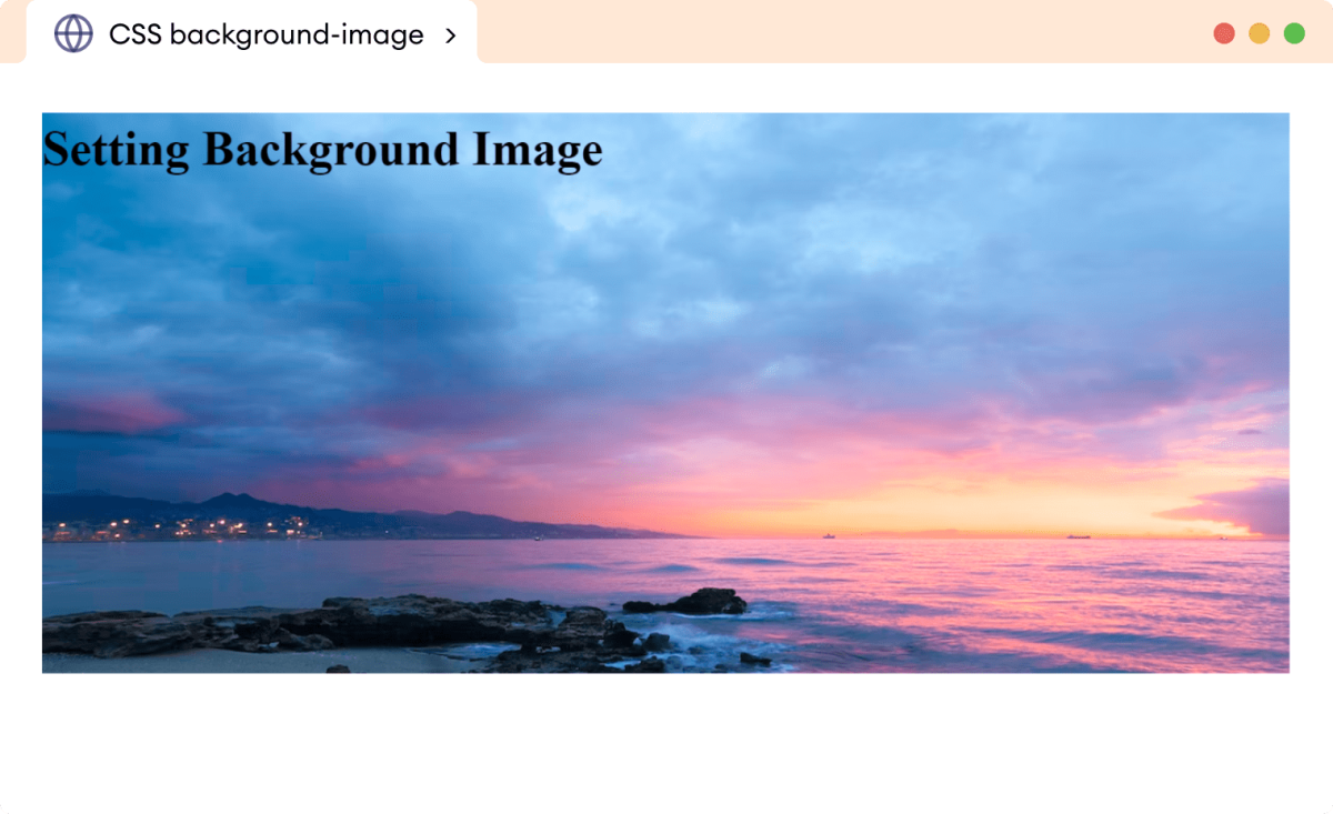
At its most fundamental level, setting a background image is straightforward. The background-image property accepts a url() value, which points to the location of your image file.
selector {
  background-image: url('path/to/your/image.jpg');
}
For instance, to apply a background image to the entire webpage, you would target the body element:
body {
  background-image: url('my_background.png');
}
By default, when you apply a background image this way, CSS will place the image at the top-left corner of the element. If the image is smaller than the element, it will automatically repeat both horizontally and vertically to fill the available space, creating a tiled effect. This default behavior is often not what you desire, especially when using larger, singular background images like wallpapers or high-resolution photography. Don’t worry, CSS provides a suite of other background properties to precisely control how these images are displayed, which we’ll delve into shortly.
Understanding Image Paths (Relative vs. Absolute)
One of the most common stumbling blocks for developers when setting background images is correctly specifying the image path. An incorrect path means the browser cannot locate the image, and thus, it won’t display. There are two primary types of paths you’ll use:
-
Relative Paths: These paths describe the location of the image file relative to the CSS file that is referencing it.
- If the image is in the same folder as your CSS file, you can simply use its filename:
url('image.png'). - If the image is in a subfolder within the CSS file’s directory (e.g.,
images/image.png), you’d use:url('./images/image.png'). The./signifies the current directory. - If the image is in a parent folder relative to your CSS file (e.g., your CSS is in
css/styles.cssand the image is inimages/image.pngat the same level ascss), you’d navigate up a directory using../:url('../images/image.png'). - This is crucial for project organization. For example, if your HTML is at
root/index.html, your CSS atroot/css/styles.css, and your image atroot/images/my_image.jpg, then fromstyles.css, the path tomy_image.jpgwould beurl('../images/my_image.jpg').
- If the image is in the same folder as your CSS file, you can simply use its filename:
-
Absolute Paths (URLs): These paths provide the full web address to the image, starting with
http://orhttps://. This is useful for images hosted on external servers, Content Delivery Networks (CDNs), or if you prefer to use full URLs for consistency.- Example:
url('https://www.tophinhanhdep.com/wallpapers/nature/mountains.jpg'). - You can also use an absolute path relative to the website’s root directory, which starts with a
/. For example, if your website iswww.example.comand the image iswww.example.com/assets/backgrounds/hero.png, you could useurl('/assets/backgrounds/hero.png').
- Example:
Using relative paths is generally preferred for images hosted within your own project, as it makes your code more portable and adaptable if your domain changes. When fetching images from platforms like Tophinhanhdep.com, you would typically use their provided absolute URLs.
Browser Compatibility and Fallbacks
Modern web development demands compatibility across a wide array of browsers and devices. The background-image property enjoys excellent support across all major contemporary browsers, including Chrome, Mozilla Firefox, Safari, and Opera. However, considering the diverse landscape of user agents, it’s always good practice to include fallback options, especially for visual effects like gradients or when using multiple background images, which might not be universally supported in older browser versions.
A common fallback strategy is to define a background-color before the background-image property. If the image fails to load for any reason (e.g., broken path, network issue, or browser incompatibility), the user will see a solid background color instead of a blank space, ensuring a more consistent user experience.
body {
  background-color: #f0f0f0; /* Fallback color */
  background-image: url('my_background.png');
}
For more complex scenarios, you might leverage browser-specific prefixes (though less common for background-image itself, more so for gradients) or employ feature queries (@supports) to apply styles only if a browser supports a particular CSS feature.
Mastering Background Image Properties for Visual Impact
While background-image sets the visual, a suite of complementary CSS properties allows for meticulous control over how that image behaves within its element. These properties are crucial for achieving the desired aesthetic, whether it’s a full-screen wallpaper, a subtle repeating pattern, or a dynamically positioned graphic.
Controlling Repetition: background-repeat
As mentioned, images by default will tile if they are smaller than the element. The background-repeat property gives you explicit control over this behavior.
background-repeat: no-repeat;: This is one of the most frequently used values. It ensures the image appears only once and does not repeat, perfect for large, singular wallpapers or hero images from Tophinhanhdep.com’s beautiful photography collections.background-repeat: repeat;: (Default) The image repeats both horizontally and vertically, creating a traditional tiled effect. This is great for small, intricate patterns or textures.background-repeat: repeat-x;: The image repeats only horizontally, along the x-axis. Useful for creating borders or horizontal bands.background-repeat: repeat-y;: The image repeats only vertically, along the y-axis. Useful for vertical strips or sidebar decorations.background-repeat: space;: The image repeats as much as possible without clipping. Any extra space is distributed evenly around the images.background-repeat: round;: The image repeats and is scaled (without clipping) so that as many images as possible fit without leaving any gaps.
Example:
body {
  background-image: url('nature_wallpaper.jpg');
  background-repeat: no-repeat; /* Ensure it appears only once */
}
Sizing for Perfection: background-size
This is perhaps the most critical property for making background images truly adaptive and visually striking. background-size allows you to define how the background image scales relative to its containing element, preventing unwanted tiling or distortion.
background-size: auto;: (Default) The background image retains its original size.background-size: cover;: This is the go-to value for full-page backgrounds. It scales the image to be as large as possible to completely cover the element’s background area, even if it has to crop a portion of the image. The aspect ratio of the image is preserved. This is ideal for showcasing high-resolution stock photos or abstract backgrounds from Tophinhanhdep.com without leaving any empty space.background-size: contain;: This scales the image to be as large as possible without cropping or stretching the image. It ensures the entire image is visible within the element. If the aspect ratio of the image doesn’t match the element, there might be empty space (similar to letterboxing). This is useful for logos or specific graphics that must be fully visible.background-size: 100% 100%;: You can specify explicit width and height values, either in percentages, pixels, or other units. Using100% 100%will force the image to stretch to fill the entire width and height of the element, potentially distorting its aspect ratio. While it ensures full coverage,coveris usually preferred to maintain image integrity.background-size: 50% auto;: You can specify individual width and height. If one dimension isauto, the image scales proportionally. This example would make the image half the width of its container, with its height adjusting accordingly.
Example:
html {
  height: 100%; /* Ensure html and body take full viewport height */
}
body {
  min-height: 100vh; /* Ensure body takes full viewport height */
  background-image: url('aesthetic_background.jpg');
  background-repeat: no-repeat;
  background-size: cover; /* Stretch to cover the entire page */
}
This combination with background-repeat: no-repeat; and background-size: cover; is a standard for modern full-screen background images, often sourced from Tophinhanhdep.com’s collection of beautiful photography or nature wallpapers.
Positioning Your Visuals: background-position
Once you prevent repetition and control sizing, background-position allows you to precisely align the background image within its element.
- Keywords: You can use keywords like
center,top,bottom,left,right. For example,background-position: center center;(or simplycenter) places the image in the exact middle.background-position: right top;places it at the top-right corner. - Percentages:
background-position: 20% 60%;positions the image 20% from the left and 60% from the top of the element. - Lengths:
background-position: 50px 100px;positions the image 50 pixels from the left and 100 pixels from the top.
Example:
div.hero {
  background-image: url('abstract_art.png');
  background-repeat: no-repeat;
  background-size: contain;
  background-position: center bottom; /* Position at the bottom center */
}
Scrolling Behavior: background-attachment
This property determines whether a background image scrolls with the content or remains fixed in the viewport.
background-attachment: scroll;: (Default) The background image scrolls with the content of the element.background-attachment: fixed;: The background image is fixed relative to the viewport. It does not scroll with the content, creating a parallax-like effect as the user scrolls down the page. This can add significant depth to aesthetic or emotional backgrounds.background-attachment: local;: The background image scrolls with the element’s content, but if the element itself has scrollbars (e.g., anoverflow: scrolldiv), the background will scroll within that element.
Example:
body {
  background-image: url('sad_emotional_scene.jpg');
  background-repeat: no-repeat;
  background-size: cover;
  background-attachment: fixed; /* Fixed background for dramatic effect */
}
Combining Properties for Efficiency: The background Shorthand
For conciseness and efficiency, CSS offers a background shorthand property that allows you to set multiple background-related properties in a single declaration. The order of values typically doesn’t matter, but it’s good practice to follow a consistent order (e.g., color, image, repeat, attachment, position, size).
selector {
  background: [background-color] [background-image] [background-repeat] [background-attachment] [background-position] / [background-size];
}
Example:
body {
  /* color image repeat attachment position / size */
  background: #f0f0f0 url('my_wallpaper.jpg') no-repeat fixed center / cover;
}
This single line achieves the effect of a light grey fallback color, a single full-cover wallpaper fixed in the viewport, and centered. It’s a powerful way to streamline your stylesheets.
Elevating Your Designs with Tophinhanhdep.com’s Image Resources
Creating truly impactful web designs with background images goes beyond just understanding CSS syntax; it requires access to high-quality visual content and the right tools to manage them. This is where platforms like Tophinhanhdep.com become invaluable.
Curated Collections for Every Aesthetic
Tophinhanhdep.com offers a rich repository of images categorized to suit a diverse range of design needs, providing ample inspiration and ready-to-use visuals for your background-image properties.
- Wallpapers & Backgrounds: A vast selection perfect for full-page
background-size: coverapplications. Whether you need a subtle pattern or a dramatic landscape, these collections are designed to be the backdrop of your digital canvas. - Aesthetic Images: For projects demanding a specific mood or contemporary style, Tophinhanhdep.com’s aesthetic collections provide images that align with current visual trends, perfect for setting a youthful or trendy tone.
- Nature & Abstract: From serene forests to mesmerizing geometric patterns, these categories offer universal appeal. Nature backgrounds can evoke calm and organic feelings, while abstract visuals provide modern, artistic, and unique backdrops for creative ideas and digital art projects.
- Sad/Emotional & Beautiful Photography: For storytelling or evoking specific human sentiments, curated collections of sad/emotional and beautiful photography are crucial. These high-resolution images can be carefully integrated into designs, perhaps with a
background-attachment: fixedeffect, to create depth and emotional resonance in line with your photo ideas or thematic collections.
By leveraging these diverse collections, designers can quickly find visuals that match their project’s theme and apply them using the CSS properties we’ve discussed.
Leveraging High-Resolution Photography and Stock Photos
The quality of your background image directly impacts the perceived professionalism of your website. Low-resolution or pixelated images can detract significantly from the user experience, especially on modern high-DPI screens.
- High Resolution: Tophinhanhdep.com specializes in high-resolution photography. Using these images ensures crispness and clarity, vital for
background-size: coverproperties that stretch images across large screens. High-resolution images are particularly important for digital photography projects and photo manipulation, where detail matters. - Stock Photos: These professionally captured images are available for various uses, saving designers time and resources. They often come with commercial licenses, making them suitable for business websites, portfolios, and blogs that need polished visuals without the cost of a custom photoshoot. Tophinhanhdep.com provides a library of stock photos that can be easily integrated into your
background-imagedeclarations.
When choosing images, consider the overall visual design of your page. A background image should complement, not overpower, your foreground content. Good editing styles ensure the image is fit for purpose, perhaps desaturated or blurred slightly to make text more readable.
Enhancing Visuals with Image Tools
Beyond just sourcing images, effective web design requires optimizing them for performance and quality. Tophinhanhdep.com supports a holistic approach to image management by discussing various image tools.
- Converters: Tools that convert images to more web-friendly formats like WebP or AVIF can significantly reduce file size without compromising quality. This is crucial for faster page load times, an important SEO factor.
- Compressors & Optimizers: Before uploading any image, it should be compressed and optimized. These tools strip unnecessary data from image files, making them lighter. A smaller
background-imageloads faster, enhancing user experience. - AI Upscalers: For images that might not be high-resolution enough but are perfect for a background, AI upscalers can intelligently enlarge them, adding detail to prevent pixelation when used with
background-size: cover. This means even a good-quality smaller image can become a beautiful large background. - Image-to-Text (OCR): While less directly related to
background-imagestyling, image-to-text tools can be useful for extracting information from images for accessibility purposes or for indexing content within a website’s overall content strategy.
By employing these tools, you ensure that the stunning wallpapers and backgrounds from Tophinhanhdep.com not only look great but also perform optimally on your website.
Advanced Techniques and Creative Considerations
Once you’ve mastered the basics, CSS background-image offers more sophisticated techniques to push your visual design boundaries.
Gradients as Backgrounds
Beyond traditional images, CSS allows you to create linear and radial gradients as backgrounds, adding a smooth transition between colors without needing an image file.
- Linear Gradients:
background-image: linear-gradient(to right, #ff0000, #0000ff);creates a gradient from red to blue, moving from left to right. You can specify angles, directions, and multiple color stops. - Radial Gradients:
background-image: radial-gradient(circle, #ff0000, #0000ff);creates a circular gradient.
These can be used as subtle accents or full backgrounds, offering a lightweight alternative to image files, and can be combined with actual images for unique effects.
Multiple Background Images
CSS supports applying multiple background images to a single element. Images are layered on top of each other, with the first image in the list appearing at the top.
div {
  background-image: url('top-layer.png'), url('bottom-layer.png');
  background-position: top left, center;
  background-repeat: no-repeat, repeat;
}
This technique is powerful for graphic design, allowing for complex visual composites or subtle overlays that enhance the overall digital art. Imagine a subtle texture repeating beneath a larger, non-repeating graphic from Tophinhanhdep.com.
Responsive Backgrounds for All Devices
Achieving a consistent look across desktops, tablets, and smartphones is crucial. Responsive web design for background images typically involves:
background-size: cover;: Already discussed, this is foundational for scaling images.- Media Queries: Use
@mediarules to change background images, sizes, or positions based on screen size or orientation. For example, you might use a high-resolution, landscape image for desktops and a smaller, portrait-oriented image (perhaps a cropped version from Tophinhanhdep.com’s collections) for mobile devices.
@media (max-width: 768px) {
  body {
    background-image: url('mobile_background.jpg');
    background-position: center bottom; /* Adjust position for mobile */
  }
}- Picture Element (
<picture>): While not a direct CSS property, for true art direction, you might use the HTML<picture>element with an<img>tag and then applybackground-imageto a parent container. This allows the browser to select the most appropriate image source based on screen size and resolution, improving performance and visual quality.
Integrating with Visual Design Principles
The choice and application of background images are deeply tied to broader visual design principles, encompassing graphic design, digital art, and photo manipulation.
- Hierarchy and Focus: A background image should enhance, not distract from, the main content. Consider its contrast, color palette, and complexity. Overly busy backgrounds can make text unreadable.
- Branding and Aesthetics: Background images often play a significant role in establishing a website’s brand identity. Whether it’s the sleek, abstract patterns for a tech company or the warm, nature-inspired photography for an eco-brand, the background sets the tone.
- Mood Boards and Creative Ideas: Before settling on a background image, gather photo ideas and create mood boards. Tophinhanhdep.com’s thematic collections and trending styles can be excellent starting points for generating creative ideas and defining the aesthetic direction of your design.
- Accessibility: Ensure sufficient contrast between background images and foreground text. Consider users with visual impairments. Sometimes, a semi-transparent overlay or a solid
background-colorfallback is necessary to maintain readability.
From Inspiration to Implementation: Best Practices
Successful implementation of background images goes beyond just writing CSS. It involves thoughtful planning, optimization, and adherence to best practices to ensure your website is both beautiful and performant.
Selecting the Right Image
The image itself is paramount. Tophinhanhdep.com provides abundant image inspiration and collections, but choosing the right one requires an eye for detail and purpose.
- Relevance: Does the image align with your website’s content and brand message?
- Quality: Always prioritize high-resolution photography. Blurry or pixelated images diminish perceived quality.
- Composition: Consider where your main content will sit. Choose images with negative space or areas that can accommodate text without obstruction.
- Licensing: Ensure you have the proper rights or licenses to use the image. Tophinhanhdep.com often provides clear licensing information for its stock photos.
- Thematic Collections & Trending Styles: Explore Tophinhanhdep.com’s thematic collections and trending styles to find images that resonate with contemporary design or specific themes. This can spark new photo ideas and creative directions for your mood boards.
Performance Optimization
Large image files are a primary culprit for slow website load times. Even the most beautiful background image becomes a liability if it takes too long to load.
- Compression: Always compress your images using tools like the ones discussed on Tophinhanhdep.com (Compressors, Optimizers). Aim for the smallest possible file size without a noticeable loss in visual quality.
- Modern Formats: Convert images to modern web formats like WebP or AVIF. These formats offer superior compression compared to traditional JPEGs and PNGs.
- Lazy Loading: For background images on elements that are not immediately visible (e.g., sections further down the page), consider implementing lazy loading to defer loading until they are needed.
- AI Upscalers (judiciously): If you must use a lower-resolution image, AI upscalers can improve quality, but this should be a last resort after seeking high-resolution alternatives from Tophinhanhdep.com.
Accessibility Considerations
A beautiful website is an accessible website. When using background images, always consider how they impact users with disabilities.
- Contrast: Ensure there’s sufficient contrast between any text or interactive elements and the background image. Tools for checking contrast ratios are readily available. If contrast is an issue, consider adding a semi-transparent overlay (
rgba()background color) on top of the image to darken or lighten it. - Alternative Text (for content images): While
background-imageis presentation, if an image conveys crucial information (which is rare for backgrounds, but sometimes happens), ensure that information is also available in the foreground text or via other accessible means. For true content images, use<img>tags withaltattributes. - Focus Management: Ensure that interactive elements remain clearly visible and distinguishable when placed over a background image.
Conclusion
The background-image property in CSS is an indispensable tool for crafting visually compelling and engaging web experiences. From setting a simple static image to creating dynamic, responsive backgrounds with gradients and multiple layers, its versatility allows designers to imbue their webpages with unique personalities and aesthetic appeal. Mastering properties like background-repeat, background-size, background-position, and background-attachment empowers you to precisely control every visual detail, transforming your creative ideas into digital reality.
Furthermore, the quality of your visual assets is paramount. By sourcing high-resolution photography, stunning wallpapers, and diverse thematic collections from platforms like Tophinhanhdep.com, and by utilizing essential image tools for compression and optimization, you can ensure your designs are not only beautiful but also performant and accessible across all devices.
Whether you’re developing aesthetic blogs, corporate websites, or personal portfolios, understanding how to effectively wield background images will significantly elevate your web design prowess. So, explore the rich imagery available, experiment with different CSS properties, and unleash your creativity to build truly memorable online spaces. Your journey to stunning web visuals begins with a single line of CSS, powered by limitless inspiration from resources like Tophinhanhdep.com.