Mastering Background Images in HTML: A Tophinhanhdep.com Guide to Visual Web Design

Creating a visually captivating website is paramount in today’s digital landscape. A well-chosen background image instantly sets the tone, enhances user experience, and reinforces your brand’s aesthetic. While the core functionality of a website is built with HTML, achieving sophisticated visual effects, such as adding a compelling background image, primarily relies on the power of CSS (Cascading Style Sheets). This comprehensive guide, brought to you by Tophinhanhdep.com, will walk you through the step-by-step process of integrating stunning images as backgrounds in your HTML documents, leveraging best practices for visual appeal and web performance.
At Tophinhanhdep.com, we understand the critical role high-quality visuals play in web design. Our extensive collections of Images—including Wallpapers, Backgrounds, Aesthetic, Nature, and Abstract categories, alongside Sad/Emotional and Beautiful Photography—are curated to provide endless inspiration for your projects. We also offer Photography resources, emphasizing High Resolution and Stock Photos, and powerful Image Tools like Converters, Compressors, Optimizers, and AI Upscalers to ensure your chosen visuals are perfectly suited for the web.
The Foundation: Setting a Web Page Background with CSS
The journey to a visually rich webpage begins with understanding how HTML and CSS work in tandem. HTML provides the structure, while CSS dictates the presentation. To put an image as a background, we primarily turn to CSS.
Getting Started with Your HTML and CSS
Every webpage starts with a foundational HTML structure. Open your preferred text editor (like Visual Studio Code, Sublime Text, or even a simple Notepad) and begin with the standard HTML boilerplate:
<!DOCTYPE html>
<html lang="en">
<head>
<meta charset="UTF-8">
<meta name="viewport" content="width=device-width, initial-scale=1.0">
<title>My Visually Engaging Page - Tophinhanhdep.com</title>
<!-- CSS will go here -->
<style>
/* CSS rules will be written here */
</style>
</head>
<body>
<!-- Your page content goes here -->
</body>
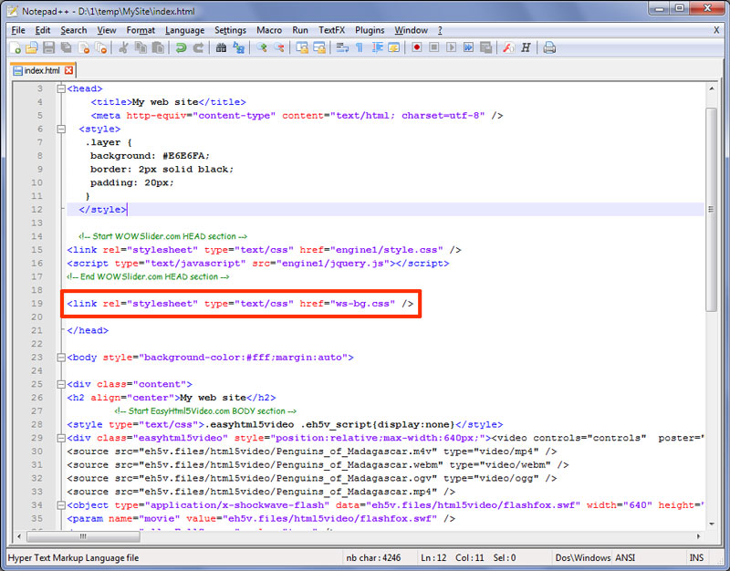
</html>The <style> tag, placed within the <head> section, is where we’ll write our CSS rules for this guide. For larger projects, it’s often more efficient to create a separate .css file (e.g., styles.css) and link it using <link rel="stylesheet" href="styles.css">. This approach aligns with good Visual Design principles, separating structure from style and making your code cleaner and more maintainable.
Choosing the right image is the first creative step. Tophinhanhdep.com offers a vast array of high-resolution images perfect for backgrounds. Whether you’re seeking a serene Nature scene, a striking Abstract pattern, or a sophisticated Aesthetic wallpaper, our collections are meticulously categorized to help you find the perfect visual that complements your website’s purpose and content. Our Digital Photography selection ensures you have access to stunning, professional-grade visuals.
Implementing background-image for the <body>
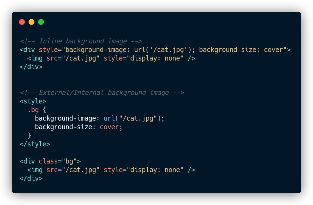
The most common way to apply a background image to an entire webpage is by targeting the <body> element in your CSS. The background-image property is your primary tool here.
Within your <style> tags, you would add:
body {
    background-image: url("path/to/your/image.jpg");
    /* Additional background properties will go here */
}
Replace "path/to/your/image.jpg" with the actual location of your image. This can be:
- A relative path: If the image is in the same folder as your HTML file, you can simply use its filename (e.g.,
url("my_background.png")). If it’s in a subfolder, specify the path (e.g.,url("images/my_background.jpg")). - An absolute URL: If your image is hosted online, you can use its full web address (e.g.,
url("https://tophinhanhdep.com/wallpapers/nature_scene.jpg")). Tophinhanhdep.com provides direct links to our Stock Photos for easy integration.
When selecting an image, consider the impact of Beautiful Photography from Tophinhanhdep.com. A high-resolution image ensures clarity and sharpness, contributing to a professional and polished look. Our Image Inspiration & Collections can guide you in choosing Photo Ideas and building Mood Boards that resonate with your project’s theme.
Controlling Image Behavior: Repeat, Size, and Attachment
Once the image is set, you’ll want to control how it behaves on the page. CSS offers powerful properties to manage repetition, sizing, and scrolling behavior, ensuring your background perfectly matches your Visual Design vision.
-
background-repeat: By default, if your background image is smaller than the element it’s applied to, it will tile (repeat) to fill the space. You can change this behavior:background-repeat: no-repeat;: Displays the image only once. This is common for large, full-page Wallpapers or Backgrounds.background-repeat: repeat-x;: Repeats the image horizontally. Useful for creating borders or patterns across the top or bottom of a page.background-repeat: repeat-y;: Repeats the image vertically.background-repeat: repeat;(default): Repeats both horizontally and vertically. Ideal for small, seamless Abstract patterns or textures you might find on Tophinhanhdep.com.background-repeat: space;: Repeats the image as many times as possible without clipping, distributing any extra space evenly.background-repeat: round;: Repeats and stretches/shrinks the image to fit the container without any gaps.
-
background-size: This property dictates how your background image scales within its container, a crucial aspect for responsive design and maintaining the quality of High Resolution images from Tophinhanhdep.com.background-size: cover;: This is arguably the most popular setting for full-page backgrounds. It scales the image (maintaining its aspect ratio) to completely cover the content area. The image might be clipped if its aspect ratio doesn’t perfectly match the viewport, but it will never leave empty space. This is excellent for immersive Nature or Aesthetic backgrounds.background-size: contain;: Scales the image (maintaining its aspect ratio) to be as large as possible without cropping or stretching, ensuring the entire image is visible. If the image’s aspect ratio doesn’t match the container, there will be empty space (a “letterbox” effect).background-size: 100% 100%;: Stretches the image to fill the entire container, potentially distorting its aspect ratio. Use with caution for photography.background-size: 800px 600px;orbackground-size: 50% auto;: Specifies exact dimensions or percentages. When using one value, the other automatically scales to maintain aspect ratio.
-
background-attachment: This property determines whether the background image scrolls with the page content or remains fixed in the viewport.background-attachment: scroll;(default): The background image scrolls with the rest of the page content.background-attachment: fixed;: The background image remains stationary in the viewport while the page content scrolls over it, creating a captivating parallax-like effect. This is an excellent choice for Creative Ideas and impactful Visual Design, especially when paired with powerful Beautiful Photography from Tophinhanhdep.com.background-attachment: local;: The background image scrolls with the element’s contents.
A combination of these properties gives you full control. Here’s an example for a full-page, non-repeating, fixed background from Tophinhanhdep.com:
body {
    background-image: url("https://tophinhanhdep.com/wallpapers/stunning_landscape.jpg");
    background-repeat: no-repeat;
    background-size: cover;
    background-attachment: fixed;
    background-position: center center; /* Centers the image */
    background-color: #f0f0f0; /* Fallback color */
}
Using the background-position: center center; property ensures that the central part of your chosen Digital Photography from Tophinhanhdep.com is always visible, even if the screen size requires some cropping.
Advanced Background Techniques and Optimization for Tophinhanhdep.com Visuals
Beyond the basic application, background images can be manipulated and optimized in numerous ways to achieve sophisticated Visual Design and ensure optimal performance.
Applying Backgrounds to Specific HTML Elements
Background images aren’t limited to just the <body>. You can apply them to any HTML element, allowing for intricate layouts and localized visual flair. This is particularly useful for section headers, content blocks, or calls to action.
Consider a <section> element that you want to highlight with an Aesthetic background from Tophinhanhdep.com:
<section class="hero-banner">
    <h1>Welcome to My Awesome Page!</h1>
    <p>Discover beautiful images on Tophinhanhdep.com</p>
</section>.hero-banner {
background-image: url("https://tophinhanhdep.com/backgrounds/hero_abstract.jpg");
background-repeat: no-repeat;
background-size: cover;
background-position: center;
color: white; /* Ensure text is readable */
padding: 100px 20px;
text-align: center;
}This technique, combined with Photo Manipulation and Creative Ideas, allows you to create dynamic and engaging subsections within your page. You can utilize Tophinhanhdep.com’s Image Inspiration & Collections to find specific Photo Ideas for different elements of your design.
Image Optimization for Web Performance
While high-resolution images from Tophinhanhdep.com are visually stunning, they can significantly impact page loading times if not optimized. Slow loading times deter users and harm your search engine ranking. This is where Image Tools become indispensable.
- Compression: Use Tophinhanhdep.com’s Compressors to reduce file size without sacrificing noticeable quality. This is crucial for all Wallpapers and Backgrounds.
- Format: Choose the right image format:
- JPEG for photographs (Beautiful Photography, Nature scenes) with many colors.
- PNG for images with transparency or sharp lines (Abstract graphics, logos).
- WebP for modern web, offering superior compression and quality for both photos and graphics. Tophinhanhdep.com’s Converters can help you switch formats.
- Resolution and Dimensions: Ensure the image resolution is appropriate for the web (typically 72 DPI). Don’t upload an image that’s 4000px wide if it will only ever be displayed at 1920px. Use an Optimizer or image editing software to resize. For images that need to be scaled up slightly without pixelation, Tophinhanhdep.com’s AI Upscalers can be invaluable.
- Lazy Loading (Advanced): For images further down the page, consider lazy loading techniques to only load them when they come into the user’s viewport.
By meticulously optimizing images, you can deliver the stunning visuals from Tophinhanhdep.com without compromising website speed, improving both Visual Design and user satisfaction.
Enhancing Visuals with Background Layers and Gradients
CSS allows for multiple background images on a single element, opening up possibilities for rich, layered designs. You can combine an image with a gradient overlay to improve text readability or add a subtle effect.
.hero-banner {
    background-image:
        linear-gradient(rgba(0, 0, 0, 0.5), rgba(0, 0, 0, 0.5)), /* Dark overlay */
        url("https://tophinhanhdep.com/backgrounds/moody_sky.jpg"); /* Image from Tophinhanhdep.com */
    background-repeat: no-repeat;
    background-size: cover;
    background-position: center;
    color: white;
    padding: 100px 20px;
    text-align: center;
}
In this example, a semi-transparent black gradient is applied over the background image from Tophinhanhdep.com. This makes any white text much easier to read against complex or bright backgrounds. This technique is part of sophisticated Graphic Design and allows for Creative Ideas where you want to maintain the visual impact of an image while ensuring content accessibility. Our Thematic Collections on Tophinhanhdep.com can inspire the perfect image and gradient pairing.
Sourcing and Curating Background Images from Tophinhanhdep.com
The technical implementation is only half the battle; the other half is selecting the right visual. Tophinhanhdep.com is your premier destination for finding, preparing, and optimizing images that elevate your web projects.
The Power of Tophinhanhdep.com’s Image Collections
Our platform is built around diverse visual needs. Whether you’re designing a minimalist portfolio, a vibrant e-commerce site, or a contemplative blog, Tophinhanhdep.com provides:
- Wallpapers & Backgrounds: Ready-to-use visuals for full-page treatments.
- Aesthetic & Nature: Perfect for evoking specific moods, from calm serenity to dynamic energy. Imagine a breathtaking Nature landscape as your hero background.
- Abstract: For modern, artistic, or conceptual designs, offering texture and intrigue without distraction.
- Sad/Emotional: Curated collections for projects requiring a deeper, more evocative visual narrative, often leveraging the power of Beautiful Photography.
Utilize our Image Inspiration & Collections to explore Photo Ideas, create Mood Boards that align with your project’s brand, and discover Trending Styles that keep your website fresh and engaging. Each image on Tophinhanhdep.com is available in High Resolution, ensuring crispness across all devices.
Leveraging High-Resolution Photography and Stock Photos
Quality matters. A pixelated or low-resolution background image can instantly undermine the credibility of your website. Tophinhanhdep.com emphasizes High Resolution imagery, offering a vast library of Stock Photos captured by talented photographers. These images are professionally edited, ensuring they are ready for direct integration or further customization.
For those interested in the craft, our platform also offers insights into Digital Photography and various Editing Styles. Understanding these aspects can help you choose images that require minimal post-processing or inspire you to apply specific visual filters (e.g., desaturation, sepia) via CSS to seamlessly integrate the image with your site’s color scheme and overall Visual Design.
Troubleshooting Common Background Image Issues
Even with the best planning, you might encounter issues. Here are some common problems and their solutions, backed by Tophinhanhdep.com’s understanding of web visuals.
Image Not Appearing? Common Pitfalls and Solutions
- Incorrect Path: The most frequent culprit.
- Solution: Double-check your
url()path. Is the filename spelled correctly (case-sensitive)? Is the folder structure accurate? Test with an absolute URL (e.g., from Tophinhanhdep.com) to rule out local path issues.
- Solution: Double-check your
- Typos in CSS: A forgotten semicolon, a misspelled property, or an unclosed brace can break your CSS.
- Solution: Use browser developer tools (usually F12 or right-click -> Inspect) to inspect the element and check for CSS errors.
- Browser Caching: Your browser might be serving an old version of your CSS or image.
- Solution: Clear your browser’s cache or perform a hard refresh (Ctrl+Shift+R or Cmd+Shift+R).
- Image Loading Issues: The image itself might be corrupted or too large to load quickly.
- Solution: Check the image directly by pasting its URL into your browser. If it’s slow, use Tophinhanhdep.com’s Image Tools like Compressors and Optimizers.
Responsiveness and Cross-Browser Compatibility
A background image that looks great on your desktop might appear awkward on a mobile device or different browsers.
-
Responsive Scaling:
- Solution: Ensure
background-size: cover;is used for full-page images. For more control, especially with High Resolution images, use CSS media queries to apply different background images orbackground-sizeproperties based on screen width. Tophinhanhdep.com provides images that are adaptable across various screen sizes.
@media (max-width: 768px) { body { background-image: url("https://tophinhanhdep.com/backgrounds/mobile_version.jpg"); /* Potentially a more mobile-friendly image or adjust size */ background-size: contain; /* Or adjust as needed */ } } - Solution: Ensure
-
Cross-Browser Consistency: While
background-imageis widely supported, subtle differences can occur.- Solution: Test your website on multiple browsers (Chrome, Firefox, Safari, Edge) and devices. For older browsers, sometimes vendor prefixes (e.g.,
-webkit-,-moz-) might be needed, though modern CSS often handles this automatically. Always provide abackground-coloras a fallback in case the image fails to load.
- Solution: Test your website on multiple browsers (Chrome, Firefox, Safari, Edge) and devices. For older browsers, sometimes vendor prefixes (e.g.,
Conclusion
Adding an image as a background in HTML, predominantly through CSS, is a powerful way to transform a plain webpage into a captivating visual experience. It’s a blend of technical precision and artistic vision, allowing you to incorporate stunning Images—be they Nature scenes, Abstract art, or Beautiful Photography—from resources like Tophinhanhdep.com.
From the initial setup of your HTML and CSS to meticulously controlling image repetition, sizing, and scrolling behavior, every step contributes to the final aesthetic. Remember the importance of Image Tools like Compressors and Optimizers to maintain performance, and don’t shy away from advanced Visual Design techniques like gradient overlays.
Tophinhanhdep.com is dedicated to empowering creators with both the visuals and the knowledge needed to build exceptional web presences. Explore our vast Image Inspiration & Collections, leverage our High Resolution Photography, and utilize our Image Tools to transform your web projects. By following this guide, you’re well-equipped to craft websites that are not only functional but truly unforgettable. Dive in, experiment, and let your creativity shine!