Mastering Background Images in CSS: A Comprehensive Guide for Stunning Web Design

In the vast and ever-evolving landscape of web development, Cascading Style Sheets (CSS) stands as the indispensable language that transforms raw HTML content into visually captivating and engaging user experiences. While HTML lays the structural foundation of a webpage, CSS is the artist’s brush, defining every aesthetic detail from fonts and colors to layouts, animations, and crucially, backgrounds. Among its many powerful properties, the background-image property is a cornerstone for creating immersive, branded, and visually appealing web pages. It allows developers and designers to imbue an element, or even an entire page, with an image, transcending plain colors to tell a visual story.
At Tophinhanhdep.com, we understand the profound impact that high-quality imagery has on digital aesthetics. Whether you’re seeking a serene nature background, an abstract wallpaper to convey modern sophistication, or a beautiful photograph to evoke emotion, the right image can elevate your design from functional to truly memorable. This guide will walk you through the fundamental principles and advanced techniques of implementing background images in CSS, demonstrating how to harness this property to its full potential. We’ll explore various methods, essential control properties, and best practices, all while highlighting how Tophinhanhdep.com can serve as your ultimate resource for stunning visual assets and indispensable image tools.

The Core of Visual Design: Understanding the background-image Property
The background-image property in CSS is your primary gateway to integrating visual imagery into your web page backgrounds. Its simplicity belies its power, enabling designers to set one or multiple images onto any HTML element, from the entire <body> of a document to individual <div> containers, paragraphs, or headers.
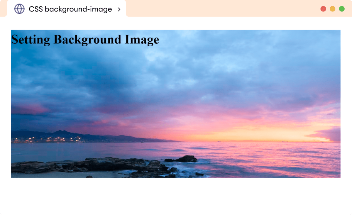
Getting Started with background-image: Syntax and Basic Application
The fundamental syntax for applying a background image is straightforward:
background-image: url('path/to/your/image.jpg');The url() value is where you specify the location of your image file. This can be a relative path (e.g., ../images/my_background.png if the image is in an images folder one level up from your CSS file) or an absolute URL (e.g., https://www.tophinhanhdep.com/wallpapers/nature/mountains.jpg if the image is hosted online).
By default, when you apply a background image to an element, CSS has a specific behavior:
- Placement: The image is initially positioned at the top-left corner of the element.
- Repetition: If the image is smaller than the element it’s applied to, it will automatically repeat itself both horizontally and vertically, creating a tiled effect. This is akin to a traditional wallpaper pattern.
For instance, to set a background image for the entire webpage, you would target the body element:

body {
  background-image: url('images/aesthetic_background.jpg'); /* Assuming 'aesthetic_background.jpg' is in an 'images' folder relative to your CSS */
}
This basic application immediately transforms the visual character of your page. For optimal results, choosing the right image is paramount. Tophinhanhdep.com offers an extensive library of high-resolution images perfect for backgrounds and wallpapers, including diverse categories like Aesthetic, Nature, Abstract, Sad/Emotional, and Beautiful Photography. Selecting a high-quality, relevant image from Tophinhanhdep.com can instantly enhance your site’s professional appearance and emotional resonance.
Beyond Static Images: Gradients and Multiple Backgrounds
While single static images are powerful, the background-image property offers more advanced capabilities, allowing for the use of CSS-generated gradients and even multiple layered background images.
CSS Gradients:
Instead of a raster image file, you can use CSS functions like linear-gradient(), radial-gradient(), or conic-gradient() to create dynamic, scalable backgrounds directly within your stylesheet. This is particularly useful for achieving modern, minimalist designs or adding subtle overlays.
For example, a linear gradient:
body {
  background-image: linear-gradient(to right, #ff7e5f, #feb47b); /* A warm gradient from orange to peach */
}
This method is excellent for creating backgrounds that perfectly match your site’s color scheme, offering a clean aesthetic that complements the content.
Multiple Background Images:
One of the most creative applications of background-image is the ability to layer multiple images on a single element. By separating image url() values with commas, you can stack them, with the first image listed appearing on top. This opens up a world of possibilities for visual design, allowing you to combine textures, patterns, logos, and photographs to create complex and unique aesthetics.
div.hero-section {
  background-image: url('images/overlay_pattern.png'), url('images/beautiful_nature_scene.jpg');
  /* 'overlay_pattern.png' will be on top of 'beautiful_nature_scene.jpg' */
}
When combining multiple images, considerations like transparency (.png files are ideal for overlays) and layering order become crucial. Tophinhanhdep.com’s collections, especially those under Digital Art and Creative Ideas, can provide rich inspiration for crafting such intricate background compositions. You might combine a subtle abstract pattern with a stunning piece of high-resolution photography sourced from Tophinhanhdep.com to achieve a truly distinctive look.
Fine-Tuning Your Visuals: Essential Background Properties for Optimal Display
While background-image sets the image, other CSS properties provide granular control over its appearance, ensuring it behaves exactly as intended, regardless of screen size or device. Mastering these properties is key to professional web design.
Controlling Image Behavior: background-repeat and background-attachment
The default behavior of background images is often not what’s desired for a modern web design. These two properties help you manage how images fill their space and interact with user scrolling.
background-repeat: This property dictates whether and how a background image repeats.
background-repeat: no-repeat;: The most common choice for a single, prominent background image. The image will appear only once at its defined position.background-repeat: repeat;: (Default) The image tiles horizontally and vertically, like traditional wallpaper. This can be effective for small, seamless patterns or textures found on Tophinhanhdep.com.background-repeat: repeat-x;: The image repeats only horizontally, useful for creating borders or horizontal bands.background-repeat: repeat-y;: The image repeats only vertically, similar to a sidebar pattern.background-repeat: space;: The image repeats as many times as possible without clipping, distributing any extra space evenly around the images.background-repeat: round;: The image repeats as many times as possible, scaling the images to fit the container without any gaps.
For example, to prevent repetition for a hero image:
body {
  background-image: url('https://www.tophinhanhdep.com/photography/high_res/cityscape.jpg');
  background-repeat: no-repeat;
}
Choosing the appropriate background-repeat value depends entirely on the design intention and the nature of the image. For wallpapers and textures, repeat or space might be suitable, especially when sourcing thematic collections or abstract patterns from Tophinhanhdep.com.
background-attachment: This property determines whether a background image scrolls with the content or remains fixed in the viewport.
background-attachment: scroll;: (Default) The background image scrolls along with the rest of the page’s content.background-attachment: fixed;: The background image stays anchored to the viewport. As the user scrolls, the content moves over the static background, creating a visually striking “parallax” effect. This is popular for hero sections and can make a high-quality Beautiful Photography image from Tophinhanhdep.com truly stand out.background-attachment: local;: Similar toscroll, but specifically for elements with scrollable content (like adivwithoverflow: scroll). The background scrolls with the element’s content, not just the overall page.
Be mindful that fixed backgrounds can sometimes be resource-intensive, particularly on older mobile devices, where some browsers might revert to scroll for performance reasons.
Achieving Perfect Fit and Placement: background-size and background-position
These two properties are critical for ensuring your background image is displayed optimally across various screen sizes and device orientations, directly impacting the responsiveness and aesthetic quality of your website.
background-size: This property controls the size of the background image. This is particularly vital for making images responsive and adapting them to different screen dimensions without pixelation or unwanted cropping.
background-size: cover;: This is the most recommended value for full-page backgrounds. It scales the image (while maintaining its aspect ratio) to completely cover the entire content area of the element. If the image’s aspect ratio differs from the element’s, parts of the image may be clipped, but it ensures no empty space. This is ideal for using stunning High Resolution Photography and Wallpapers from Tophinhanhdep.com, ensuring they always fill the screen.background-size: contain;: This scales the image (maintaining its aspect ratio) to be as large as possible while ensuring the entire image is visible within the element. If the image’s aspect ratio differs, there might be empty space (letterboxing or pillarboxing) around the image. This can be useful for logos or specific graphics sourced from Tophinhanhdep.com’s Digital Art collections.background-size: 100% 100%;: This stretches the image to fill the entire width and height of the element, potentially distorting its aspect ratio. While it guarantees no empty space, it’s generally avoided for photographic images unless a stretched effect is explicitly desired. ThoughtCo mentions this as an alternative but highlights its flaws.background-size: <width> <height>;: You can specify exact pixel values (e.g.,150px 200px) or percentage values (e.g.,50% autoto set width to 50% and height to auto-scale). If only one value is provided, it’s treated as the width, and the height scales proportionally (auto).
When using background-size: cover; with high-resolution imagery from Tophinhanhdep.com, you can achieve a truly immersive and professional look without sacrificing image quality.
background-position: This property controls the starting position of the background image within the element.
You can specify positions using keywords (e.g., center, top, bottom, left, right), pixel values (e.g., 100px 50px), or percentage values (e.g., 20% 60%).
background-position: center;: Centers the image both horizontally and vertically. This is often paired withno-repeatandcoverfor a balanced look.background-position: right top;: Positions the image at the top-right corner.background-position: 20px 50%;: Positions the image 20 pixels from the left and 50% down from the top.
Combining background-size: cover; with background-position: center; is a powerful duo for responsive background images, ensuring that the most important parts of your chosen Beautiful Photography or Nature image from Tophinhanhdep.com are visible and centered.
body {
  background-image: url('https://www.tophinhanhdep.com/wallpapers/abstract/colorful_waves.jpg');
  background-repeat: no-repeat;
  background-size: cover;
  background-position: center;
  background-attachment: fixed; /* For a fixed parallax effect */
}
The Importance of Fallbacks: background-color and Performance Considerations
Even with the most robust CSS, there are scenarios where your background image might not load (e.g., slow internet, broken path, user settings). This is where a fallback background-color becomes essential.
background-color: Always define a background-color for the element beneath your background-image. If the image fails to load, this color will be displayed, preventing a jarring blank space and maintaining some level of visual continuity. Choose a color that complements your intended image and overall design theme.
body {
  background-color: #f0f0f0; /* Light gray fallback */
  background-image: url('images/my_background.jpg');
  /* ... other background properties ... */
}
Performance Considerations and Image Optimization: Background images, especially high-resolution ones, can significantly impact page loading times if not optimized correctly. Slow loading times deter users and harm SEO.
- Compression: Always compress your images before uploading them. Tophinhanhdep.com offers various Image Tools, including Compressors and Optimizers, that can drastically reduce file sizes without noticeable quality loss.
- Format: Choose the right image format. JPEG is ideal for photographs (like those in Beautiful Photography collections on Tophinhanhdep.com), PNG for images with transparency or sharp lines (Digital Art), and WebP for modern web images offering excellent compression.
- Dimensions: While
background-size: cover;will scale, providing an image that is reasonably close to the expected display dimensions (e.g., 1920px wide for desktop full-screen) can reduce browser processing. - AI Upscalers: If you have an image that isn’t quite high-resolution enough for a large background, Tophinhanhdep.com’s AI Upscalers can be invaluable for enhancing image quality and making them suitable for stunning, large-scale displays without pixelation.
Optimizing images is not just about speed; it’s about providing a seamless user experience, which is a core tenet of good visual design.
Implementing Background Images: Best Practices and Advanced Techniques
Beyond the individual properties, how you structure your CSS and integrate imagery influences the overall maintainability, responsiveness, and interactivity of your web projects.
Choosing Your Method: Internal, External, and Inline CSS
There are three primary ways to embed CSS into your HTML, each with its own use cases for background images.
-
Internal Stylesheet: CSS rules are placed within a
<style>tag in the<head>section of your HTML document.<head> <style> body { background-image: url('images/nature_scene.jpg'); } </style> </head>- When to Use: Ideal for single-page applications or small projects where styles are specific to that one HTML file. It’s also great for quick demonstrations or initial testing.
-
External Stylesheet: CSS rules are written in a separate
.cssfile and linked to your HTML document using the<link>tag in the<head>.<head> <link rel="stylesheet" href="styles.css"> </head>/* styles.css */ body { background-image: url('images/abstract_art.jpg'); }- When to Use: Highly Recommended for most projects. It separates content (HTML) from presentation (CSS), making your code cleaner, easier to maintain, and allowing styles to be reused across multiple HTML pages. This is crucial for managing extensive image collections, like those from Tophinhanhdep.com.
-
Inline Styles: CSS rules are applied directly to an HTML element using the
styleattribute.<body style="background-image: url('images/sad_aesthetic.jpg');">- When to Use: Generally Not Recommended for background images in production. It mixes HTML and CSS, making maintenance difficult and violating the principle of separation of concerns. It might be used for quick, one-off overrides or dynamic styling via JavaScript.
When referencing image paths, ensure accuracy. If your image is in a subfolder (e.g., /images/) and your CSS is at the root, the path should be url('/images/my_image.jpg'). If your CSS is in /css/ and images are in /images/, you might use url('../images/my_image.jpg') to go up one directory and then into the images directory. Tophinhanhdep.com serves as an excellent reference for managing these image assets, providing clear paths for Stock Photos and Digital Photography downloads.
Crafting Responsive Designs with Tophinhanhdep.com Imagery
Responsive design is non-negotiable in today’s multi-device world. Your background images must adapt gracefully to desktops, tablets, and smartphones.
background-size: cover;as a Starting Point: As discussed,coveris fundamental for ensuring your image scales to fill the viewport without distortion.- Media Queries: For more granular control, use CSS media queries to apply different background images or adjust their properties based on screen size or orientation. This is particularly useful for optimizing performance or changing the visual focus. For instance, a complex Beautiful Photography image might be perfect for large screens, but a simpler, more compressed Abstract pattern might be better for mobile. Tophinhanhdep.com’s Image Inspiration & Collections can help you find suitable alternatives.
body {
  background-image: url('https://www.tophinhanhdep.com/wallpapers/nature/desktop_forest.jpg');
  background-size: cover;
  background-position: center;
}

@media (max-width: 768px) { /* For screens up to 768px wide */
  body {
    background-image: url('https://www.tophinhanhdep.com/wallpapers/nature/mobile_forest.jpg'); /* A more mobile-friendly image */
    background-attachment: scroll; /* Fixed might be less performant on mobile */
  }
}- SVG as Backgrounds: For vector-based graphics like logos, icons, or Digital Art, using SVG files as background images is a powerful technique. SVGs scale infinitely without losing quality, making them perfect for responsive design and offering superior crispness on high-DPI screens. Tophinhanhdep.com’s collections, especially those under Visual Design, could inspire such assets.
Dynamic Backgrounds and Creative Ideas from Tophinhanhdep.com
Modern web design often calls for interactivity and dynamic elements. Backgrounds can participate in this, enhancing user experience through subtle changes or grand transformations.
-
JavaScript for Dynamic Changes: You can use JavaScript to change
background-imageproperties dynamically based on user interaction (e.g., a button click to switch themes), time of day, or other conditions. For instance,document.body.style.backgroundImage = "url('new_image.jpg')";This allows for interactive experiences, such as cycling through a Thematic Collection of wallpapers from Tophinhanhdep.com based on user preference or implementing a light/dark mode with corresponding background aesthetics. -
Gradient Overlays for Readability: When placing text over a detailed background image (like a Beautiful Photography piece from Tophinhanhdep.com), readability can be a challenge. Adding a semi-transparent gradient overlay can create sufficient contrast for text while still showcasing the image.
.hero-banner {
  background-image: linear-gradient(rgba(0,0,0,0.5), rgba(0,0,0,0.5)), url('https://www.tophinhanhdep.com/photography/high_res/sunset_view.jpg');
  color: white; /* Ensure text is visible */
}
This technique uses two background layers: a transparent black gradient on top of the image.
-
Leveraging Tophinhanhdep.com for Creative Inspiration: The possibilities for background imagery are endless. Tophinhanhdep.com isn’t just a source for images; it’s a hub for Image Inspiration & Collections. Browse Mood Boards, explore Trending Styles, and discover Photo Ideas to spark your next design concept. Whether you need a somber background for a Sad/Emotional theme or a vibrant one for a lively Aesthetic, Tophinhanhdep.com provides the visual resources and ideas to fuel your Graphic Design and Photo Manipulation projects.
-
Video Backgrounds (Advanced Consideration): While this article focuses on images, it’s worth noting that HTML5
<video>elements can be used as background visuals for highly dynamic effects. This introduces performance trade-offs but can create an incredibly engaging experience, especially for landing pages. Tophinhanhdep.com could inspire the aesthetic of such background videos, providing a visual direction even if not supplying the video files directly.
Conclusion
The background-image property in CSS is a cornerstone of modern web design, offering unparalleled potential to transform the aesthetic and emotional appeal of any webpage. From setting a simple, repeating pattern to crafting complex, responsive, and dynamically changing visual narratives, its versatility is unmatched. By mastering properties like background-repeat, background-attachment, background-size, and background-position, you gain precise control over how your imagery is displayed, ensuring a professional and engaging user experience across all devices.
As you embark on your journey to create stunning web designs, remember that the quality and relevance of your imagery are paramount. Tophinhanhdep.com stands as your comprehensive partner in this endeavor. Whether you’re searching for high-resolution stock photos, unique digital art, specific wallpapers (be it nature, abstract, aesthetic, or sad/emotional themes), or simply seeking image inspiration and trending styles for your mood boards, Tophinhanhdep.com offers an unparalleled collection. Furthermore, our suite of image tools – including converters, compressors, optimizers, and AI upscalers – ensures that your chosen visuals are perfectly prepared for web performance, maintaining their beauty without compromising loading speed.
By thoughtfully applying the techniques outlined in this guide and leveraging the vast resources available at Tophinhanhdep.com, you can elevate your web projects with backgrounds that are not just visually appealing but truly integral to your overall visual design strategy.