Mastering Image Integration: A Comprehensive Guide to Adding Visuals in HTML

In today’s digital landscape, a website without images is like a story without illustrations – functional, but ultimately lacking the depth and engagement that truly captures an audience. From breathtaking nature photography and abstract digital art to aesthetic wallpapers and high-resolution stock photos, visuals are paramount in conveying messages, evoking emotions, and establishing brand identity. As the foundation of web content, HTML provides straightforward methods for embedding images, transforming plain text into dynamic and visually rich experiences.
This comprehensive guide will walk you through the essential techniques of integrating images into your HTML documents, suitable for both novices and those looking to refine their web development skills. We’ll explore the fundamental <img> tag, delve into advanced semantic structuring, uncover the power of CSS for background visuals, and touch upon crucial aspects of image optimization and ethical usage. Whether your goal is to showcase a portfolio of beautiful photography, set an emotional mood with a poignant image, or simply enhance your visual design, understanding how to effectively place images in HTML is a critical skill for any digital creator.
The Core HTML <img> Element: Your Gateway to Visuals
The <img> element is the cornerstone of image integration in HTML. It’s a “void” or “empty” tag, meaning it stands alone and doesn’t require a closing tag like </div> or </p>. Instead, all the necessary information for displaying an image is provided through its attributes. The two most critical attributes are src (source) and alt (alternative text), which together tell the browser what image to load and what to display if the image cannot be rendered.
Understanding src and File Paths: Locating Your Images
The src attribute is where you specify the path to your image file. This path can be either relative or absolute, each with its own use cases and implications for how browsers locate your visual assets.
-
Relative Paths: A relative path points to an image based on its location relative to the HTML file itself. For instance, if your
index.htmlfile andmy-dog.jpgare in the same directory, thesrcwould simply bemy-dog.jpg. If the image is in a subdirectory namedimageswithin the same parent folder as your HTML file, you would useimages/my-dog.jpg. Relative paths are generally preferred for images hosted on your own server because they make your website more portable; if you move your entire site to a new domain or subdirectory, these paths typically remain valid without needing modification. An example looks like:<img src="images/my-dog.jpg" alt="A cute dog."> -
Absolute Paths (URLs): An absolute path, or URL, provides the full web address to the image, starting with
http://orhttps://. For example,<img src="https://www.Tophinhanhdep.com/my-dog.jpg" alt="A cute dog.">. While useful for linking to images hosted externally, using absolute URLs for images on your own site is generally discouraged.
The Importance of Image Hosting and Avoiding Hotlinking: It is crucial to host the images you use on your own server or a reputable content delivery network (CDN). Never “hotlink” to images hosted on someone else’s website without explicit permission. Hotlinking consumes the other website’s bandwidth, costing them money, and leaves you vulnerable to the image being removed or replaced with something inappropriate without your control. Always ensure you have the rights to use any image you embed.
Practical Steps for Image Uploads: Before you can link an image, it needs to be accessible online. Common methods for uploading images include:
- FTP Client: For those with direct server access, an FTP client like FileZilla allows you to upload image files directly to your website’s directories (e.g.,
public_html/images/). - File Manager (hPanel/cPanel): Most web hosting control panels offer a file manager interface where you can easily navigate to your website’s folders and upload images.
- WordPress Media Library: If you’re using a Content Management System (CMS) like WordPress, the Media Library provides a user-friendly interface to upload images, which then generates a unique URL for each image.
Once uploaded, ensure your image filenames are descriptive and use hyphens instead of spaces (e.g., beautiful-nature-wallpaper.jpg). This practice improves search engine optimization (SEO) by helping search engines understand the image content.

Enhancing Accessibility and SEO with the alt Attribute
The alt attribute provides “alternative text” for an image. This text is displayed if the image fails to load, if a user has images disabled, or if a screen reader is being used by a visually impaired user. It’s a small but incredibly powerful attribute for both accessibility and SEO.
Why Alt Text Matters:
- Accessibility: Screen readers vocalize the alt text, allowing visually impaired users to understand the image’s content and context.
- Broken Images: If an image URL is incorrect or the file is missing, the alt text provides a textual fallback, preventing a blank or confusing space on your page.
- SEO: Search engines crawl alt text to understand the subject matter of an image, which can improve your image’s visibility in image search results and contribute to your overall page ranking.
Crafting Effective Alt Descriptions:
- Be Descriptive and Concise: Describe the image’s content and purpose clearly. Avoid generic phrases like “image” or “picture of.”
- Provide Context: Consider why the image is there. If it’s a wallpaper featuring a serene nature scene, the alt text could be “A tranquil forest with sunlight filtering through trees, perfect for a calming background.”
- Incorporate Keywords (Naturally): If relevant, include target keywords, but avoid keyword stuffing. The primary goal is a helpful description for users.
- Decorative Images: For purely decorative images (e.g., small, non-essential aesthetic elements), use an empty alt attribute (
alt=""). This tells screen readers to skip the image, as it conveys no critical information.
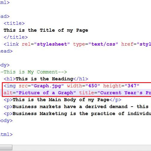
Example: <img src="beautiful-photography.jpg" alt="A high-resolution photograph of a misty mountain range at sunrise." width="800" height="500">
Sizing and Display: width, height, and Best Practices
The width and height attributes allow you to specify the dimensions of your image directly within the <img> tag. These values are typically given in pixels (e.g., width="400", height="300") but can also be percentages in HTML5 (though CSS is generally preferred for percentage-based sizing).
Specifying Dimensions in HTML:
<img src="abstract-art.png" alt="An abstract digital art piece with swirling colors." width="600" height="400">
The primary benefit of specifying width and height in HTML is to prevent layout shifts. When a browser loads an HTML page, it starts rendering content as soon as it receives the HTML. If image dimensions aren’t specified, the browser leaves space for the image but only allocates its final size once the image file itself has downloaded. This can cause surrounding content (like text or other elements) to jump around as images load, leading to a jarring user experience. By providing dimensions, the browser can reserve the correct amount of space from the outset, ensuring a smoother loading process.
The Pitfalls of HTML Resizing and the Power of Pre-Optimization:
While you can use width and height to force an image to display at a different size than its original dimensions, this is generally not recommended for resizing. If you display a very large image (e.g., 2000px wide) at a much smaller size (e.g., 200px wide) using HTML attributes, the user’s browser still has to download the entire large file. This wastes bandwidth, slows down page loading, and can make your site feel sluggish, especially on mobile devices or slow internet connections. Furthermore, scaling images up or down excessively in HTML can lead to pixelation or a blurry appearance.
Best Practice for Digital Photography and Aesthetic Images: For optimal performance and visual quality, always pre-optimize and resize your images using image editing software (or an online image tool like a compressor or optimizer) to their intended display size before uploading them to your website. This ensures that users only download the necessary data, maintaining crisp image quality and improving your site’s overall speed and SEO. When dealing with high-resolution photography, this step is particularly critical. Consider using image tools for converting formats, compressing files, or even AI upscalers to ensure your visuals are perfectly prepared for the web.
Beyond the Basics: Advanced Image Integration & Semantic Markup
Once you’ve mastered the fundamentals, you can explore more sophisticated ways to integrate images, making them interactive, semantically meaningful, and better organized within your web content.
Making Images Interactive: The Art of Image Linking
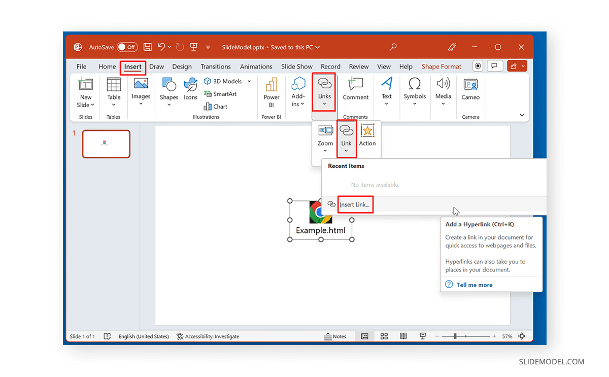
Images often serve as more than just static visuals; they can be powerful interactive elements, guiding users to other parts of your website or external resources. Turning an image into a clickable link is straightforward by nesting the <img> tag inside an <a> (anchor) tag.
Turning an Image into a Clickable Element:
The <a> tag requires an href attribute, which specifies the destination URL.
<a href="https://www.Tophinhanhdep.com/our-gallery.html"><img src="trending-styles-thumbnail.jpg" alt="Explore our gallery of trending photography styles." width="250" height="150"></a>
In this example, clicking the trending-styles-thumbnail.jpg image will navigate the user to https://www.Tophinhanhdep.com/our-gallery.html. This is particularly useful for creating visual navigation, showcasing product images that link to detail pages, or integrating social media icons. Remember to ensure your alt text for linked images is descriptive of both the image and its link destination for optimal accessibility.
Grouping Images with Context: The <figure> and <figcaption> Elements
While you can place an <img> tag anywhere, sometimes an image needs to be explicitly associated with a caption or descriptive text. This is where the <figure> and <figcaption> elements come into play. These semantic HTML5 tags provide a structured way to group media content (like images, code snippets, charts, or videos) with their captions, enhancing both readability and accessibility.
Adding Semantic Captions for Better Understanding:
The <figure> element acts as a self-contained unit of content, typically referenced as a single unit from the main flow of the document. The <figcaption> element provides the caption for the <figure>.
Example:
<figure>
  <img src="nature-wallpaper.jpg" alt="A serene mountain lake reflecting the sunrise, ideal for a desktop wallpaper." width="800" height="600">
  <figcaption>Sunrise over Lake Serenity: A moment of peace in nature's embrace. Perfect for desktop backgrounds.</figcaption>
</figure>
Using <figure> and <figcaption> semantically links the image with its caption. This is beneficial for:
- Accessibility: Screen readers can announce the image and its associated caption together, providing a complete context.
- SEO: Search engines can better understand the relationship between your images and their textual descriptions.
- Visual Design: It provides a clear structural hook for styling, allowing designers to apply consistent aesthetic treatments to all figures and captions. This is especially useful for thematic collections or mood boards on your site.
Choosing the Right Image Format: Quality vs. Performance
The file format you choose for your images significantly impacts both their visual quality and loading performance. Understanding the strengths of each format is key to optimizing your website’s visual content.
- JPEG/JPG (Joint Photographic Experts Group): Best for complex, full-color digital photography, wallpapers, and backgrounds. JPEGs use “lossy” compression, meaning some data is discarded to achieve smaller file sizes. This is excellent for photos where slight data loss is imperceptible to the human eye, but bad for images with sharp lines or text.
- PNG (Portable Network Graphics): Ideal for images requiring transparency (like logos or graphic design elements) or images with sharp lines, text, and few colors (like screenshots or digital art with flat color areas). PNGs use “lossless” compression, preserving all image data, which results in higher quality but generally larger file sizes than JPEGs for photos.
- GIF (Graphics Interchange Format): Suitable for simple animations and images with a very limited color palette (up to 256 colors). GIFs also support transparency, but it’s not as sophisticated as PNG’s alpha channel. Rarely used for static images due to larger file sizes compared to JPEGs or PNGs for similar quality.
- SVG (Scalable Vector Graphics): A vector-based format perfect for logos, icons, and illustrations. SVGs are resolution-independent, meaning they scale perfectly to any size without losing quality or becoming pixelated. They are text-based files, making them small and highly optimizable. Essential for crisp graphic design elements across all devices.
- WebP (pronounced “weppy”): A modern image format developed by Google that offers superior lossless and lossy compression for images on the web. WebP images are often significantly smaller than JPEGs or PNGs while maintaining comparable (or even better) visual quality. It’s increasingly supported across browsers and is an excellent choice for optimizing all types of images for fast loading.
By selecting the appropriate format for each image, you can strike a balance between high-resolution visuals and efficient web performance, contributing to a better user experience and higher search engine rankings.
Dynamic Visuals: Leveraging CSS for Background Images
While the <img> tag is perfect for content-based images that carry semantic meaning (like a product photo or a key piece of photography), CSS offers a powerful and flexible way to integrate images for purely decorative purposes. This is where you bring your wallpapers, aesthetic backgrounds, and visual design ideas to life without cluttering your HTML.
Setting Background Images with Internal and External Stylesheets
The background-image CSS property is used to apply one or more background images to an element. This can be applied to almost any HTML element, such as the <body> for a full-page background, or a <div> for a specific section.
The background-image Property:
The basic syntax involves specifying the URL to your image:
body {
  background-image: url('https://www.Tophinhanhdep.com/backgrounds/aesthetic-wallpaper.jpg');
}
This CSS rule, when applied, would set the aesthetic-wallpaper.jpg as the background for the entire web page.
Internal vs. External CSS for Visual Design:
- Internal Stylesheets: You can embed CSS rules directly within the
<style>tags in the<head>section of your HTML document. This is suitable for single-page sites or small projects where styles are localized.<head> <style> .hero-section { background-image: url('images/hero-background.jpg'); background-size: cover; height: 500px; } </style> </head> <body> <div class="hero-section"> <!-- Content for your hero section --> </div> </body> - External Stylesheets: For larger websites and more complex visual designs, using an external CSS file (e.g.,
style.css) is the best practice. This separates your structural HTML from your presentational CSS, making your code cleaner, easier to maintain, and more efficient (as the CSS file can be cached by browsers).<head> <link rel="stylesheet" href="style.css"> </head>/* In style.css */ body { background-image: url('backgrounds/nature-abstract.jpg'); background-size: cover; background-position: center; background-repeat: no-repeat; }
External stylesheets are particularly valuable for managing consistent branding and thematic collections across multiple pages, allowing you to update a visual style in one place and have it apply site-wide.
Controlling Display and Responsiveness: background-size, position, and repeat
Once you’ve set a background image, CSS offers a suite of properties to control how it appears, ensuring it fits your visual design and responds gracefully across different screen sizes.
background-size: This property controls the size of the background image.cover: Scales the image to cover the entire container, potentially cropping parts of the image. Ideal for full-page wallpapers and responsive backgrounds.contain: Scales the image to fit within the container, ensuring the entire image is visible. May leave empty space (letterboxing).auto: Uses the image’s natural dimensions.- Specific values (e.g.,
50%,200px): Sets the size explicitly.
background-position: Determines the initial position of the background image within its container.- Keywords:
top,bottom,left,right,center. - Percentages:
50% 50%is equivalent tocenter. - Units:
20px 30px.
- Keywords:
background-repeat: Controls whether and how the background image repeats.no-repeat: Displays the image once.repeat: Repeats the image both horizontally and vertically (default).repeat-x: Repeats horizontally only.repeat-y: Repeats vertically only.
Creating Engaging Backgrounds and Ensuring Images Look Good on All Devices: A common pattern for responsive, full-screen background images is:
body {
  background-image: url('backgrounds/high-resolution-scenery.jpg');
  background-size: cover;       /* Ensures image covers entire viewport */
  background-position: center;  /* Centers the image */
  background-repeat: no-repeat; /* Prevents tiling */
  background-attachment: fixed; /* Keeps image fixed during scroll (parallax effect) */
}
For more complex responsive behaviors, especially when images contain critical details, you might employ CSS @media queries to serve different background images or adjust their properties based on screen size:
/* Default for larger screens */
.main-banner {
  background-image: url('banners/beautiful-photography-desktop.jpg');
}

/* For smaller screens */
@media (max-width: 768px) {
  .main-banner {
    background-image: url('banners/beautiful-photography-mobile.jpg');
    background-size: contain; /* Or another suitable size */
  }
}
Advanced Background Techniques: Gradients and Video Backgrounds
CSS background-image is incredibly versatile, supporting not just single images but also combinations and other visual effects:
- Gradient Overlays: You can layer gradients over background images to improve text readability or add stylistic flair.
This example adds a semi-transparent black overlay to a background image, making any overlaid text easier to read, especially useful for emotionally impactful or dramatic visuals.
.overlay-effect { background-image: linear-gradient(rgba(0,0,0,0.5), rgba(0,0,0,0.5)), url('backgrounds/sad-emotional-image.jpg'); background-size: cover; /* other background properties */ } - Video Backgrounds: While not strictly a
background-imageproperty, HTML5’s<video>element can be positioned and styled with CSS to create engaging full-screen video backgrounds. This adds a dynamic layer to your visual design but requires careful optimization for performance.
Image Management and Ethical Considerations: A Responsible Approach
Integrating images into your website goes beyond just coding; it involves responsible sourcing, ethical usage, and smart optimization to ensure your site is high-performing, legally compliant, and respectful of creators.
Understanding Image Licensing: Copyright, Permissive Use, and Public Domain
Every image you find online is governed by some form of license, whether explicitly stated or implied by copyright law. Understanding these licenses is critical to avoid legal issues.
- All Rights Reserved (Copyright): By default, most original creative works, including digital photography and digital art, are protected by copyright, meaning the creator (or publisher) holds exclusive rights to its use. To use such images, you typically need to:
- Obtain explicit written permission from the copyright holder.
- Purchase a license (e.g., royalty-free or rights-managed from stock photo sites).
- Ensure your use falls under “fair use” or “fair dealing” in your jurisdiction, which is often complex and subject to interpretation.
- Permissive Licenses (e.g., Creative Commons, MIT, BSD): These licenses allow more freedom but often come with conditions. Creative Commons (CC) licenses, for example, might require:
- Attribution (crediting the creator).
- Non-commercial use (not for profit).
- No derivatives (no modifications).
- Share Alike (derivative works must be shared under the same license). Always check the specific terms of the license. Many stock photo sites (like Unsplash, Pixabay, Pexels) offer images under permissive licenses, making them excellent sources for high-resolution photography and creative ideas.
- Public Domain / CC0: Works in the public domain have no copyright restrictions and can be used freely without permission or conditions. CC0 is a Creative Commons license specifically designed to waive all copyright. When using public domain images, it’s wise to retain proof of their public domain status for your records.
The Golden Rule: Never Hotlink Without Permission: As mentioned earlier, directly linking to an image on someone else’s server (hotlinking) is unethical and potentially illegal. Always download the image (if licensed for use), upload it to your own server, and then link to your hosted version. Tophinhanhdep.com advocates for respectful and legal image usage.
Optimizing Images for Web Performance: Speed and User Experience
Fast loading times are paramount for user experience and SEO. Large, unoptimized images are a common culprit for slow websites. Effective image optimization can drastically improve your site’s speed.
Tools and Techniques for Efficient Image Delivery:
- Compression: Reduce file size without significant loss of quality. Use image tools like online compressors (TinyPNG, ImageOptim) or features within graphic design software.
- Format Selection: Choose the right format (JPEG for photos, PNG for transparency/graphics, SVG for vectors, WebP for modern efficiency).
- Responsive Images: Implement
<picture>elements orsrcsetattributes to serve different image versions based on screen size and resolution, ensuring users download only what they need. - Lazy Loading: Defer loading images until they are about to enter the user’s viewport, improving initial page load times. This can be achieved with HTML’s
loading="lazy"attribute or JavaScript libraries. - CDN (Content Delivery Network): For larger sites, a CDN can distribute your images across multiple servers globally, delivering them faster to users based on their geographic location.
By diligently applying these optimization techniques, you ensure that your beautiful photography, aesthetic visuals, and creative ideas load quickly and seamlessly, contributing to an outstanding user experience and stronger website performance.
In conclusion, integrating images into HTML is a fundamental aspect of modern web development, bridging the gap between functional code and captivating visual design. By mastering the <img> tag, understanding image paths, leveraging semantic elements like <figure>, and harnessing the power of CSS for decorative backgrounds, you equip yourself with the tools to create engaging and accessible web experiences. Always remember the importance of image optimization, ethical licensing, and choosing the right formats to balance stunning visuals with exceptional performance. With these practices, your website will not only look visually appealing but also provide a smooth and enjoyable journey for every visitor, showcasing your dedication to both craft and user satisfaction.