Mastering Image Resizing in HTML for Optimal Visuals on Tophinhanhdep.com

In today’s visually-driven digital landscape, images are the cornerstone of engaging web experiences. From stunning wallpapers and aesthetic backgrounds to high-resolution photography and intricate digital art, Tophinhanhdep.com understands that every pixel counts. However, simply uploading beautiful images isn’t enough; how these images are presented on your website dramatically impacts both user experience and site performance. One of the most fundamental yet often misunderstood aspects of web development is image resizing, particularly when using HTML.
While HTML offers straightforward methods for adjusting image dimensions, a deeper understanding of these techniques, coupled with modern optimization strategies, is crucial. Improper resizing can lead to pixelated photography, slow loading times, and a diminished visual impact for your carefully curated “Image Collections” and “Creative Ideas.” This comprehensive guide will delve into the various ways to resize images in HTML, expose the critical downsides of relying solely on client-side adjustments, and ultimately reveal how Tophinhanhdep.com empowers you to serve perfectly optimized images that captivate your audience without compromise. We’ll explore techniques that ensure your “Nature,” “Abstract,” and “Sad/Emotional” images retain their intended quality and emotional depth, regardless of screen size.

Fundamental HTML Approaches to Image Resizing
The most basic methods for resizing images in HTML involve direct manipulation within the <img> tag itself or using inline CSS. These approaches offer immediate control over an image’s displayed dimensions, making them popular for quick adjustments. However, it’s vital to understand their underlying mechanics and inherent limitations.
Direct width and height Attributes
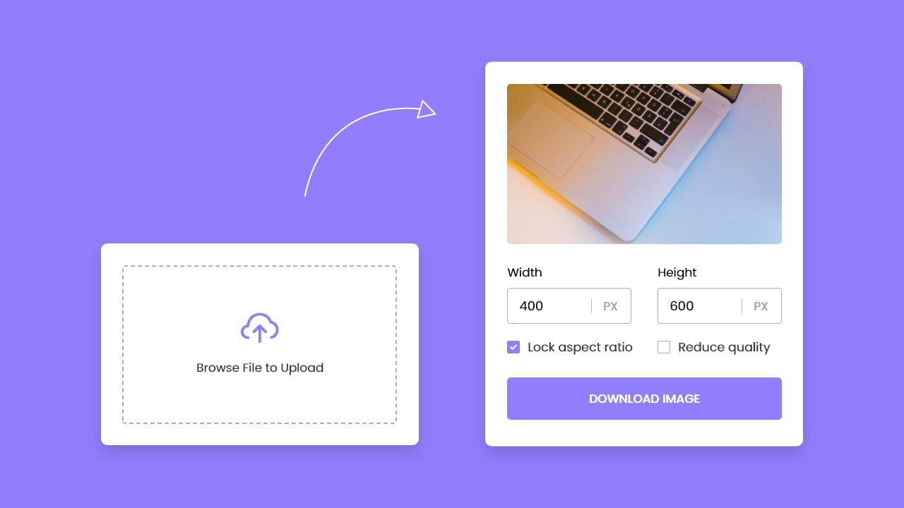
The simplest way to resize an image directly in HTML is by utilizing the width and height attributes within the <img> tag. These attributes allow you to explicitly define the dimensions in pixels, dictating how the browser should render the image. For instance, if you have an image and want it to display at 400 pixels wide and 500 pixels high, your HTML code would look like this:
<img src="https://example.com/your-beautiful-image.jpg"
     width="400"
     height="500"
     alt="A stunning piece of digital art from Tophinhanhdep.com" />
In this example, the browser takes the original image and scales it to fit these specified dimensions. This might involve downscaling a larger image or even upscaling a smaller one. While seemingly convenient, it’s important to note that if the width and height values do not match the original image’s aspect ratio, the image will be stretched or compressed, leading to visual distortion. For “Beautiful Photography” or any image where “Aesthetic” appeal is paramount, this distortion can severely detract from the intended visual design. In HTML5, these values are always interpreted as pixels, offering consistent sizing across different display contexts.
Inline CSS with the style Attribute
For slightly more control over individual images or when you need to override existing styling, you can use the style attribute directly within the <img> tag to apply inline CSS. This method allows you to define width and height (and other CSS properties) on a per-image basis, without affecting other images or requiring external stylesheets.
Here’s an example:
<img src="https://example.com/another-masterpiece.jpg"
     style="width:500px;height:600px;"
     alt="An abstract background from Tophinhanhdep.com" />
This inline CSS directly instructs the browser to display the image at 500 pixels wide and 600 pixels high. The style attribute has a high specificity, meaning it will override most other styling rules applied to that particular <img> element. This can be useful for unique instances, such as a specific “Wallpaper” or “Background” image that requires precise sizing within a complex layout.
However, similar to direct HTML attributes, this method only changes the display size of the image; it does not alter the actual file size. The original, full-resolution image is still downloaded by the user’s browser, which can have significant performance implications, as we will discuss in detail later. While quick for visual adjustments, relying heavily on inline styles for resizing can also make your HTML code cluttered and harder to maintain, especially for extensive “Image Collections.”
Elevating Visuals with CSS for Responsive Image Control
While direct HTML attributes and inline styles offer basic image resizing, CSS provides more sophisticated tools for achieving responsive, aesthetically pleasing images that adapt beautifully across diverse devices and screen sizes. This is essential for delivering an optimal experience when showcasing “High Resolution” and “Digital Photography” from Tophinhanhdep.com.
Preserving Aspect Ratio for Aesthetic Integrity
Maintaining the original aspect ratio is crucial for the “Aesthetic” integrity of “Beautiful Photography” and “Digital Art.” When both width and height are explicitly set (either via HTML attributes or CSS), there’s a risk of distorting the image if the specified dimensions don’t match the original ratio. CSS offers elegant solutions to prevent this:
One common and effective technique is to specify only one dimension (either width or height) and set the other to auto. For example:
img {
    width: 400px; /* Sets a fixed width */
    height: auto; /* Adjusts height proportionally */
}
This approach tells the browser to make the image 400 pixels wide and then automatically calculate the corresponding height to maintain the image’s original proportions. This ensures that your “Nature” photography or “Abstract” designs never appear stretched or squashed.
For creating truly responsive images that adjust dynamically to the user’s screen or containing element, percentages are invaluable:
img {
    width: 100%; /* Image takes 100% of its parent's width */
    height: auto; /* Height adjusts automatically */
}
By setting width: 100%, the image will scale up or down to match the width of its parent element. While this makes the image responsive, caution is needed: if the image scales up beyond its original resolution, it can result in a blurred or pixelated appearance, severely undermining the quality of “High Resolution” images.
A safer and often preferred responsive strategy is to use max-width:
img {
    max-width: 100%; /* Image scales down if larger than its container, but never scales up beyond its original size */
    height: auto;
}
With max-width: 100%, the image will shrink if its container is smaller than its original width, but it will never enlarge beyond its intrinsic dimensions. This is ideal for preventing quality degradation and ensuring that your “Beautiful Photography” always looks sharp, even on smaller screens. This method is a cornerstone of effective “Visual Design” for the modern web.
Advanced Cropping and Fitting with object-fit and Background Images
Sometimes, simply resizing isn’t enough; you need to precisely control how an image fits into a designated area, potentially cropping it or ensuring it entirely covers a space while preserving its aspect ratio. CSS provides powerful properties for these advanced scenarios, crucial for dynamic “Visual Design” and impactful “Backgrounds.”
The object-fit CSS property, applied directly to the <img> element, dictates how the image’s content should be resized to fit its container. This property offers fine-grained control that was previously only achievable with background images or complex JavaScript. It’s particularly useful for image galleries, user profiles, or any layout where images need to conform to specific, fixed dimensions without distortion or awkward empty spaces.
Here are its primary values:
object-fit: contain;: The image is scaled down (or up) to fit within the container while maintaining its aspect ratio. The entire image will be visible, but there might be empty space (letterboxing) around it if the container’s aspect ratio differs from the image’s. This is excellent for ensuring full visibility of “Digital Art” pieces.object-fit: cover;: The image is scaled to completely fill the container, maintaining its aspect ratio. Any parts of the image that overflow the container are clipped. This creates a visually impactful effect, perfect for “Wallpapers” or hero sections where the image needs to cover the entire area, even if some parts are cropped.object-fit: fill;: This is the default behavior. The image is stretched or squashed to fill the container’s dimensions completely, ignoring its aspect ratio. This can lead to significant distortion and is generally avoided for “Beautiful Photography.”object-fit: none;: The image is not resized at all. It retains its original size and is positioned within the container, with any overflow being clipped.object-fit: scale-down;: The image is displayed at the smaller size of eithernoneorcontain. This ensures the image is never displayed larger than its original size, preventing blurriness, while also fitting it within the container if it’s smaller.
When object-fit: cover; is used, parts of the image might be cropped. To control which part of the image remains visible, you can use the object-position property. For example, object-position: right; would ensure the right side of your image is visible within the cropped container, which is invaluable for focusing on specific subjects in “Nature” or “Sad/Emotional” photography.
Beyond <img> tags, background images offer another robust way to incorporate visuals into specific container areas, often used for “Backgrounds” or thematic sections. The background-image CSS property allows you to apply an image to any HTML element, and then control its resizing and positioning with related properties:
background-size: Similar toobject-fit, this property defines how the background image should be sized. Values likecoverandcontainbehave similarly, ensuring the image fills or fits within the element, respectively. You can also specify exact lengths or percentages (e.g.,background-size: 100% auto;).background-position: Controls the starting position of the background image within the element (e.g.,center,top left,20% 50%).background-repeat: Determines if the image should repeat (e.g.,no-repeatfor a single image,repeat-xfor horizontal tiling).
These advanced CSS techniques are fundamental for creating dynamic, visually rich, and responsive web layouts that truly do justice to the “High Resolution” and “Beautiful Photography” available on Tophinhanhdep.com, all while maintaining precise “Visual Design” aesthetics.
The Critical Downsides of Browser-Side Resizing
While HTML and CSS provide seemingly convenient ways to resize images, relying solely on client-side (browser-based) resizing is a practice fraught with significant drawbacks. These issues directly undermine the goals of Tophinhanhdep.com, which strives to offer “High Resolution,” “Beautiful Photography,” and an optimal user experience. Understanding these limitations is critical to appreciating the value of robust “Image Tools” and server-side optimization.
Performance Impact and Bandwidth Wastage
The most glaring problem with browser-side image resizing is its detrimental impact on web performance. When you set width and height attributes in HTML or CSS for an image, the browser still downloads the entire original image file, regardless of how small it’s displayed on the screen.
Consider a scenario where you have a “High Resolution” image, say a 4MB photograph captured by a professional, intended for a stunning desktop “Wallpaper.” If you display this image as a 200px thumbnail on a mobile device, the user’s browser will still download the full 4MB file before it can scale it down. This leads to:
- Slower Page Loading: Large image files are bandwidth-intensive. Downloading unoptimized images significantly increases the overall page load time. This is particularly problematic for users on slower internet connections or limited mobile data plans, directly leading to a frustrating user experience.
- Bandwidth Wastage: You, as the website owner, pay for the bandwidth consumed to serve these unnecessarily large files. Your users also pay, either through data limits or slower loading, which can deter them from exploring more of your “Image Collections.” This is inefficient and costly for everyone involved.
- Increased Time to First Paint (TFP) and Largest Contentful Paint (LCP): These critical web performance metrics suffer because the browser has to download and then process a massive amount of data before displaying the primary visual content. This delay impacts user engagement and search engine rankings.
For a platform like Tophinhanhdep.com, which is built around showcasing “Beautiful Photography” and extensive “Image Collections,” neglecting server-side optimization can lead to a significant drop in user satisfaction and potential abandonment.
Compromised Image Quality
Another severe downside of browser-side resizing is the potential for significant degradation in image quality. The algorithms used by web browsers to scale images (both up and down) are often optimized for speed rather than pristine visual fidelity.
- Blurriness and Pixelation: When a large “High Resolution” image is significantly downscaled by the browser, subtle details can become blurry or lost. Conversely, if a small image (e.g., a “Digital Art” thumbnail) is upscaled by the browser to fit a larger display area, it will inevitably become noticeably pixelated and fuzzy. This directly contradicts the artistic intent behind “Aesthetic” or “Nature” photography.
- Inconsistent Rendering: Different browsers and operating systems may employ varying scaling algorithms, leading to inconsistencies in how your images appear across different user agents. This lack of control makes it difficult to ensure a uniform “Visual Design” experience.
- The Golden Rule: Never Upscale Raster Images: Raster image formats like JPEG, PNG, WebP, and AVIF are composed of pixels. When upscaled, new pixels must be invented, leading to a loss of sharpness and clarity. While vector formats (SVG) are ideal for icons and graphics that need to scale without loss of quality, attempting to upscale a standard photo in the browser will always result in a suboptimal, often blurry, output. This is a critical consideration for maintaining the quality of your “Beautiful Photography.”
Resource Consumption on Client Devices
Finally, the act of resizing large images locally in the browser consumes precious client-side resources.
- Increased CPU and Memory Usage: Processing and scaling large image files is a computationally intensive task. When a user’s browser has to perform this operation for numerous images on a page, it consumes more CPU and memory, especially on less powerful devices like older smartphones or tablets.
- Degraded User Experience: This increased resource consumption can lead to a sluggish browsing experience. Pages may render slowly, scrolling might become choppy, and the overall responsiveness of the website can decrease. For “Sad/Emotional” or “Abstract” galleries where immersion is key, such performance hitches can disrupt the user’s connection with the content.
These critical downsides highlight that while HTML and CSS provide the mechanism for resizing, they are not the solution for optimal image delivery on the modern web. For Tophinhanhdep.com to truly excel in showcasing “High Resolution” images and “Beautiful Photography,” a more robust, server-side approach is indispensable.
The Tophinhanhdep.com Solution: Server-Side Image Optimization
Recognizing the inherent limitations and critical downsides of browser-side image resizing, Tophinhanhdep.com champions a powerful and efficient solution: server-side image optimization. This approach ensures that every image, whether a captivating “Wallpaper,” a detailed piece of “Digital Photography,” or an evocative “Aesthetic” background, is delivered in its optimal size and format, enhancing both visual quality and web performance.
The Smart Approach to Image Delivery
The cornerstone of Tophinhanhdep.com’s strategy is to serve already optimized and correctly sized images directly from the server. This fundamental shift eliminates the need for browsers to download massive original files and then perform resource-intensive resizing. Instead, users receive precisely the image they need, perfectly tailored for their specific device and display context.
Tophinhanhdep.com leverages its advanced Image Tools—including high-performance Converters, Compressors, and Optimizers, alongside cutting-edge AI Upscalers—to achieve this. Instead of a one-size-fits-all approach, images are dynamically transformed on the fly, just moments before they are delivered to the user.
Imagine you upload a stunning “High Resolution” photograph to Tophinhanhdep.com. When a user requests that image, Tophinhanhdep.com’s system processes it, using URL parameters to define the exact required dimensions, quality, and format. For example, a request might look something like this (conceptual URL, replacing specific service syntax):
https://tophinhanhdep.com/images/nature-sunset.jpg?width=400&height=auto&format=webp
This URL tells Tophinhanhdep.com to:
- Fetch
nature-sunset.jpg. - Resize it to 400 pixels wide, maintaining its aspect ratio (
height=auto). - Convert it to the next-gen WebP format for maximum compression without sacrificing quality.
The benefits of this dynamic, server-side approach are transformative:
- Significantly Reduced Bandwidth Usage: Only the necessary data is transferred, drastically cutting down on bandwidth costs for Tophinhanhdep.com and saving data for users.
- Blazing-Fast Image Loading: Smaller, optimized files load almost instantly, leading to faster page renders and a seamless browsing experience. This is crucial for keeping visitors engaged with our “Image Inspiration & Collections.”
- Superior Image Quality: Images are processed with sophisticated, high-quality algorithms on powerful servers, ensuring that scaling (especially downscaling) results in crisp, clear visuals without blurriness or pixelation. For images in categories like “Nature,” “Abstract,” or “Beautiful Photography,” maintaining this pristine quality is paramount.
- Enhanced Performance Metrics: Improved loading speeds directly contribute to better core web vitals, which are essential for SEO and overall site health.
Furthermore, Tophinhanhdep.com’s commitment to cutting-edge technology includes automatically serving images in next-gen formats like WebP or AVIF wherever supported. These formats offer superior compression ratios compared to traditional JPEGs and PNGs, translating into even greater bandwidth savings and faster load times without compromising the rich detail of your “Digital Photography.” This empowers content creators to upload their “High Resolution” originals, confident that Tophinhanhdep.com will handle the complex optimization process, allowing their “Creative Ideas” to shine without performance bottlenecks.
Ensuring Consistent Quality Across All Devices
Beyond raw speed and efficiency, Tophinhanhdep.com’s server-side optimization is engineered to guarantee a consistent and high-quality visual experience across the entire spectrum of user devices. Whether someone is viewing a majestic “Wallpaper” on a large desktop monitor, an “Aesthetic” background on a tablet, or “Sad/Emotional” photography on a small smartphone screen, the image will always be perfectly adapted.
Our system intelligently supports responsive images by dynamically generating and delivering multiple versions of an image, often in conjunction with HTML’s srcset and sizes attributes. This means that a mobile user will automatically receive a smaller, lighter version of an image, while a desktop user with a high-resolution display will get a larger, more detailed version – all without manual intervention. This eliminates the potential for blurriness that arises from browser upscaling or the bandwidth waste from serving oversized images to mobile devices.
Moreover, Tophinhanhdep.com’s advanced tools integrate intelligent cropping features, similar to conceptual ‘auto-gravity’ functionalities. For a “Digital Photography” shot with a clear focal point, our systems can identify and prioritize that subject, ensuring it remains perfectly framed even when the image is cropped to fit a specific layout. This is invaluable for maintaining the artistic integrity and communicative power of an image, allowing specific elements in your “Visual Design” to capture attention.
By adopting this comprehensive server-side approach, Tophinhanhdep.com transcends the limitations of traditional HTML resizing. We provide a platform where “High Resolution” images and “Beautiful Photography” can be uploaded once and then automatically optimized for every conceivable viewing context. This empowers our users, from casual browsers seeking “Image Inspiration” to professional designers curating “Thematic Collections,” to enjoy a truly optimized, visually stunning, and performant web experience.
Conclusion
Effective image resizing is far more than a technical detail; it is a critical component of delivering an outstanding online experience, especially for a platform dedicated to visual excellence like Tophinhanhdep.com. While basic HTML attributes and CSS properties offer straightforward ways to adjust image display sizes, relying solely on these client-side methods introduces significant performance bottlenecks, leads to compromised image quality, and wastes valuable bandwidth and device resources. The allure of quick fixes with width, height, or object-fit quickly fades when confronted with blurry “Photography,” slow-loading “Wallpapers,” and choppy browsing experiences.
At Tophinhanhdep.com, we recognize that every “High Resolution” image, “Aesthetic” design, and “Beautiful Photography” piece deserves to be presented flawlessly. Our commitment to optimal visual delivery means moving beyond the limitations of browser-side resizing. By embracing advanced, server-side image optimization tools—including intelligent converters, compressors, and dynamic resizing capabilities—Tophinhanhdep.com ensures that every image is precisely tailored for its viewing context. This guarantees lightning-fast loading, pristine visual fidelity, and a seamless responsive design, from the most intricate “Digital Art” to expansive “Nature” landscapes.
Ultimately, Tophinhanhdep.com empowers you to focus on the “Creative Ideas” and “Image Inspiration” that drive your content, confident that the technical complexities of image optimization are expertly handled. We transform your raw “High Resolution” uploads into perfectly optimized assets, delivering stunning visuals without compromise, and ensuring that your “Image Collections” always leave a lasting, positive impression on every visitor.