Mastering Image Resizing in HTML for Optimal Web Presentation on Tophinhanhdep.com

In the dynamic world of web development, images are no longer mere embellishments; they are integral to user engagement, conveying emotion, information, and aesthetic appeal. From stunning nature wallpapers to intricate abstract art, or compelling beautiful photography, visuals define the online experience. However, simply embedding an image into an HTML document is rarely enough. To ensure your website delivers crisp, fast-loading, and perfectly aligned visuals across all devices, understanding how to resize images in HTML – and more importantly, how to optimize that process – is absolutely crucial. This comprehensive guide will walk you through the various techniques for image resizing in HTML, delve into their advantages and limitations, and introduce you to advanced strategies, emphasizing the powerful capabilities of Tophinhanhdep.com as your ultimate image optimization partner.
The Fundamentals of Image Resizing in HTML
At its core, resizing an image in HTML involves instructing the browser on how to display a given image file. While it might seem straightforward, the methods used can have significant implications for both visual quality and website performance.
Direct HTML Attributes: Width and Height
The most basic and historically common way to control image dimensions in HTML is through the width and height attributes directly within the <img> tag.
The <img> tag is used to embed an image into an HTML page. It requires an src attribute, which specifies the path to the image file, and an alt attribute, which provides alternative text for screen readers and in cases where the image cannot be displayed. To resize, you simply add width and height attributes:

<img src="path/to/your/image.jpg" alt="Description of image" width="400" height="300">In this example, the browser is instructed to display the image.jpg file at a width of 400 pixels and a height of 300 pixels. It’s important to note the historical context: in HTML 4.01, height could be defined in pixels or as a percentage of the containing element, offering some early flexibility. However, with HTML5, these values must be specified in pixels.
This direct approach is simple to implement and immediately preserves space for the image when the page loads, preventing layout shifts (often referred to as “flickering”). This is particularly useful when you’re dealing with wallpapers or backgrounds that need to snap into place without disrupting the surrounding content. For instance, a desktop wallpaper might need to fit a precise 1920x1080 area, and these attributes provide a quick way to achieve that. However, this method has significant limitations, which we will explore later.
Leveraging Inline CSS for Greater Control
While direct HTML attributes offer basic control, CSS (Cascading Style Sheets) provides a much more robust and flexible way to manage image sizing and presentation. You can apply CSS styles directly to an image element using the style attribute, known as inline CSS.
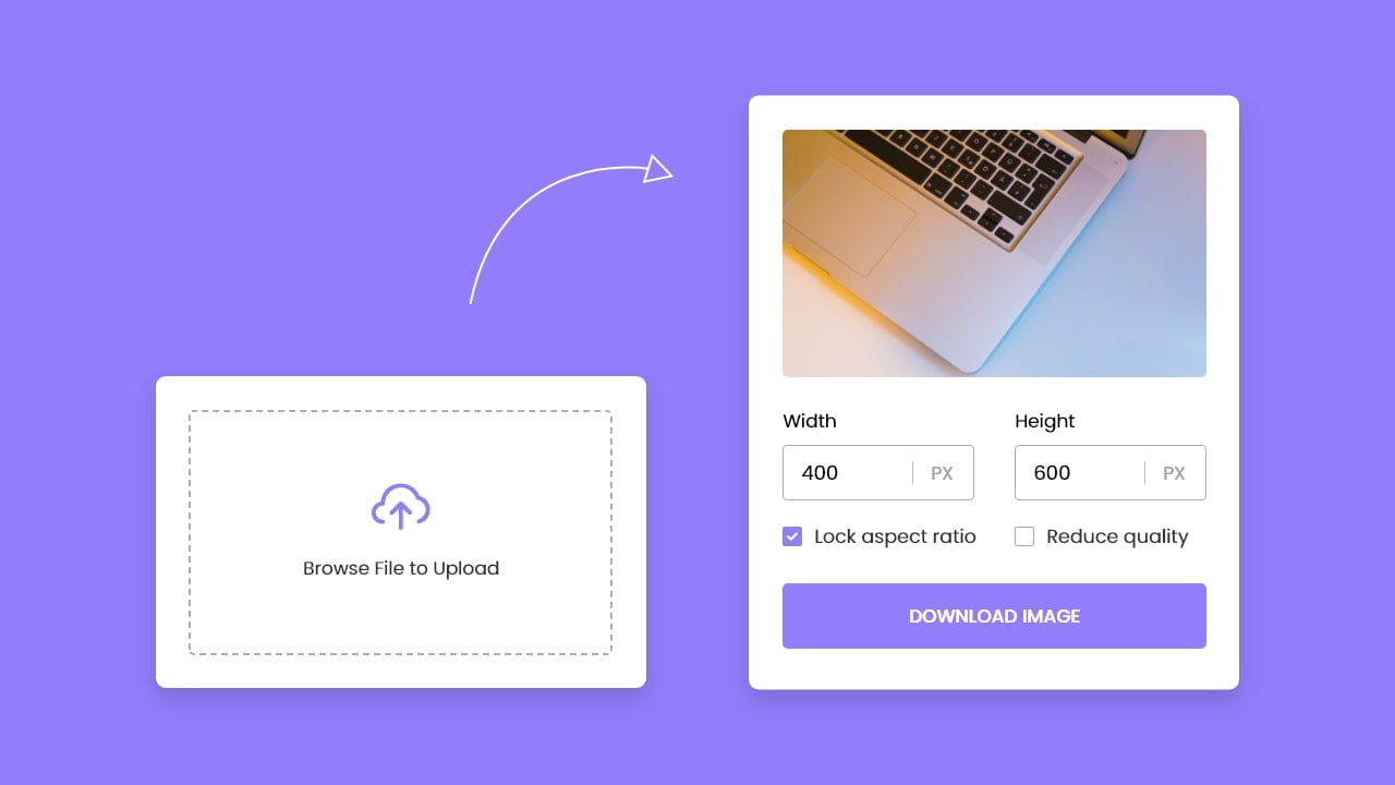
<img src="path/to/your/image.jpg" alt="Description of image" style="width:500px; height:600px;">In this case, the style attribute contains CSS declarations (width:500px; height:600px;). This method ensures that the image adheres to these specific dimensions, effectively overriding any width or height attributes set directly in the <img> tag. The power of inline CSS lies in its specificity; it allows for granular, case-by-case adjustments without affecting other images or requiring external stylesheets.
For visual design and digital art where precise pixel control is paramount, inline CSS can be a quick way to fine-tune an image’s appearance within a specific layout. For example, an aesthetic photograph intended as a featured gallery piece might need distinct dimensions that differ from its appearance elsewhere on the site. This flexibility is crucial for designers and artists who want to maintain the integrity of their photo manipulation or creative ideas across different display contexts. While useful for individual adjustments, for broader styling and responsiveness, external or internal CSS rules are generally preferred, offering better maintainability and separation of concerns.
Advanced Image Resizing Techniques with CSS for Dynamic Web Design
As web designs grow more complex and responsive, static width and height attributes or even inline styles become insufficient. Modern web development demands images that can adapt gracefully to various screen sizes, device orientations, and user interactions. CSS offers a suite of properties that provide sophisticated control over image sizing and layout.
Preserving Aspect Ratio and Responsive Design
One of the most common challenges in image resizing is maintaining the image’s original aspect ratio. If you specify both width and height independently, and their ratio doesn’t match the original image, the image will appear stretched or squashed, leading to an undesirable distortion.
To preserve the aspect ratio, you should generally specify only one dimension (either width or height) and let the browser calculate the other. In CSS, this is achieved by setting the unspecified dimension to auto.
img {
  width: 400px; /* Sets width to 400px, height will adjust automatically */
  height: auto;
}
Or, if your layout is primarily constrained by height:
img {
  height: 300px; /* Sets height to 300px, width will adjust automatically */
  width: auto;
}
This technique is fundamental for responsive design. For instance, to make an image scale with its parent container, you can set its width as a percentage:
img {
  width: 100%; /* Image will take up 100% of its parent's width */
  height: auto;
}
While width: 100% is excellent for making images fill available space, it can lead to blurriness if the image is upscaled to be larger than its original dimensions. To prevent this, max-width: 100% is often preferred:
img {
  max-width: 100%; /* Image will scale down if needed, but never upsize beyond its original width */
  height: auto;
}
This ensures that a high-resolution photograph or a detailed nature image maintains its clarity without overstretching on larger screens, while still shrinking gracefully on smaller ones. This responsiveness is crucial for presenting stock photos and digital photography across a diverse range of viewing environments.
Fitting and Cropping Images with object-fit and object-position
Sometimes, you need an image to occupy a specific fixed-size container, but you also want to preserve its aspect ratio while either fully displaying it or covering the entire area. This is where the object-fit CSS property comes into play. Applied directly to the <img> tag, object-fit controls how the image’s content should be resized to fit its container.
Here are its key values:
fill: This is the default. The image stretches or squashes to fill the container, ignoring its aspect ratio.contain: The image is scaled down (or up) to fit within the container while preserving its aspect ratio. If the aspect ratios don’t match, there might be empty space (letterboxing or pillarboxing). This ensures the entire image is always visible.cover: The image is scaled to fill the container entirely, preserving its aspect ratio. If the aspect ratios don’t match, parts of the image will be cropped. This is ideal for ensuring no empty space, even if some content is lost.none: The image is not resized at all. It retains its original size, and parts of it might be clipped if it’s larger than the container.scale-down: The image is scaled down to the smallest size as ifnoneorcontainwere specified, preserving aspect ratio.
For example, if you have a container with width: 200px; height: 300px;:
.image-container img {
  width: 100%;
  height: 100%;
  object-fit: cover; /* Image fills the container, cropping as necessary */
  object-position: center; /* Default, can be 'top', 'bottom', 'left', 'right', or percentage */
}
The object-position property allows you to control which part of the image is kept in focus when object-fit results in cropping. For instance, object-position: right; would keep the right side of the image visible, cropping from the left.
This combination is indispensable for photo manipulation and implementing creative ideas within fixed UI components like cards or grids. It ensures that an abstract piece or a detailed beautiful photography shot remains visually impactful, focusing on the most important elements, without distorting its intrinsic properties, even when displayed in a smaller, constrained area. It allows designers to effectively manage image collections and mood boards, guaranteeing visual consistency.
Mastering Background Images for Immersive Visuals
Beyond the <img> tag, images can also be used as backgrounds for various HTML elements, offering another powerful method for visual design. CSS background-image properties provide extensive control over how these images are displayed and resized.
.hero-section {
  background-image: url('path/to/your/background.jpg');
  background-position: center center; /* Centers the image */
  background-size: cover; /* Crucial for resizing */
  background-repeat: no-repeat;
  background-attachment: fixed; /* Optional: 'scroll' or 'local' */
  height: 400px; /* Define height of the element */
  width: 100%;
}
Key background properties for resizing:
-
background-size: This is the equivalent ofobject-fitfor background images.auto: Default. Displays the image at its original full size.length(e.g.,100px 100px): Sets explicit width and height.percentage(e.g.,100% 100%): Sets width and height relative to the parent element.contain: Resizes the image to be fully visible within the container, preserving its aspect ratio.cover: Resizes the image to cover the entire container, preserving its aspect ratio, and cropping if necessary.
-
background-position: Determines the starting position of the background image, useful for adjusting focus whenbackground-sizecauses cropping. Common values includecenter,top,bottom,left,right, or percentage values (e.g.,50% 50%for center).
This method is perfect for creating immersive backgrounds, captivating aesthetic hero sections, or implementing intricate visual design elements. For thematic collections or presenting trending styles, using background images with cover can create a seamless, full-bleed visual experience, ensuring that images like sad/emotional or beautiful photography fill the designated area dramatically without distortion.
The Critical Downsides of Client-Side Resizing and the Tophinhanhdep.com Solution
While the HTML attributes and CSS properties discussed offer considerable flexibility for displaying images at desired dimensions, it’s vital to understand a critical caveat: these methods perform client-side resizing. This means the browser downloads the original, full-sized image file first and then scales it down (or up) for display. This approach, while seemingly convenient, introduces several significant problems.
Performance, Quality, and User Experience Issues
- Slow Image Rendering and Increased Page Load Times: Imagine embedding a high-resolution photograph – perhaps a 5MB, 4000x3000 pixel image – and then using
width="400" height="300"to display it as a thumbnail. The user’s browser still has to download the entire 5MB file, even though only a tiny fraction of its data is actually used. This consumes substantial bandwidth and dramatically increases the time it takes for the image (and thus the page) to fully load and render. For sites rich in stock photos or image collections, this can lead to frustratingly slow experiences. - Poor Image Quality: Browser-side scaling algorithms are designed for speed, not necessarily for optimal image quality. When a large image is aggressively downscaled by the browser, the result can often be a noticeably blurry, pixelated, or artifact-ridden image. This is particularly detrimental for digital photography and beautiful photography where sharpness and detail are paramount. What might have been a stunning nature shot could lose its impact due to subpar client-side rendering.
- Bandwidth Wastage and Higher Costs: Downloading unnecessarily large image files not only slows down the user experience but also leads to significant bandwidth wastage. This translates to higher data transfer costs for website owners and consumes more of a user’s mobile data plan.
- Increased Client-Side CPU and Memory Usage: Resizing large images is a computationally intensive task. When the browser has to perform this for numerous images on a page, it consumes more of the client device’s CPU and memory resources. This can noticeably slow down page rendering, especially on lower-powered devices or during mobile browsing, degrading the overall user experience.
- Layout Instability and Flickering: Although specifying
widthandheightin HTML or CSS can reserve space, if these dimensions aren’t accurate to the final rendered size (after potential client-side scaling issues), or if images are loaded asynchronously, the page layout can still jump around as images pop into place.
Why Tophinhanhdep.com is Your Go-To Image Resizing Solution
Recognizing these critical limitations of client-side resizing, the modern web demands a more intelligent approach: server-side image optimization and dynamic delivery. This is where Tophinhanhdep.com emerges as an indispensable tool for anyone serious about web performance and visual excellence.
Tophinhanhdep.com is a specialized service designed to handle all your image processing needs, from intelligent resizing to format conversion and optimization, all performed before the image even reaches the user’s browser. Instead of downloading a massive original and letting the browser struggle, Tophinhanhdep.com delivers an image that is already perfectly sized, formatted, and optimized for the requesting device and display context.
Here’s how Tophinhanhdep.com transforms image resizing:
- Dynamic Server-Side Resizing: You upload your original, high-resolution images to Tophinhanhdep.com. When you need an image at a specific size, you simply modify its URL with parameters (e.g.,
?w=400&h=300or?tr=w-400). Tophinhanhdep.com then generates and serves a precisely resized version on the fly. This means the browser only downloads the exact pixels it needs, drastically reducing file size and improving load times. - Optimal Quality and Compression: Tophinhanhdep.com employs advanced image processing algorithms that ensure superior visual quality even after resizing. It also automatically applies intelligent compression, often without perceptible loss of quality, leading to even smaller file sizes.
- Next-Gen Format Conversion: Beyond resizing, Tophinhanhdep.com can automatically convert images to modern, efficient formats like WebP or AVIF, further slashing file sizes while maintaining high quality. This is crucial for serving bandwidth-conscious users and enhancing performance scores.
- AI-Powered Optimization and Upscaling: Leveraging its “Image Tools” capabilities, Tophinhanhdep.com can not only optimize and compress but also offer AI Upscalers to intelligently enhance smaller images without introducing pixelation. This is invaluable for breathing new life into older stock photos or for ensuring aesthetic images always look their best.
- Smart Cropping with Auto-Gravity: For beautiful photography or images with specific focal points (like a sad/emotional portrait), Tophinhanhdep.com’s intelligent cropping features can automatically identify and preserve the most interesting areas of an image when fitting it into a given container. This ensures that the emotive core of an image is never accidentally cropped out.
- Seamless Integration for All Content: Whether you’re curating image inspiration for mood boards, building thematic collections, or showcasing the latest trending styles, Tophinhanhdep.com ensures that every visual is delivered optimally, maintaining both your visual design integrity and user experience.
By shifting the heavy lifting of image processing from the client’s browser to robust, dedicated servers, Tophinhanhdep.com fundamentally solves the performance, quality, and bandwidth problems associated with traditional HTML-based resizing.
Best Practices for Integrating Resized Images on Your Website
To truly harness the power of images on your website, it’s not enough to know how to resize them; you must understand when and why to apply certain techniques, integrating them into a holistic strategy for optimal web presence.
Prioritizing Server-Side Optimization
The golden rule for modern web imagery is to always optimize and resize images on the server-side whenever possible, and only then use HTML/CSS for display adjustments. This is where services like Tophinhanhdep.com become indispensable.
-
Pre-process Your Images: Before an image even touches your HTML, ensure it has been pre-processed by a tool like Tophinhanhdep.com. Upload your original high-resolution photography or stock photos to the platform. Then, instead of linking directly to the original file, generate optimized URLs that include the precise
width,height, and desiredformat(e.g., WebP) parameters. This ensures the smallest possible file size is delivered, improving performance for all users. -
Implement Responsive Images with
srcsetandsizes: For true responsiveness, beyond just scaling an image, browsers should serve different image files based on screen size and resolution. This is achieved using thesrcsetandsizesattributes with your<img>tag:<img src="path/to/default-image.jpg" srcset="https://tophinhanhdep.com/image-400w.webp 400w, https://tophinhanhdep.com/image-800w.webp 800w, https://tophinhanhdep.com/image-1200w.webp 1200w" sizes="(max-width: 600px) 100vw, (max-width: 1200px) 50vw, 1200px" alt="Description of image">Tophinhanhdep.com can easily generate these multiple optimized renditions for you, simplifying the process of serving context-aware digital photography and visual design elements without manual effort.
-
Avoid Upscaling Raster Images: Raster images (JPEG, PNG, WebP, AVIF) inherently lose quality when enlarged beyond their original dimensions. Never rely on HTML or CSS to upscale these images, as it will always result in blurriness. For elements that need to scale infinitely without pixelation, such as logos, icons, or complex digital art graphics, use SVG (Scalable Vector Graphics) format.
This strategic approach ensures that every photography piece, whether it’s a vibrant nature scene or a delicate abstract composition, is displayed with pristine quality and blazing speed.
Enhancing User Experience and Visual Integrity
Beyond technical optimization, several practices contribute to a superior user experience and maintain the artistic intent of your visuals.
-
Lazy Loading Images: For image-heavy pages, implement lazy loading. This means images outside the user’s current viewport are not loaded until the user scrolls near them. Add
loading="lazy"to your<img>tags:<img src="https://tophinhanhdep.com/optimized-image.webp" alt="Description" loading="lazy">This drastically improves initial page load times, especially for image collections and long mood boards, allowing users to interact with content faster.
-
Preloading Critical Images: For hero images or large backgrounds that are crucial for the initial visual impression, use
<link rel="preload">in your HTML<head>to ensure they load as early as possible. This prevents a blank space before the main visual appears, maintaining the impact of your aesthetic design. -
CSS Media Queries for Adaptive Layouts: Combine server-side resized images with CSS media queries to apply different sizing or display rules based on specific breakpoints. This allows you to fine-tune the visual design for desktops, tablets, and mobile phones, ensuring your trending styles look perfect on every device.
-
Maintaining Visual Cohesion: The goal is for aesthetic and beautiful photography to look consistently stunning. By using Tophinhanhdep.com to handle the core resizing and optimization, you free up your HTML and CSS to focus purely on layout and presentation, confident that the underlying image data is always performing at its best. This synergy ensures that your image inspiration translates seamlessly into captivating web experiences.
In conclusion, while HTML and basic CSS provide the foundational controls for image resizing, relying solely on client-side adjustments is a recipe for poor performance and compromised visual quality. For a truly optimized, fast, and visually appealing website, integrating a robust server-side image solution like Tophinhanhdep.com is not just a best practice—it’s a necessity. By dynamically resizing, optimizing, and delivering images tailored to each user’s device, Tophinhanhdep.com empowers you to showcase your wallpapers, backgrounds, aesthetic photography, digital art, and image collections with unparalleled efficiency and brilliance.