Decoding the Palette: What Color Is This Image and Why It Matters for Visual Content on Tophinhanhdep.com

The seemingly simple question, “what color is this image?”, unravels a profound tapestry woven from physics, physiology, and psychology. For anyone working with visual content, from casual creators to professional graphic designers, understanding color is not merely an aesthetic choice; it’s a foundational principle that dictates perception, evokes emotion, and ultimately defines the impact of an image. On Tophinhanhdep.com, where users seek everything from stunning wallpapers and backgrounds to tools for image optimization and inspiration for digital art, a deep appreciation for color is paramount. This article delves into the multifaceted nature of color, exploring its scientific underpinnings, the intricacies of human perception, and its critical role in the creation, manipulation, and appreciation of digital imagery.
The Science and Perception of Color: Beyond a Simple Wavelength
At its core, color is a sensory experience, a visual perception rather than an inherent property of an object itself. While a physicist might assert that color is merely a wavelength of light, this definition is incomplete. As vision scientists attest, an apple isn’t inherently “red”; rather, “red” is our perception of how that apple interacts with specific lighting and how our individual visual system processes that information. This dynamic interplay between light, object, and observer forms the bedrock of our color experience, making the seemingly objective question of “what color is this image?” far more complex and fascinating.

Color, Light, and the Electromagnetic Spectrum
Our journey into understanding color begins with light itself. Color, in physics, is directly associated with electromagnetic radiation within a specific range of wavelengths visible to the human eye. This narrow band is known as the visible spectrum, comprising what we commonly refer to as light.
The pioneering work of Isaac Newton in 1666 provided the scientific basis for our modern understanding of color. Through his famous prism experiments, Newton demonstrated that white light, far from being a singular entity, could be broken down into a continuous spectrum of colors—red, orange, yellow, green, blue, indigo, and violet. He also proved that recombining these spectral colors would reconstitute white light. While the spectrum is continuous, these seven names, chosen by Newton in analogy to musical scales, represent distinct segments. Crucially, Newton also recognized that “rays, to speak properly, are not colored.” Instead, they possess “a certain power… to stir up a sensation of this or that color.” This fundamental insight highlights that color is not intrinsic to light but emerges from our interaction with it.

The visible spectrum spans wavelengths approximately between 380 and 750 nanometers (nm). Each color corresponds to a different wavelength, frequency, and photon energy:
| Color | Wavelength (nm) | Frequency (THz) | Photon Energy (eV) |
|---|---|---|---|
| Violet | 380–450 | 670–790 | 2.75–3.26 |
| Blue | 450–485 | 620–670 | 2.56–2.75 |
| Cyan | 485–500 | 600–620 | 2.48–2.56 |
| Green | 500–565 | 530–600 | 2.19–2.48 |
| Yellow | 565–590 | 510–530 | 2.10–2.19 |
| Orange | 590–625 | 480–510 | 1.98–2.10 |
| Red | 625–750 | 400–480 | 1.65–1.98 |
An object appears colored because of how it interacts with the light hitting it. Pigments in an object absorb certain wavelengths of light and reflect others. The wavelengths that are reflected are the ones we perceive as the object’s color. For instance, a red shirt absorbs most wavelengths except red, which it reflects, making it appear red to our eyes. This interaction is the domain of the physics of color, laying the groundwork for how we perceive and reproduce colors in high-resolution photography and digital art on Tophinhanhdep.com.
The Human Element: How Our Eyes and Brain Interpret Color
While the physics of light explains the objective stimuli, the actual experience of color is profoundly shaped by our physiology and psychology. Our eyes are equipped with specialized photoreceptor cells: rods and cones. Rods are responsible for vision in dim light and are colorblind, detecting only shades of bluish-gray. This is why, in very low light, the world appears desaturated, a phenomenon known as scotopic vision. Cones, on the other hand, are responsible for color vision and operate in brighter conditions (photopic vision). Humans typically have three types of cone cells, each sensitive to different ranges of wavelengths—roughly red, green, and blue light. This “trichromatic” model of color vision is fundamental to how we perceive the vast spectrum of hues.
The brain plays an active and interpretive role in color perception. It doesn’t just passively receive light signals; it processes, compares, and adjusts them based on context and stored memories. This active construction of reality means that color is inherently a “visual perception,” as Mark Fairchild, a vision scientist, explains. He argues that you can take any wavelength and make it appear almost any color simply by changing the illumination or background. This highlights that “redness isn’t a property of the apple. It’s a property of the apple in combination with a particular lighting that’s on it and a particular observer looking at it.”
One of the most remarkable aspects of color perception is color constancy and chromatic adaptation. Our brains constantly adjust our perception to keep colors looking relatively constant despite dramatic changes in lighting. For example, a white object will appear white whether viewed under a yellow incandescent bulb or a cool blue fluorescent light, even though the wavelengths reaching our eyes are vastly different. Our brain “corrects” for the illumination. This adaptive mechanism, however, can also be tricked, leading to fascinating optical illusions.
The viral “dress” illusion is a prime example of color constancy in action. Depending on how individual brains interpret the ambiguous lighting in the photograph—either correcting for overexposure or underexposure—some observers see the dress as white and gold, while others see it as black and blue. The physical reality of the dress’s color is black and blue, meaning a significant portion of people’s brains made an “incorrect” correction based on their assumptions about the lighting. Josef Albers’ artwork, where identical “X” shapes appear different colors due to varied backgrounds, further illustrates this contextual dependence. These illusions reveal that what we perceive is “a constructed illusion, based upon algorithms that make reasonable assumptions about distance, shading, size, movement, and color – but they are assumptions, none-the-less, and sometimes they can be wrong or misleading.”
Beyond these universal mechanisms, individual differences also affect color perception. Even among people with “normal” color vision, cone cells might be tuned to slightly different wavelength ranges, leading to subtle variations in how colors are experienced. Furthermore, aging can yellow the eye’s lens, acting like a built-in filter. And, of course, about 8% of men experience some form of colorblindness, where certain cone types are missing or function abnormally, making it difficult to distinguish between specific colors like red and green. These physiological and psychological nuances underscore that the answer to “what color is this image?” is far from objective, influencing how artists and photographers think about their audience when creating aesthetic or nature-inspired images for platforms like Tophinhanhdep.com.
The Language of Color: Models, Wheels, and Schemes for Visual Creation
To navigate the complex world of color, humans have developed various systems and tools to organize, categorize, and utilize it effectively. These models and visual aids are indispensable for everything from traditional painting to modern digital art, providing a common language and framework for creators. For Tophinhanhdep.com, which serves as a hub for visual content, understanding these systems is crucial for selecting, categorizing, and inspiring the creation of diverse image collections.
Organizing Color: From Newton’s Circle to Modern Color Wheels
The concept of organizing colors in a systematic way dates back centuries. While Aristotle viewed color as a mixture of black and white, it was Isaac Newton who, following his prism experiments, first presented a color circle in his book Opticks. Newton’s original circle showed only spectral hues, arranged according to musical intervals, illustrating how mixtures of lights could be predicted.
Over time, this concept evolved into the modern color wheel or color circle, an abstract illustrative organization of color hues around a circle that shows relationships between primary, secondary, and tertiary colors. Most contemporary color wheels incorporate purples (extra-spectral colors formed by mixing red and violet) to create a continuous loop, departing from Newton’s original spectral-only arrangement. These tools are fundamental for visual design and art, helping creators understand how colors interact and combine.
The two main categories of color models represented on color wheels are additive and subtractive.
-
Subtractive Color Models (RYB and CMY): These models describe how pigments or dyes mix, as they subtract wavelengths of light from white light.
- RYB (Red, Yellow, Blue): This is the traditional artists’ primary color model. Mixing these primaries creates secondary colors: green (yellow + blue), orange (red + yellow), and violet/purple (red + blue). Tertiary colors are formed by mixing a primary with a secondary (e.g., red-orange, yellow-green). In a subtractive color wheel, the center typically represents black, as mixing all primary pigments absorbs most light. This model is vital for painters, print artists, and anyone involved in physical media.
- CMY (Cyan, Magenta, Yellow): This is the modern subtractive primary model used in color printing (often with ‘K’ for black, making it CMYK). Cyan, magenta, and yellow are more effective subtractive primaries, as they produce a wider gamut of colors when mixed and can theoretically create a true black. Understanding CMYK is essential for graphic design and preparing images for print, ensuring that the colors seen on screen translate accurately to the printed page, a consideration for high-resolution stock photos intended for publication.
-
Additive Color Models (RGB): These models describe how light mixes.
- RGB (Red, Green, Blue): These are the additive primaries, meaning that when combined, they produce lighter colors, eventually mixing to white light. This model is the foundation of digital displays, televisions, and digital photography. When a color wheel is based on RGB, its secondary colors are cyan (green + blue), magenta (red + blue), and yellow (red + green), which are the subtractive primaries. In an additive color circle, the center is white or gray, representing the mixture of different wavelengths of light. This model is critical for creating wallpapers, backgrounds, and any digital content where color fidelity on screen is paramount.
Modern digital color spaces, like HSL (Hue, Saturation, Lightness) and HSV (Hue, Saturation, Value), are often visualized as cylindrical or conical forms, with the outer circular face representing a color wheel. These models are derived from RGB and offer more intuitive ways for artists and designers to adjust colors. Hue describes the pure color (red, orange, yellow), saturation refers to the color’s purity or intensity (how much gray is mixed in), and lightness/value refers to its brightness. These attributes are crucial for photo manipulation and achieving specific aesthetic effects in digital photography, as they allow for precise control over the emotional and visual impact of an image.
Beyond these models, some color wheels are based on the opponent process theory of color vision, which postulates that we perceive colors in opposing pairs (red-green, blue-yellow). While less common for practical color mixing, it reflects a deeper understanding of human visual psychology. These structured ways of thinking about color are invaluable on Tophinhanhdep.com for artists creating digital art and for users selecting images that convey specific moods or themes, from vibrant nature shots to contemplative abstract pieces.
Crafting Visual Harmony: Color Schemes and Their Impact
The systematic organization of color on a wheel is not just an academic exercise; it provides a powerful framework for creating harmonious and impactful visual designs. Color schemes, also known as color palettes, are logical combinations of colors chosen to create a particular style, appeal, or emotional response in a design for various media. For content on Tophinhanhdep.com, whether it’s an aesthetic wallpaper, a stock photo, or a piece of digital art, the chosen color scheme profoundly influences its effectiveness and resonance with the viewer.
Color theory offers several established types of color schemes, each with distinct visual characteristics:
- Monochromatic: Uses different shades, tints, and tones of a single color. This creates a subtle and cohesive look, often conveying sophistication or calmness. For example, a “sad/emotional” collection might use a monochromatic scheme of deep blues and grays.
- Analogous: Consists of colors that are next to each other on the color wheel (e.g., red, orange, and yellow). These schemes are often found in nature and are perceived as harmonious and pleasing to the eye, providing a sense of unity and often used for “nature” or “beautiful photography” images.
- Complementary: Involves two colors directly opposite each other on the color wheel (e.g., red and green, blue and orange). These pairs offer strong visual contrast and can create vibrant, energetic designs. Used effectively, complementary colors can make an image pop, drawing attention and adding dynamic tension, making them suitable for bold abstract art or striking advertising visuals.
- Triadic: Uses three colors that are evenly spaced around the color wheel (e.g., the primary colors red, yellow, and blue). Triadic schemes are vibrant and offer good contrast while maintaining balance, providing a rich and dynamic visual. They are versatile for various creative ideas and thematic collections.
- Tetradic (or Double Complementary): Employs four colors arranged in two complementary pairs, forming a rectangle or square on the color wheel (e.g., yellow, purple, red, and green). This scheme offers the richest array of colors but can be challenging to balance, requiring careful thought to prevent a chaotic appearance. When mastered, it can create complex and visually stimulating compositions.
The psychological and aesthetic uses of color are deeply intertwined with these schemes. Colors evoke specific emotions and associations: red for passion or danger, blue for calm or sadness, yellow for happiness or caution, green for nature or growth. Understanding these associations allows creators on Tophinhanhdep.com to intentionally craft imagery that communicates specific messages or moods. For example, a mood board for a “beautiful photography” collection might focus on analogous warm tones for a sunset landscape, while an “abstract” piece might leverage a complementary scheme to create visual tension.
Beyond aesthetics, color schemes also play a critical role in user experience and readability, especially when considering “image-to-text” tools or general website design. Adequate color contrast ensures that text is legible against backgrounds, an important consideration for any visual content that includes typography. For Tophinhanhdep.com, whether curating trending styles, developing photo ideas, or building thematic collections, the thoughtful application of color schemes is fundamental to creating visually compelling and effective digital content that resonates with a global audience.
Mastering Color in Digital Imagery for Tophinhanhdep.com
In the digital realm, color is not just observed but actively created, manipulated, and optimized. For a platform like Tophinhanhdep.com, which deals extensively with digital images, mastering color involves both understanding its technical specifications and leveraging powerful tools to achieve desired visual outcomes. This section explores the practical aspects of working with color in digital imagery, from precise identification to advanced enhancement techniques, all crucial for delivering high-quality visual content.
Precision in Pixels: Identifying and Applying Color Codes
In the digital world, colors are quantified and communicated through specific codes. These codes ensure consistency and accuracy across different devices, software, and platforms. For graphic designers, web designers, and digital artists using Tophinhanhdep.com’s resources, understanding and utilizing these color codes is fundamental.
The most common digital color codes include:
- HEX Code (HTML Color Code): A hexadecimal representation (e.g., #RRGGBB) widely used in web design and digital interfaces. It’s a shorthand for RGB values and is particularly important for specifying colors in HTML, CSS, and other web-based applications. When you’re picking a color for a website’s background or a specific element in a digital art piece, a HEX code provides precise identification.
- RGB Code (Red, Green, Blue): Specifies color using varying intensities of red, green, and blue light, typically ranging from 0 to 255 for each channel. For example, RGB(255, 0, 0) is pure red. This model is the native language of digital screens, monitors, and scanners, making it indispensable for any digital image work, from creating high-resolution wallpapers to editing stock photos.
- HSL Code (Hue, Saturation, Lightness): Defines color based on its hue (the pure color), saturation (intensity), and lightness (brightness). HSL(0, 100%, 50%) is pure red. This model is often more intuitive for designers as it aligns with how humans describe and perceive color. Adjusting hue, saturation, or lightness can quickly alter the mood or aesthetic of an image.
- CMYK Code (Cyan, Magenta, Yellow, Key/Black): As discussed, this subtractive model is primarily used for print. Each value represents the percentage of ink laid down. CMYK is crucial for converting digital images (typically RGB) to print-ready formats, ensuring that colors are reproduced accurately on paper.
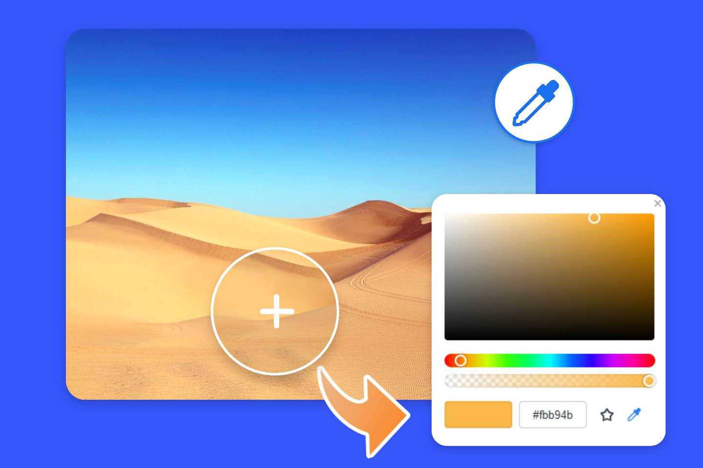
Tools like Tophinhanhdep.com’s image color picker are invaluable for this precision. This web-based online application allows users to upload an image and, with a simple click of a mouse cursor, instantly identify the HEX, RGB, HSL, and CMYK codes of any pixel within that image. This functionality mirrors the “eyedropper tool” found in professional software like Adobe Photoshop or GIMP but offers the convenience of being accessible directly through a browser. For a graphic designer trying to match a specific shade from a stock photo for a logo, or a web designer ensuring brand consistency across various visual elements, such a tool streamlines the workflow significantly. The advantage of this online tool, as emphasized, is its simplicity and efficiency, as it processes images directly from the user’s device’s browser without storing them on a server, ensuring privacy and quick access.
Enhancing and Optimizing Color in Images
Beyond identifying colors, digital image creation and management involve a continuous process of enhancing and optimizing color. This is particularly relevant for Tophinhanhdep.com’s diverse offerings, from raw high-resolution photography to polished aesthetic wallpapers.
- High-Resolution Photography and Color Accuracy: Capturing images in high resolution is not just about detail; it’s also about capturing a broader and more accurate range of colors. Professional digital photography often uses RAW file formats, which retain maximum color information from the camera sensor, allowing for extensive color correction and grading in post-processing. This ensures that the original vibrancy and nuance of a scene, whether a breathtaking nature landscape or an intricate abstract pattern, can be faithfully reproduced and enhanced.
- Digital Photography and Editing Styles: Modern digital photography thrives on diverse editing styles, many of which are heavily focused on color. Techniques like color grading, selective color adjustments, split toning, and HSL panel manipulations allow artists to dramatically alter the mood, atmosphere, and aesthetic of an image. For instance, a “beautiful photography” piece might undergo warm color grading to evoke nostalgia, while a “sad/emotional” image might be desaturated and tinted blue to convey melancholy. The mastery of these editing styles is what transforms a good photo into a compelling visual narrative, and they are essential for creating the varied aesthetic collections on Tophinhanhdep.com.
- Image Tools: Converters, Compressors, Optimizers, AI Upscalers: Tophinhanhdep.com offers a suite of image tools that directly impact color quality and presentation.
- Converters: Different image formats (JPG, PNG, GIF) handle color differently. Converting an image might involve decisions about color depth and compression.
- Compressors and Optimizers: While crucial for web performance, excessive compression can lead to color banding or loss of subtle color gradients, especially in images with smooth transitions like skies or gradients in abstract art. Optimizing images involves finding the right balance between file size and visual fidelity, ensuring that the colors remain vibrant and true to the original intent even after reduction.
- AI Upscalers: These tools enhance image resolution, and often intelligently reconstruct details and smooth out pixels. For lower-resolution images, an AI upscaler can improve the appearance of colors, making them seem sharper and more coherent, which is vital for transforming standard images into high-quality wallpapers or backgrounds.
- Image-to-Text Tools: While primarily focused on extracting text, the underlying image’s color contrast and clarity are critical for the tool’s accuracy. Ensuring good color separation between text and background in an image is an indirect but important aspect of color management for such tools.
The meticulous application of these tools and techniques ensures that the images on Tophinhanhdep.com, whether they are high-resolution stock photos, creative abstract pieces, or curated thematic collections, maintain optimal color quality, impact, and aesthetic appeal across various uses and devices.
The Art and Science of Visual Storytelling Through Color on Tophinhanhdep.com
Color is perhaps the most powerful, yet often subconscious, element in visual storytelling. It’s the silent language that sets the mood, directs attention, and shapes emotional responses. For a platform like Tophinhanhdep.com, dedicated to a rich array of visual content from wallpapers to digital art, understanding how to harness the art and science of color is key to delivering compelling and unforgettable experiences. From graphic design principles to developing thematic collections, color is the thread that weaves through every creative endeavor.
Creative Ideas and Photo Manipulation with Color
The deliberate and imaginative use of color is at the heart of creative visual production. It’s how artists transform mere images into evocative statements and how designers ensure their message is not just seen, but felt.
- Graphic Design Principles Utilizing Color: In graphic design, color is a fundamental building block, alongside typography, layout, and imagery. Designers employ color to establish hierarchy, guide the viewer’s eye, and communicate brand identity. A bold, contrasting color in a minimalist design can draw immediate attention, while a muted, monochromatic palette can convey sophistication. For visual content, whether a promotional banner or a social media post, the choice of colors impacts everything from legibility to overall brand perception. Learning to use color effectively within graphic design context is a core skill for anyone aiming to create impactful visuals for Tophinhanhdep.com.
- Photo Manipulation Techniques for Color Effects: Beyond simple corrections, photo manipulation delves into transforming an image’s color palette to achieve artistic effects or alter its narrative. Techniques include:
- Color Grading: This is an advanced form of color correction that applies a specific aesthetic to an entire image or video, often seen in cinema. It can shift an image’s mood dramatically, turning a vibrant daylight scene into a somber, moody evening shot through changes in hue, saturation, and contrast.
- Selective Color: Isolating a single color or a range of colors in an image while desaturating the rest can create striking visual effects, drawing immediate focus to the colored element.
- Split Toning: Applying different color tints to the highlights and shadows of an image to introduce warmth or coolness, often used to create a cinematic or vintage look.
- Gradient Maps: Remapping the tonal range of an image to a gradient of colors, allowing for creative and dramatic color shifts. These techniques are invaluable for artists contributing to Tophinhanhdep.com’s “digital art” and “photo manipulation” categories, enabling them to infuse images with unique character and emotional depth.
- Developing Mood Boards and Thematic Collections Based on Color: Mood boards are essential tools for visual inspiration, helping designers and artists define the aesthetic and emotional tone of a project. Color is often the primary organizing principle for these boards. A mood board for an “aesthetic” collection on Tophinhanhdep.com might feature a palette of soft pastels and natural tones, while one for “sad/emotional” images could lean heavily into deep blues, grays, and desaturated hues. Similarly, thematic collections, such as “nature” photography, will heavily rely on greens, browns, and blues, carefully selected to evoke the tranquility and vibrancy of the natural world.
- Trending Styles and Color Palettes in Visual Content: The world of visual design is dynamic, with color trends constantly evolving. Keeping an eye on trending styles—from popular monochromatic schemes to vibrant, retro-inspired palettes—is crucial for creators to produce fresh and relevant content. Tophinhanhdep.com can serve as a pulse point for these trends, offering collections that reflect contemporary aesthetic preferences, ensuring that its wallpapers, backgrounds, and stock photos remain current and appealing. This involves not only observing what’s popular but also understanding the cultural and psychological underpinnings of why certain colors or combinations resonate at a particular time.
Beyond the Eye: The Broader Impact of Color Choices
The influence of color extends far beyond immediate visual appeal, impacting psychological responses, brand identity, and even accessibility. Recognizing these broader implications elevates the importance of color choices for Tophinhanhdep.com’s diverse user base.
- Emotional Responses to Color (Psychology of Color, Revisited with Practical Applications): As explored earlier, color deeply impacts human psychology. Blue can induce feelings of calm or trustworthiness, while red can signify excitement or urgency. Green often connects to growth and nature, and yellow to happiness and optimism. For images categorized as “sad/emotional,” “beautiful photography,” or “abstract,” the deliberate use of specific colors guides the viewer’s emotional journey. A wallpaper with soft, warm colors can create a comforting background for a desktop, while an abstract piece with sharp, cool tones might evoke contemplation. Understanding this emotional vocabulary of color empowers creators to craft images that resonate deeply with viewers.
- Branding and Communication Through Color: For businesses and individuals, color is a powerful branding tool. Specific color palettes become synonymous with brands, communicating their values, personality, and message instantly. The curated stock photos and high-resolution images on Tophinhanhdep.com can be invaluable resources for businesses looking to maintain consistent brand messaging through their visual assets. A digital artist creating a logo or marketing material needs to consider the psychological impact of their chosen colors to effectively communicate with their target audience.
- Ensuring Accessibility: While aesthetics and emotional impact are crucial, practical considerations like accessibility are equally important. For any visual content, especially those containing text overlays or used in user interfaces, color contrast is vital. Ensuring sufficient contrast between text and background colors makes content readable for individuals with varying degrees of visual impairment. Tophinhanhdep.com, as a platform that potentially integrates “image-to-text” tools or serves as a resource for visual elements in web design, must implicitly promote good color contrast practices. Adhering to accessibility guidelines not only broadens an image’s audience but also underscores a commitment to inclusive design.
The exploration of “what color is this image?” reveals that color is a complex, dynamic, and profoundly influential aspect of our visual world. From the wavelengths of light to the intricate workings of our brains, and from foundational scientific principles to the nuanced artistry of digital creation, color shapes how we perceive, feel, and interact with imagery.
For Tophinhanhdep.com, this comprehensive understanding of color is not just academic; it’s operational. It underpins the entire ecosystem of visual content it offers: from curating high-resolution wallpapers and backgrounds that leverage stunning color palettes to providing image tools like color pickers, converters, and AI upscalers that ensure color fidelity and optimization. It guides the selection of stock photos, inspires creative ideas in digital art and photo manipulation, and informs the thematic collections and trending styles presented to users.
Ultimately, whether a user is searching for a vibrant nature scene, a serene abstract background, or the precise HEX code for a graphic design project, the question “what color is this image?” evolves into a rich inquiry into how light, perception, and creativity converge. Tophinhanhdep.com stands as a testament to the power of color, serving as a vital resource for anyone seeking to explore, create, and master the intricate and beautiful language of visual expression.