Understanding Grayscale Images: A Comprehensive Guide to the World Without Color

In a world saturated with vibrant hues and dazzling color palettes, there’s a profound beauty and utility in the absence of color. Grayscale images, often mistakenly simplified as mere “black and white,” represent a sophisticated spectrum of tones that can evoke deep emotions, highlight intricate details, and serve a multitude of practical purposes. From fine art photography to advanced scientific imaging, the grayscale image holds a unique and powerful position in the visual landscape.
At Tophinhanhdep.com, we understand the multifaceted nature of images, whether bursting with color or rendered in the nuanced shades of gray. Our platform is dedicated to exploring every facet of visual content, offering a rich repository of images, cutting-edge tools, and invaluable inspiration for creators and enthusiasts alike. This guide delves into the essence of grayscale images, uncovering their scientific underpinnings, aesthetic impact, and practical applications, all while showcasing how Tophinhanhdep.com empowers you to explore this captivating medium.

What is a Grayscale Image? Unveiling the Tonal Spectrum
At its core, a grayscale image is one in which the value of each pixel is a single sample, representing only an amount of light, or intensity. Unlike color images which use multiple samples (typically red, green, and blue) to represent color, a grayscale image uses a range of shades from pure black to pure white, encompassing all the intermediate tones of gray. This continuous spectrum allows for a remarkable degree of detail and subtlety, even without the presence of color.
Think of it as a spectrum of light intensity: 0% light (pure black), 100% light (pure white), and everything in between. Each pixel in a grayscale image carries a numerical value that corresponds to its brightness, offering a granular control over the visual information presented.
The Science Behind Grayscale: Pixels, Intensity, and the Absence of Color
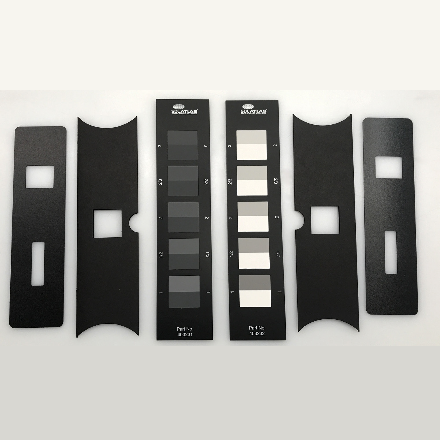
To truly understand a grayscale image, one must look at its fundamental building blocks: pixels. In a digital image, each pixel is assigned a value that determines its appearance. For a grayscale image, this value typically ranges from 0 to 255. A value of 0 usually represents pure black, while 255 represents pure white. Values in between correspond to various shades of gray, with lower numbers indicating darker grays and higher numbers indicating lighter grays.
This range of 256 possible intensity levels (2^8, as it’s often represented in 8-bit images) is sufficient to create a smooth, continuous gradation of tones that the human eye perceives as a seamless transition from black to white. While some specialized applications might use 10-bit or 16-bit grayscale for even finer distinctions (up to 65,536 shades), 8-bit is the standard for most common uses. This single channel of information, focused solely on luminance, simplifies data processing and storage compared to the three or four channels (RGB or CMYK) found in color images.
On Tophinhanhdep.com, when you explore our collection of high-resolution images or delve into digital photography resources, you’ll appreciate how this precise control over pixel intensity allows for the creation of stunning grayscale visuals. The meticulous detail in an abstract grayscale wallpaper or the stark beauty of a nature background, for instance, relies heavily on this scientific principle.
How Grayscale Differs from Black and White: More Than Just a Shade Apart
The terms “grayscale” and “black and white” are often used interchangeably, but there’s a crucial distinction. A true “black and white” image, in its strictest sense, contains only two colors: pure black and pure white, with no intermediate shades of gray. This binary representation is characteristic of line art, text documents, or early forms of digital images where memory was severely limited.
Grayscale, on the other hand, embraces the entire spectrum of gray tones. It’s a rich, continuous tonal scale that captures the nuances of light and shadow, texture, and form with incredible depth. While a black and white image might look stark and graphic, a grayscale image offers softness, depth, and a more photographic quality. It’s the difference between a simple line drawing and a detailed charcoal sketch.
This distinction is vital for anyone engaging with visual content, whether for aesthetic purposes or practical applications. Tophinhanhdep.com emphasizes this nuance in its offerings, providing resources that help users understand and create visually compelling images, whether they lean towards the crispness of true black and white or the sophisticated subtlety of full grayscale.
Why Grayscale Matters: Applications and Aesthetic Appeal
The enduring appeal and utility of grayscale images stem from their unique ability to convey information and emotion in ways that color sometimes cannot. By stripping away the distractions of hue, grayscale forces the viewer to focus on core elements: light, shadow, form, texture, and composition.
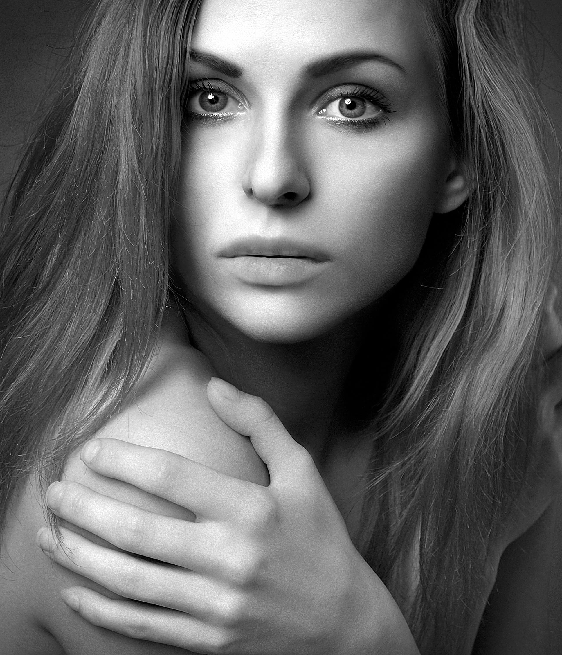
Artistic and Aesthetic Impact: Evoking Mood and Emotion
In photography and visual design, grayscale is a powerful artistic tool. Removing color can transform an ordinary scene into something extraordinary. Without color, the viewer’s eye is drawn to:
- Form and Texture: The subtle ridges of a tree bark, the delicate folds of fabric, or the rugged contours of a landscape become more pronounced and tactile.
- Light and Shadow: Grayscale excels at emphasizing dramatic lighting. The interplay of highlights and deep shadows creates depth, mood, and can sculpt subjects with striking intensity.
- Composition: With color out of the equation, the strength of the image’s composition – its lines, shapes, and balance – comes to the forefront.
- Emotion: Grayscale often conveys a sense of timelessness, nostalgia, melancholy, or raw emotion that color can sometimes dilute. A sad or emotional image in grayscale can feel more poignant, while a beautiful photograph gains a classic, fine-art quality.
At Tophinhanhdep.com, you can explore numerous aesthetic images, nature shots, and abstract compositions that demonstrate the profound impact of grayscale. Our collections of “sad/emotional” and “beautiful photography” often feature examples where the absence of color amplifies the narrative and emotional resonance, guiding photographers and designers in developing their creative ideas.
Practical Applications: From Data to Digital Efficiency
Beyond its artistic merit, grayscale serves a crucial role in various practical fields:
- Medical Imaging: X-rays, MRI scans, and ultrasound images are predominantly grayscale. The varying shades represent different tissue densities, allowing medical professionals to interpret critical diagnostic information without the distraction or potential misinterpretation of color.
- Scientific and Technical Imaging: From microscopy to astronomy, grayscale is used to visualize data where specific light intensity levels are more important than color. It highlights structural details and variations in material properties.
- Printing and Publishing: For economical printing, especially for books and documents, grayscale is a cost-effective choice. It ensures consistency across different print media and reduces ink consumption.
- File Size Reduction: A significant advantage of grayscale images is their smaller file size compared to their full-color counterparts. Since they only store one channel of intensity information per pixel instead of three (RGB), they require less data. This is particularly beneficial for web optimization, faster loading times, and reducing storage requirements. Our image tools at Tophinhanhdep.com, such as compressors and optimizers, can further enhance this efficiency, whether for original grayscale content or converted color images.
- Legacy Systems and Accessibility: Many older display technologies or accessibility features for colorblind individuals benefit from or even require grayscale content.
These practical applications highlight why understanding grayscale is not just for artists but for anyone working with digital media. Tophinhanhdep.com’s diverse range of resources, from high-resolution stock photos to image converters and optimizers, provides the tools to work effectively with grayscale in all these contexts.
Creating and Converting Grayscale Images: Techniques and Tools
Whether you’re starting with a vision for a monochrome masterpiece or need to convert an existing color image for a specific purpose, mastering the creation and conversion of grayscale images is an essential skill for any digital artist, photographer, or designer.
Capturing Grayscale: In-Camera Options and Intentionality
Many modern digital cameras, including smartphone cameras, offer a built-in “monochrome” or “black and white” mode. When you shoot in this mode, the camera processes the light information and directly outputs a grayscale JPEG file. This can be a great way to immediately visualize your scene in black and white and train your eye to see in tones.
However, a more flexible approach for professional-level photography is to shoot in color (specifically RAW format) and convert to grayscale in post-processing. Shooting in RAW retains all the original color information, giving you maximum control over how the colors are translated into different shades of gray later on. This allows for more precise adjustments to contrast, brightness, and the intensity of specific tonal ranges that originated from different colors. Tophinhanhdep.com encourages photographers to explore both in-camera experimentation and the power of post-processing to achieve their desired grayscale effects, offering insights into various photography and editing styles.
Post-Processing and Conversion: Software Tools and Techniques
The most powerful way to create stunning grayscale images is through post-processing software. Programs like Adobe Photoshop, Lightroom, GIMP, and countless others offer sophisticated tools for conversion and enhancement.
The simplest method is often a “desaturation” tool, which removes all color information. However, this method can often result in flat, uninspired grayscale images. More advanced techniques involve:
- Channel Mixer/Black & White Adjustment Layers: These tools allow you to control how much each color channel (red, green, blue) contributes to the final grayscale image. For example, you might make blues darker and reds lighter to create a dramatic sky or emphasize skin tones. This level of control is crucial for achieving depth and impact.
- Hue/Saturation Adjustments: Even in grayscale conversion, manipulating the original color’s hue and saturation before desaturating can dramatically alter the tonal relationships in the final grayscale image.
- Contrast and Tone Curve Adjustments: These are vital for adding punch, defining highlights, and deepening shadows to make the grayscale image truly pop.
- Dodging and Burning: Selectively lightening (dodging) or darkening (burning) specific areas of an image, a technique borrowed from traditional darkroom practices, allows for precise tonal control and emphasis.
Tophinhanhdep.com’s Image Tools, particularly our converters and resources on editing styles and photo manipulation, provide excellent avenues for users to experiment with these techniques. Our platform supports the transformation of color images into nuanced grayscale masterpieces, guiding users through the creative process.
Grayscale Conversion Algorithms: Luminosity, Average, and Lightness
When a software or a camera converts a color image to grayscale, it uses an algorithm to determine how each color pixel’s RGB values translate into a single grayscale intensity value. Common algorithms include:
- Luminosity Method: This is often considered the most accurate and visually pleasing method. It accounts for how the human eye perceives different colors’ brightness. Our eyes are more sensitive to green light than red or blue. Therefore, the luminosity method typically assigns weights to each color channel (e.g., Green: 59%, Red: 30%, Blue: 11%) to calculate the grayscale value, mimicking natural human perception.
- Average Method: This is the simplest method, merely averaging the Red, Green, and Blue values (R+G+B)/3. While straightforward, it can sometimes result in a flatter image because it doesn’t account for varying perceived brightness of different colors.
- Lightness Method: This method calculates the average of the maximum and minimum RGB components (Max(R,G,B) + Min(R,G,B))/2. It often produces results similar to the average method but can be slightly different depending on the color distribution.
Understanding these underlying algorithms, even superficially, helps you appreciate why certain conversion methods yield better results and how Tophinhanhdep.com’s image converters can offer different quality outputs depending on their sophistication.
The Role of Grayscale in Visual Design and Photography on Tophinhanhdep.com
Grayscale is not merely an alternative to color; it’s a distinct visual language with its own grammar and vocabulary. Its integration into modern visual design and photography is profound, influencing everything from minimalist aesthetics to complex photo narratives. Tophinhanhdep.com serves as an invaluable resource for exploring and leveraging this language.
Enhancing Visual Storytelling: Focus and Emphasis
In visual storytelling, grayscale can be a powerful amplifier. By removing color, it strips away superficial elements and forces the viewer to confront the core narrative. A grayscale image can:
- Create a sense of gravitas or timelessness: Historical photos are almost exclusively grayscale, imbuing a sense of history and permanence.
- Highlight emotion: Without the distraction of color, the expressions on faces, the body language, and the overall mood of a scene become intensely magnified. This is why many poignant and sad/emotional images often utilize grayscale.
- Emphasize texture and form: An architectural detail or a rugged landscape might reveal its true character more effectively in grayscale, drawing attention to its physical properties.
- Direct the viewer’s eye: By carefully manipulating light and shadow, a designer can subtly guide the viewer through the composition, ensuring key elements receive due attention.
Tophinhanhdep.com’s vast collection of images, including wallpapers and backgrounds, often demonstrates these principles. Our photo ideas and mood boards inspire users to think beyond color and explore how grayscale can create compelling narratives and impactful visual statements.
Grayscale in Digital Art and Graphic Design: Versatility and Sophistication
For graphic designers and digital artists, grayscale is far from limiting; it’s a foundation for creative exploration.
- Branding and Logos: Many iconic brands use grayscale or monochrome elements in their logos to convey sophistication, professionalism, and timelessness. It ensures legibility and adaptability across various media.
- User Interface (UI) Design: Grayscale palettes are frequently used in UI design to create clean, minimalist interfaces where color is reserved for functional cues (e.g., green for success, red for error).
- Digital Painting and Illustration: Many digital artists start their work in grayscale to establish values, form, and lighting before adding color. This “value study” ensures a strong underlying structure for the artwork.
- Creative Marketing Materials: Grayscale can lend a high-end, artistic feel to advertisements, brochures, and website designs, making the content stand out.
Tophinhanhdep.com provides a wealth of resources related to visual design, graphic design, and digital art, illustrating how grayscale plays a pivotal role. Our image inspiration sections and thematic collections often showcase creative ways grayscale is utilized in contemporary design.
Optimizing Grayscale for Web and Print: Quality and Performance
Optimizing grayscale images is crucial for both online performance and print quality.
- Web Optimization: As mentioned, grayscale images are inherently smaller in file size. However, further optimization with Tophinhanhdep.com’s compressors and optimizers ensures that they load quickly on websites, improving user experience and SEO. Choosing the right file format (e.g., JPEG for photographic images, PNG for images with sharp lines or transparency) is also key.
- Print Optimization: For print, resolution (DPI) is critical. A high-resolution grayscale image (e.g., 300 DPI for standard printing) will ensure sharp, clear results. Proper color profile management (even for grayscale, to ensure accurate tonal reproduction across different printers) is also important.
- AI Upscalers: For older or lower-resolution grayscale images, Tophinhanhdep.com’s AI upscalers can be incredibly useful. These tools use artificial intelligence to intelligently increase the resolution of an image, preserving or even enhancing details without introducing blurriness, making them suitable for modern displays or print.
Tophinhanhdep.com stands as a comprehensive hub for all your image needs, whether you’re sourcing high-resolution stock photos, converting an image to grayscale, compressing it for web use, or seeking inspiration for your next visual project. Our commitment is to provide the tools and content that empower you to master the art and science of images, including the powerful and evocative world of grayscale.
In conclusion, a grayscale image is far more than just a lack of color. It’s a universe of light and shadow, form and texture, emotion and functionality. Its scientific principles underpin countless applications, while its aesthetic capabilities continue to captivate artists and viewers alike. By understanding and embracing grayscale, you unlock a powerful dimension of visual communication. And with Tophinhanhdep.com as your guide, you have all the resources at your fingertips to explore, create, and optimize stunning grayscale content for any purpose.